Abbey
Smith
She/Her
Design inspires and demands constant innovation and attention to detail, which continually motivates me to improve and develop new skills. I entered the design program with a very general understanding of what “graphic design” meant and little to no understanding of what I could do within that field. But throughout the course of my education I have had the realization that this was the perfect path to take. My big moment of realization that my passion for novels could be blended with my passion for design continually reiterates that I have definitely chosen the best career. My design practice is focused on publication and editorial design, but there are so many aspects to the field that fascinate and excite me. My goals are to see where design can take me and enjoy every step of the creative process.
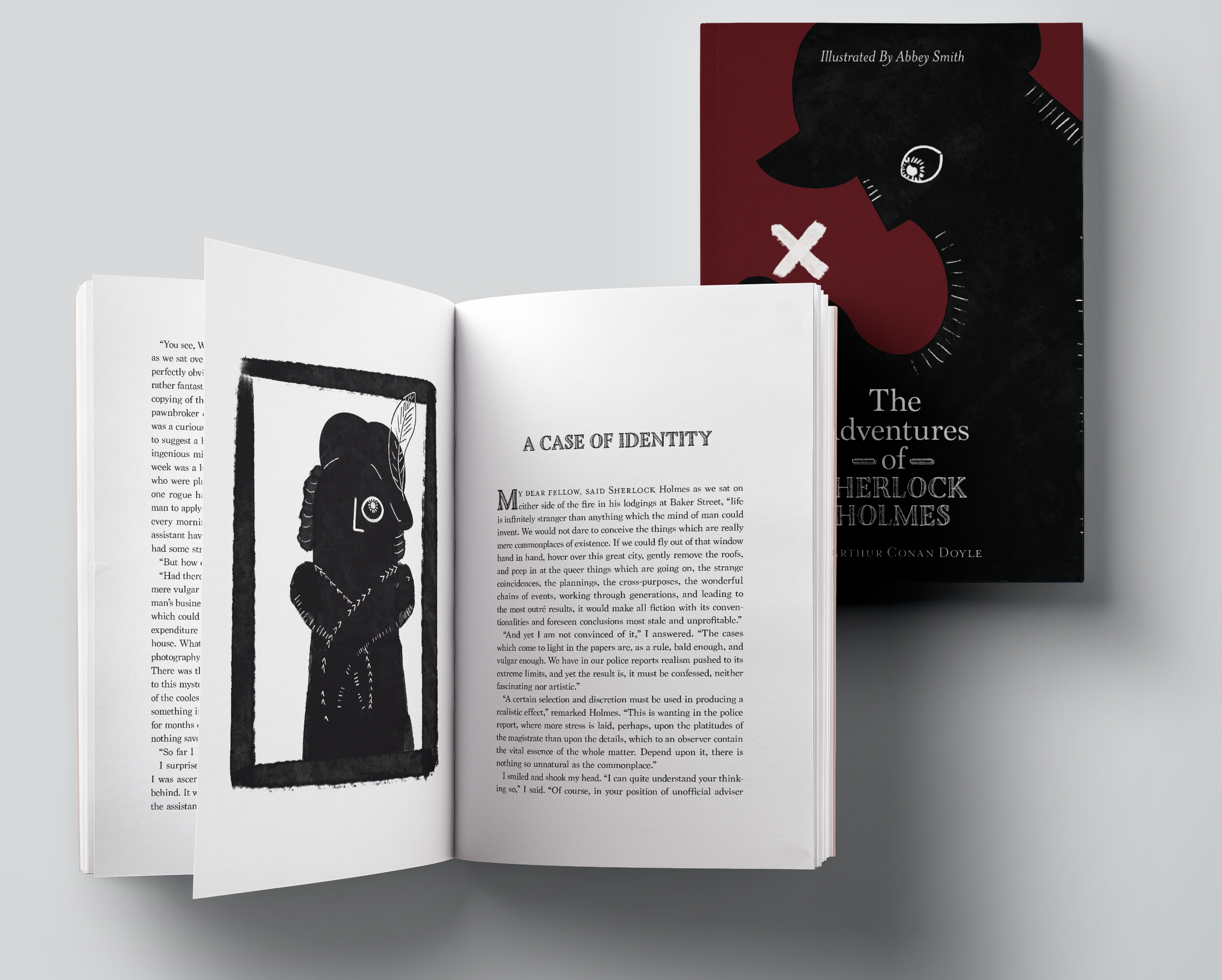
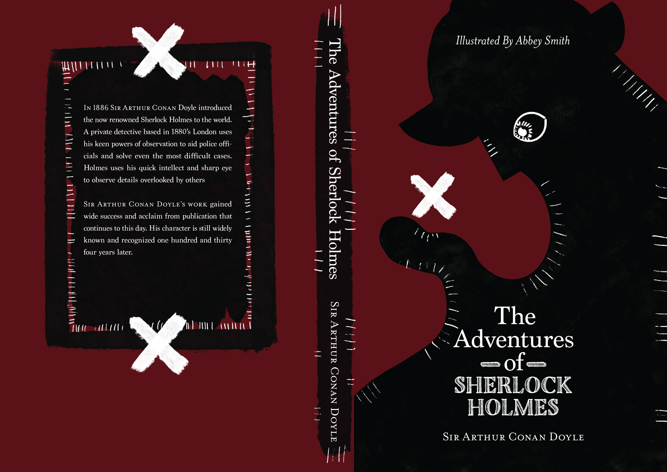
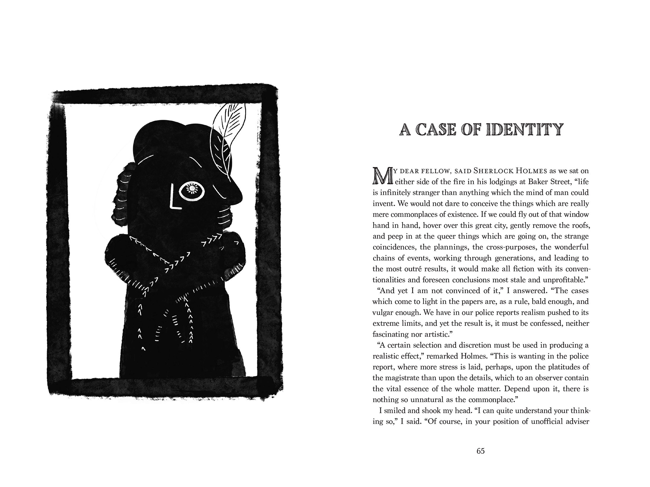
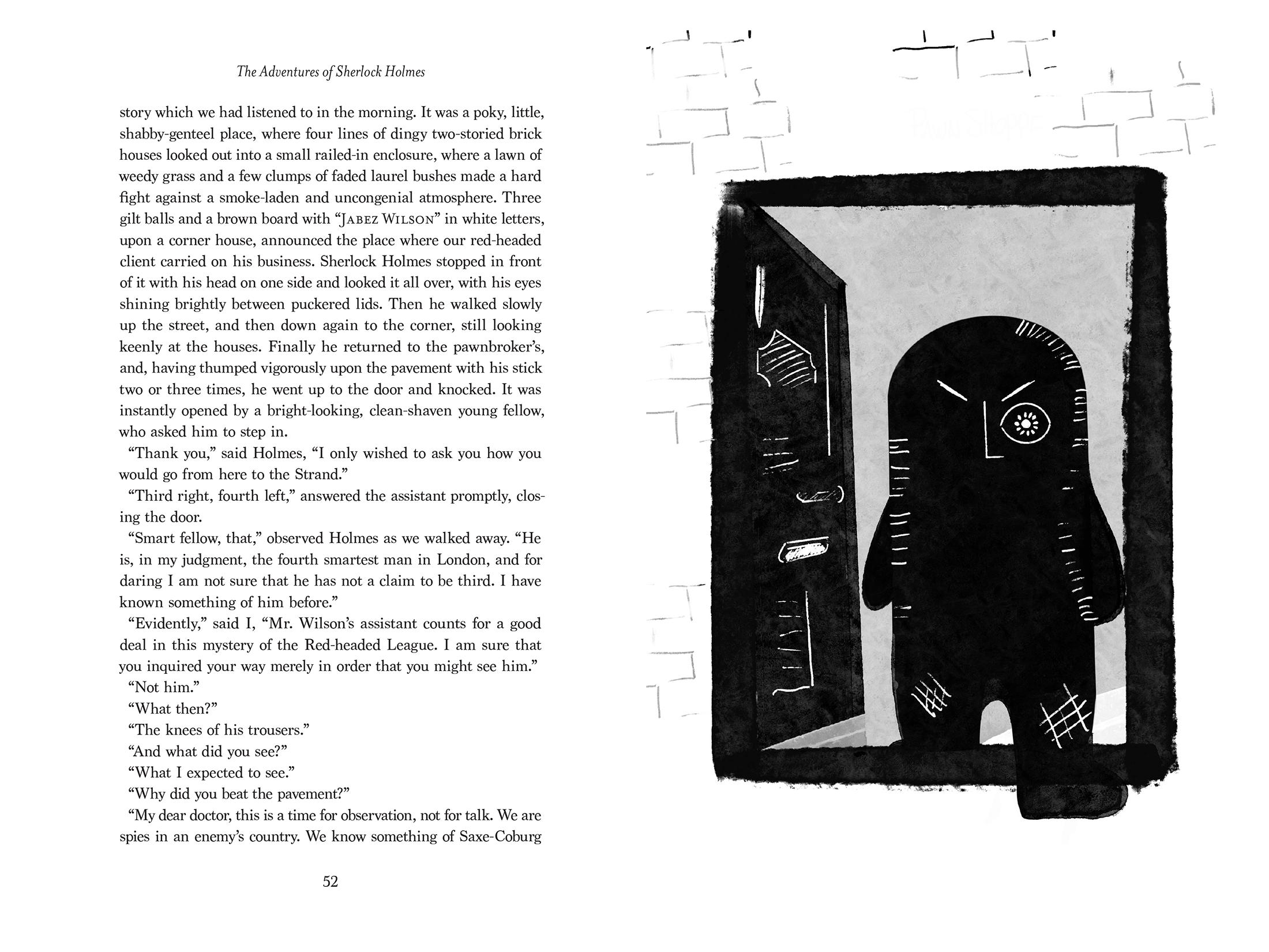
The Adventures of Sherlock Holmes - Publication
Sherlock Holmes, written by Sir Arthur Conan Doyle, is a novel from the 1890s about a sharp witted private investigator solving difficult crimes and murders in London, England. The book is a compilation of short stories all based on the darker themes of crime and murder. Based on these themes, my design leans toward the horror genre while still maintaining a relatable feel.
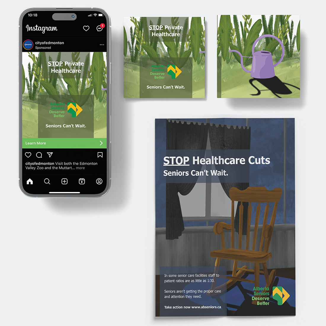
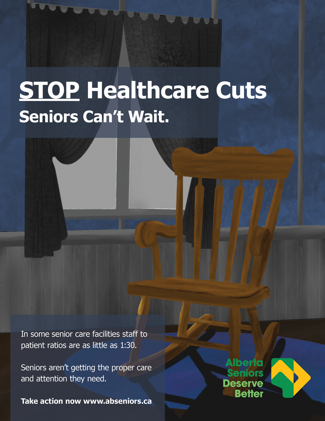
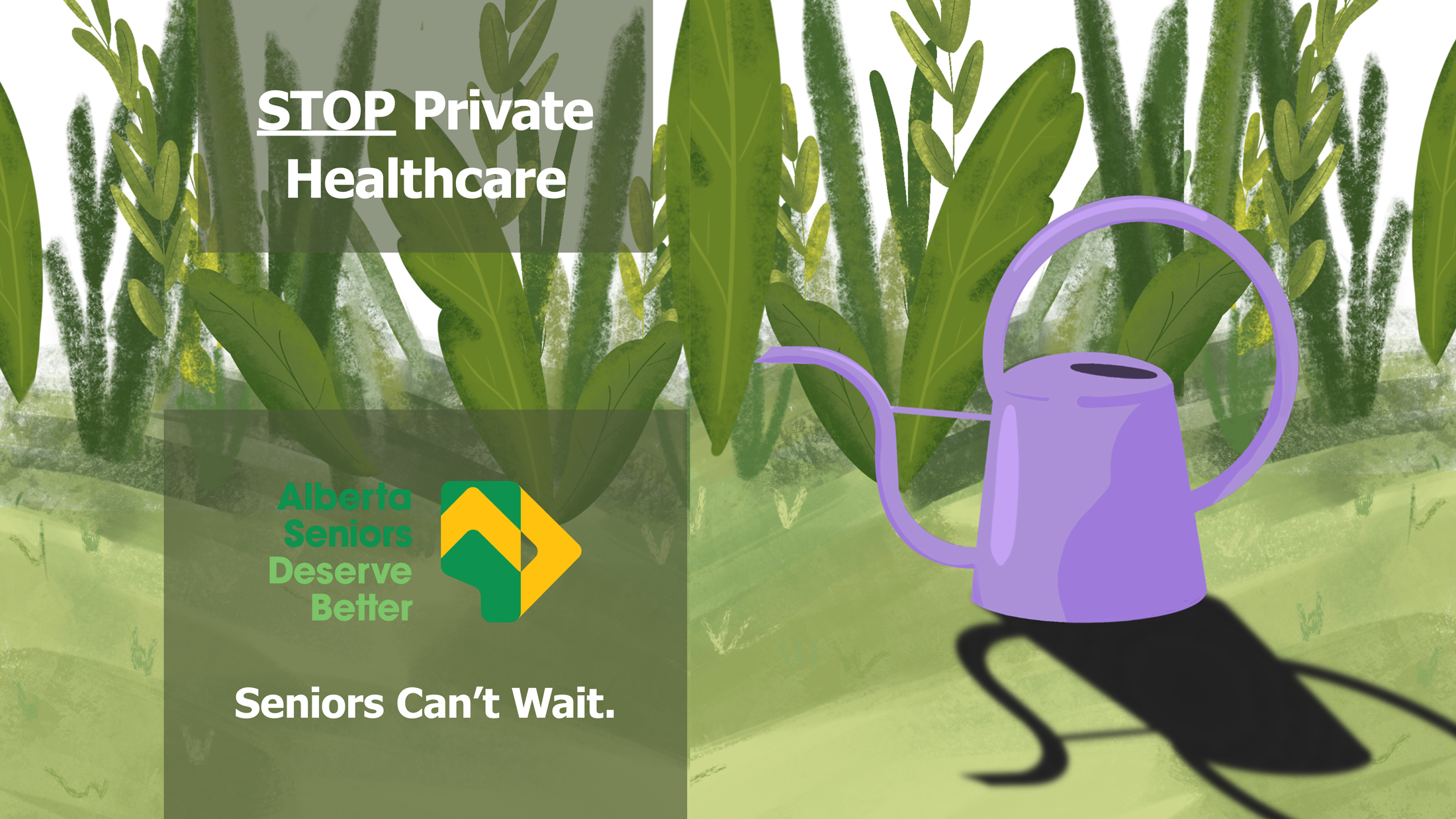
“Alberta Seniors Deserve Better” Social Justice Campaign - Advertising
Alberta Seniors Deserve Better is a non-profit organization that aims to prioritize the health and well being of albertan’s (especially elders) above all else. This campaign aims to raise awareness, and through eliciting a feeling of societal obligation, calls the audience to take action.
The Illustration style grasps the audience’s attention through the warm nostalgic feeling, but forces the viewer to do a double take once they understand the messaging. The Drop shadow creates a feeling of loneliness in the illustration that reinforces the emotion to the audience.
The Illustration style grasps the audience’s attention through the warm nostalgic feeling, but forces the viewer to do a double take once they understand the messaging. The Drop shadow creates a feeling of loneliness in the illustration that reinforces the emotion to the audience.
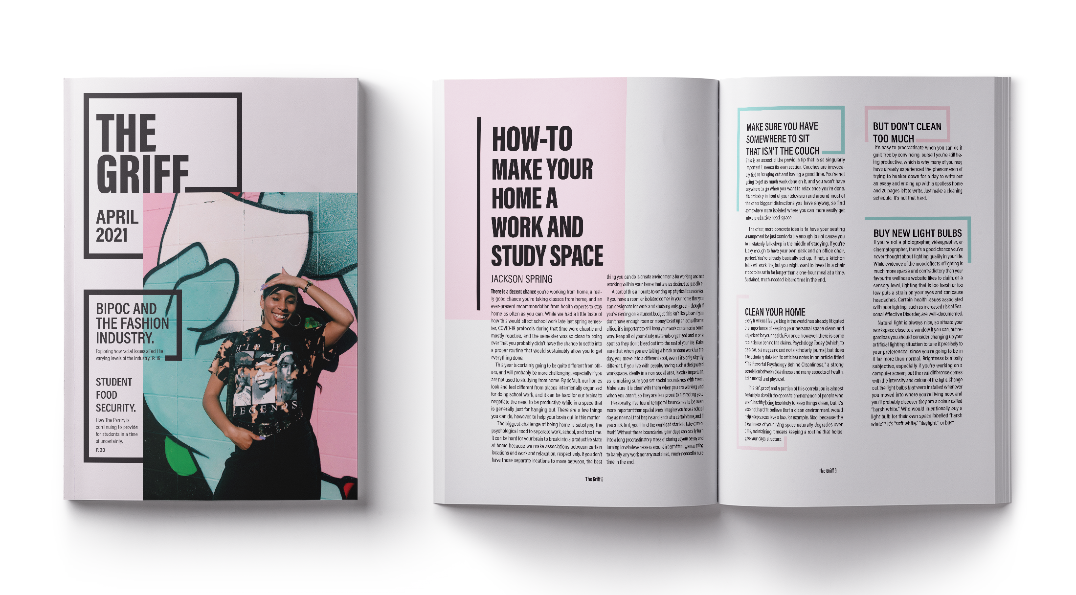
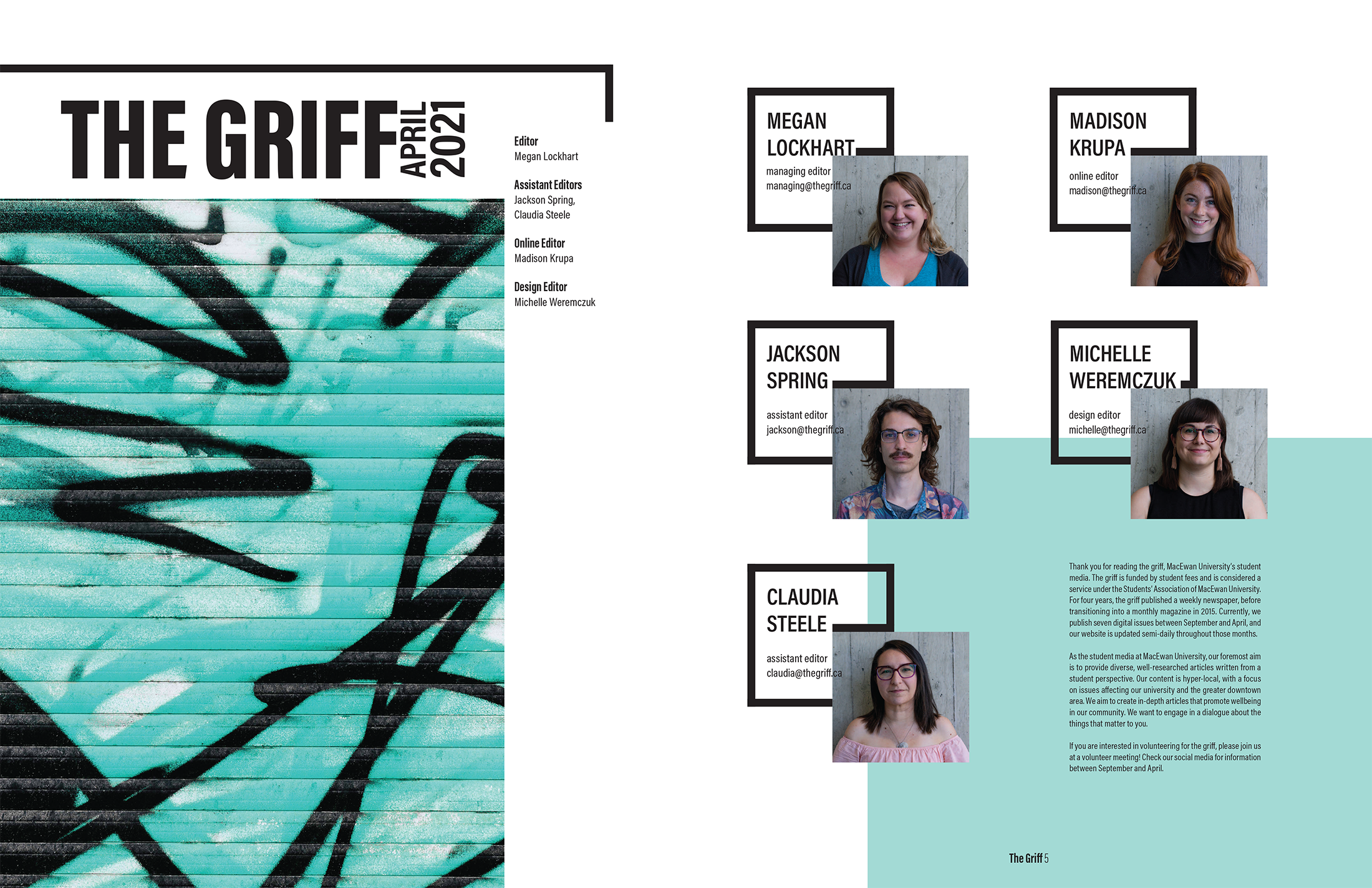
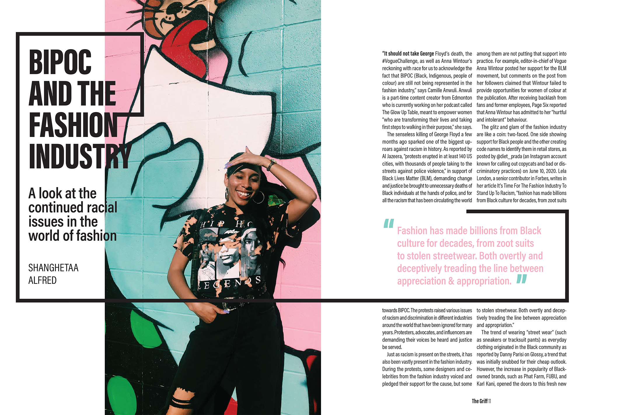
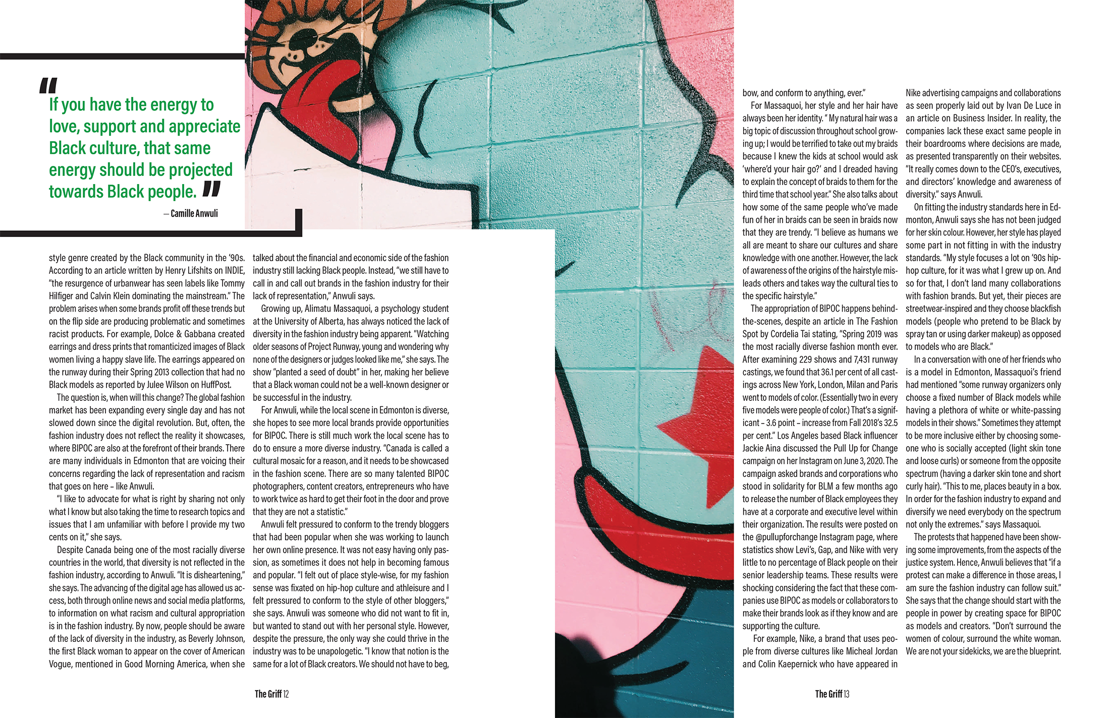
The Griff Magazine Redesign - Publication
Complete reinvention, the new identity of The Griff creates an experience through its bold presence, commanding to the audience, “Read Me!”. The New Griff expresses to the audience “We are experimental, breaking out of the box and you should, too,” because university is the time to take risks. This version of The Griff is a redesign of an existing issue—September 2020—taking existing articles, but joining them under a cohesive system, creating an identity for the magazine.


