Ale
Hernandez
She/Her
Within a unique time comes a unique experience, and as 2023 continues unfolding, my journey in design also does. I have spent half of my bachelor during the pandemic, which brought challenges to overcome and the need to learn and adapt. This spring, I’m proud of my work and prouder of my growth— but I’m mainly excited to keep growing and seeing the rest of my design career unfold. Throughout my multiple experiences in the Design program, I enjoyed different branches of design for different reasons. Still, I found a particular interest in branding and publication design because of their diversity of needs and themes for their respective purpose. Furthermore, my background in art plays a significant role in my design process as I try to implement those skills in my work.
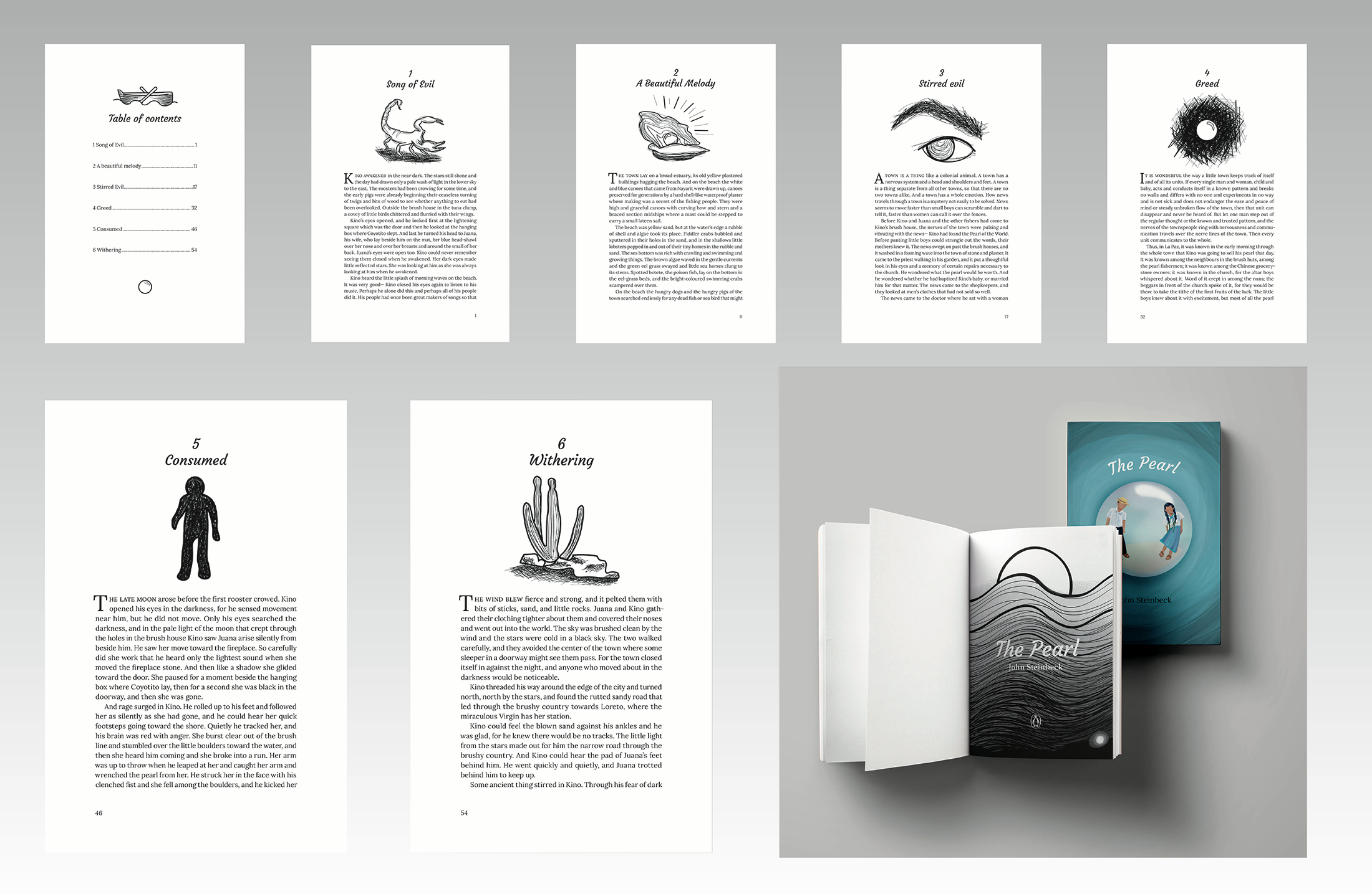
The Pearl
The design for The Pearl by John Steinbeck follows an illustrative style to tie into the story’s context of being a folk tale that has been passed down.
Meanwhile, the illustrations and imagery consistently have a dreary mood to correspond with the tragedy of this story as well as other works by John Steinbeck. The illustration for the cover plays into how the characters' lives became trapped by the pearl they found.
Meanwhile, the illustrations and imagery consistently have a dreary mood to correspond with the tragedy of this story as well as other works by John Steinbeck. The illustration for the cover plays into how the characters' lives became trapped by the pearl they found.
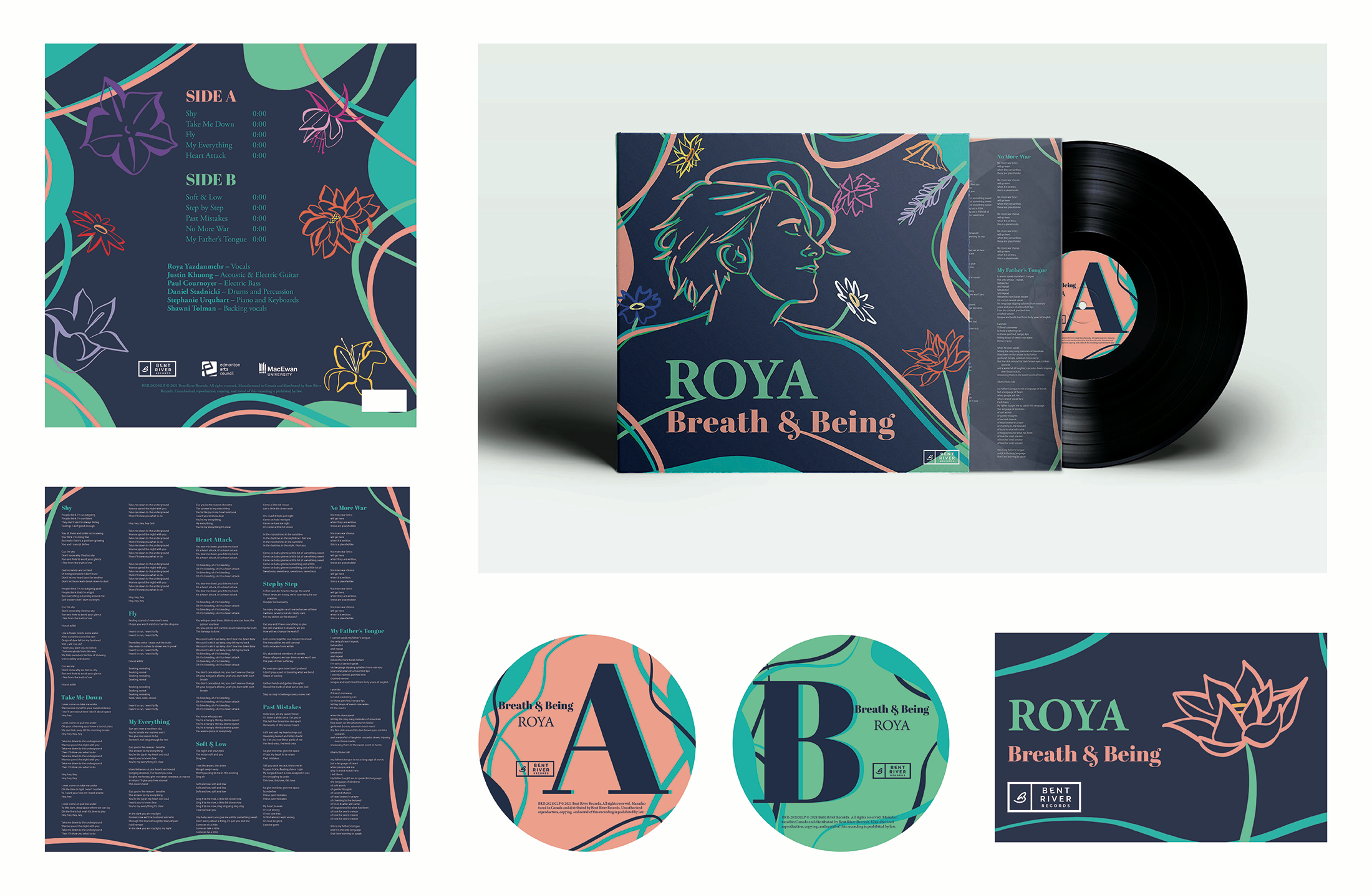
Breath & Being
This album cover was part of a competition to design Roya’s album Breath & Being. The design for Breath & Being follows an organic theme inspired by the references to flowers and nature within the album's songs, as well as the energy and flow of Roya’s music. The organic theme of the design explores ideas of growth, flourishing, and connections through conceptual analogies between flowers and personal growth.
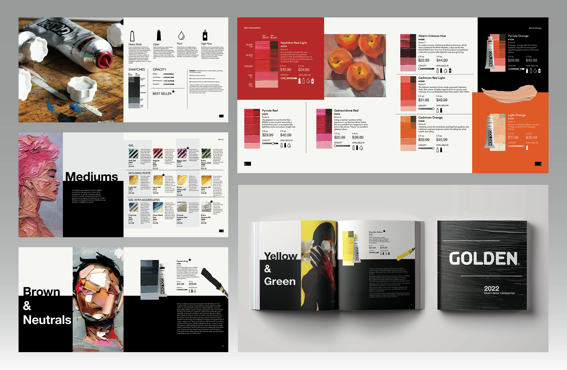
Golden Artist Colors Catalogue
This is a catalogue for the Golden Artist Colors. This project focuses on layout and information organization, in which the catalogue showcases the products, textures and relevant information about the product. The catalogue adheres to Golden’s brand through the dominant use of black and white, which helps to showcase Golden’s beautiful colours.
*I don't own the imagery used. The art pieces are credited to their artists by appearance and at the end of the catalogue.*
Artists on the left side:
- Elena Gual
- Daniel Benneworth
Artists on the right side:
- Carol Marine
- Nashid Chroma
*I don't own the imagery used. The art pieces are credited to their artists by appearance and at the end of the catalogue.*
Artists on the left side:
- Elena Gual
- Daniel Benneworth
Artists on the right side:
- Carol Marine
- Nashid Chroma
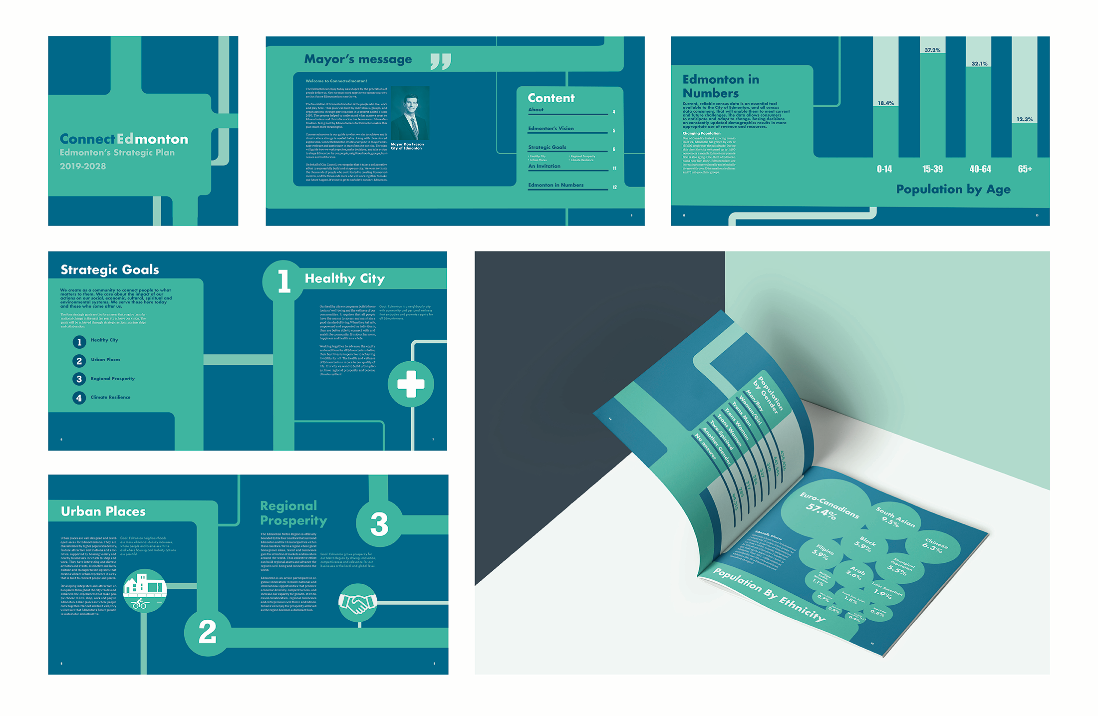
Connect(Ed)monton
This project is about redesigning the city of Edmonton’s strategic plan publication— ConnectEdmonton. The approach taken for this redesign is to focus on the idea of connection by having visual elements that lead through the pages and emphasize the conjunctions of the different aspects that make up our city.