Kim
Huynh
She/Her
I’ve always been drawn to the act of creation, and I love transforming ideas into problem-solving visuals. This led me to MacEwan, and I’ve grown to appreciate all aspects of design, particularly visual communication, illustration, branding and publication. I’m inspired by art and storytelling in all forms, ranging from fine art, film, and more. I’ve worked with non-profit organizations and I’m constantly seeking opportunities to learn and grow as a designer. Through my work, I strive to make a truly meaningful and positive impact on the community.
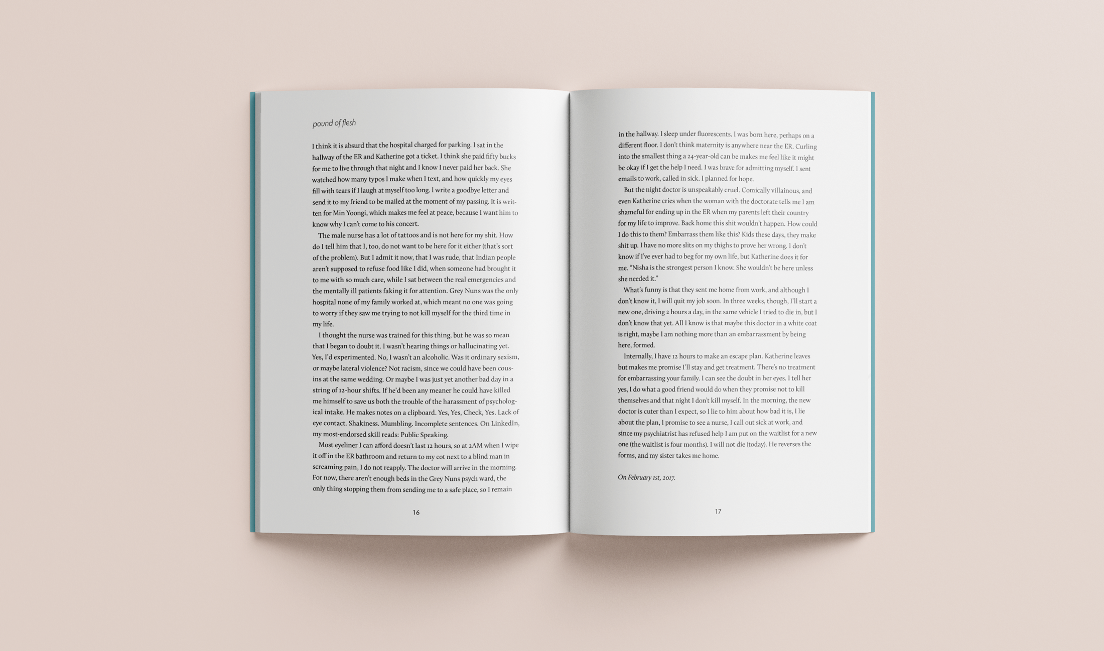
A Blow to the Head Poetic Memoir
A Blow to the Head is an introspective poetic memoir written by Edmonton’s eighth poet laureate, Nisha Patel, containing various poems and prose relating to chronic illness, disability, and trauma. The cover design depicts the author in the process of being pixelated - a metaphor for her concussions and disabilities. The writing consists of varying lengths and complexity, requiring a high attention to detail in order to design a cohesive system.
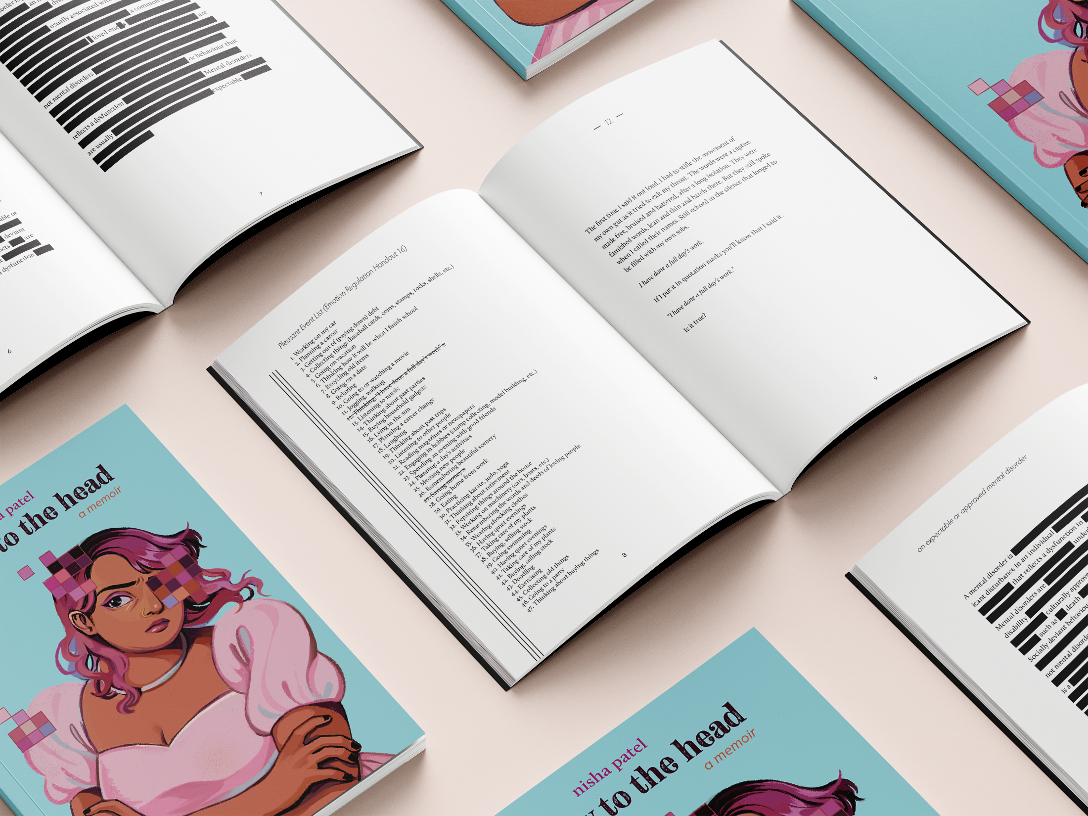
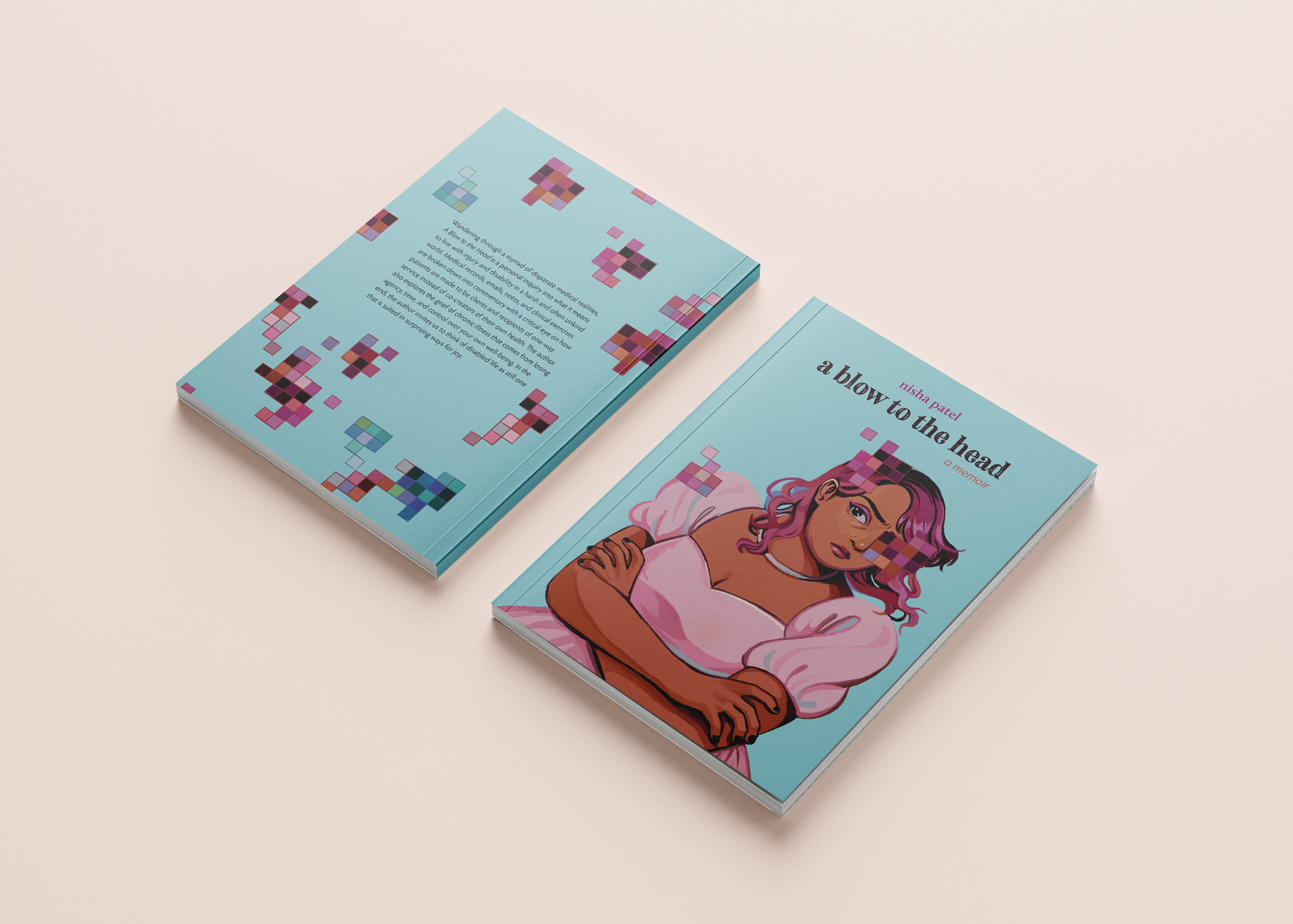
Carefully considered typeface selections in the memoir reflect the intimate writing through the delicate and elegant Hypatia and Calluna typefaces. Negative space is another key component of the memoir, where it is thoughtfully applied and balanced to the poems to create a place for contemplation.
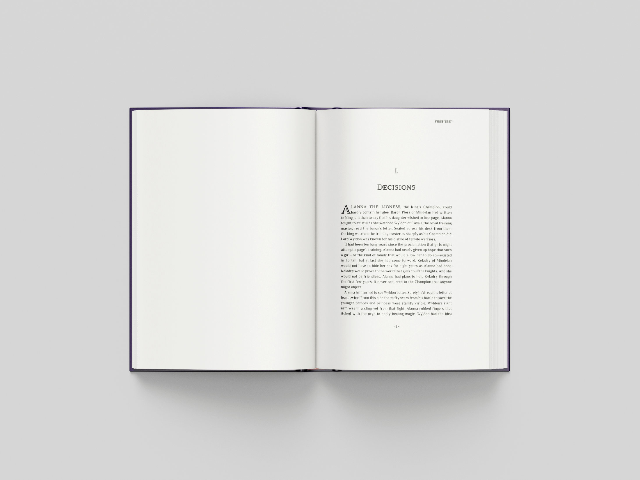
First Test Book Design
Tamora Pierce weaves a powerful anti-bullying feminist story in the young adult series, Protector of the Small: First Test. Kel is the first and only female page within a decade on a difficult path to knighthood in the medieval fantasy realm of Tortall. With strength, wit, and courage, she learns how to navigate childhood by confronting her bullies and destroying prejudices.
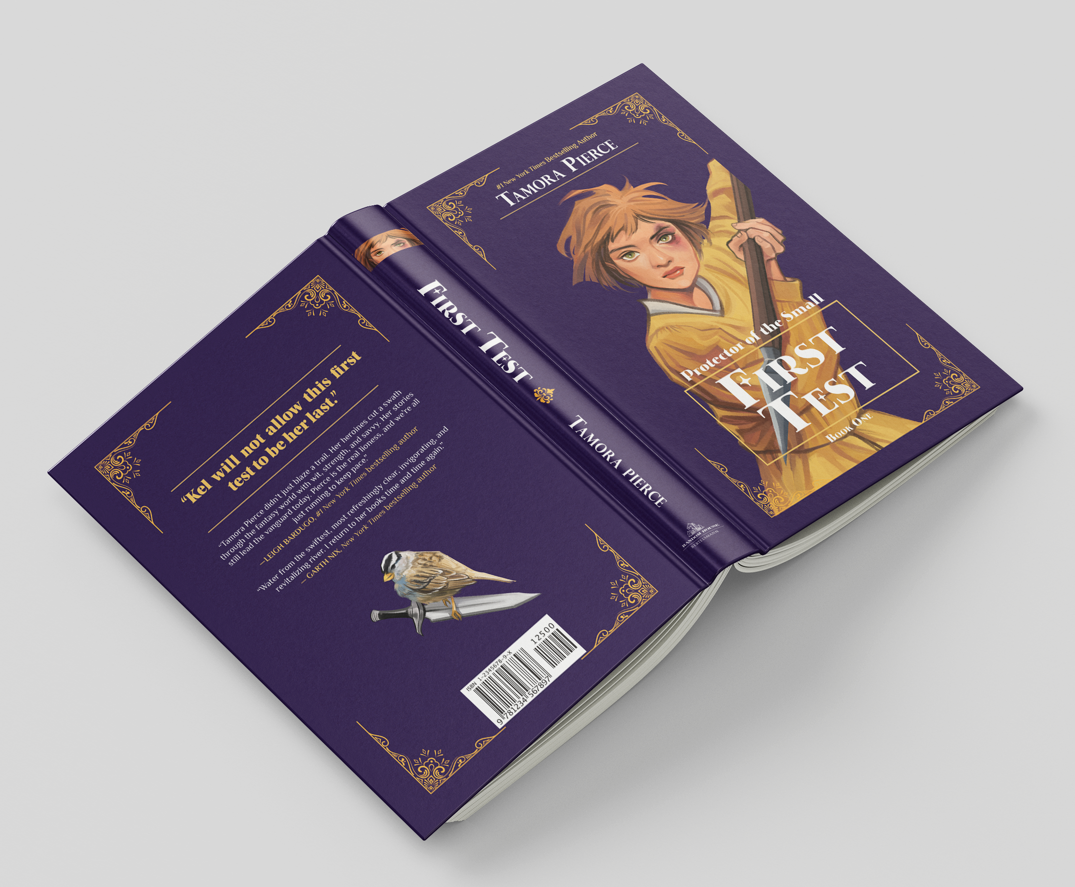
This dust jacket is inspired by imagery from the medieval era and the Arts and Crafts movement, with elaborate filigrees and transitional typefaces. The Philosopher typeface resembles historical typefaces through characteristics commonly used during the Middle Ages. The juxtaposition of rich golden hues against a textured deep violet backdrop invokes royal associations, as the heroine aims to become a knight for her kingdom.
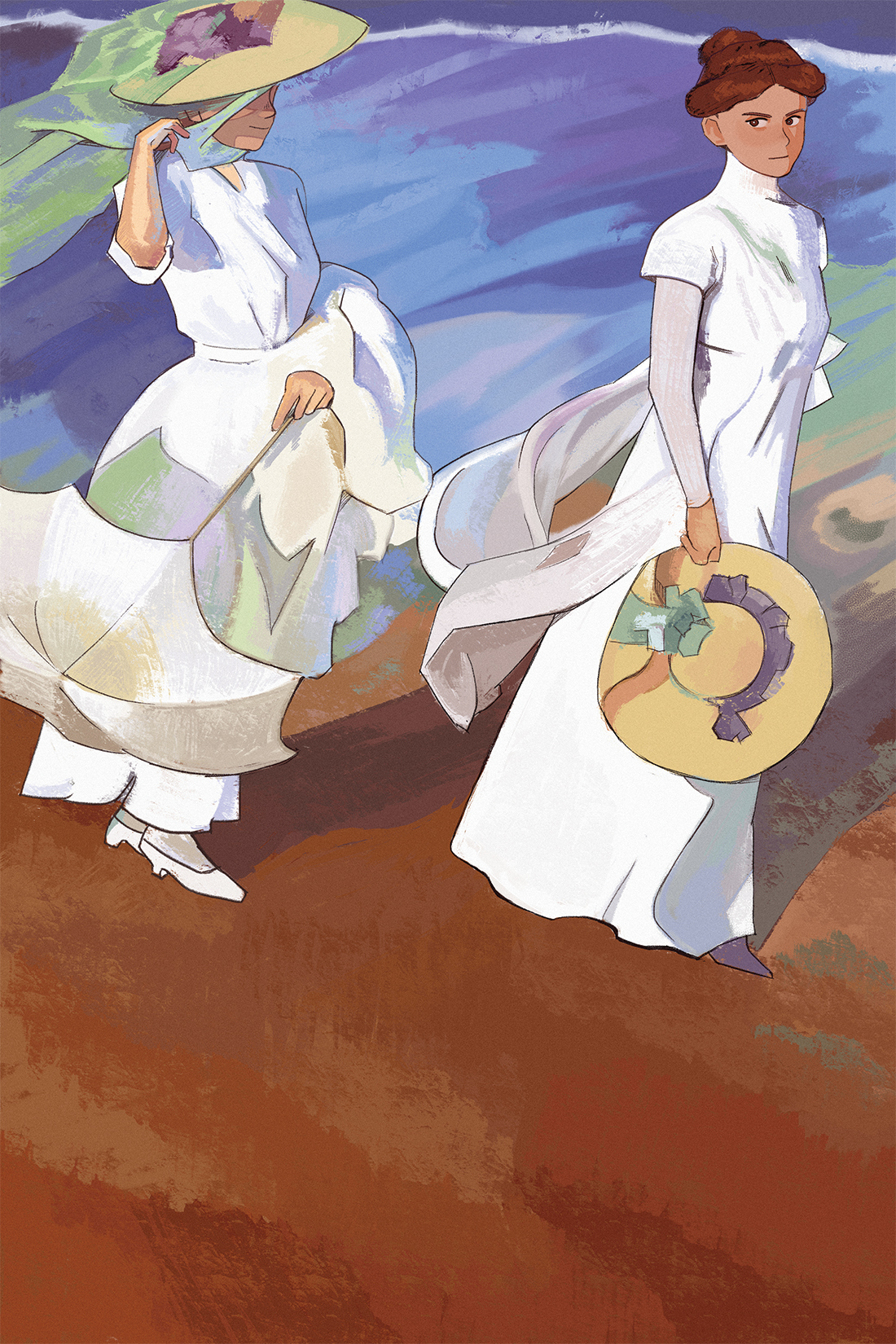
Master Study of Joaquin Sorolla and George Park
This project focuses on creating a master’s study of a classical painting in another illustrator’s style. I conducted a master study of Joaquin Sorolla’s 1909 Promenade by the Sea oil painting in the style of George Park, an animator and illustrator. The impressionist painting depicts two well-dressed women with sun hats holding a parasol standing near the sea’s edge.
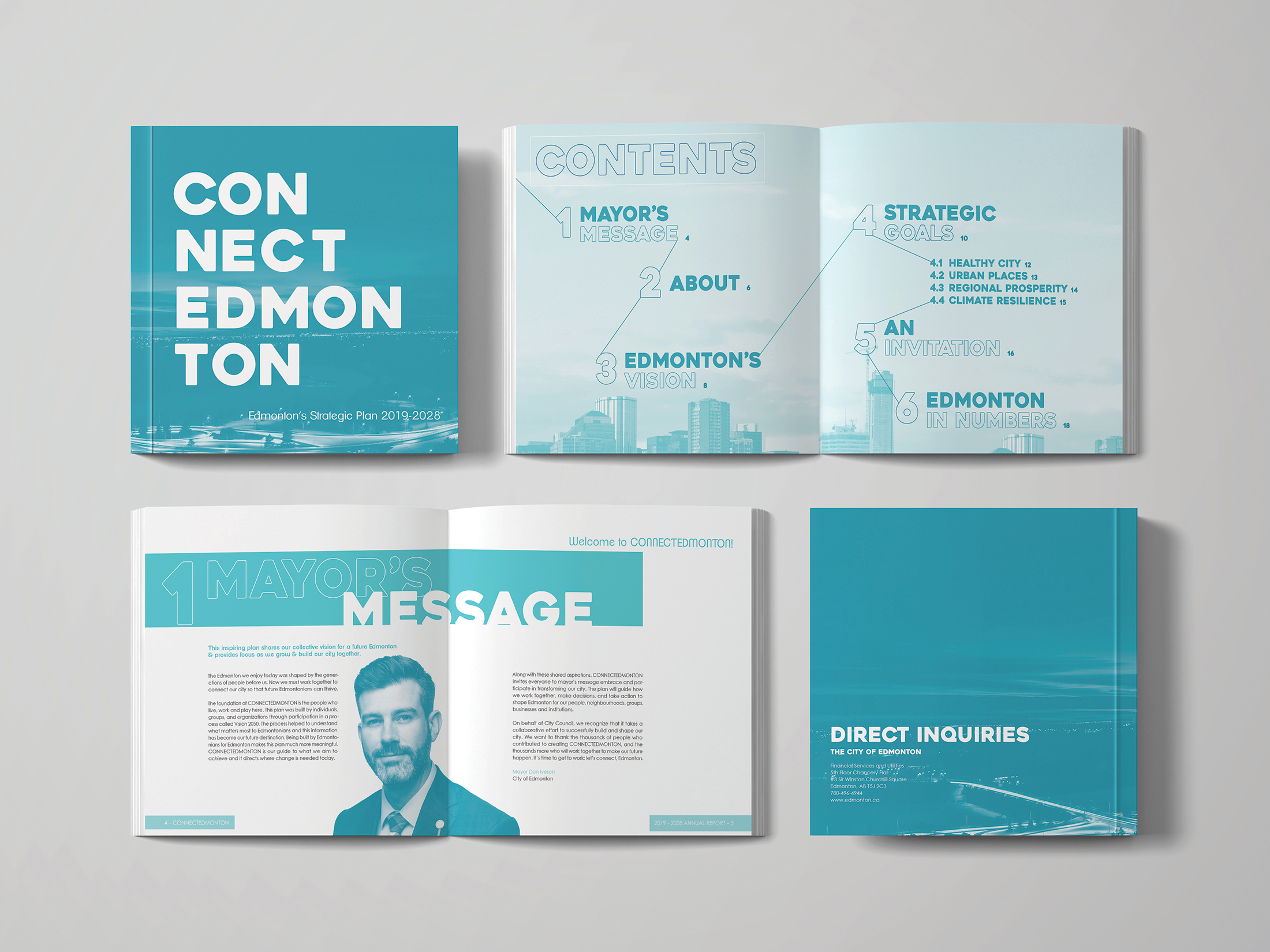
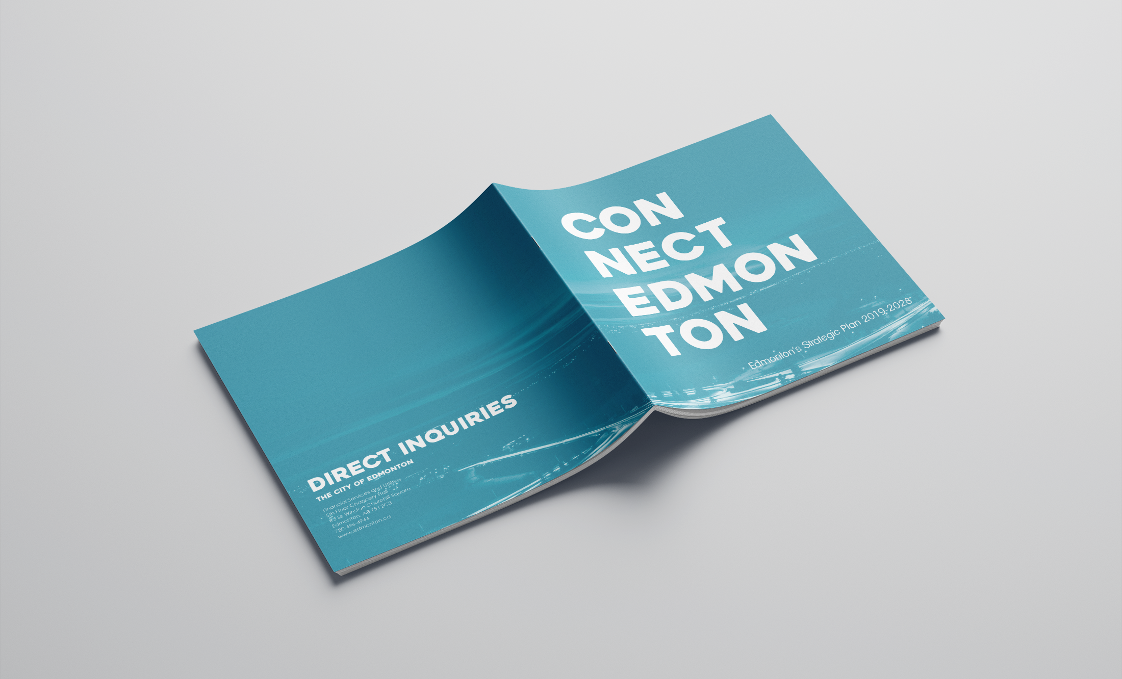
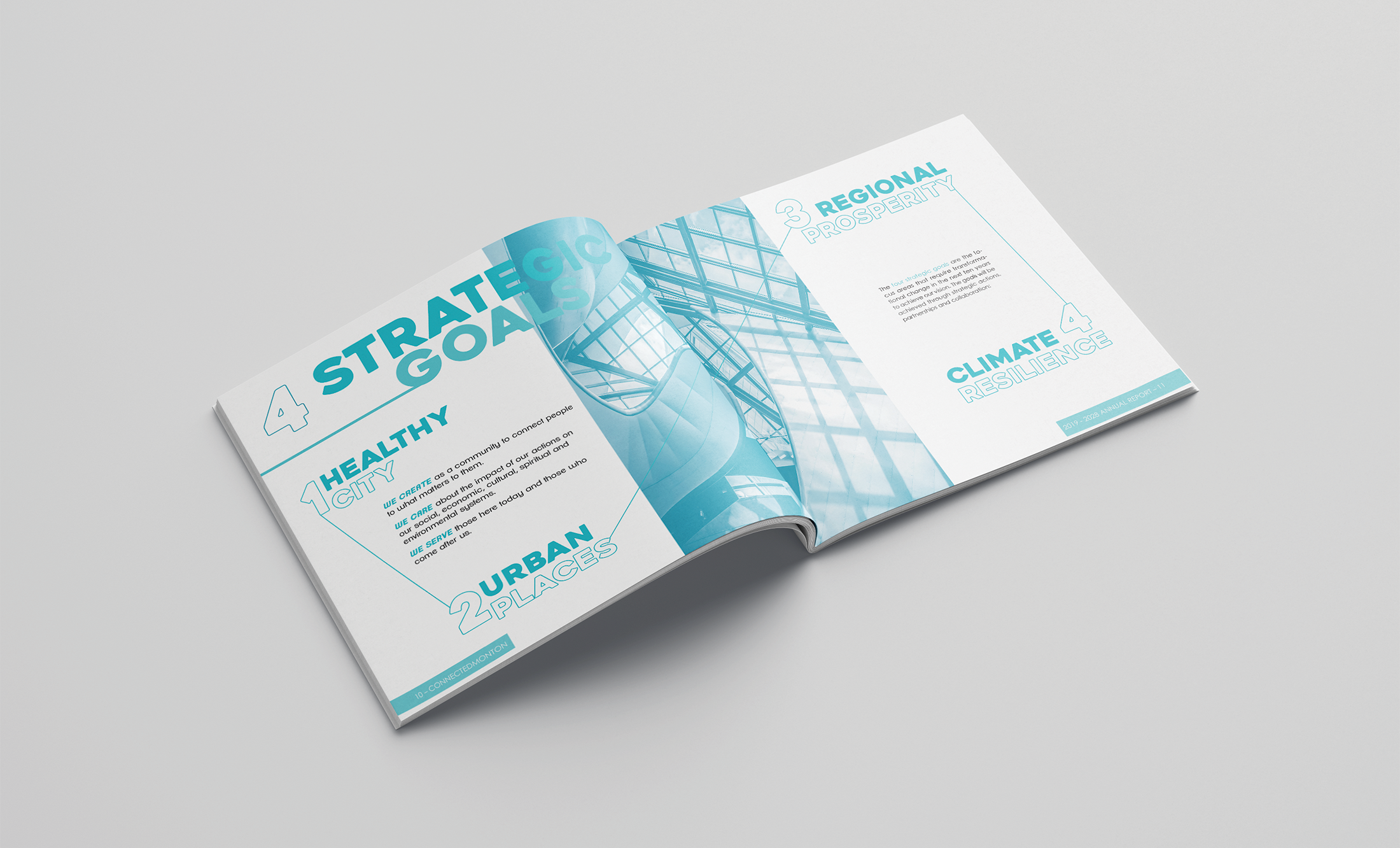
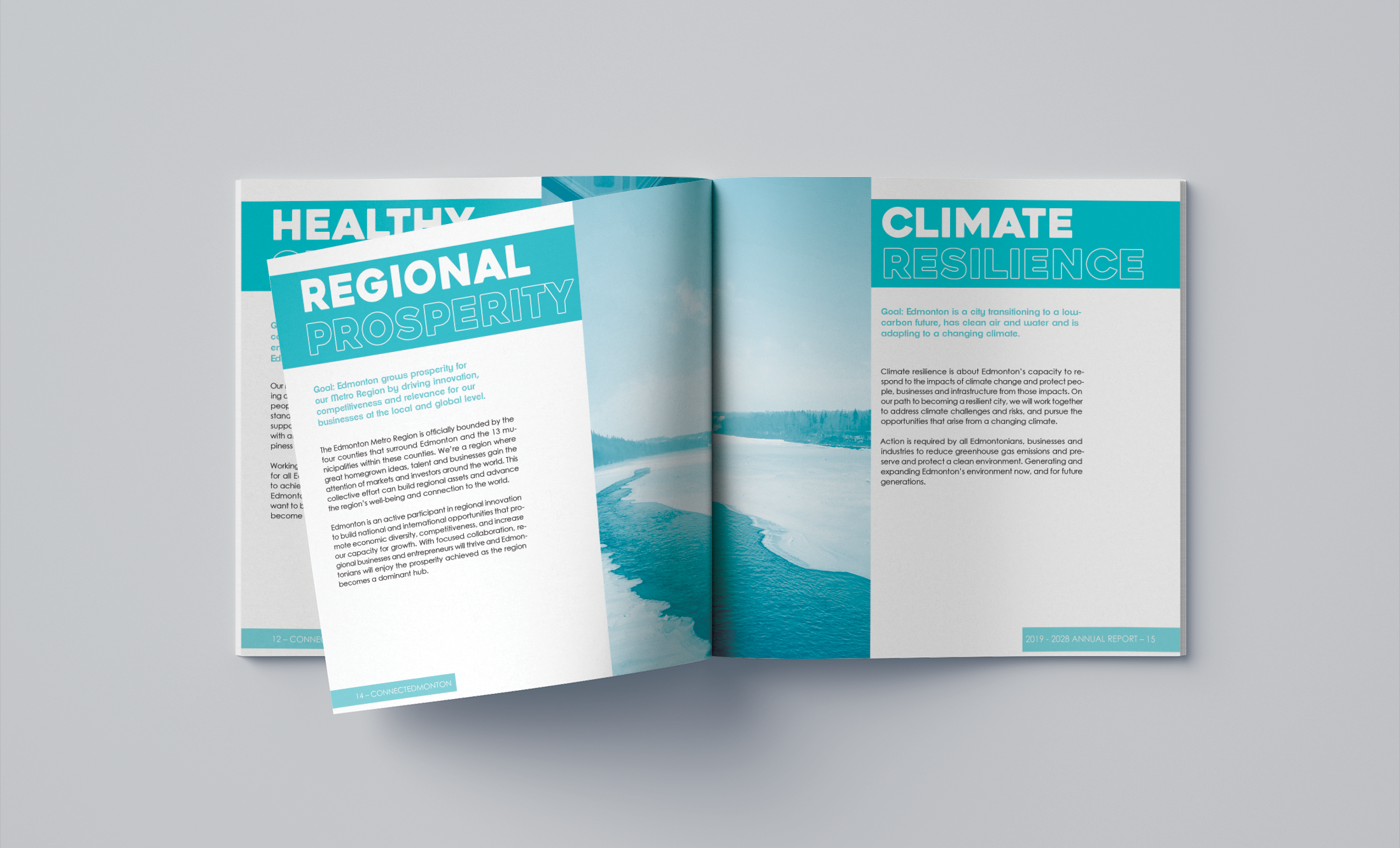
CONNECTEDMONTON Annual Report Brochure Design
This project is an annual report for CONNECTEDMONTON, where I designed a clean and cohesive system for the design. A mix of engaging and welcoming typefaces invites the viewer to read through the annual report in a friendly manner. Blue hues invoke calm and relaxation as well as being representative of the North Saskatchewan River.
In DESN410, I conducted an extended literature review consisting of articles on the effects of gaming, cognitive behavioural therapy, and game design. I interviewed three individuals (2 experts and 1 student). I also conducted a precedent analysis of 40 games and identified any user reviews with therapeutic benefit from gaming.