Anna
Bury
Hi there! My name is Anna.
I am a designer from St. Albert, passionate about creating useful, unique, accessible, and meaningful designs. I find inspiration from my own experiences, the people I meet, and the intriguing/exciting designs I see around me. After graduation, I aspire to find work in the world of branding or UX/UI. I love design because it's exciting! It sits in a world of exploration and discovery. Through design, I express myself creatively while simultaneously developing different solutions to problem spaces based on research that creates valuable and helpful experiences for people, leading to a more exciting, accessible, and inclusive world.
Over the pandemic, I had the privilege of volunteering as a designer for two non-profits while facing new fun challenges, learning to roller skate, trying out rugby, all while listening to lots of Elton John and Taylor Swift.
Ptarmigan Website Design
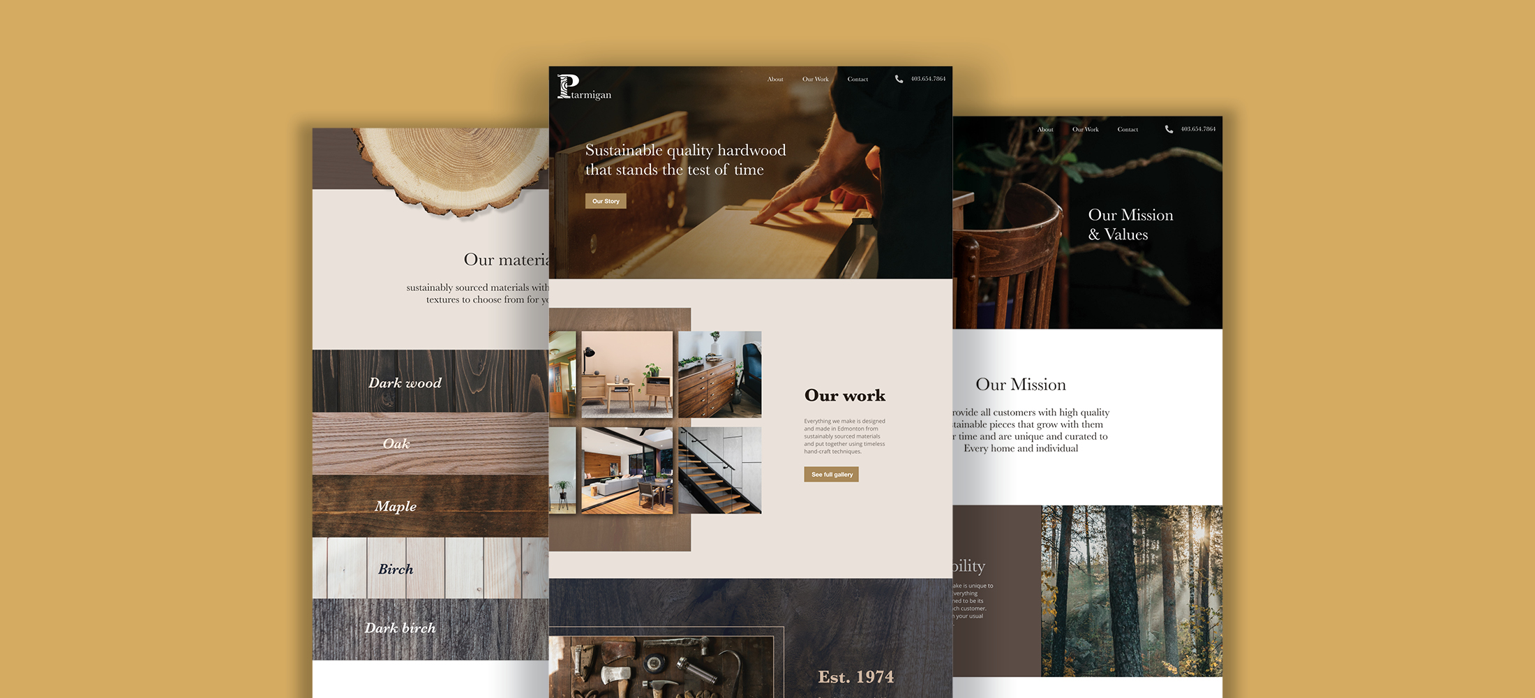
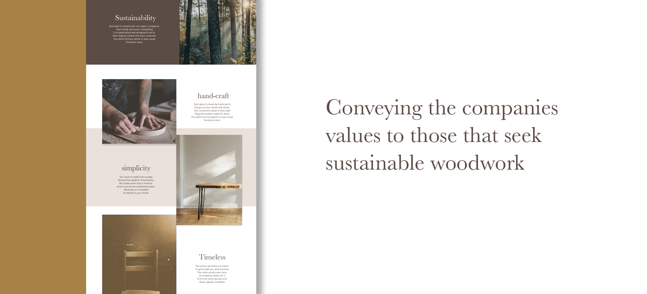
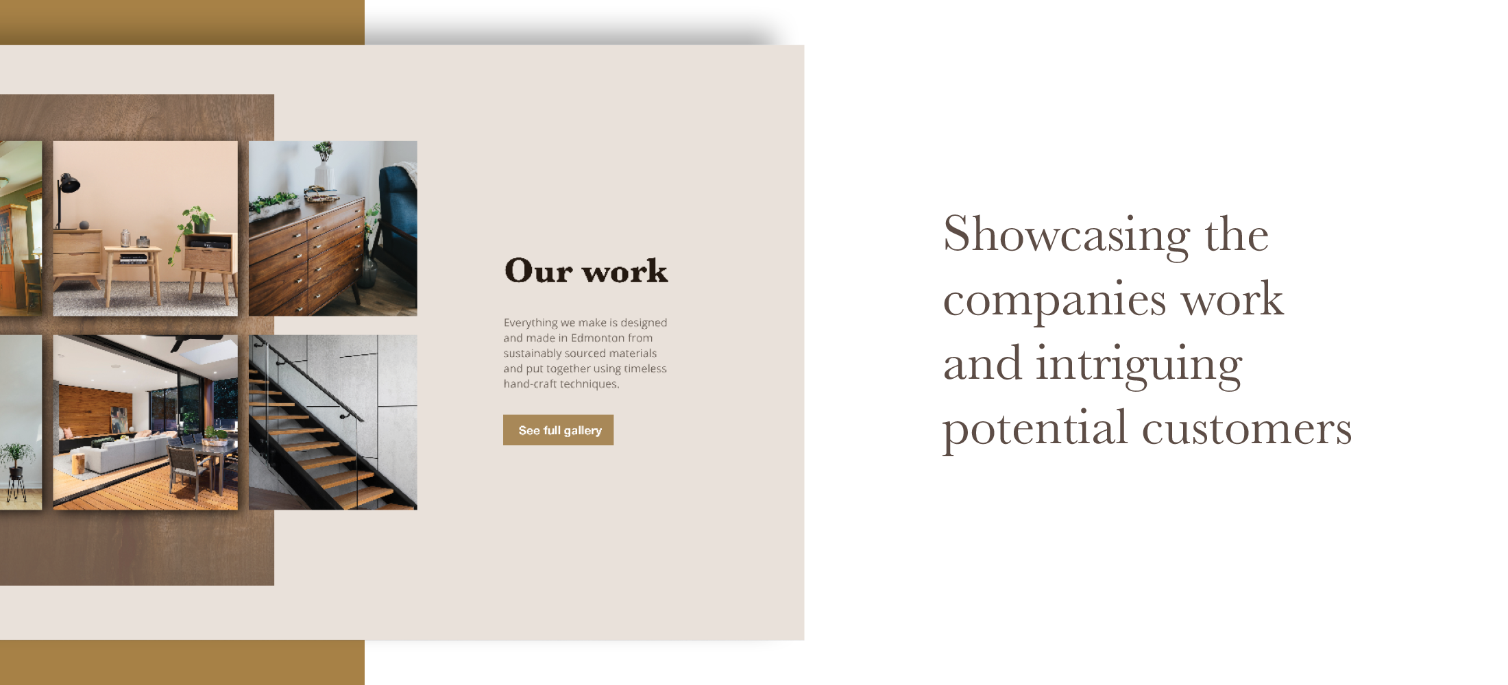
This project consisted of designing a website for a millwork company that does renovation and interior design projects. They wanted the website to serve as a place to direct customers to call or email them for projects. They needed it to show the work they do and their values. The goal was to appeal to clients willing to spend more on quality and sustainability and connect with their values.
Video of the website experience shows a timeless look emphasizing high-quality handcraft to those willing to pay more for a higher quality. It shows how the website informs potential customers where to call or email for project interests.
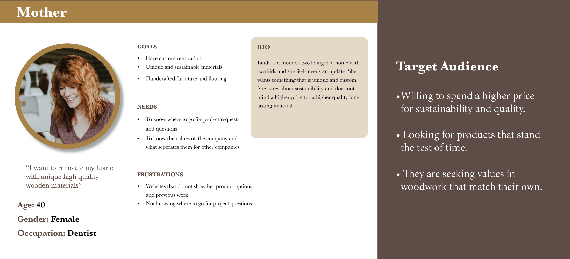
This information shows the qualities of a website the target audience requires and needs. It also offers information based on its previous clients.
Body Neutrality Campaign
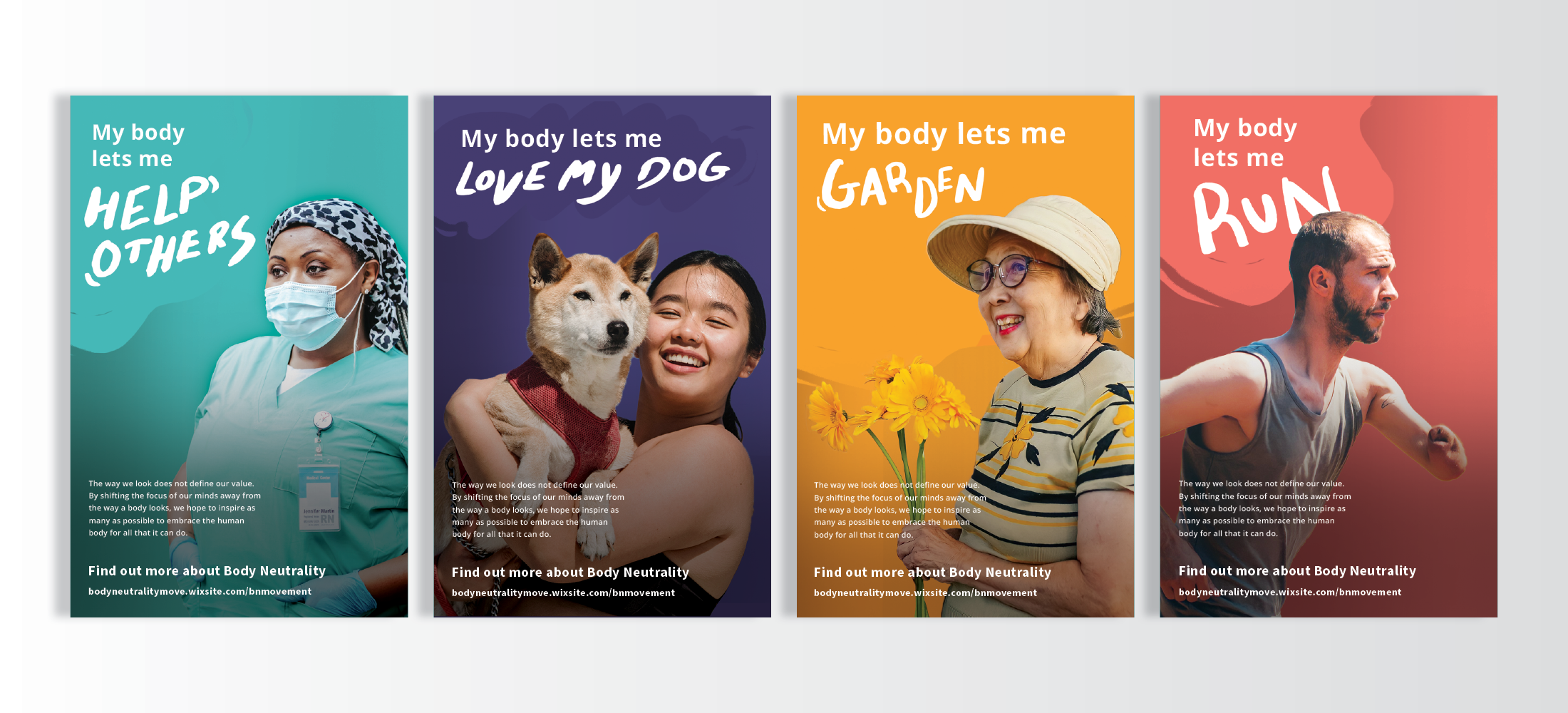
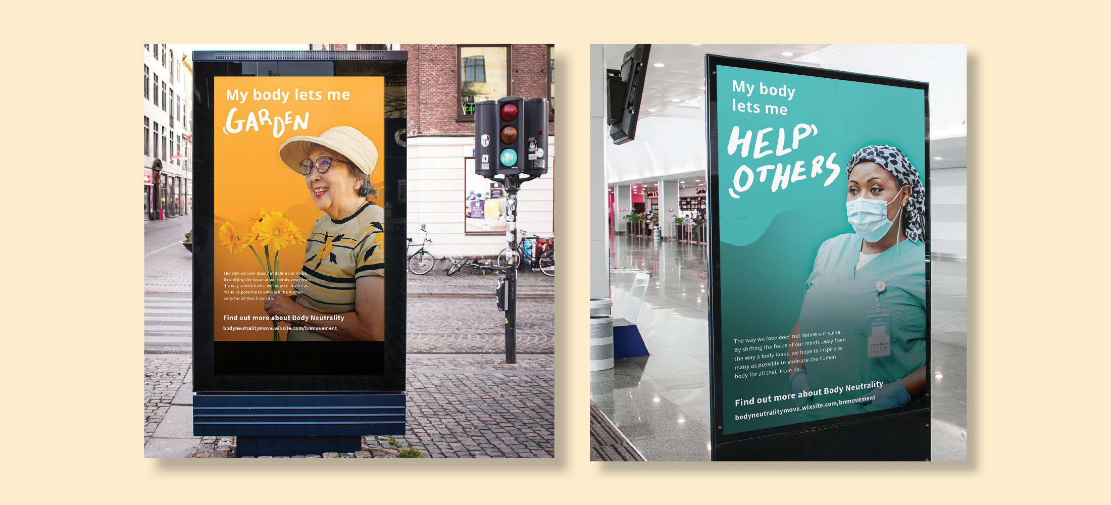
This project consisted of designing a campaign for a social justice issue. The issue chosen is body neutrality. All imagery in the campaign shows people doing what they love with words stating what their body lets them do. The campaign's goal is to encourage those who struggle with body image to look towards the value of their body instead of its appearance.
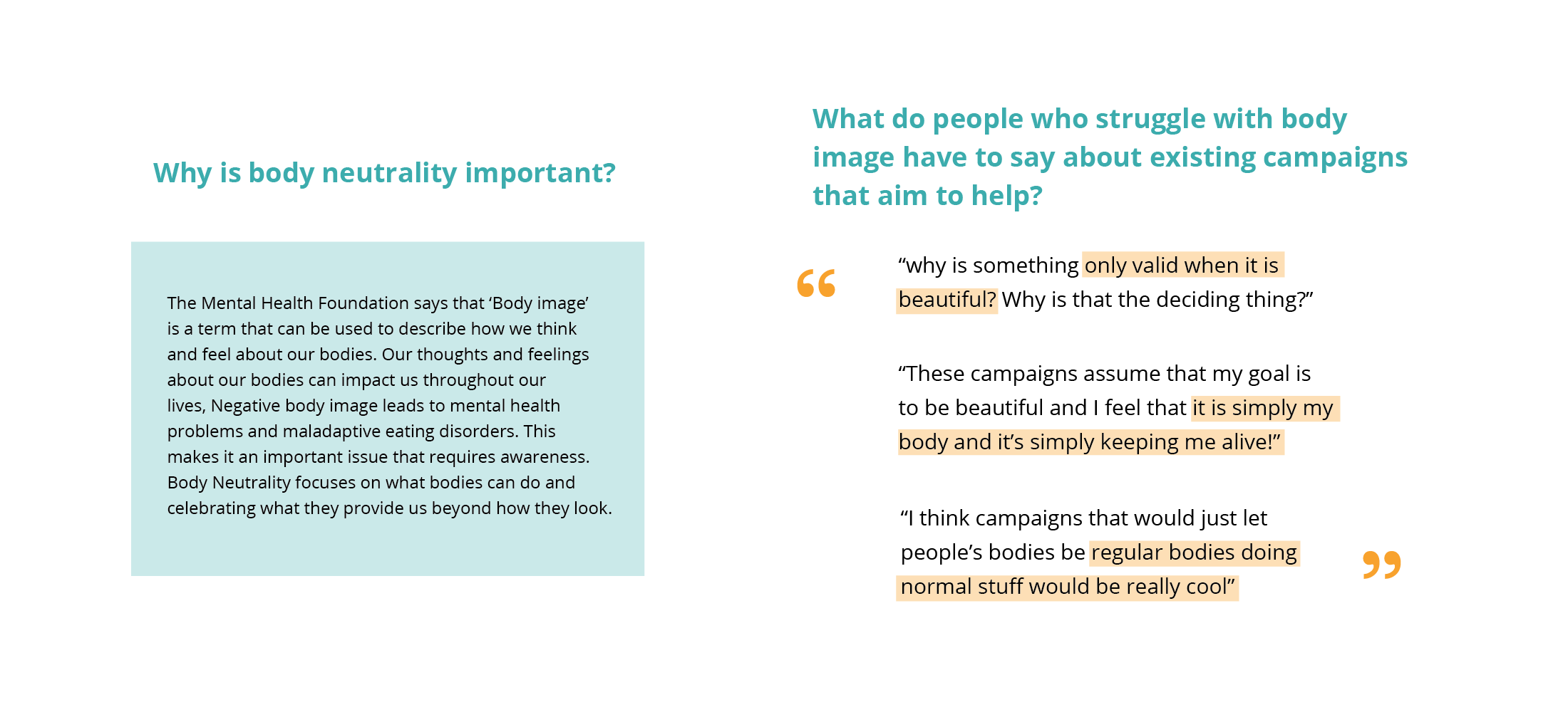
The following is research conducted on body neutrality as a movement and the thoughts of people who struggle with body image in what they dislike about current messaging and what they would like to see.
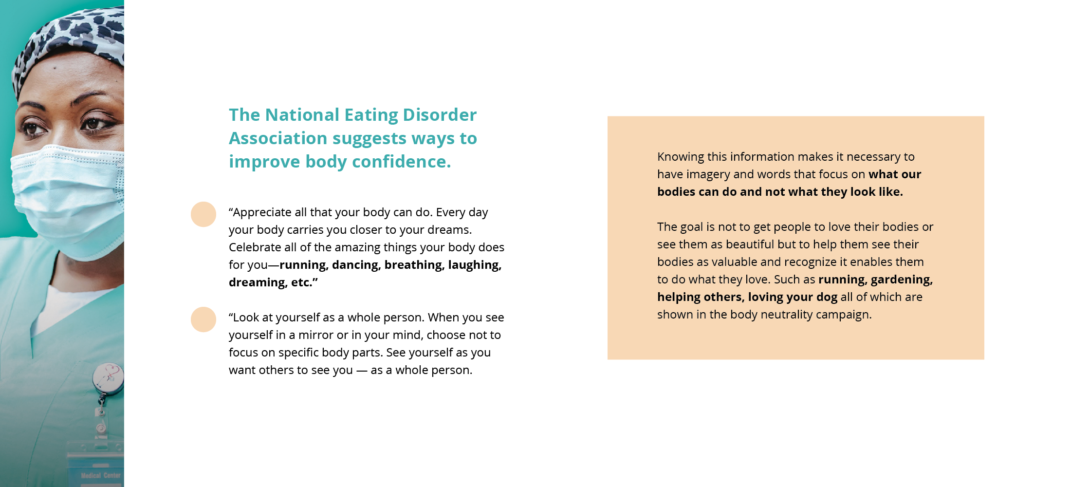
Further research was conducted on what messaging was most helpful and productive for those who struggle with body image. It also shows how the research led to the messaging and imagery of the campaign.
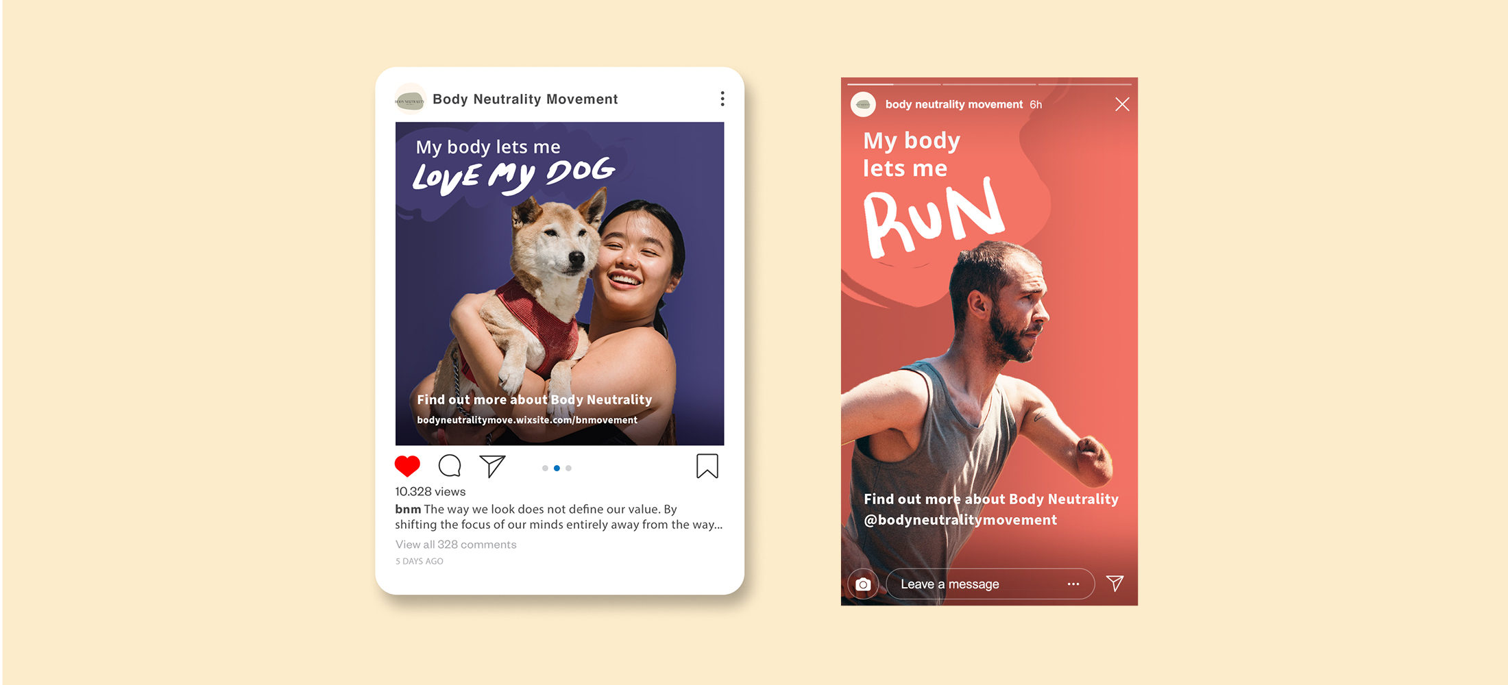
These social ads presented are targeted towards the younger demographic. Social media is where they see imagery and messaging that could lead to them feeling poorly about their body. This makes it a great spot to have body neutrality messaging.
Parks Canada App
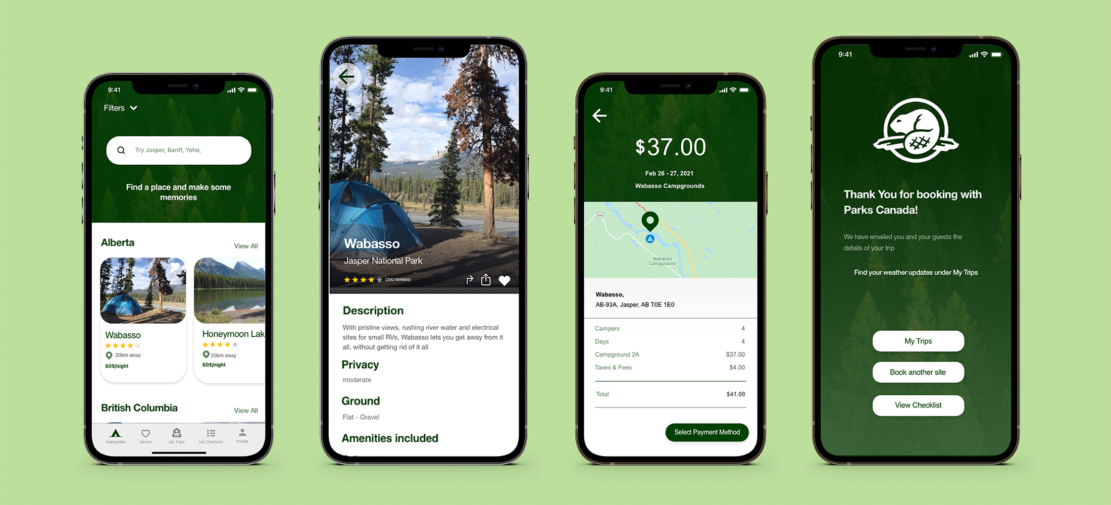
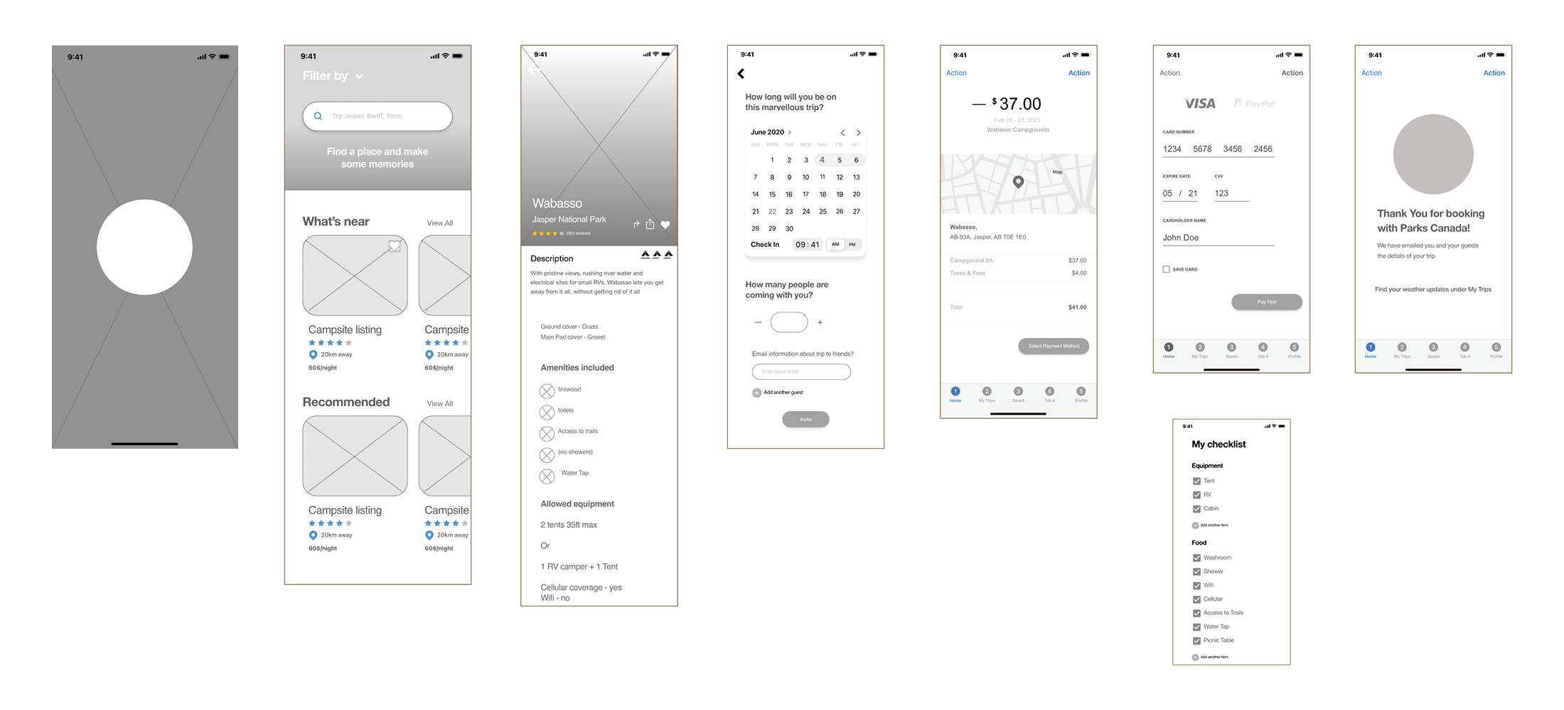
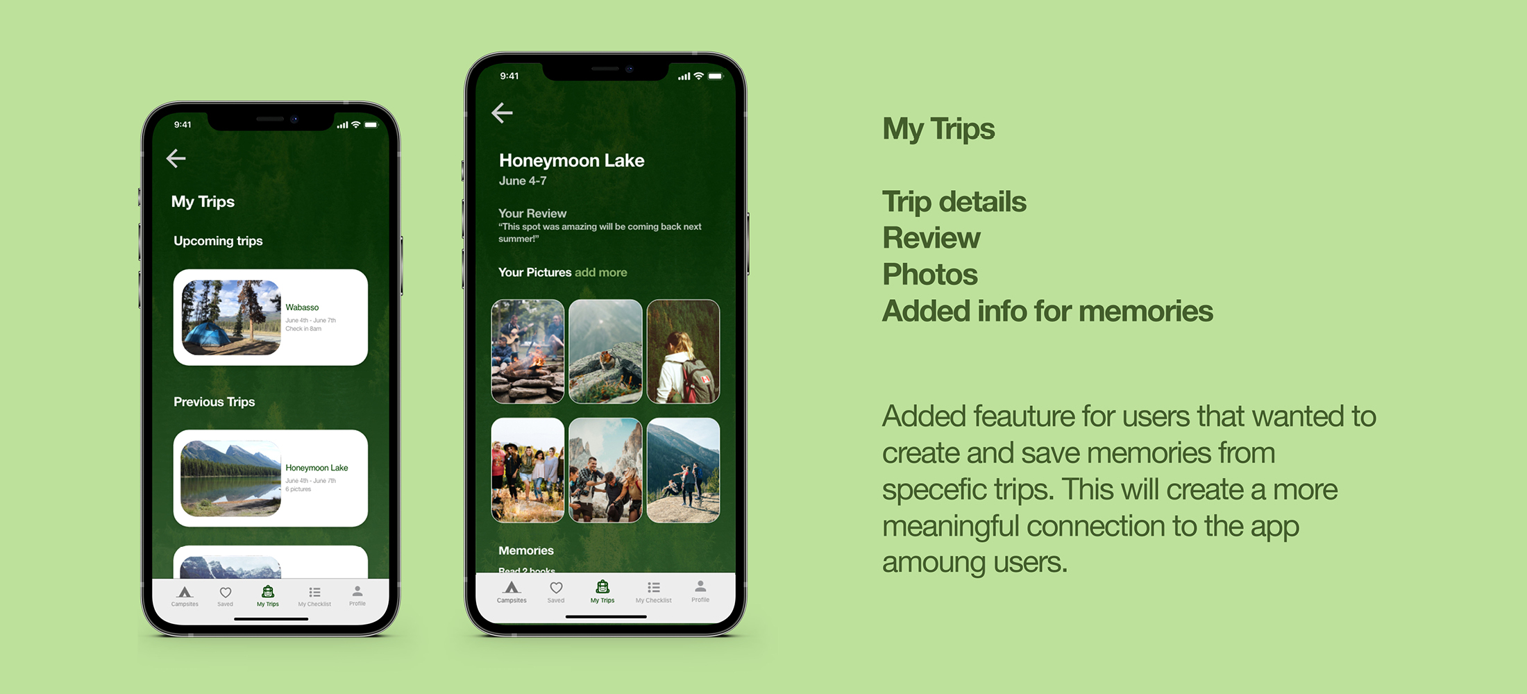
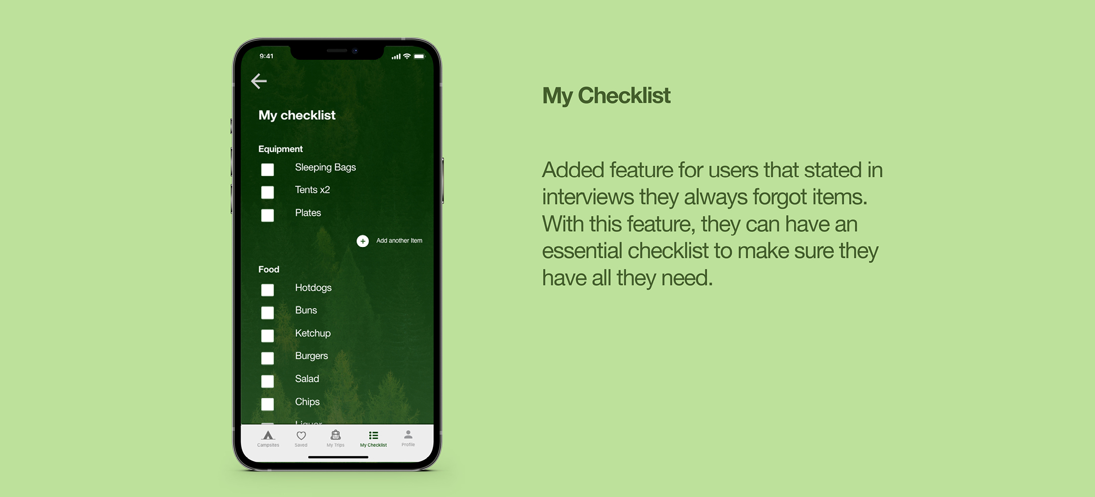
The main objective of this project was to design an app that would allow avid campers to view and book campsites. The app aimed to create a clear and intuitive way for campers to reserve a campground within Canada. Group project by Anna Bury, Nathaniel Hehir and Jade Staines. Lo-fi and Hi-fi screens and personas designed by Anna Bury.
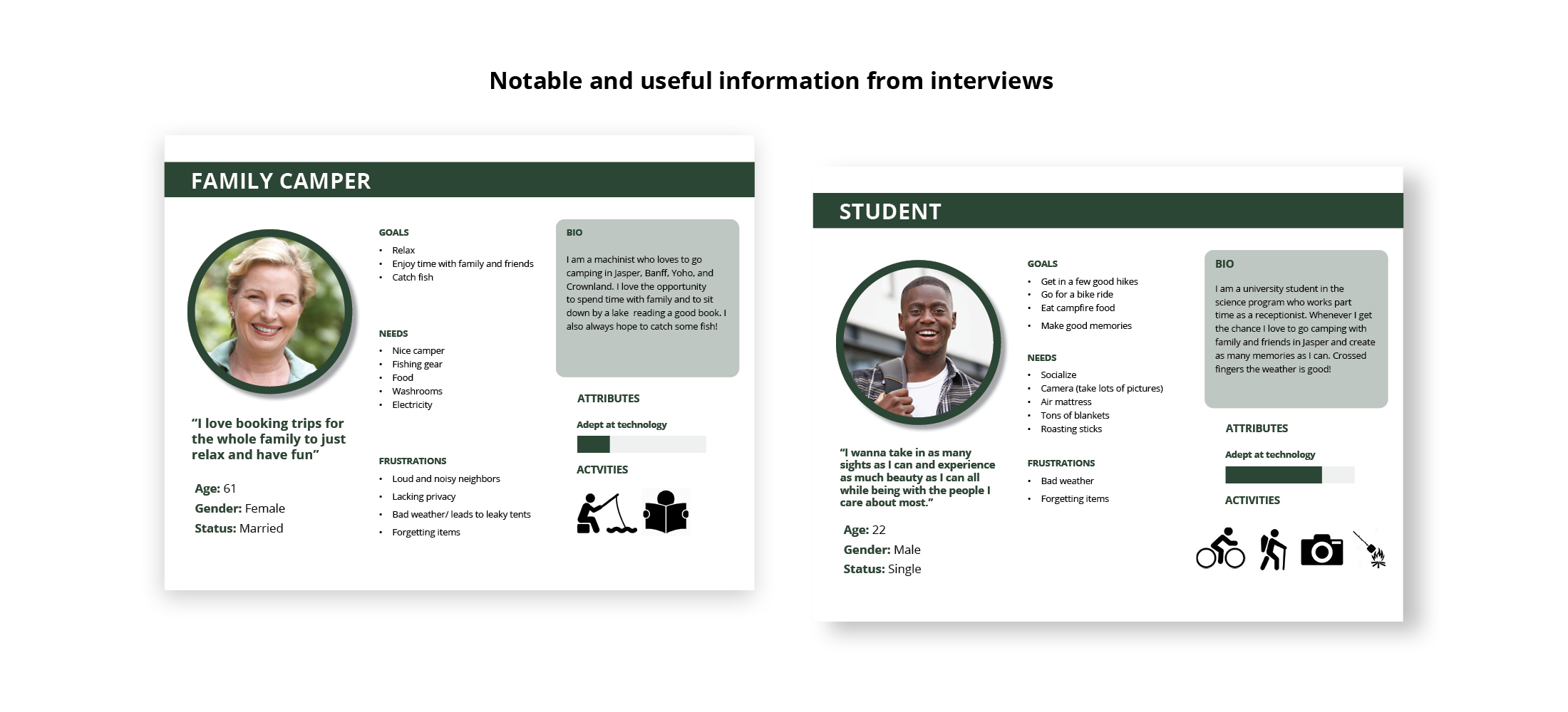
Displayed is the most important information from the interviews. It helped to show the user's desires, needs, frustrations, and goals. It also indicates possibilities for features that could be added to ease frustrations and aid in goals.
This feature is added based on interviews and assessment of what a user would want. The feature was added based on users wanting to create memories and take photos of their trip.
Kenny Muzia Branding
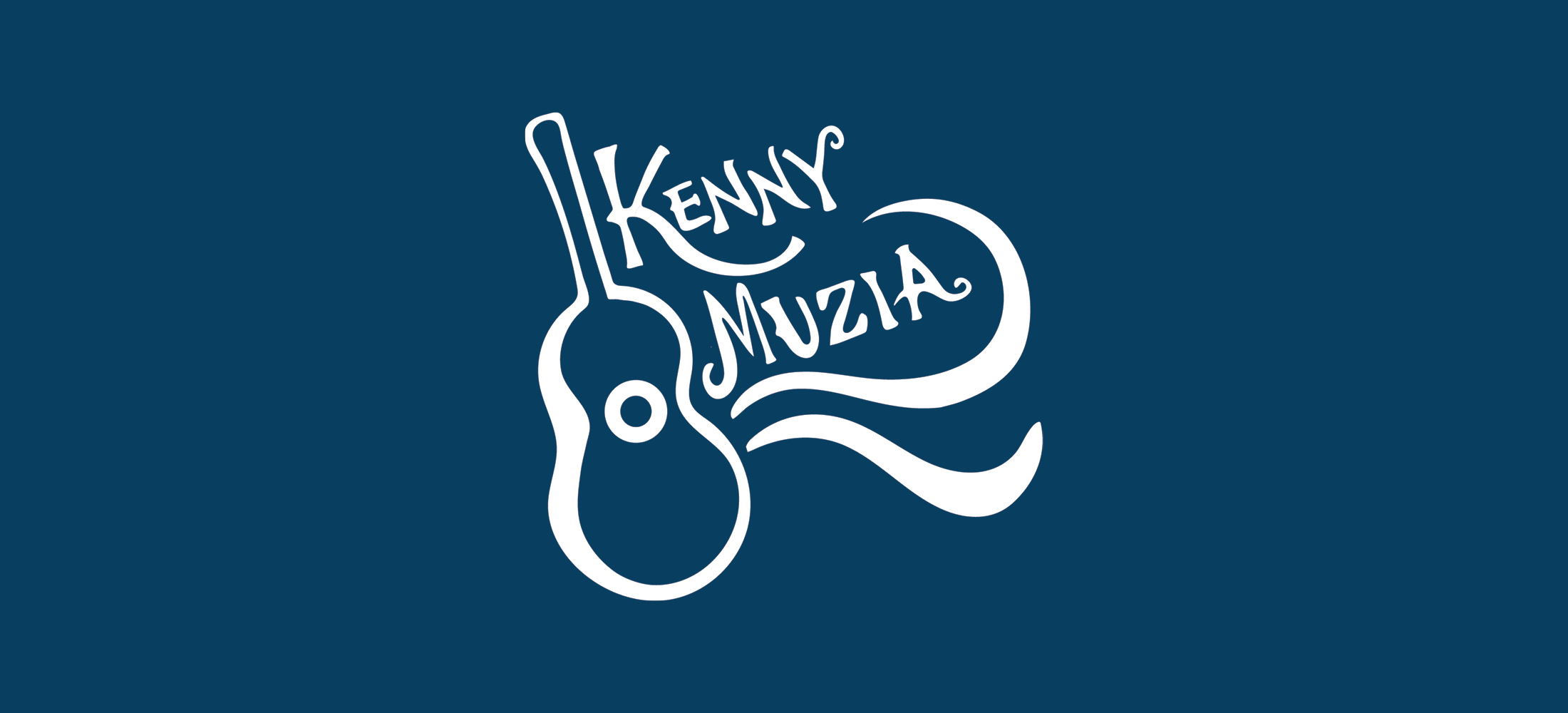
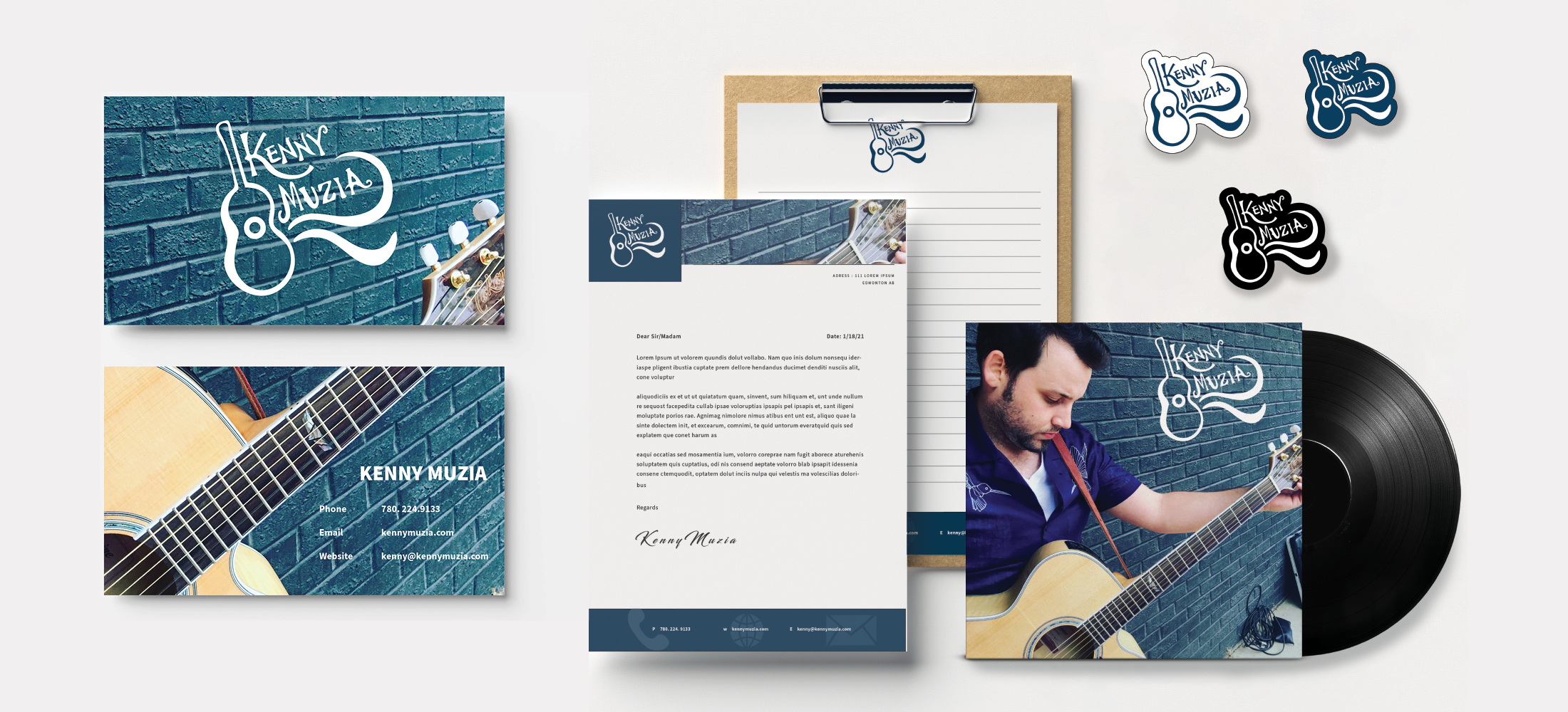
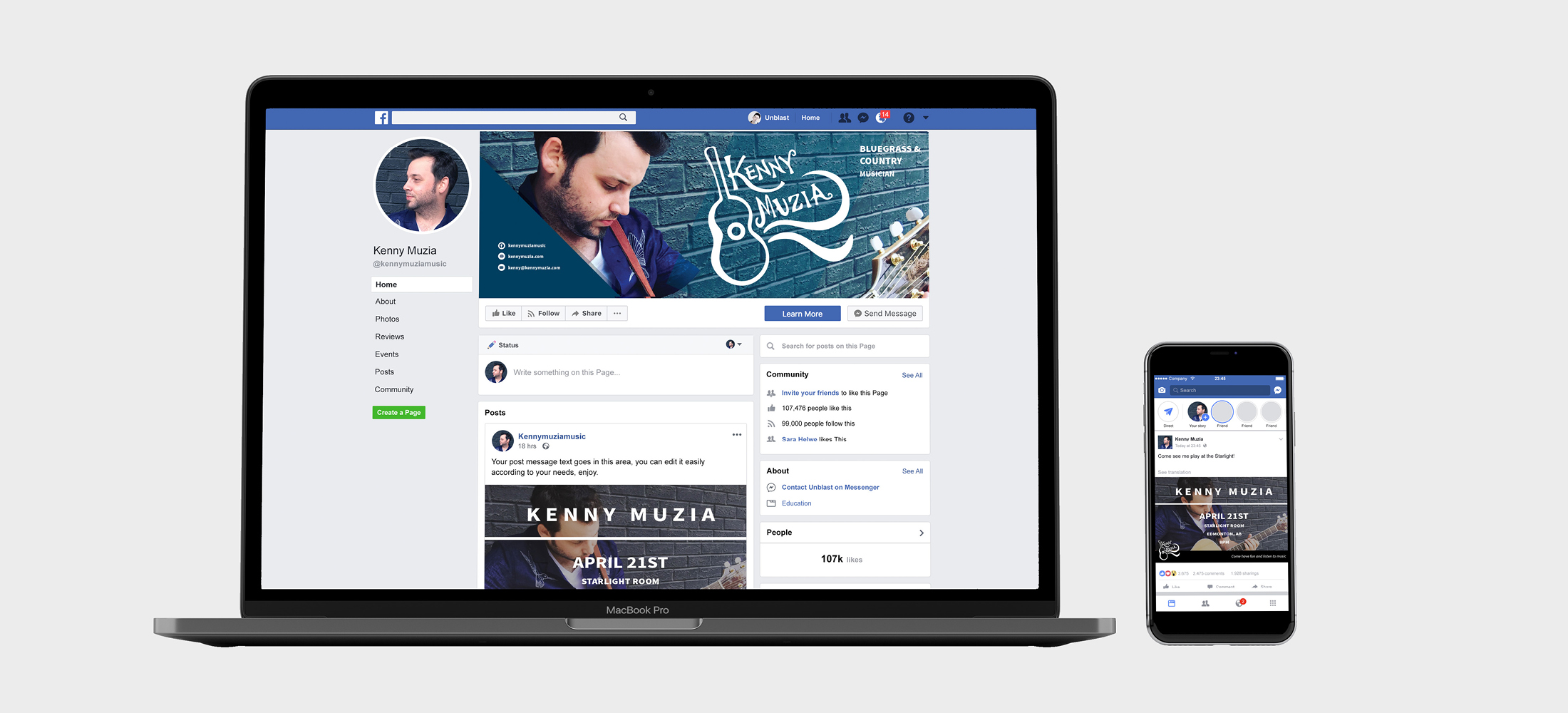
This brand was created for Kenny Muzia, a country and bluegrass musician in the Edmonton area. As a musician, Kenny Muzia needed to have a brand that would be lively and unique to him as a musician. He is full of life and loves to entertain, and his brand identity needed to represent these qualities.
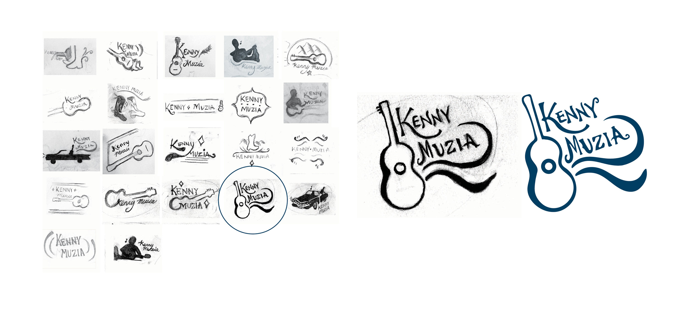
A hand-lettered mark was decided on due to the life and unique human quality it added. The typography aims to give the feeling of bluegrass mixed with western/country.
He liked guitars and Cadillacs and cowboy boots and guitar as imagery for the brand. It wasn't evident with the non-musical symbols that he was a musician. This is why the guitar was chosen—specifically the one with the lively swooshes that represented music pouring from the guitar.
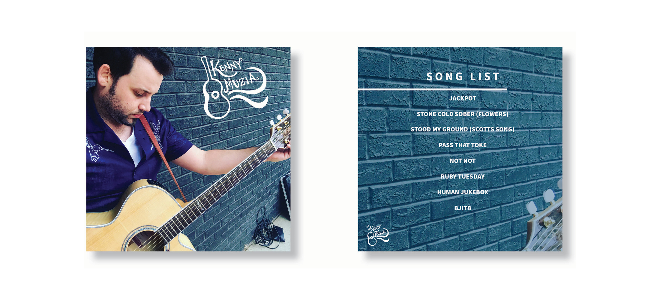
Stationary items including Business cards, notepad paper, Letterhead, Album cover, patches (jackets)
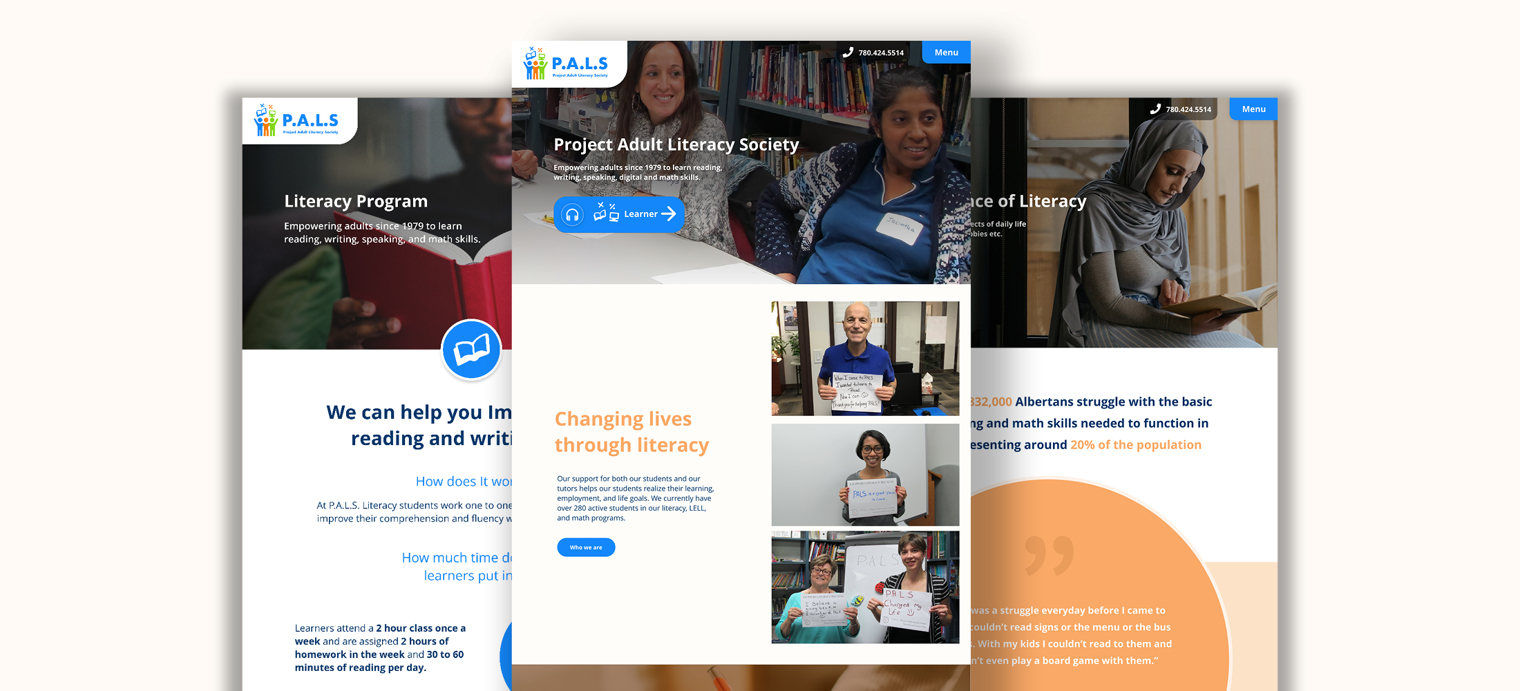
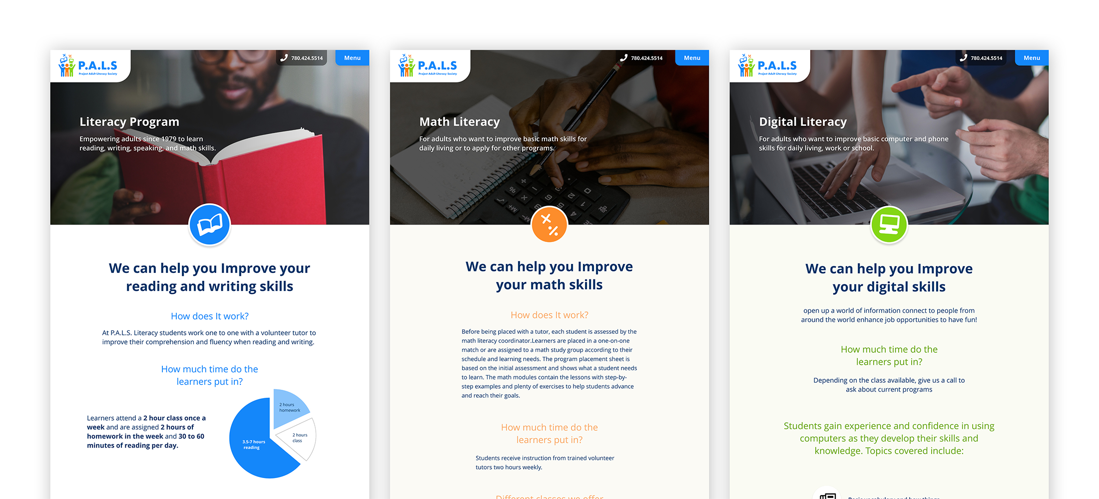
I worked with Project Adult Literacy Society to create a brand and website that reflected its values and what they mean to its learners, staff, and community. The website needed to be accessible to learners with low to no literacy in written and digital areas. Throughout this project, I gathered information on low literacy and how it affected website use and was able to develop a website and brand for the organization that was fitting to potential donors and their learners.
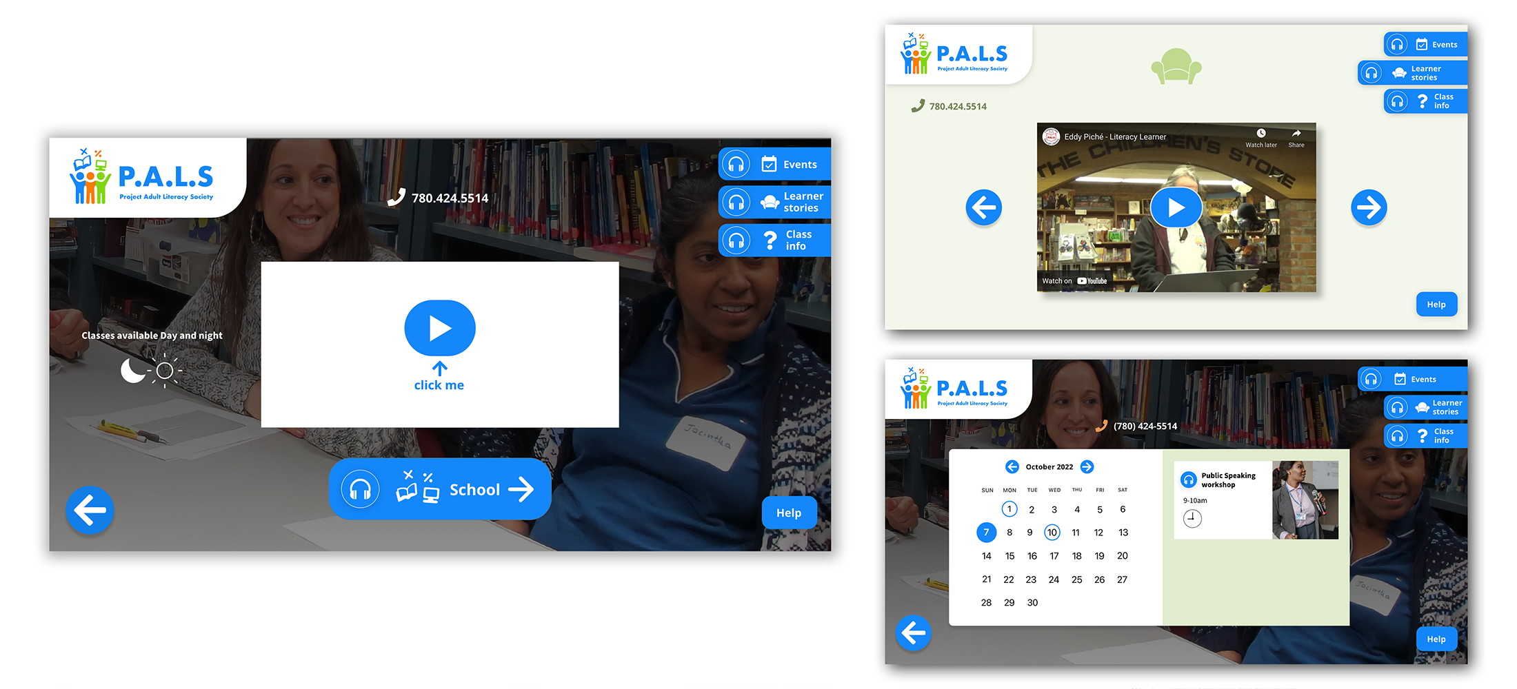
These three screens show the pages of the website that are for the learners. In research, videos for information and tutorial are a solution to taking the guesswork out of the website's navigation and is usable for people who cannot read. The buttons have text-to-speech for labels, and all clickable items are blue, maintaining the system learners can understand and are taught in their digital classes.
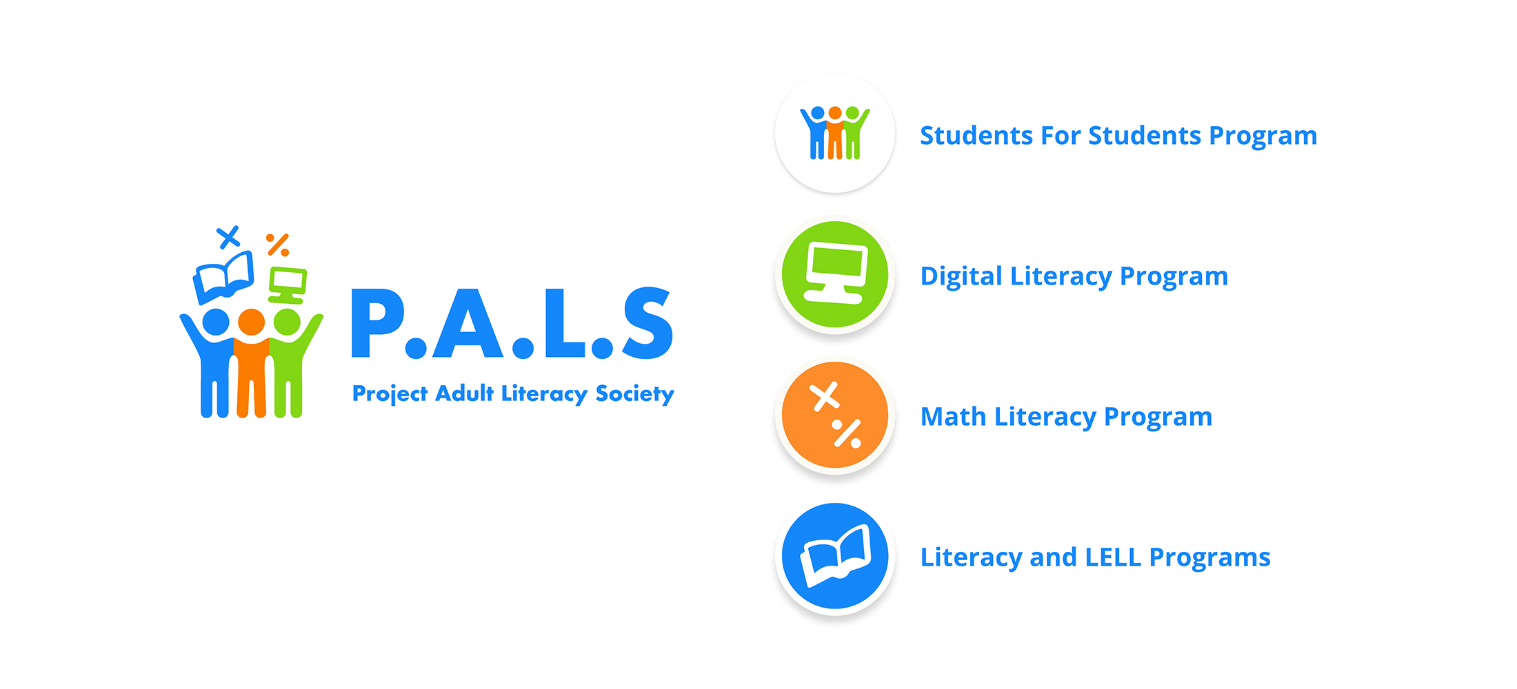
The PALS rebrand reflects the information gathered from learners on what PALS meant to them. They said that PALS was more than literacy and learning but also a community, a place of friendship, and mutual respect. The logo reflects PALS values and beliefs of respect, inclusion, and self-esteem in the colours and the icon itself. One student felt the diverse colours symbolized that you are welcome no matter your skin colour or background. The symbols showing a book, computer, and math stand for the programs provided at PALS showing what PALS does as a company.


