DesignersAnna Bury
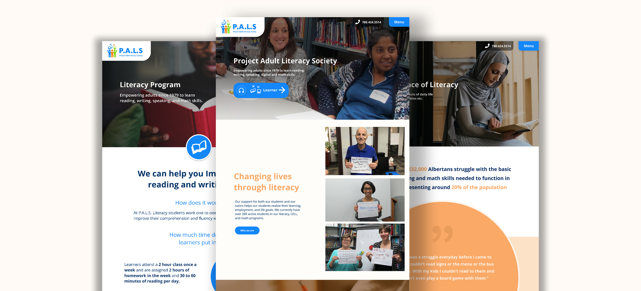
I worked with Project Adult Literacy Society to create a brand and website that reflected its values and what they mean to its learners, staff, and community. The website needed to be accessible to learners with low to no literacy in written and digital areas. Throughout this project, I gathered information on low literacy and how it affected website use and was able to develop a website and brand for the organization that was fitting to potential donors and their learners.
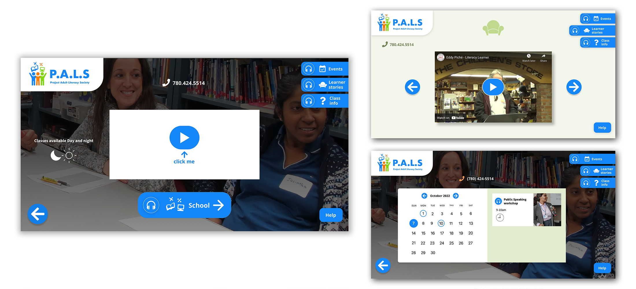
These three screens show the pages of the website that are for the learners. In research, videos for information and tutorial are a solution to taking the guesswork out of the website's navigation and is usable for people who cannot read. The buttons have text-to-speech for labels, and all clickable items are blue, maintaining the system learners can understand and are taught in their digital classes.
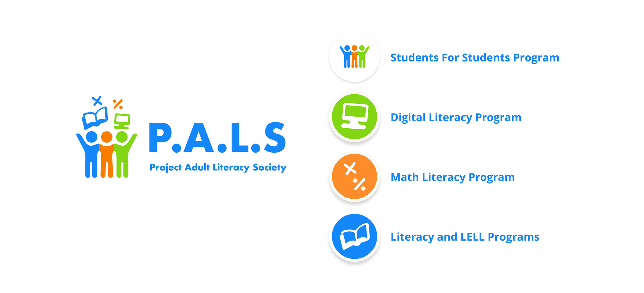
The PALS rebrand reflects the information gathered from learners on what PALS meant to them. They said that PALS was more than literacy and learning but also a community, a place of friendship, and mutual respect. The logo reflects PALS values and beliefs of respect, inclusion, and self-esteem in the colours and the icon itself. One student felt the diverse colours symbolized that you are welcome no matter your skin colour or background. The symbols showing a book, computer, and math stand for the programs provided at PALS showing what PALS does as a company.
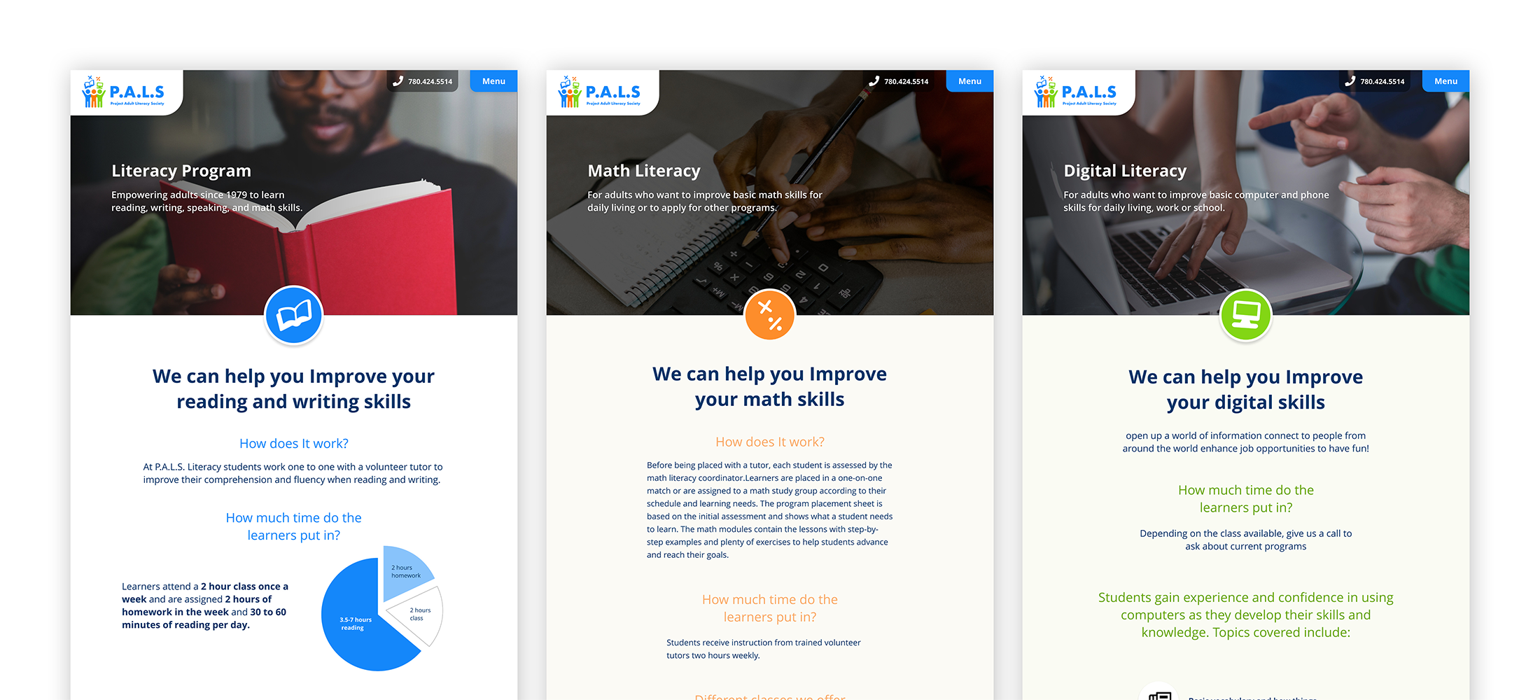
These three screens show the pages that inform on PALS programs and show the use of the icons from the logo.