Kelsey
Skene
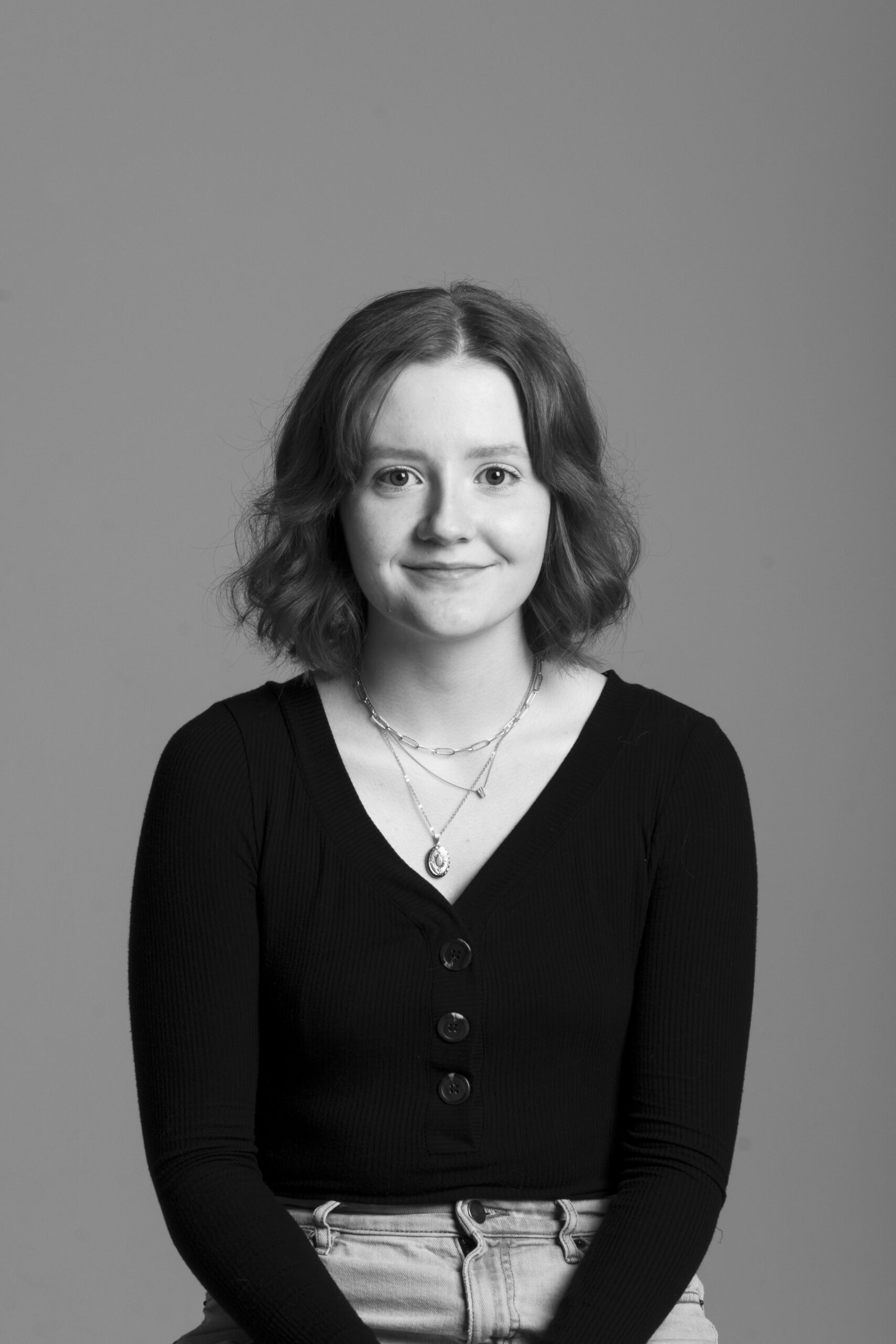
My name is Kelsey Skene and I live to create. I love teaching myself new types of art and design. These diverse mediums, past design movements, and other designers/artists inspire me! I love design because it allows me to continue exploring different ways to create and acts as a space to implement the skills I have already taught myself. My goal is to become a stronger designer and to find excitement in every design project I take on. Over the pandemic I have kept busy with fun personal projects, worked in publication design, and on freelance work.
Album Design
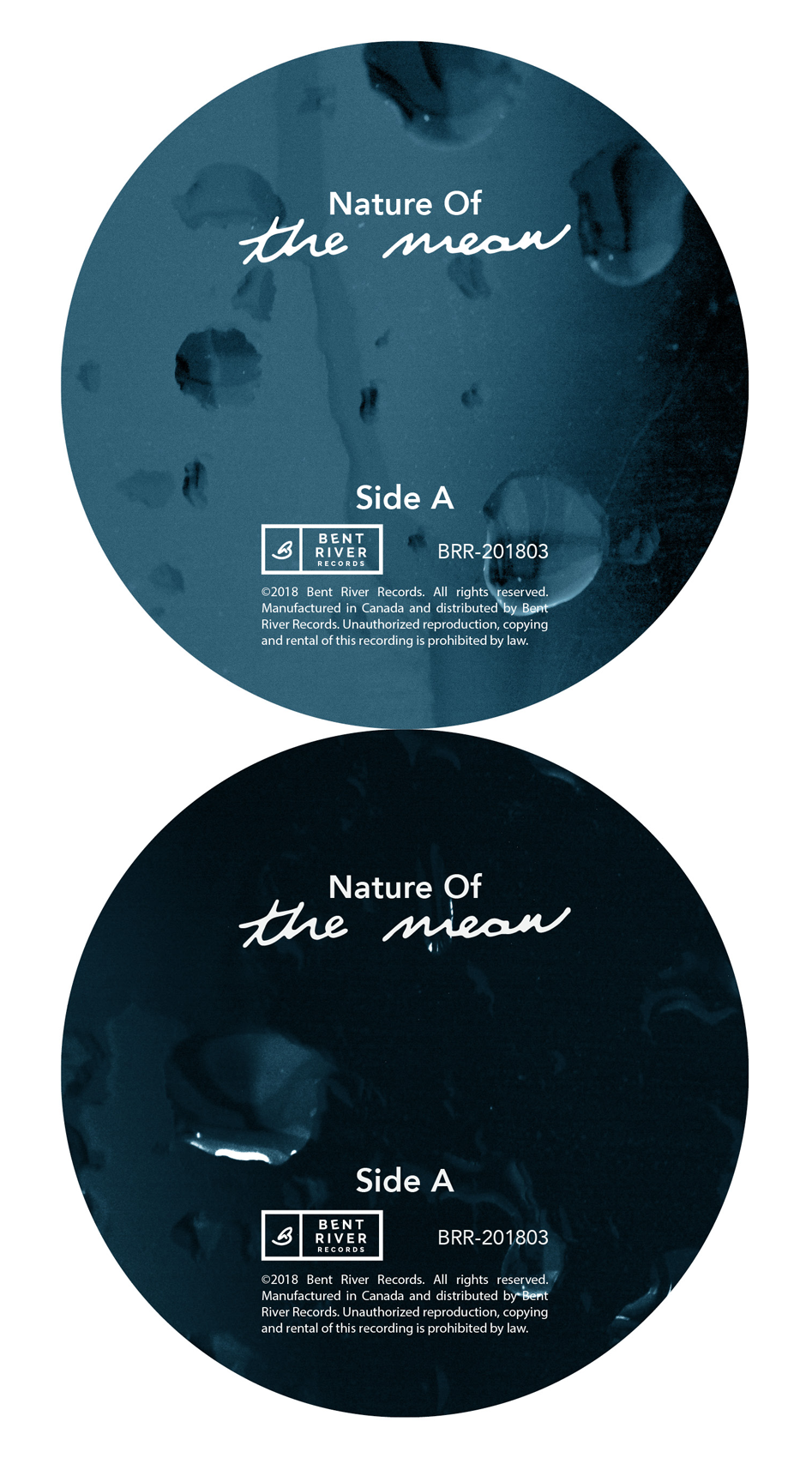
For this project we worked with the band “Nature Of” to create the design for their new album “The Mean”. It included the development of the jacket, sleeve, centre labels, and drop cards.
Taking into account what we discussed with the band and our interpretation of the album to create a cohesive set of designs.
Taking into account what we discussed with the band and our interpretation of the album to create a cohesive set of designs.
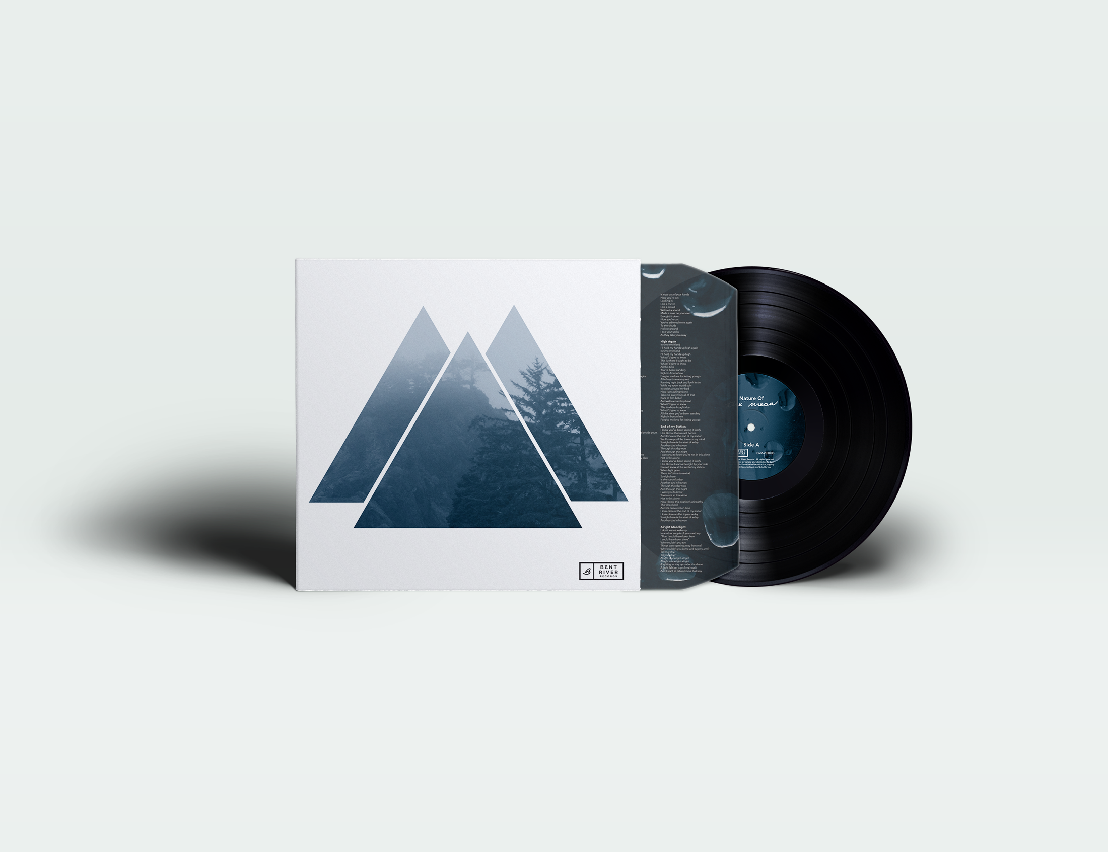
A mockup of the entire project. The album feels like the soundtrack to a rainy day that makes you want to curl up with a warm cup of tea which was the inspiration for the visuals throughout.
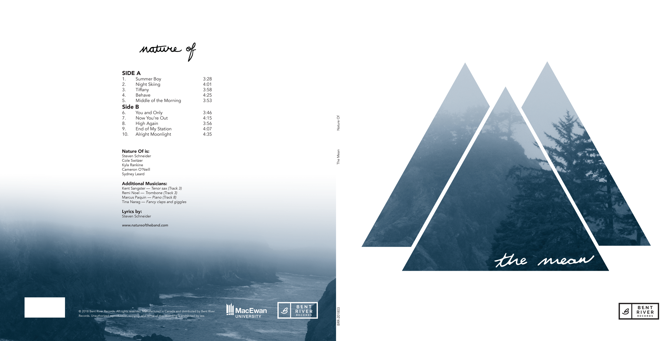
The jacket uses photos I took of the Oregon coast on a foggy day. Additional visual interest was created with geometric frames to contrast the soft natural forms.
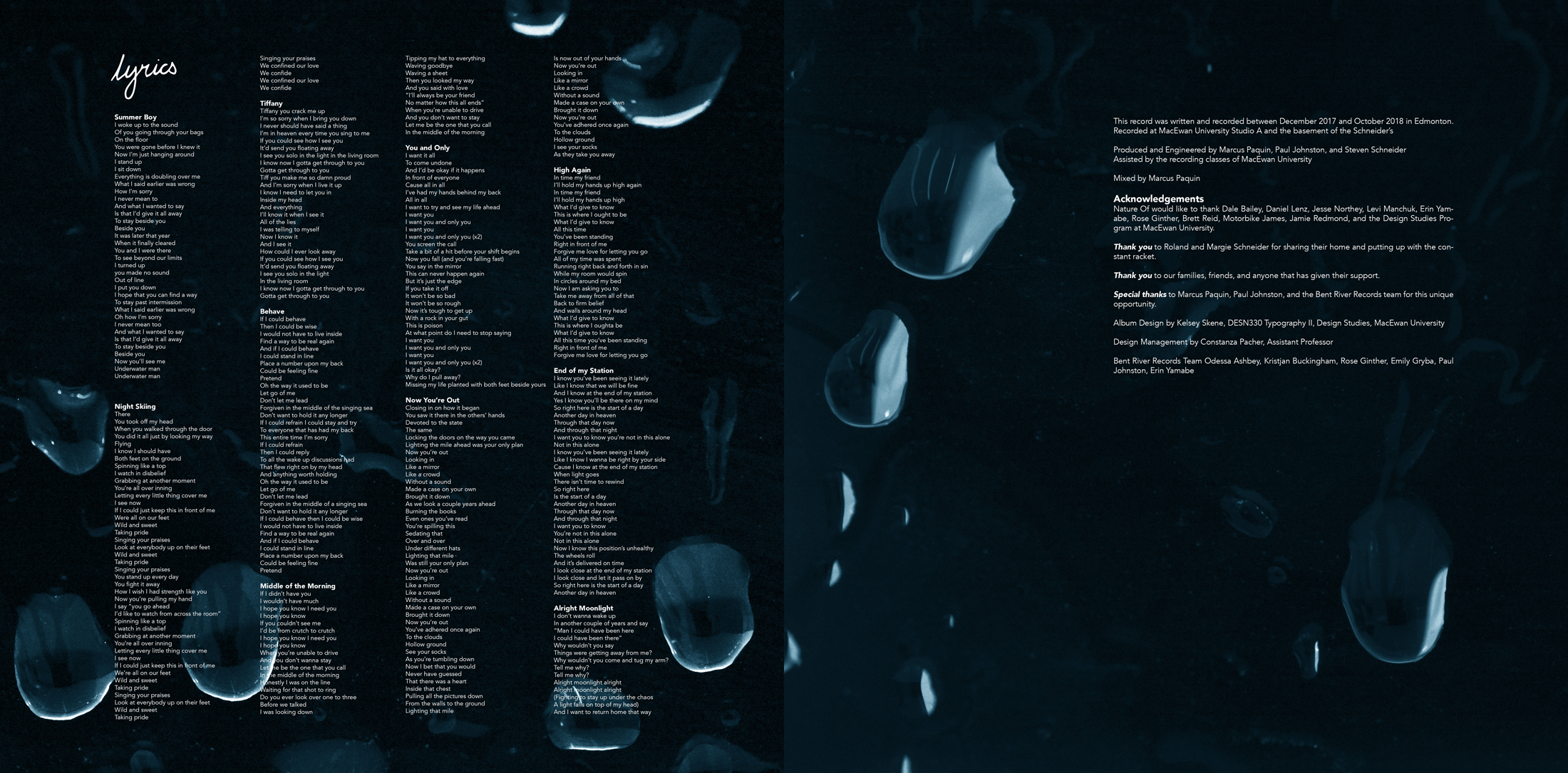
The interior sleeve used photos of rain droplets on a dark background. It provided a simple backdrop for the extensive lyric text as well as strong contrast to the outside jacket.
Monochromatic Fashion Photo Essay
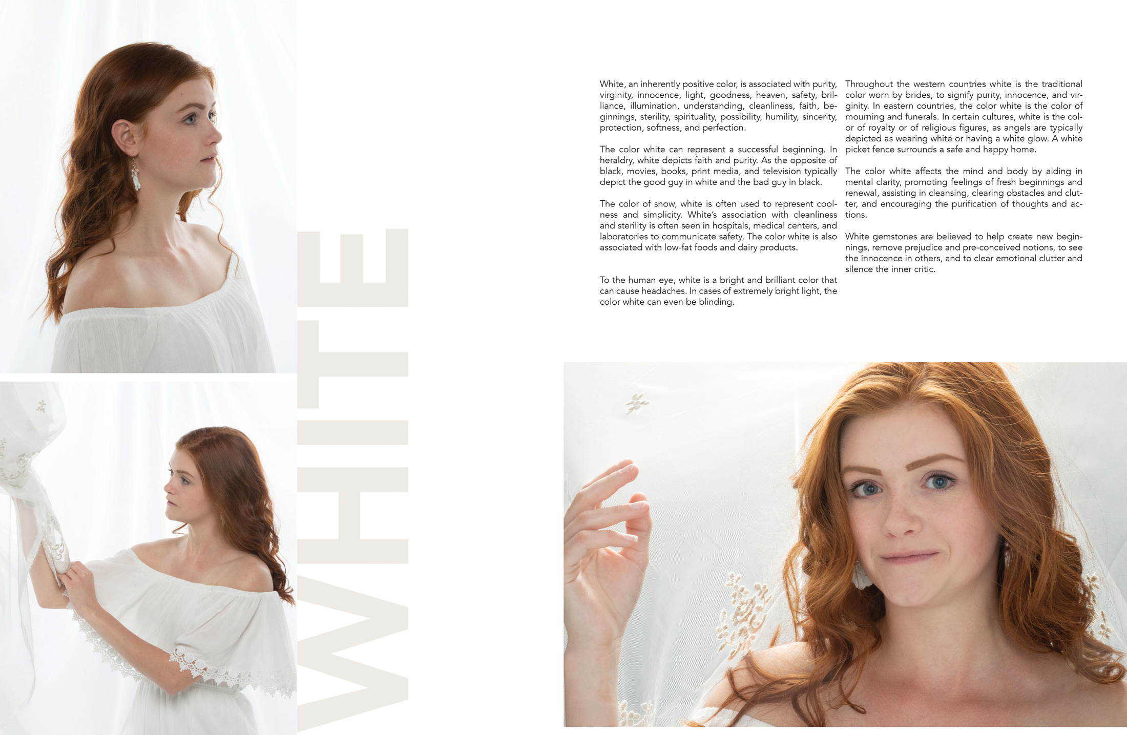
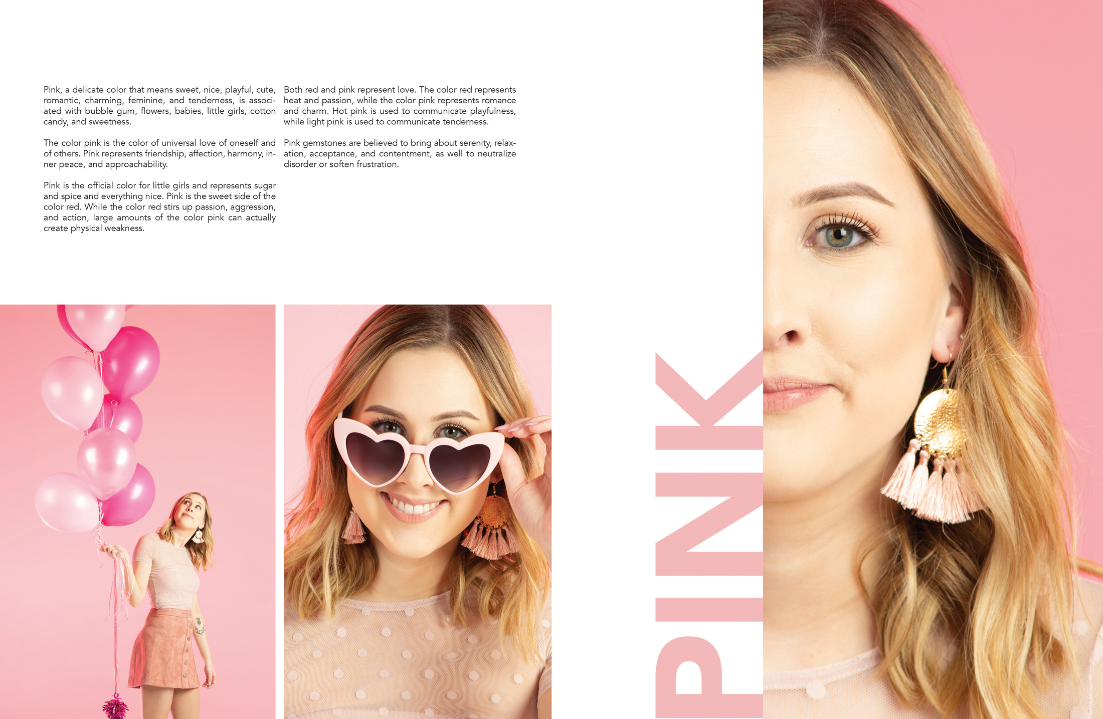
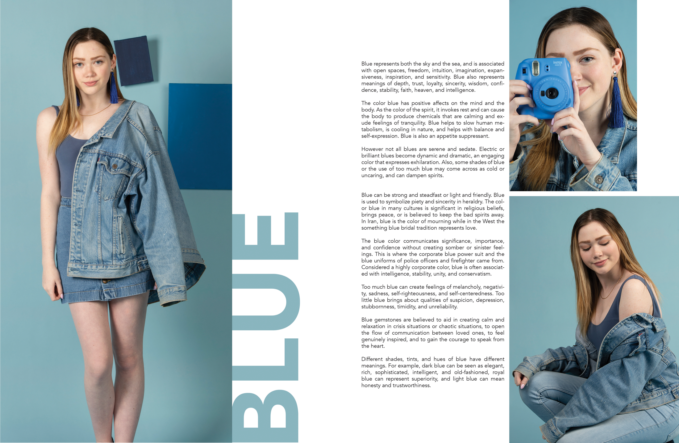
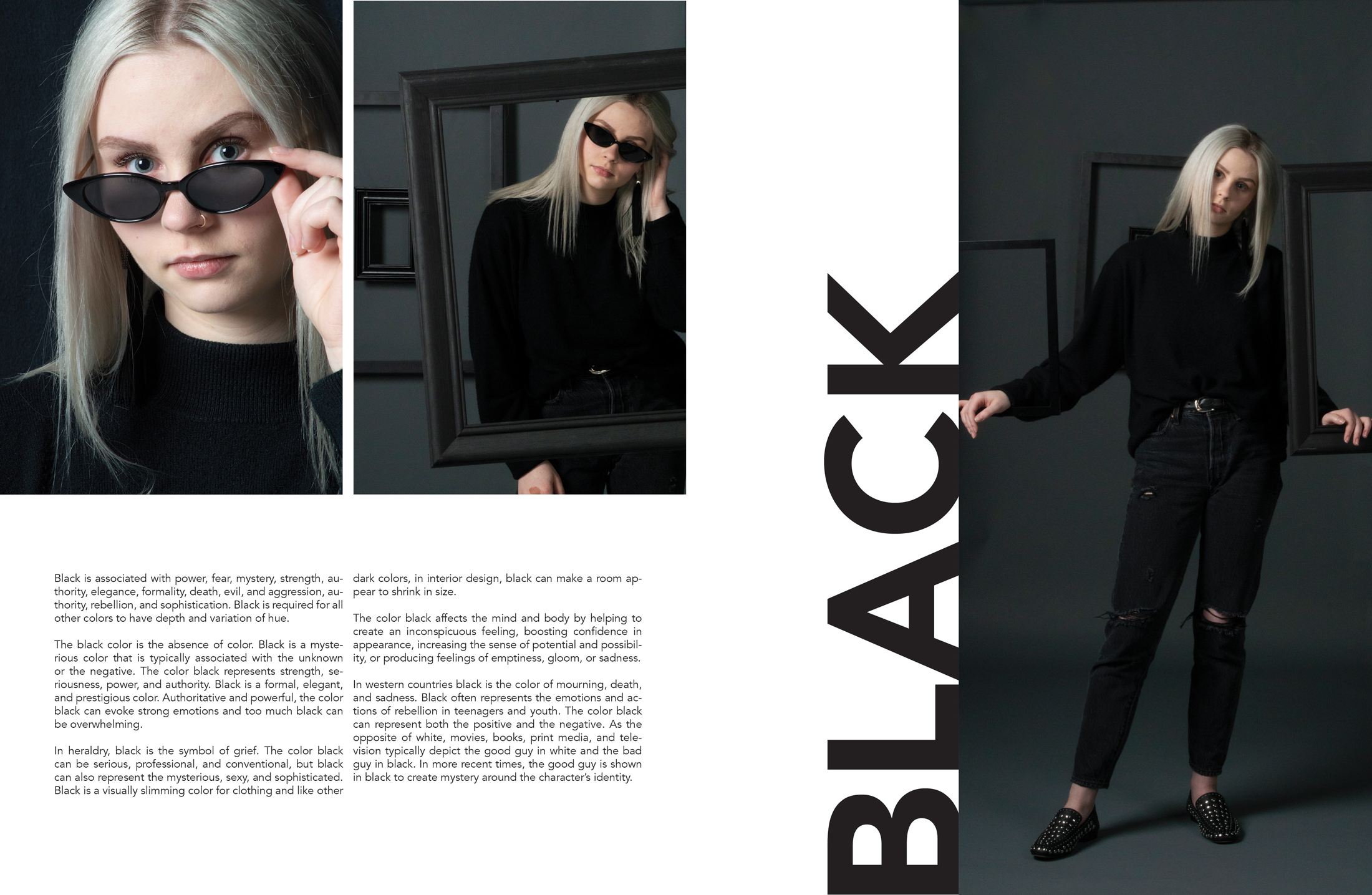
This project was open ended, which allowed me to create multiple unique, monochromatic fashion photography shoots. Photos from each shoot were then laid out in spreads for the final photo essay.
The cover of the photo essay shows a brief glimpse of the colours to come using statement earrings as the focal point for each.
The cover of the photo essay shows a brief glimpse of the colours to come using statement earrings as the focal point for each.
This spread showcases the white photos. Soft, flowing fabric was used both in the wardrobe and set design. It helped create the ethereal, pure look associated with the colour. The model was specifically chosen so that her red hair would contrast against the white.v
This spread showcases the pink photos. The photos encapsulate the sweet, playful, and feminine characteristics tied to the colour.
The blue photos use lighter cool blues that create a sense of calm confidence in the model. Hanging canvases were used to add interest on the solid blue background.
Event Posters
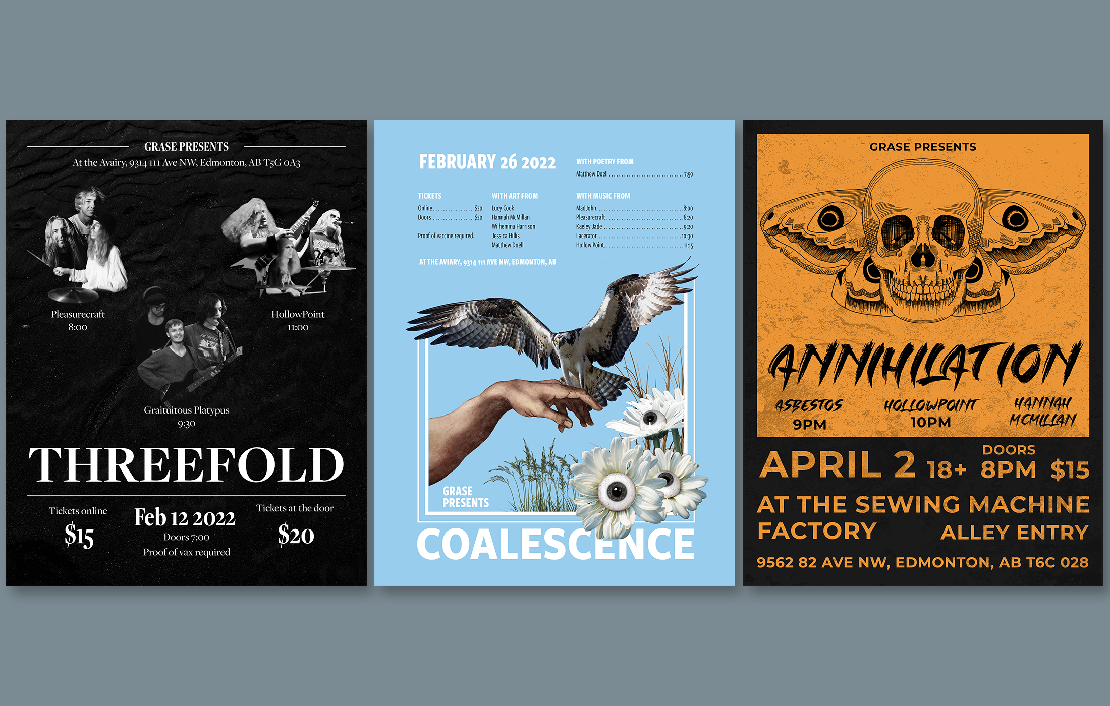
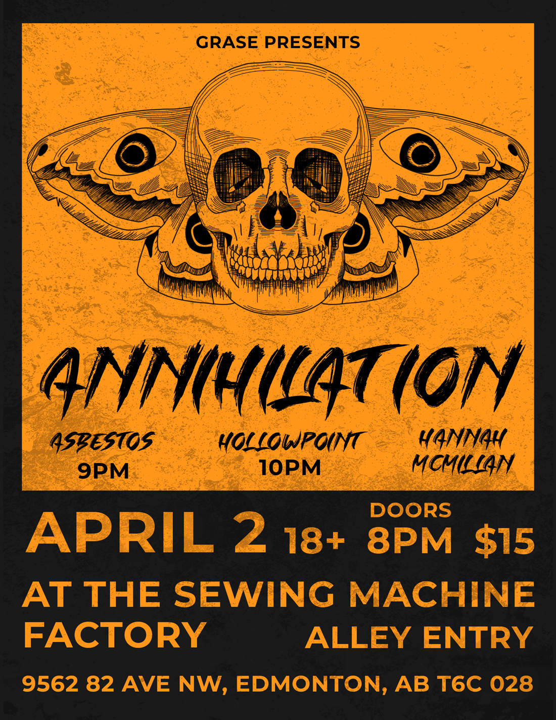
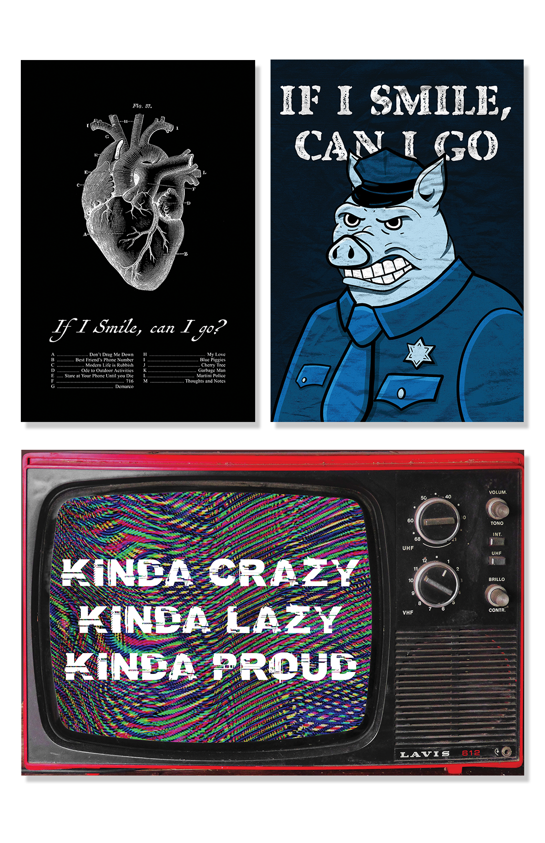
This project consists of posters for 3 local music and art shows. They come from an ongoing partnership with Grase (@ggrraassee on instagram). They showcase a variety of styles derived from visual inspiration supplied with each poster request.
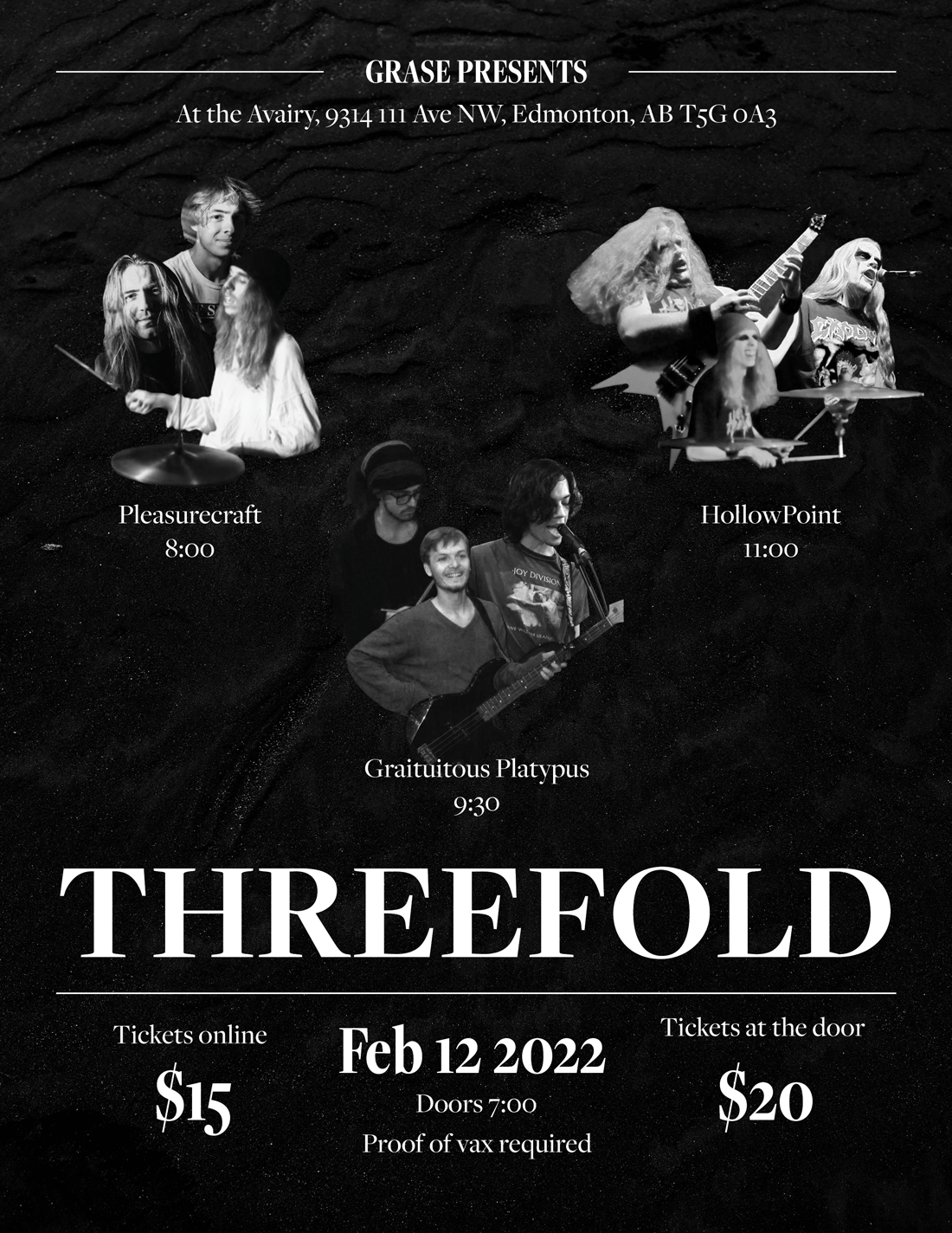
An event poster for Threefold. The inspiration for this poster was mainly dark imagery and black and white photos. This led to creating the series of collages of the members of the bands.
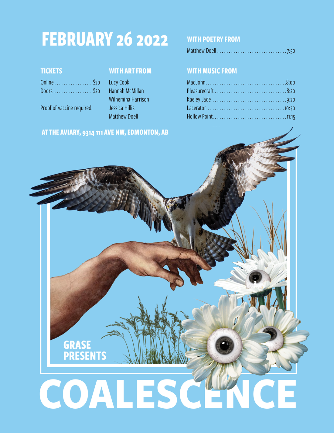
An event poster for Coalescence. Grase wanted this poster to make the event feel like a safe space to open your mind. The visual inspiration she gave had bright colours, collages, and some illustration.
Beer Can Illustrations
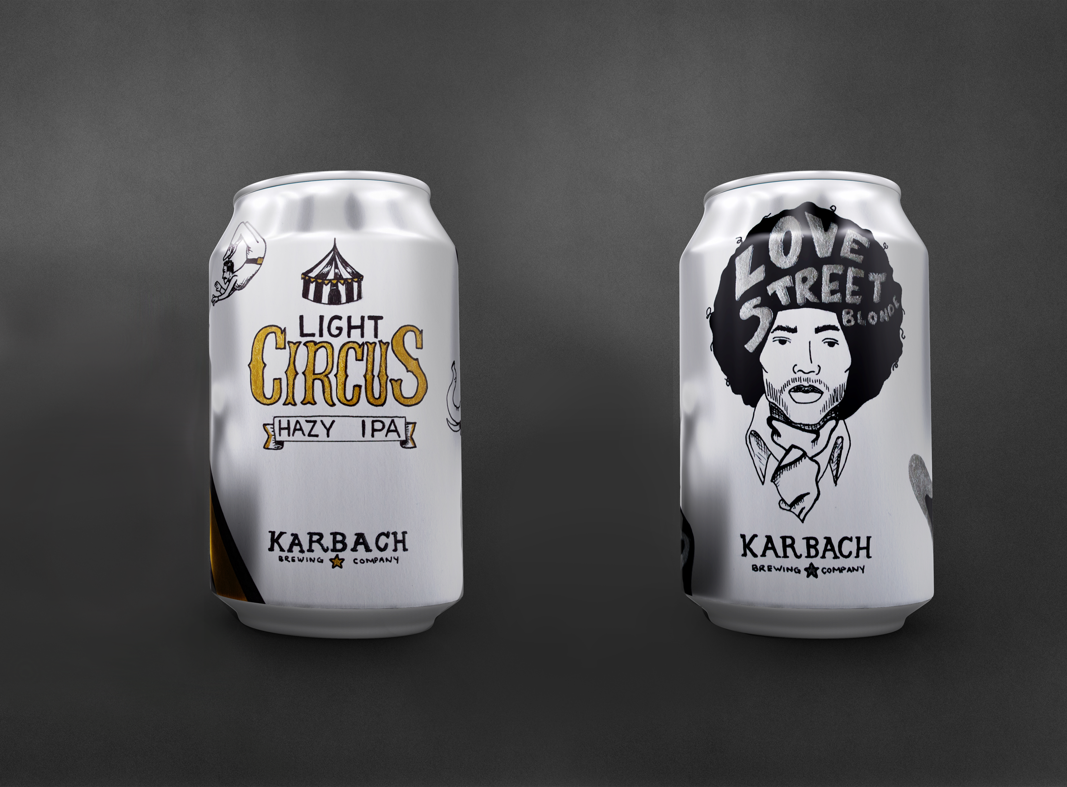
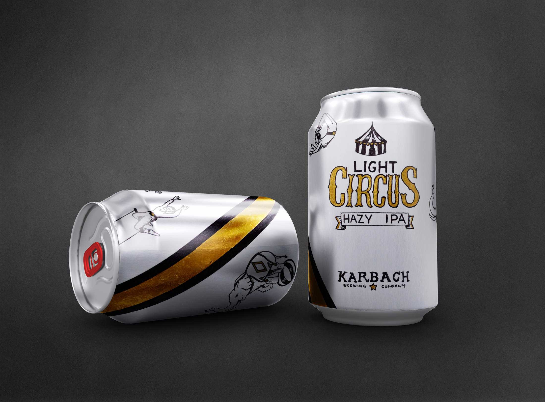
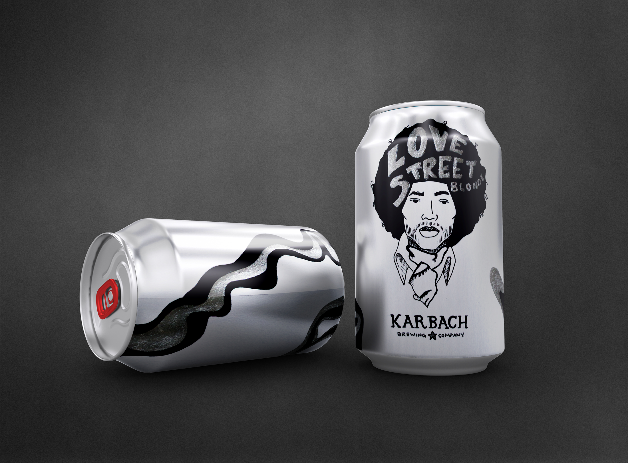
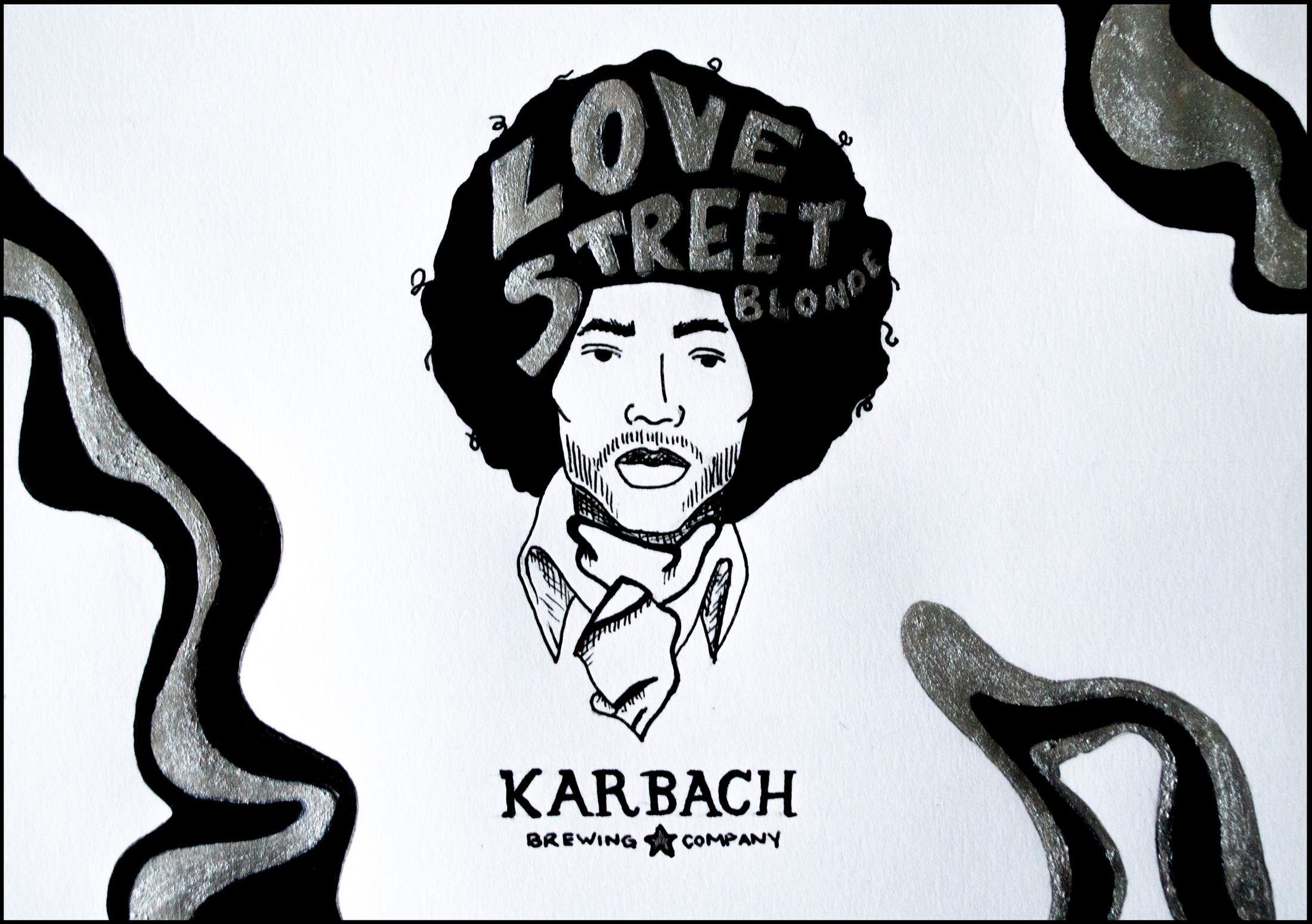
For this project we had to find an existing brewery and select 2 of their beers to draw new labels for. They should work with the name of the beer and look like the start of a visual system for their beers.
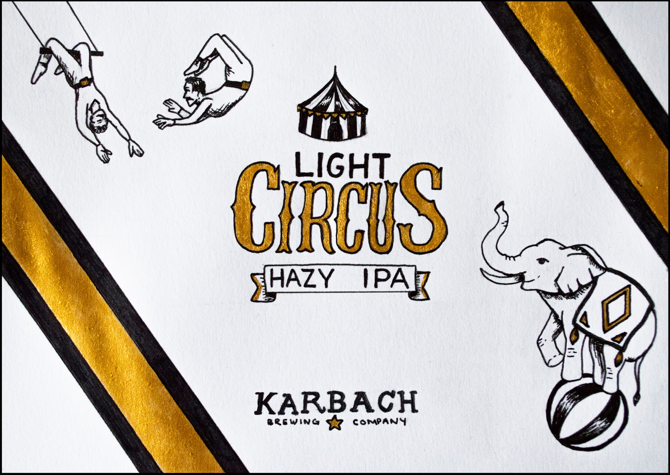
I utilised black and metallic ink for my illustrations and hand rendered type, with the visuals based off of vintage posters.
I utilised black and metallic ink for my illustrations and hand rendered type, with the visuals based off of vintage posters.
The illustration for Light Circus pulled imagery from vintage circus posters and the traditional acts seen at them. The stripe follows the angle seen in the acts and helps the design connect over the seam.
Gratuitous Platypus Modern Life is Rubbish Music Video
My capstone was focused on creating engaging visuals that complement the music Gratuitous Platypus creates. Colour psychology was utilized to reinforce the manic and depressive episodes present in bipolar disorder. The ups and downs of the song paired with the actions mentioned led to bipolar disorder becoming the concept for the video. The band is utilizing this opportunity to establish mental health as a core value due to its presence throughout the album.
During a meeting with the band the idea of having easter eggs (hidden references) in the video was brought up. These all consist of references to song titles or lyrics from throughout the album. While these were not a part of the initial proposed outcome they created interesting visual elements in the video and will possibly become merchandise for the band in the future.
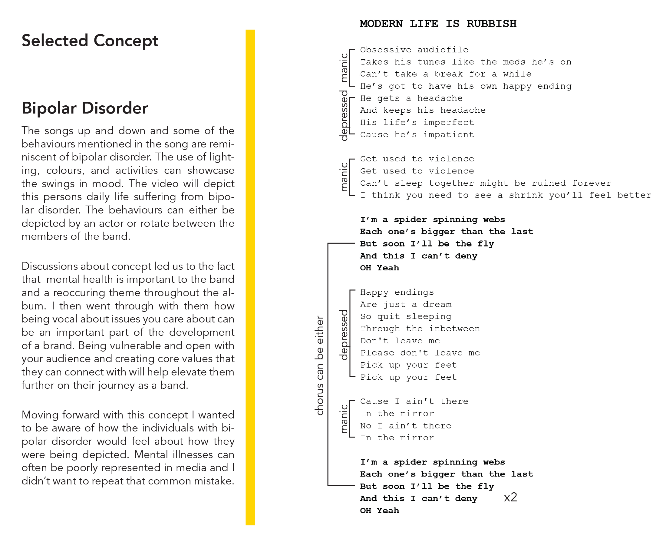
Getting to these results first started with creating these lyric breakdowns. Analysing the lyrics in this way allowed me to better understand the possible results for each direction as well as weed out any weak ideas. I was then able to clearly articulate these 2 primary ideas to the band.
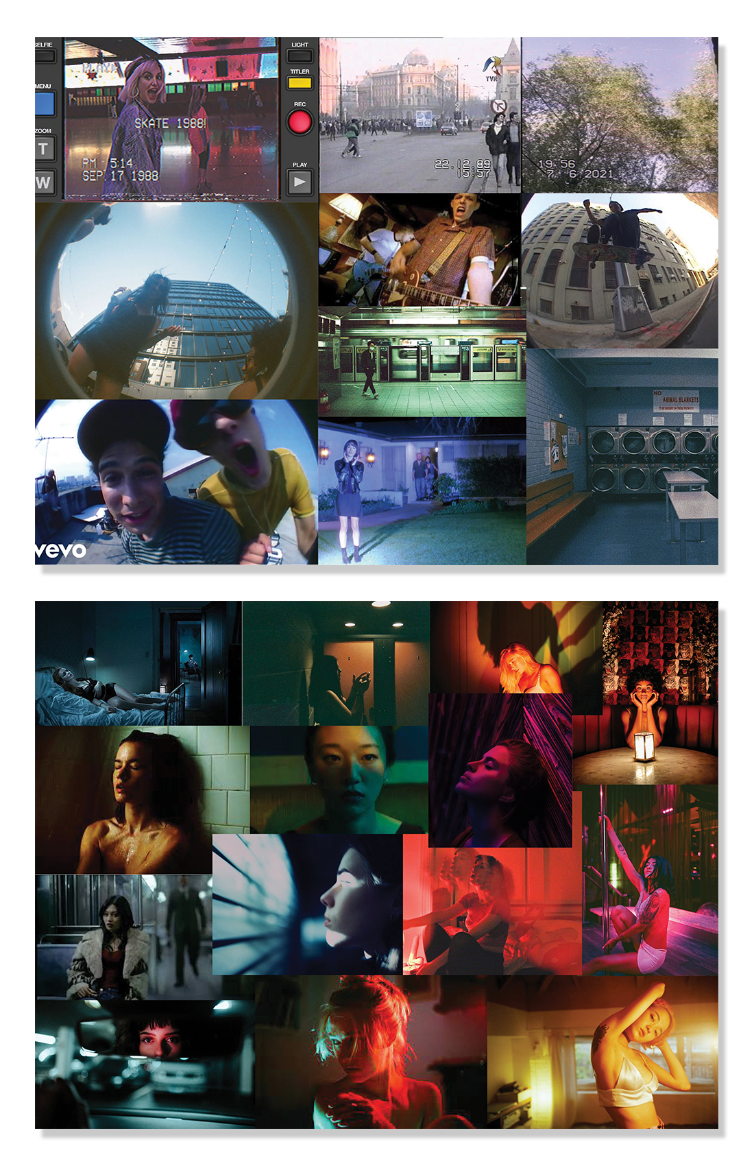
Once the bipolar concept was chosen the visual style became important. These are the moodboards that provided the base for the aesthetic of the video. The first was created as a visual conclusion to my precedent analysis, showing the style the band gravitated towards. The second is a moodboard for the bipolar concept, you can start to see how the colours will relate to mood. The final visual is a happy medium between the two.
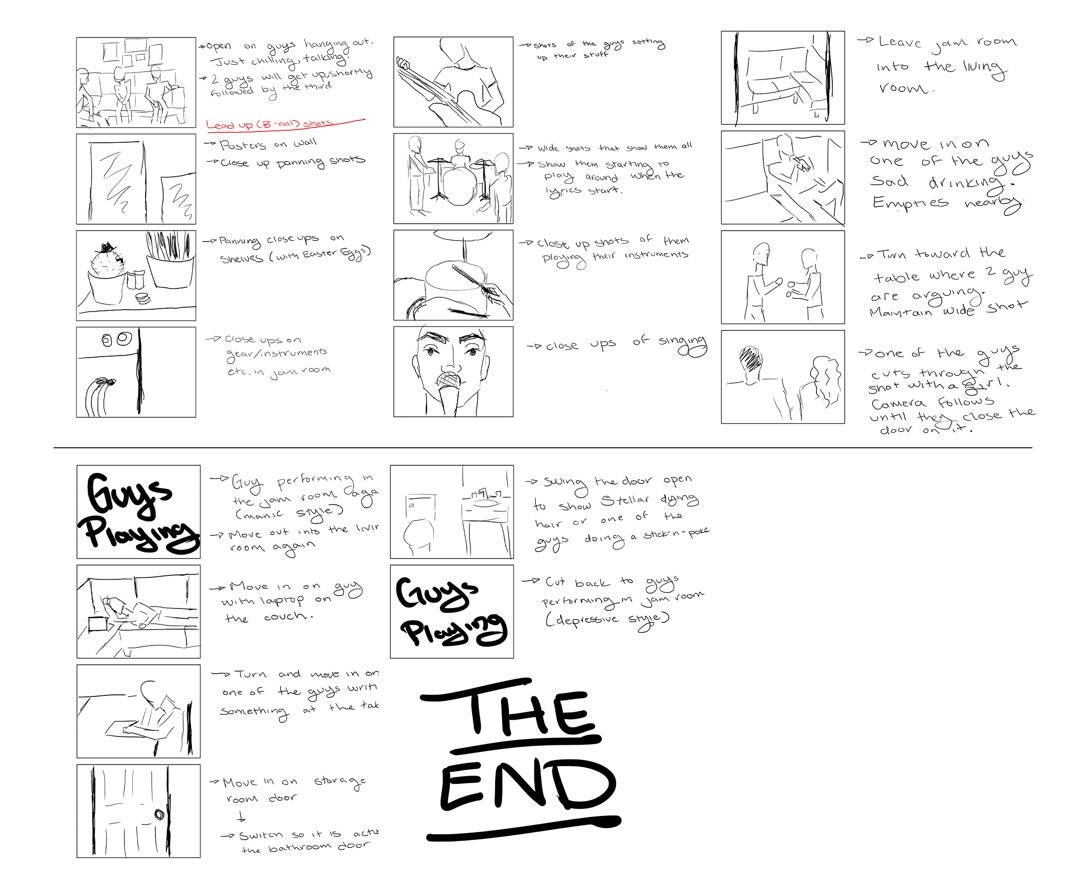
My storyboarding process went through a variety of stages before it got to a standard visual storyboard. I broke down which sections were manic or depressive, the length of them, the actions that relate to it, and the potential movement of the camera. Each step built on the last to create a solid plan for the music video shoot.


