Yasmin
Dehghannegad
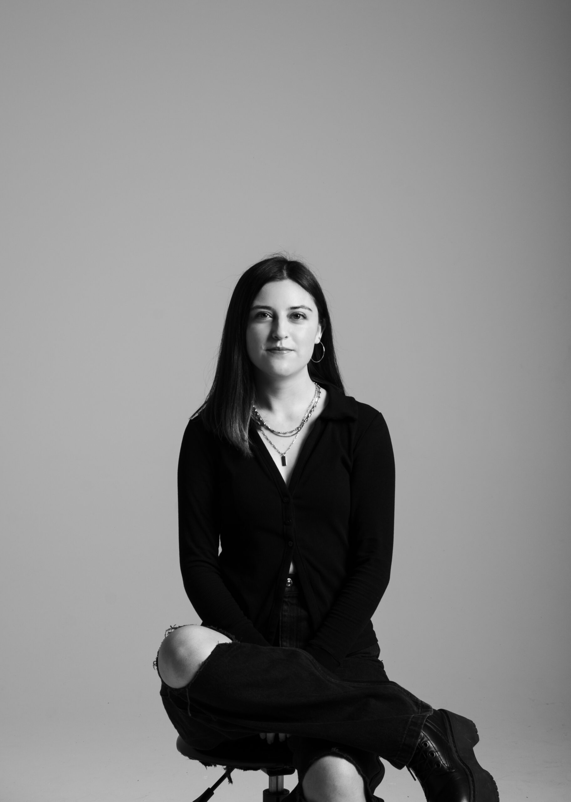
Hello! My name is Yasmin, and I'm from Edmonton, Alberta! I started my official design journey at the UofA for two years before transitioning to the design program at MacEwan University. I find inspiration from other fellow photographers/creatives and fashion editorials/publications. I love photography the most in design because I get to be creative with the concept, lighting, styling, etc. My ultimate goal is to become either a fashion editorial photographer, a fashion advertising photographer, or an editorial designer! Over the pandemic, I refreshed and improved my photographic/design skills with personal projects.
Editorial Photography
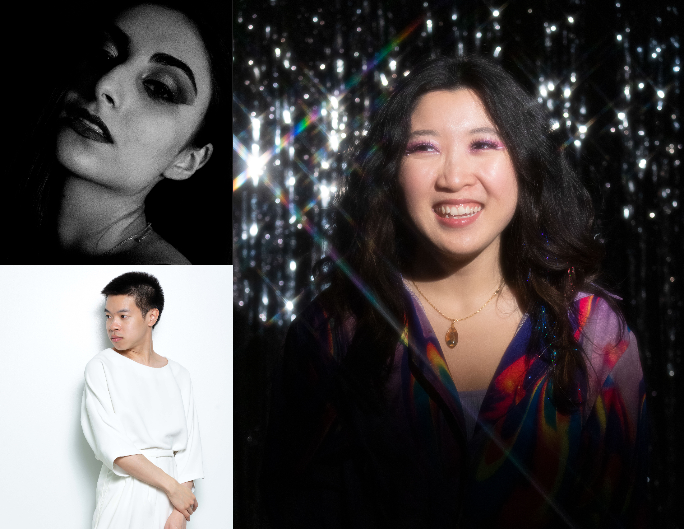
Photo Collage: A compilation of 3 of my strongest editorial style photographs I’ve taken.
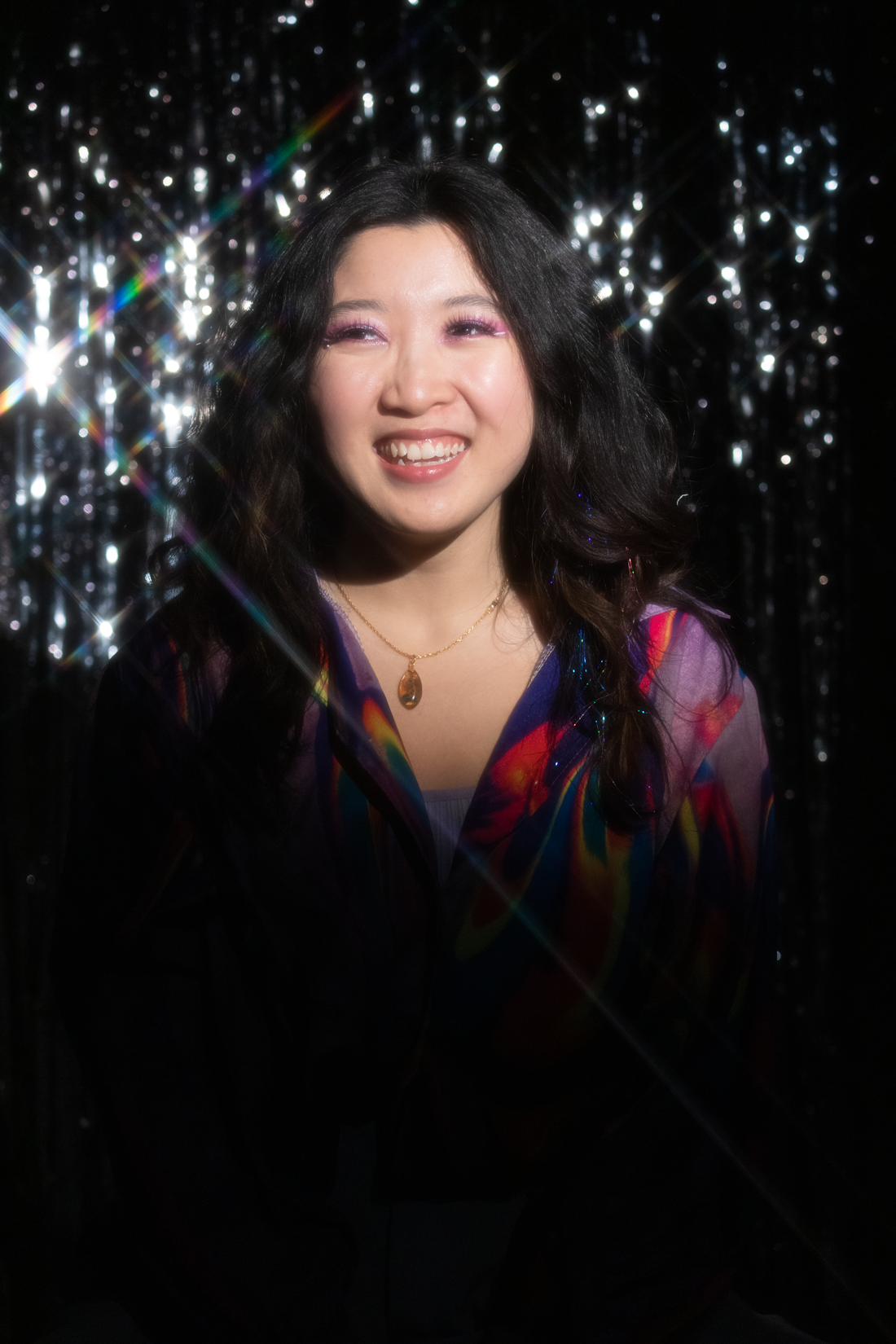
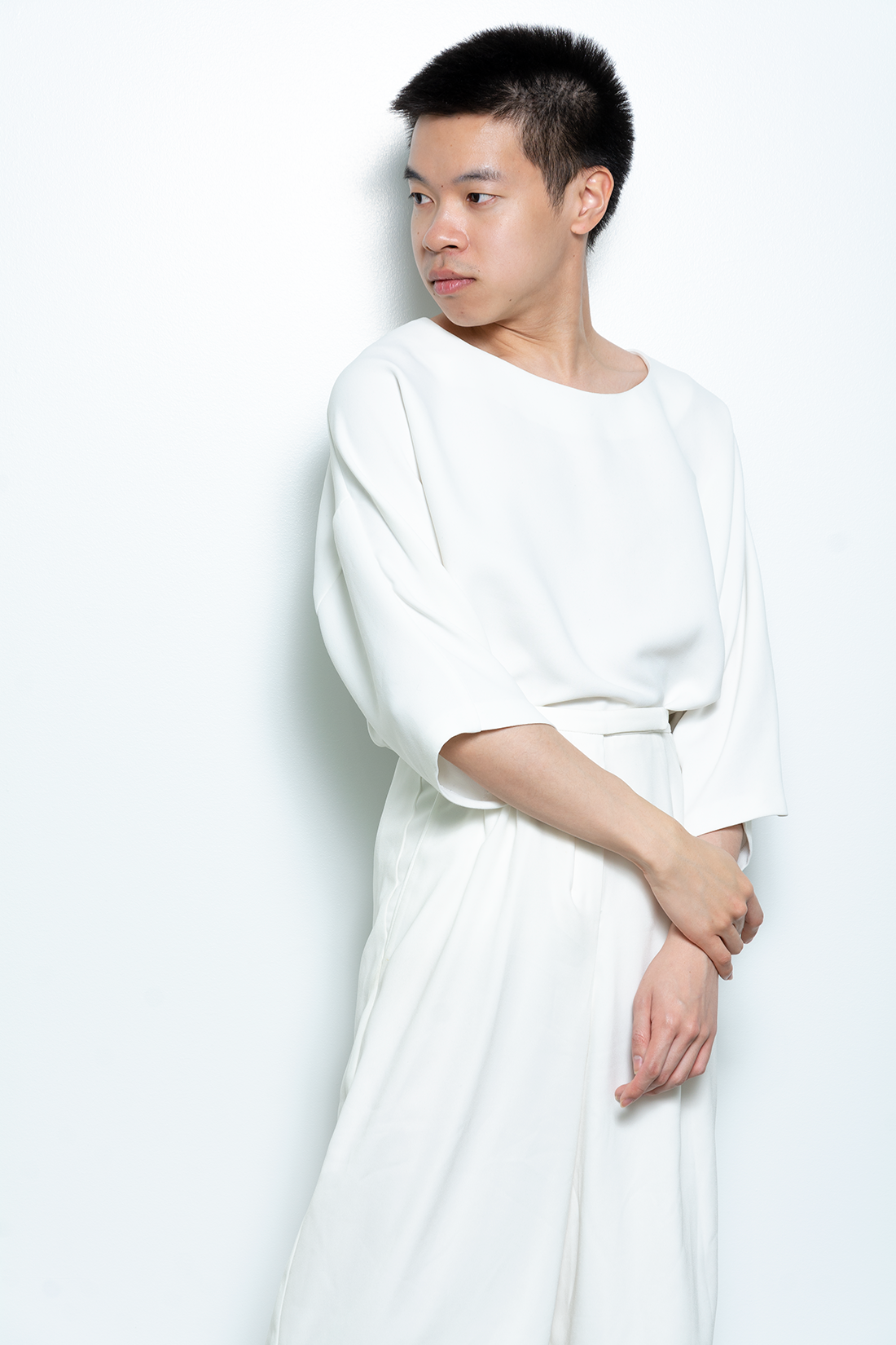
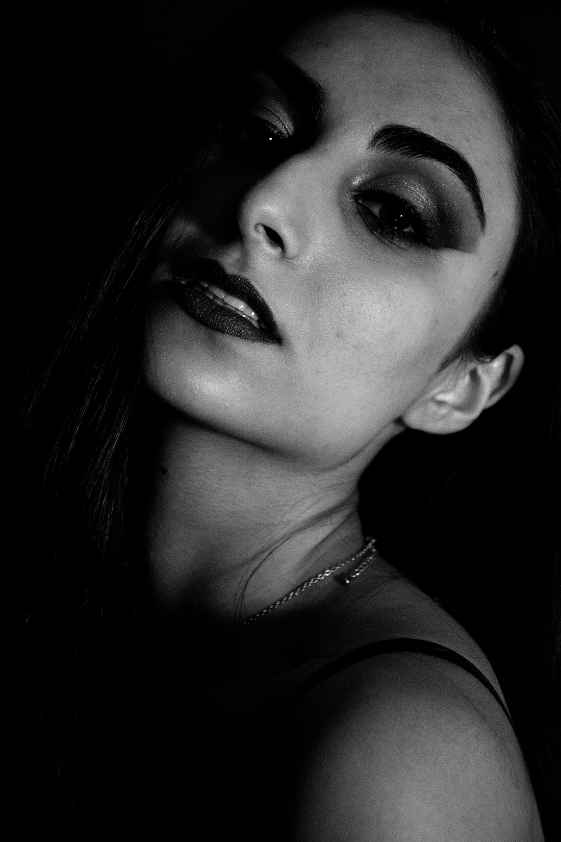
This collection of photos is a mixture of school and personal photo projects that fall under the fashion/beauty editorial photo style I did. All images were taken in the photo studio using various creative lighting techniques, and attractive styling to create visually appealing and editorial looking photos.
This was a personal project and I wanted to explore and play around with creative lighting, creative props, and bold styling. Model: Aldricia Chong
This was a school project and I wanted to do a minimal clean approach with a plain white background with the model wearing a white monochrome outfit. Model: Alan Ngo
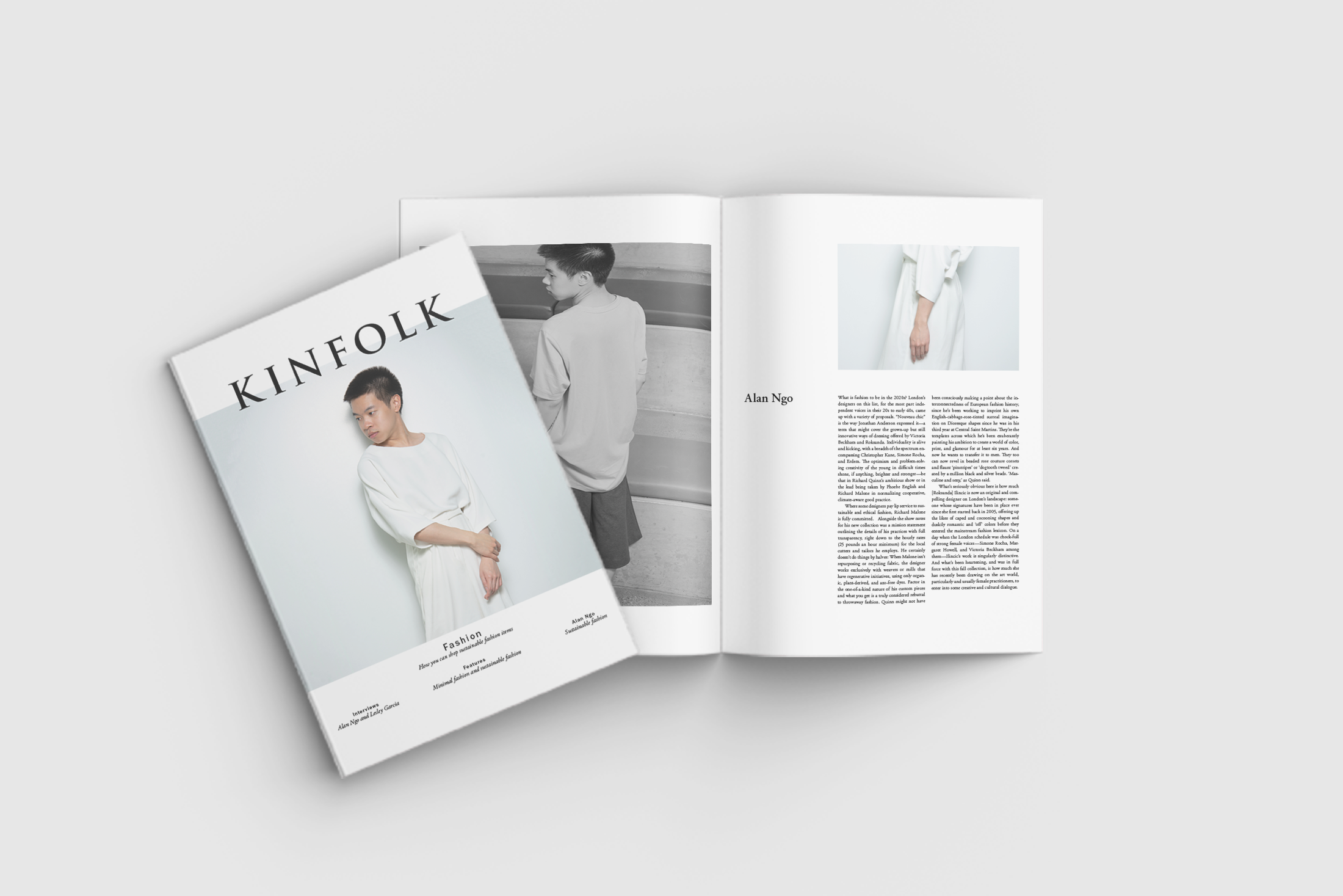
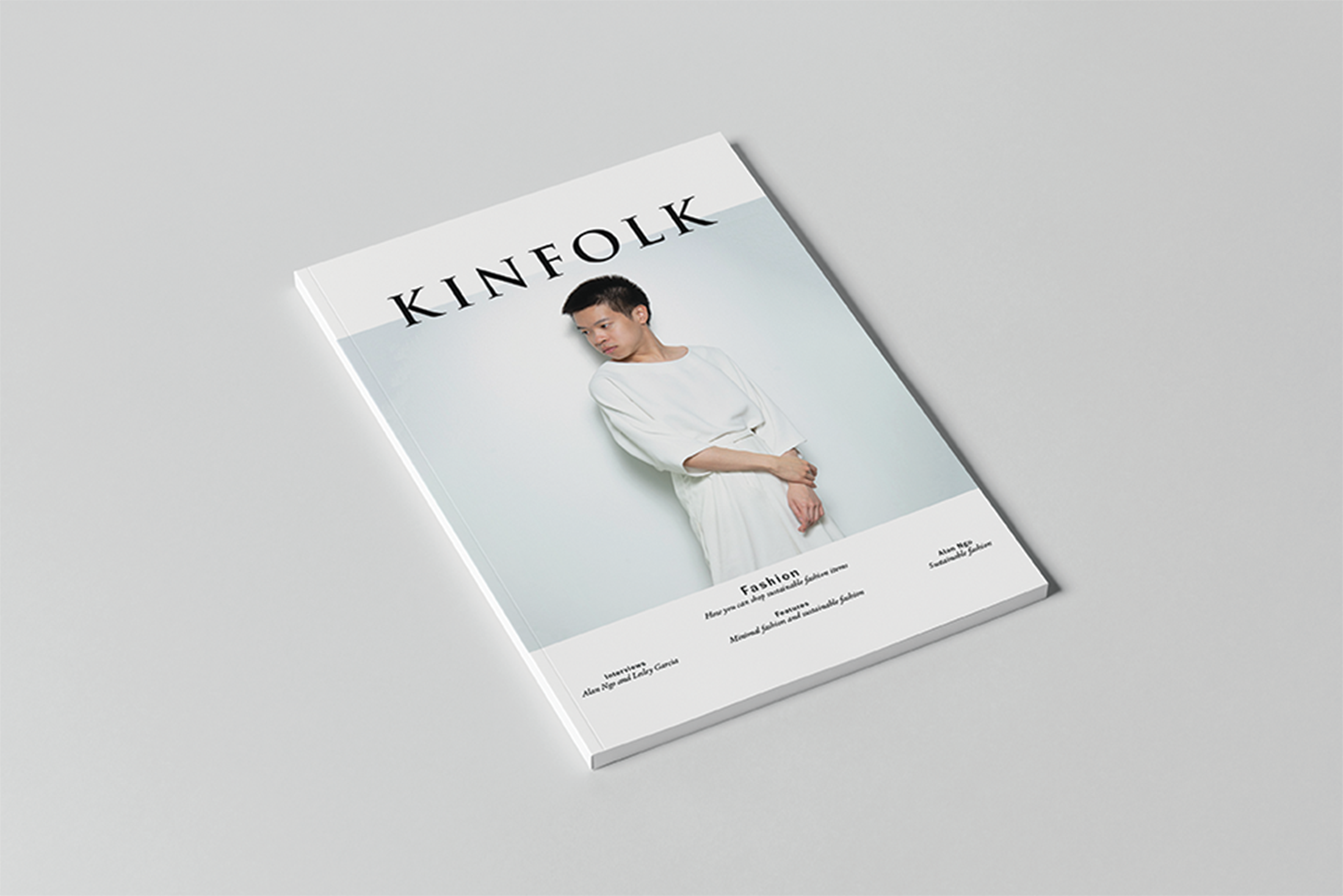
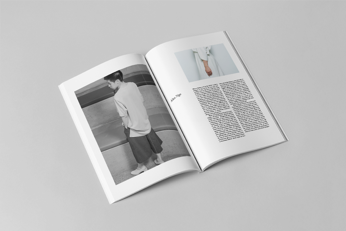
Editorial Location Portrait using Strobe in Layout
This was a school project where we had to produce one editorial cover portrait and an accompanying dps portrait using strobe as our main light source, in layout. We had the option to choose a magazine style, existing or made up, and create a narrative using the “Story” or “Subject”.
The magazine-style that I choose to do is a fashion magazine called Kinfolk Magazine which covers fashion, interior, architecture and lifestyle. The concept of their magazine and their editorials are very minimal and clean.
I decided to dress the model in minimal clothing with a minimal backdrop for the cover to follow the aesthetics of Kinfolk.
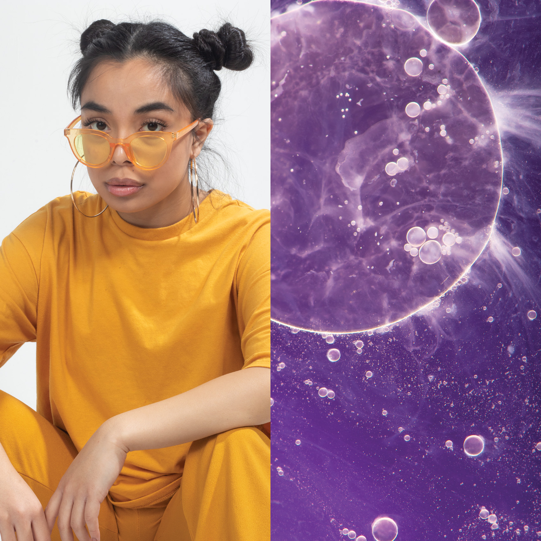
Color Diptychs
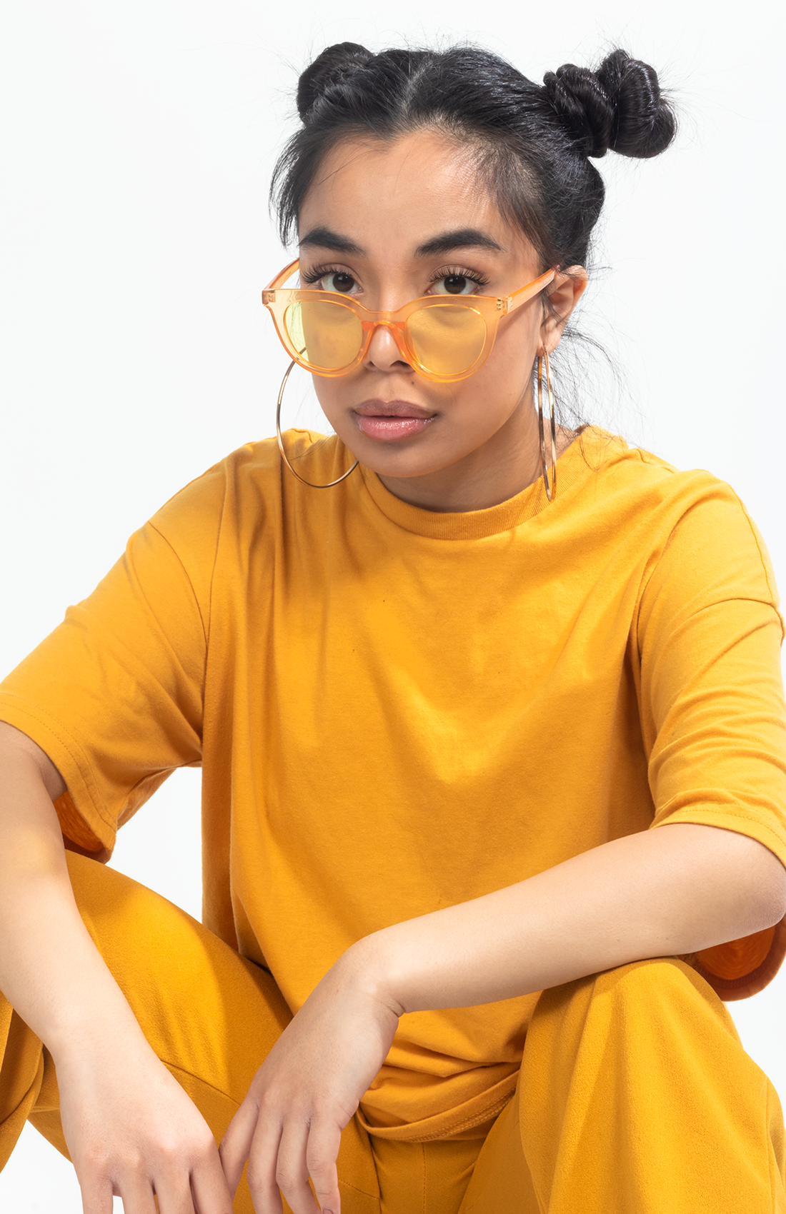
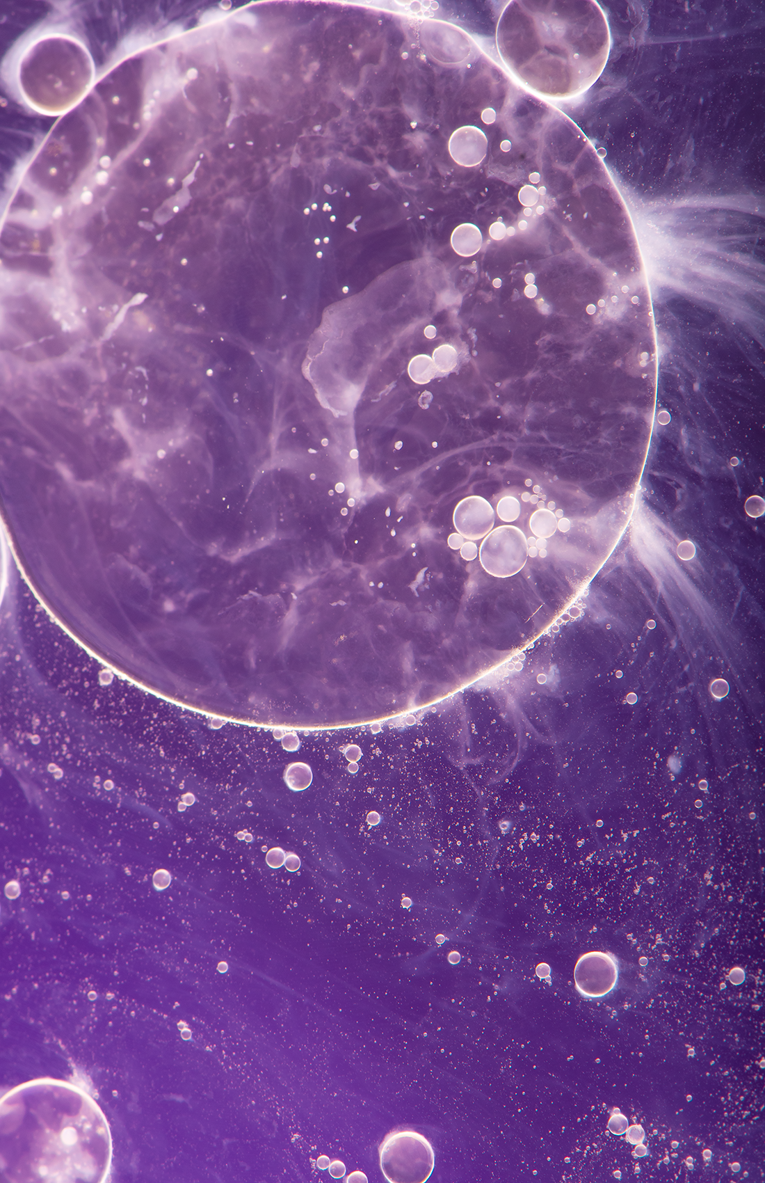
Color Diptychs was a school project where we had to take a portrait photo and a macro photo and both photos had to be cohesive in terms of color.
For the concept of both the macro and portrait, the colors that were chosen were the complementary colors yellow and purple. I was creating a fun and bubbly ambiance.
The portrait style was inspired by fashion photography. The model was styled in a saturated, monochrome yellow outfit. The styling was meant to be fun, bold and casual and the lighting decision was meant to be high-key with the lighting on the model being natural and well lit with the background being clean and white so the focus can be on the model and the outfits bright color.
Incluskin (Packaging Design)
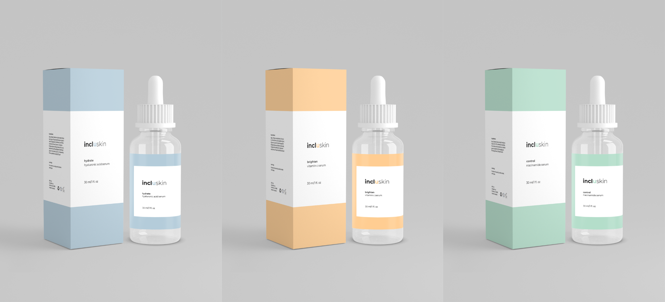
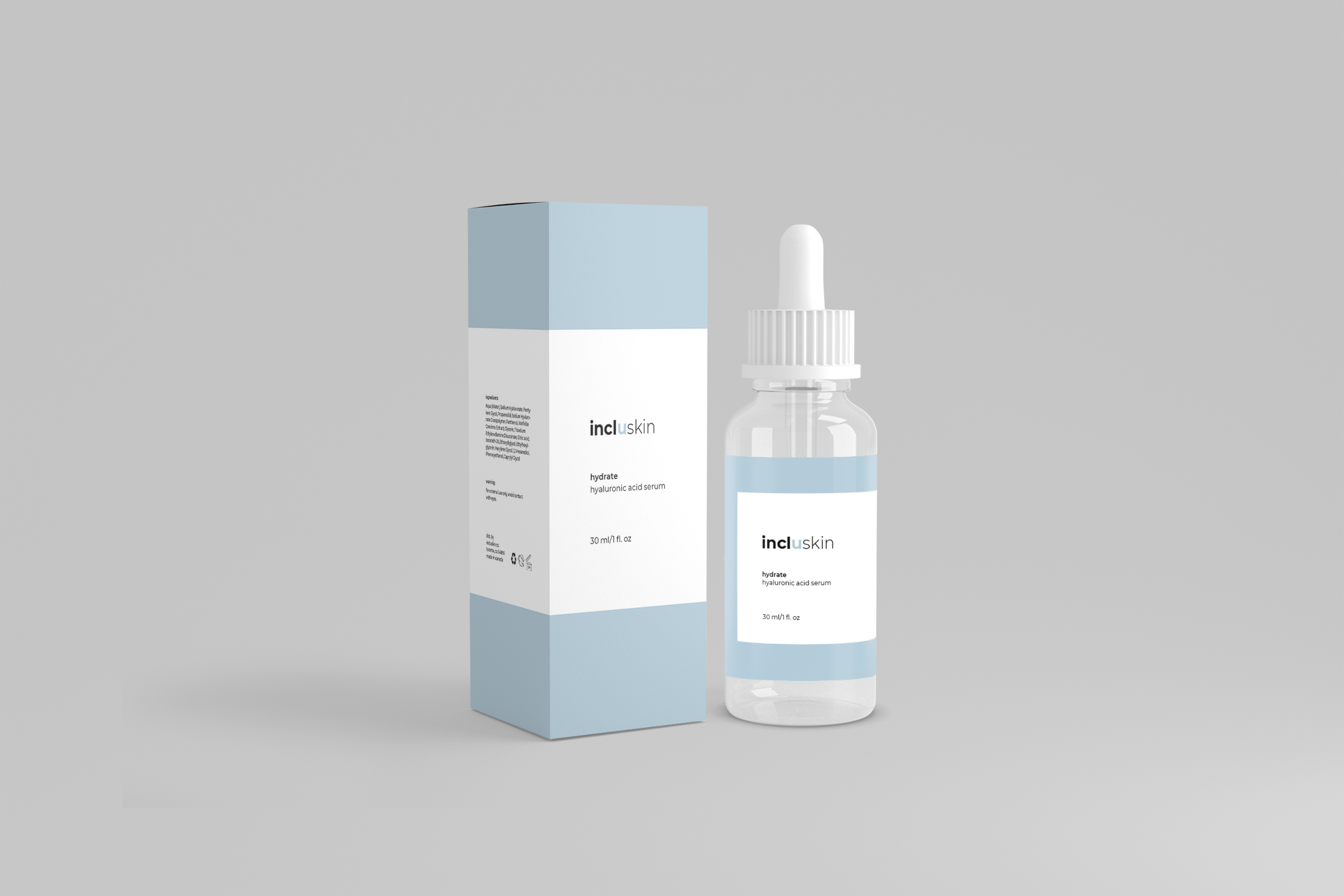
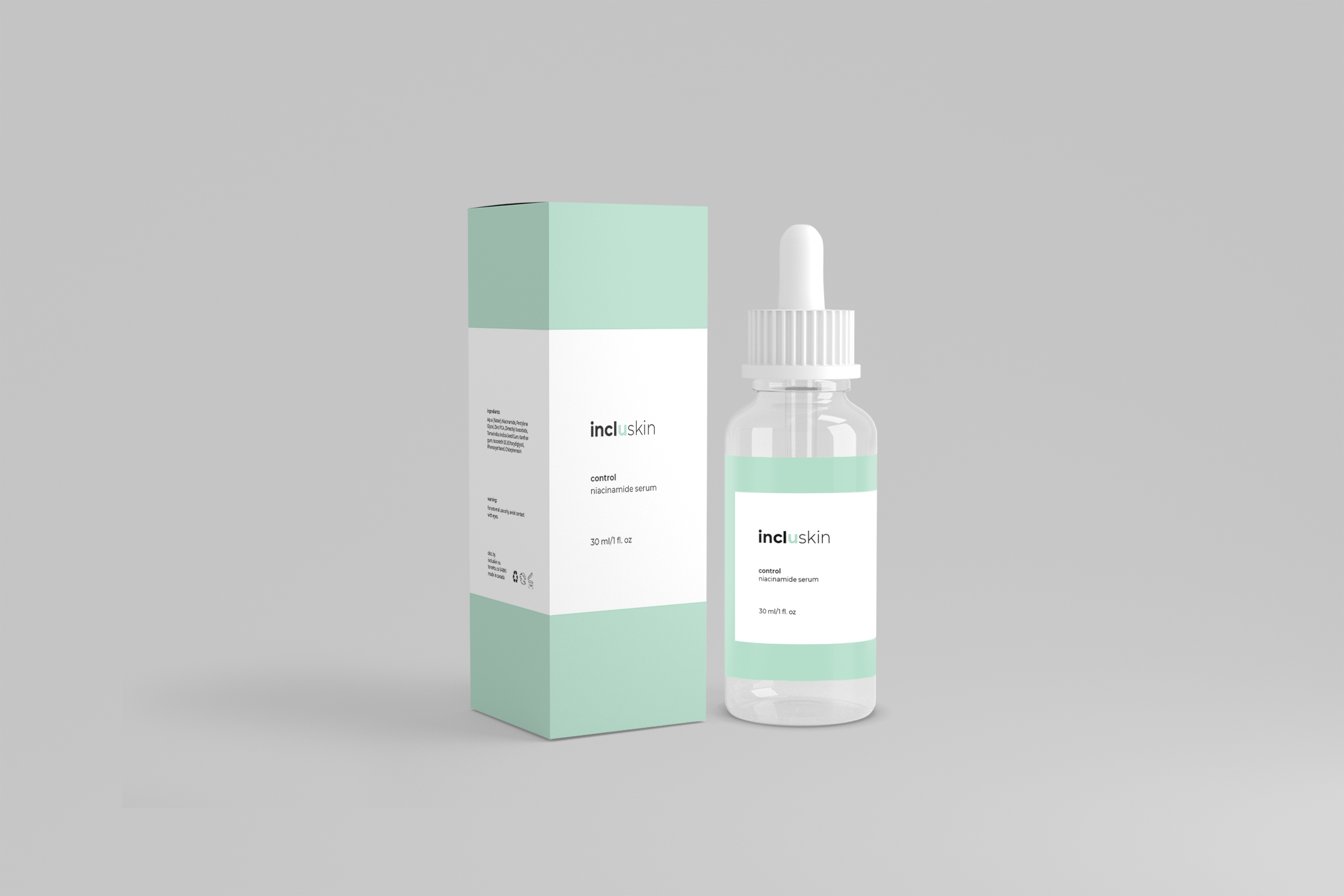
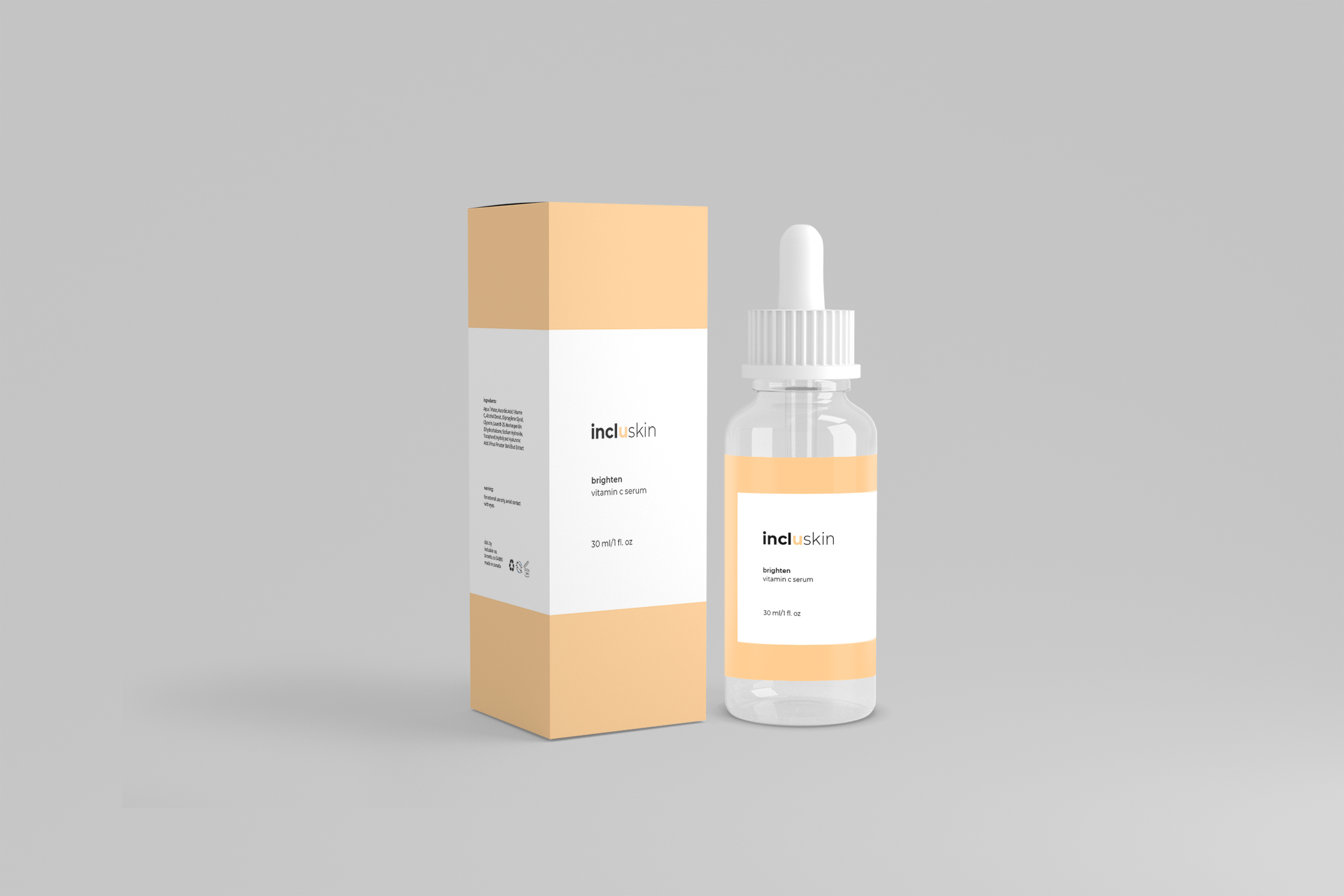
This packaging design was a school project and the goal was to design a unique and appropriate logo and packaging system with an uncommon design style and strong visual standards.
Incluskin is a skincare line that focuses on simple but effective skincare. The name of the brand is the wordplay of inclusive and skin. Incluskin is a beginner skincare brand that focuses only on serums. The target audience is young adults between 16-25 who want to get into skincare but don’t know where to start.
The brand focuses on having an easy-to-understand system that skincare beginners can understand what each serum is, the benefits for each serum, and choose what best suits their needs. (Hyaluronic Acid Serum)
The brand focuses on simple and minimal visuals that match what the brand is all about, which is understandable and straightforward skincare for those getting started and be inclusive to all, which is where the wordplay’s importance in the brand name comes in. (Niacinamide Serum)
Portraits of individuals in the marginalized community
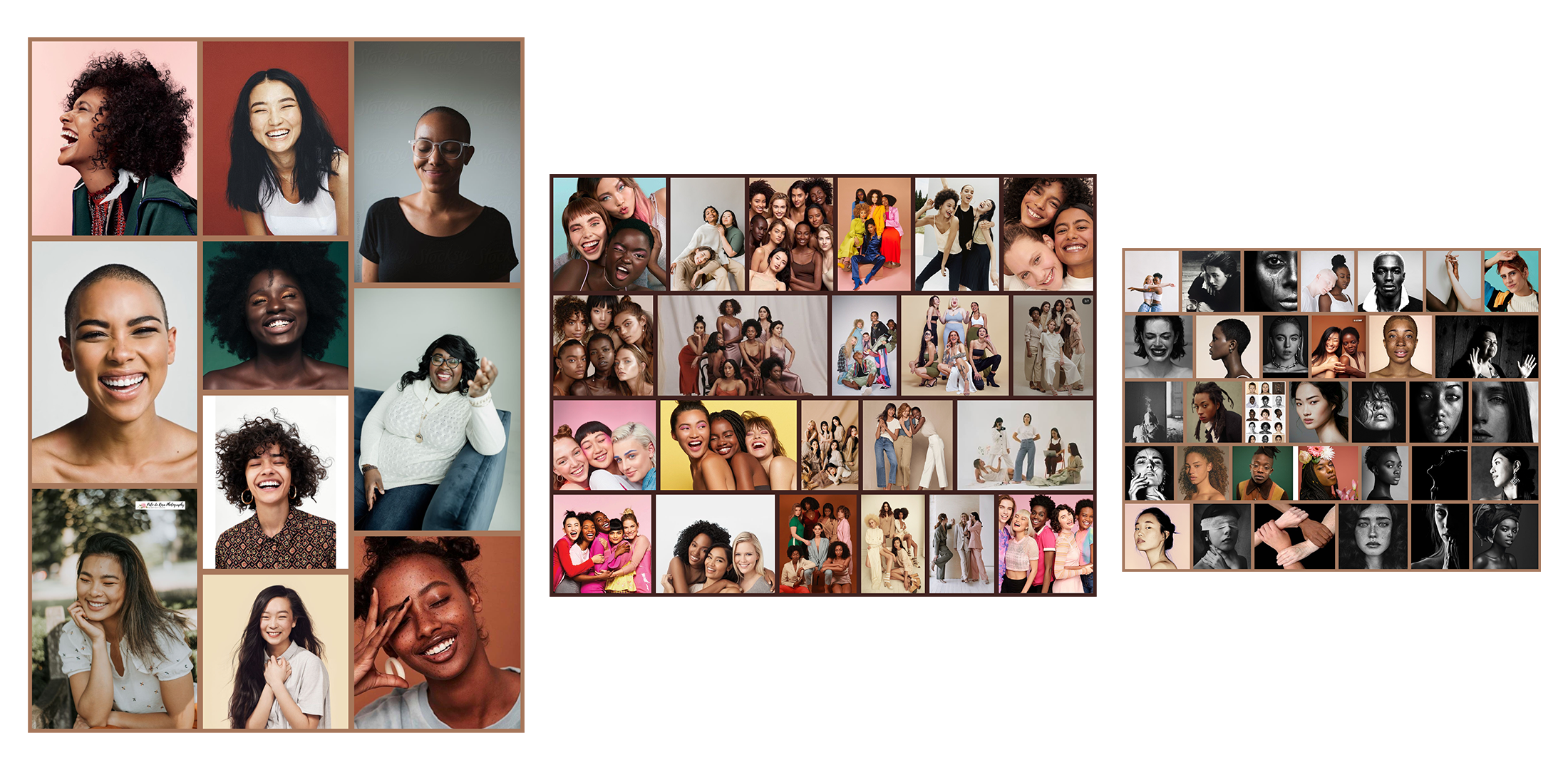
I studied the importance of representation of the marginalized communities and the importance of their lived experience. I wanted to communicate the lived experiences of BIPOC, LGBTQ+, and people of disability through portraits that tell a story. Sharing the lived experiences is vital because it would share the importance of representation and understanding the lived experiences of these individuals. (Community partner: the Unique Get Together Society).
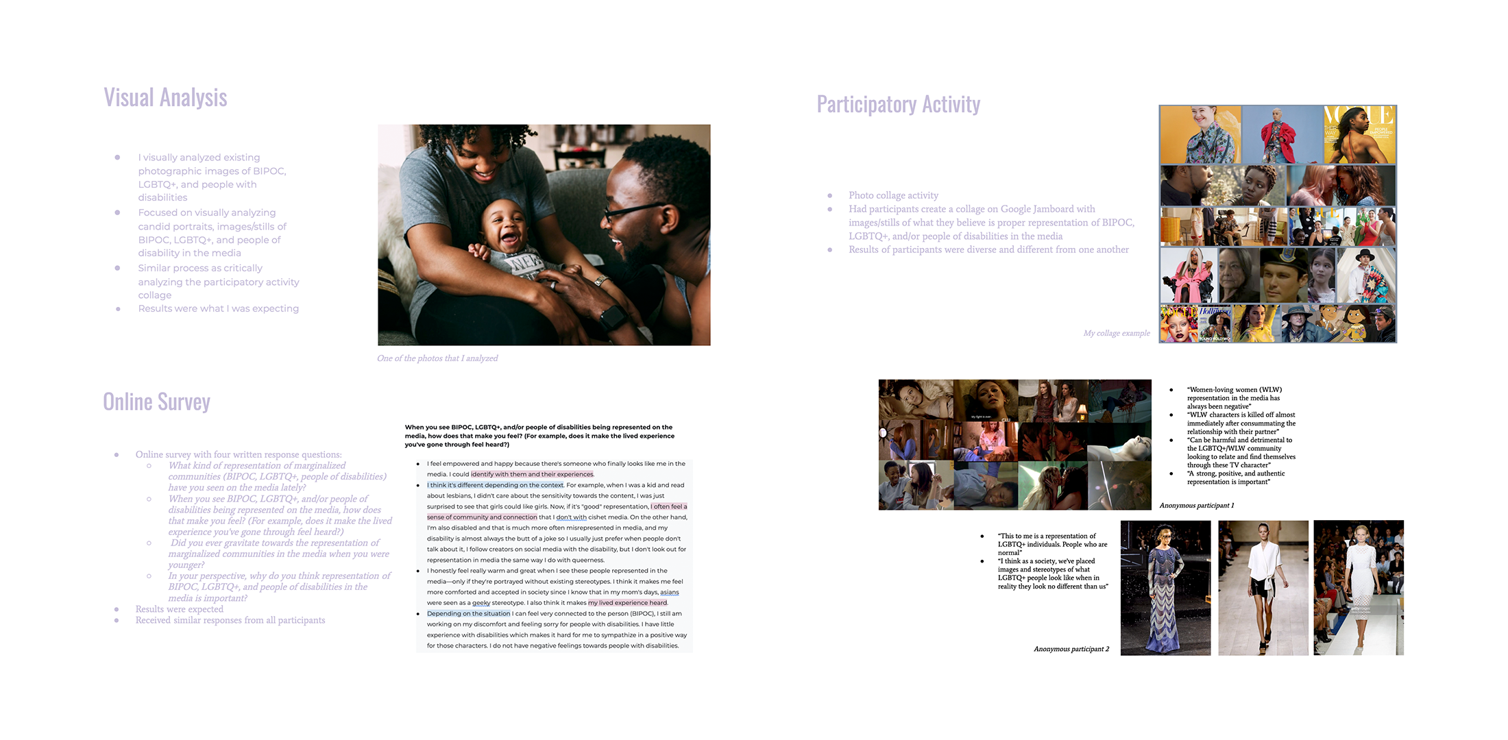
In the fall semester, my research topic focused on the Representation of BIPOC, LGBTQ+, and People with Disability in the Media and how I could translate and deliver photographic images that convey the lived experiences of the marginalized community. I did data collection that consisted of a visual analysis, an online survey, and a participatory activity. The participatory activity was the most vital data collection I did, as it revealed the most diverse perspective of individuals within the marginalized community.
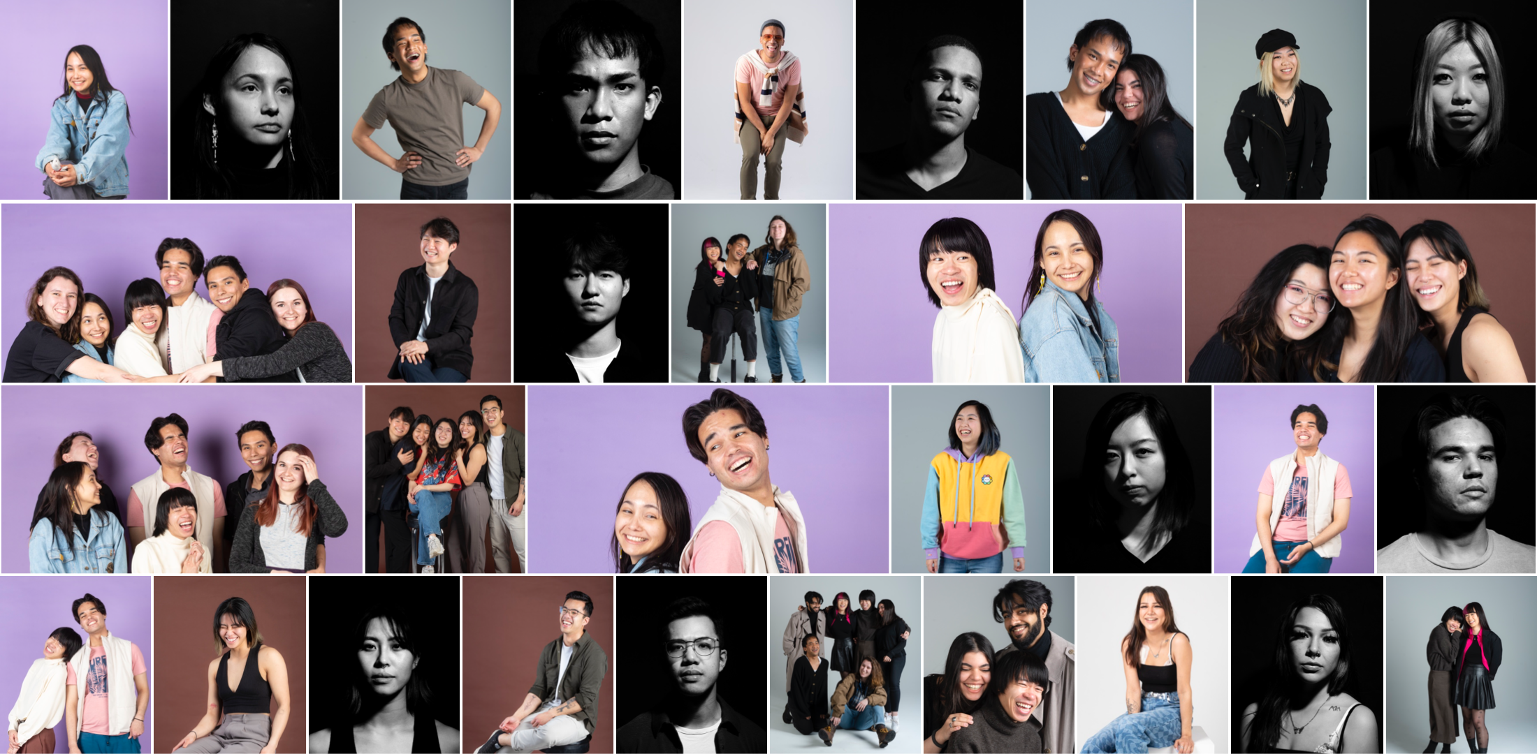
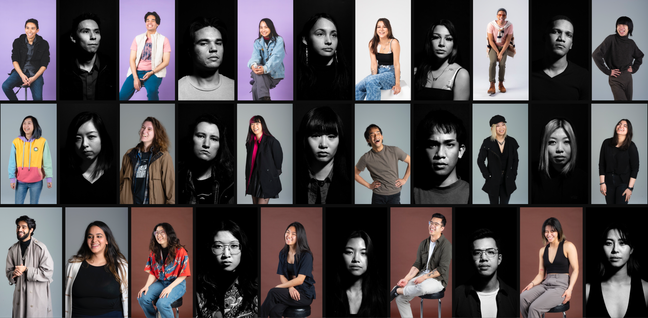
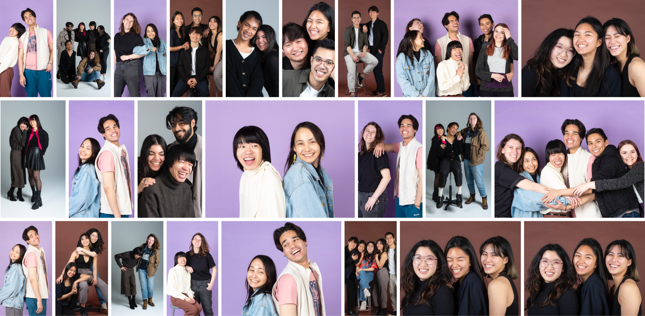
I wanted to showcase the raw emotions of the individuals captured in the frame, showcasing the light side and the dark side. I wanted to keep the portraits clean and minimal with crisp lighting and neutral backgrounds to focus on the model's facial expressions, emotions, body language, and individuality. I captured both individual and group shots to showcase the importance of community.
With this set of light photos, I wanted to communicate raw happiness, showing that we as a community are happy to be who we areand where we come from. For the dark side photos, I wanted to capture the raw hardships of the individuals. Even though there are endless positives to being part of such a fantastic community, there are also many difficulties and hardships. I wanted the facial expression and eyes to tell a story of the marginalized community's lived experience.


