Logann
Fitt
My name is Logann Fitt from Edmonton, Alberta and I love user experience and creating with people in mind. I find inspiration through talking to people and other designers/researchers. I love design because it is all around us and truly has the power to impact lives. I enjoy learning about new projects and discovering insights about people that increase my world view. My goal is to become a stronger designer by always listening and practicing. Over the pandemic, I kept busy by working on personal projects and learning more about startup companies.
Language Learning Website
This project is based on the redesign of a large language learning website. The goals are to reorganize the information architecture, redesign existing content and design a new website.
The first two layers of the sitemap and the number of pages were listed to understand the main functions. Card sort activities were done with target participants to help restructure the content. Wireframes, mockups and prototypes were made of the homepage, a lesson, quiz and results.
The first two layers of the sitemap and the number of pages were listed to understand the main functions. Card sort activities were done with target participants to help restructure the content. Wireframes, mockups and prototypes were made of the homepage, a lesson, quiz and results.
Homepage Redesign
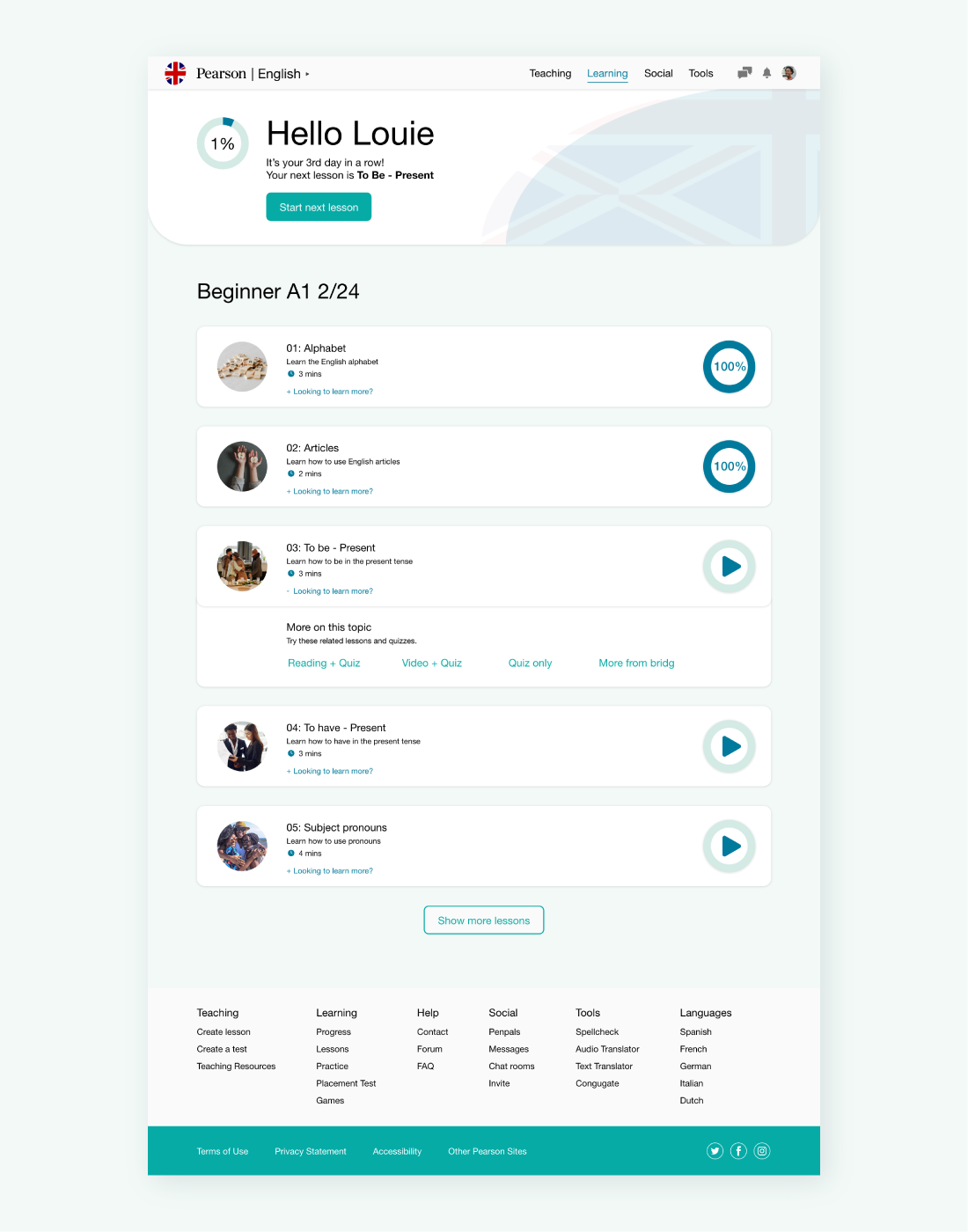
The existing structured lesson plan was redesigned into a personal dashboard for guided lessons and easily tracking progress. Completed lessons and only the following three lessons are shown to avoid overwhelming the learner. Updated hero provides encouragement, progress and creates ease for continuation. Related topics have been added to lessons to gain extra practice quickly. Finally, time estimates are displayed so learners can complete lessons within their schedules.
Lesson Redesign
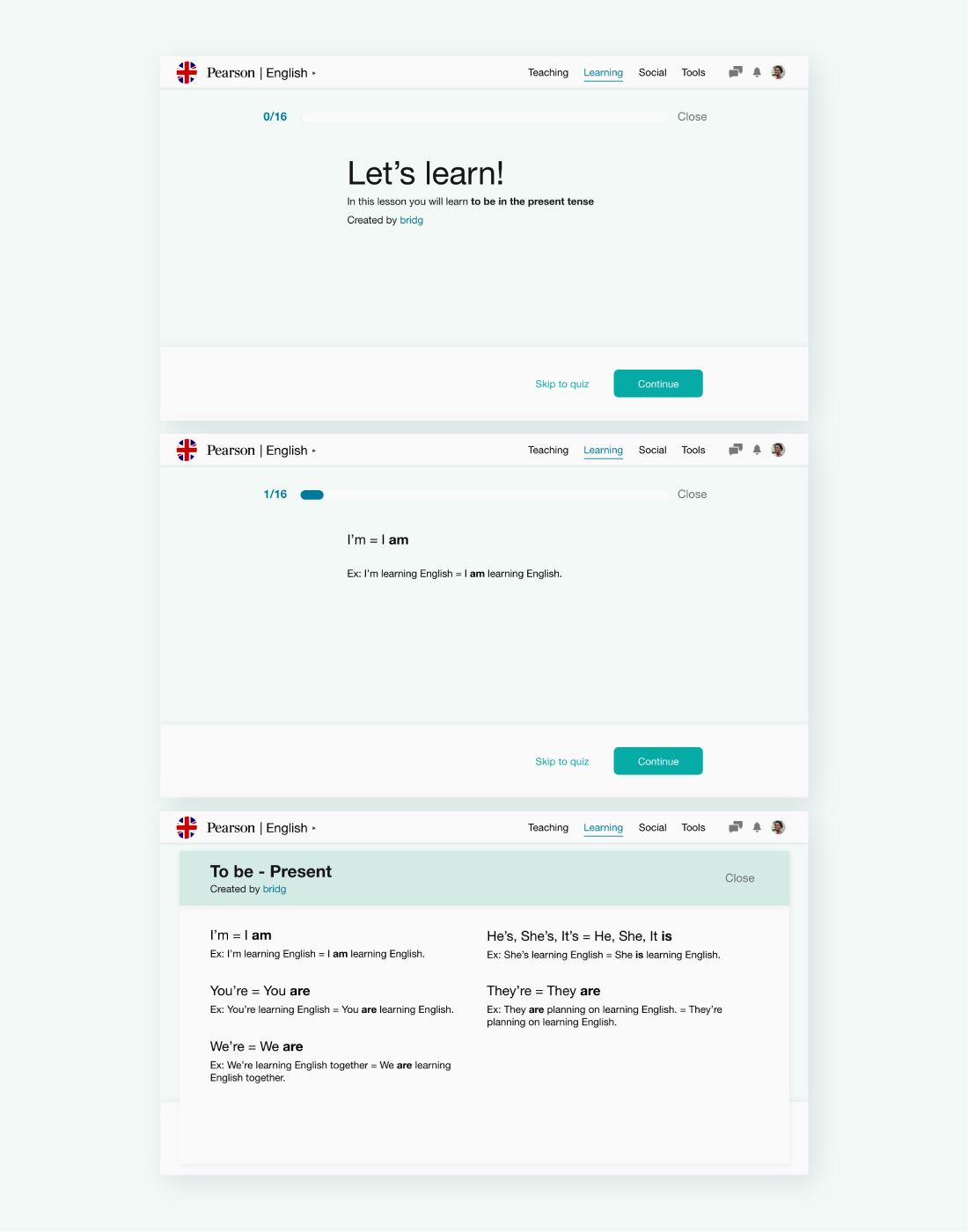
Lessons within the guided dashboard are restructured to be more digestible. Learners are provided with the option to view the entire lesson or skip to the quiz anytime.
Quiz Redesign
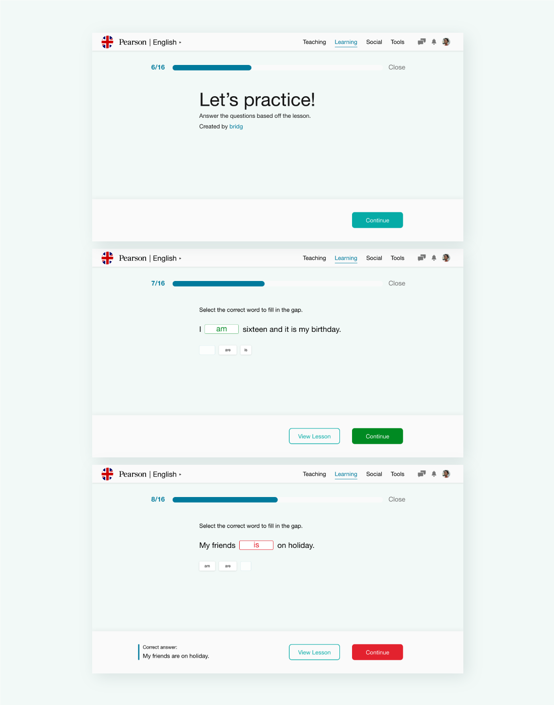
The original quizzes often used drop-down for multiple choice. All the options are now displayed for more straightforward navigation. Learners are provided instant feedback on their answers. The reasoning is provided when the selected answer is incorrect. Closing the test will give the option to save current progress.
Results & Statistics Redesign
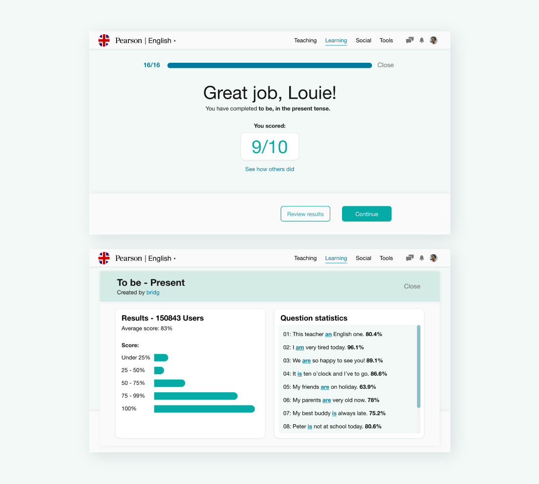
The results page is clean, simplistic and encouraging to ease the learners after completing a lesson and test. Scores are based on the number of questions instead of percentages to provide clarity. Viewing statistics is now optional as some people don't wish to compare themselves to others. Correct answers are now displayed so learners can quickly go over their possible mistakes.
Canadian Craft Brewery Search Aggregator
This project is based on designing a search aggregator website while focusing on search functionality.
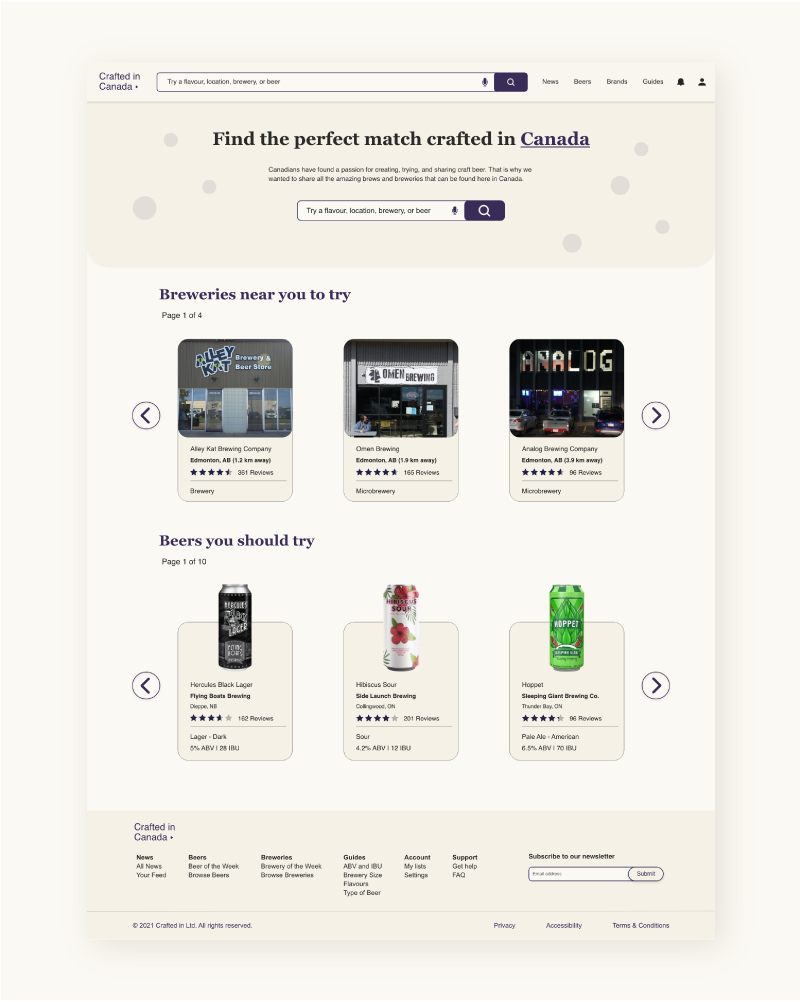
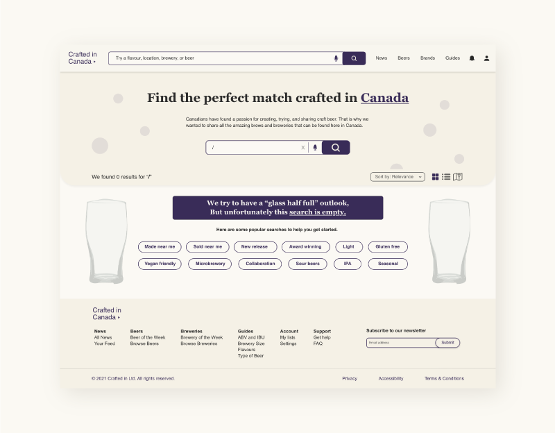
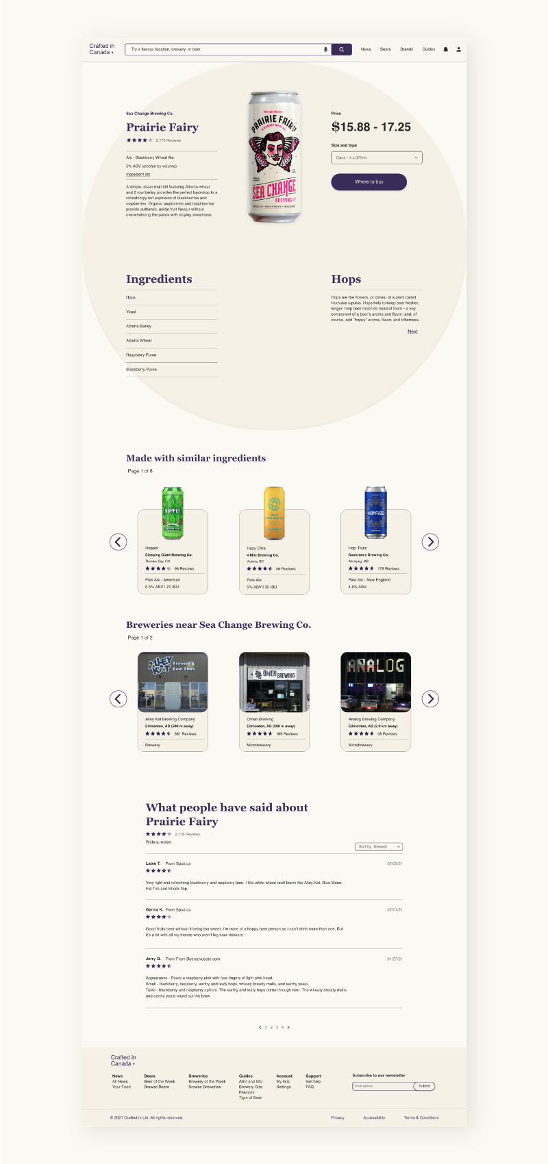
Initially, data sources are found to provide the content of the website. Content models are created to show the sources of each piece of content on a page. Wireframes, mockups and prototypes were made for multiple pages of the website. Pages include the homepage, search results with faceted navigation, sort and filters, no results page and a destination page.
Initially, data sources are found to provide the content of the website. Content models are created to show the sources of each piece of content on a page. Wireframes, mockups and prototypes were made for multiple pages of the website. Pages include the homepage, search results with faceted navigation, sort and filters, no results page and a destination page.
Homepage
Users have the option to create an account to see customized suggestions on the homepage based on their previous searches, preferences and location. The content updates as new products are released, new breweries open, and prior suggestions are tried. Search boxes featuring voice input are displayed in the navigation and the hero. The logo in the navigation acts as a drop-down for selecting other countries' versions of the website.
Search Results (lots)
Users are shown how many total results, breweries and products. Results can be viewed as a grid, list or map. Different options are provided for distance when purchasing and where it is made. Input, slider and a dropdown can be used for selecting distance. Sorting options include relevance, alphabetical order, popularity and distance. Users' pre-made preferences can be applied for quick filtering. Subcategories for types would be displayed after initial selection.
Search Results (none)
A friendly message is displayed to take away from error frustration. Popular searches are shown to help users proceed in their navigation. A hero search box is present to allow for quick changes in the search.
Destination Page
A large image showcases the product while accompanied by a description, the producer, percentage, rating, a drop-down for selecting a size that updates the price, and a button that shows where to purchase. The ingredient list describes what each ingredient is. Products with similar ingredients and nearby breweries are offered as carousels for continued browsing and to save page space. Finally, users can view and add reviews for the product.
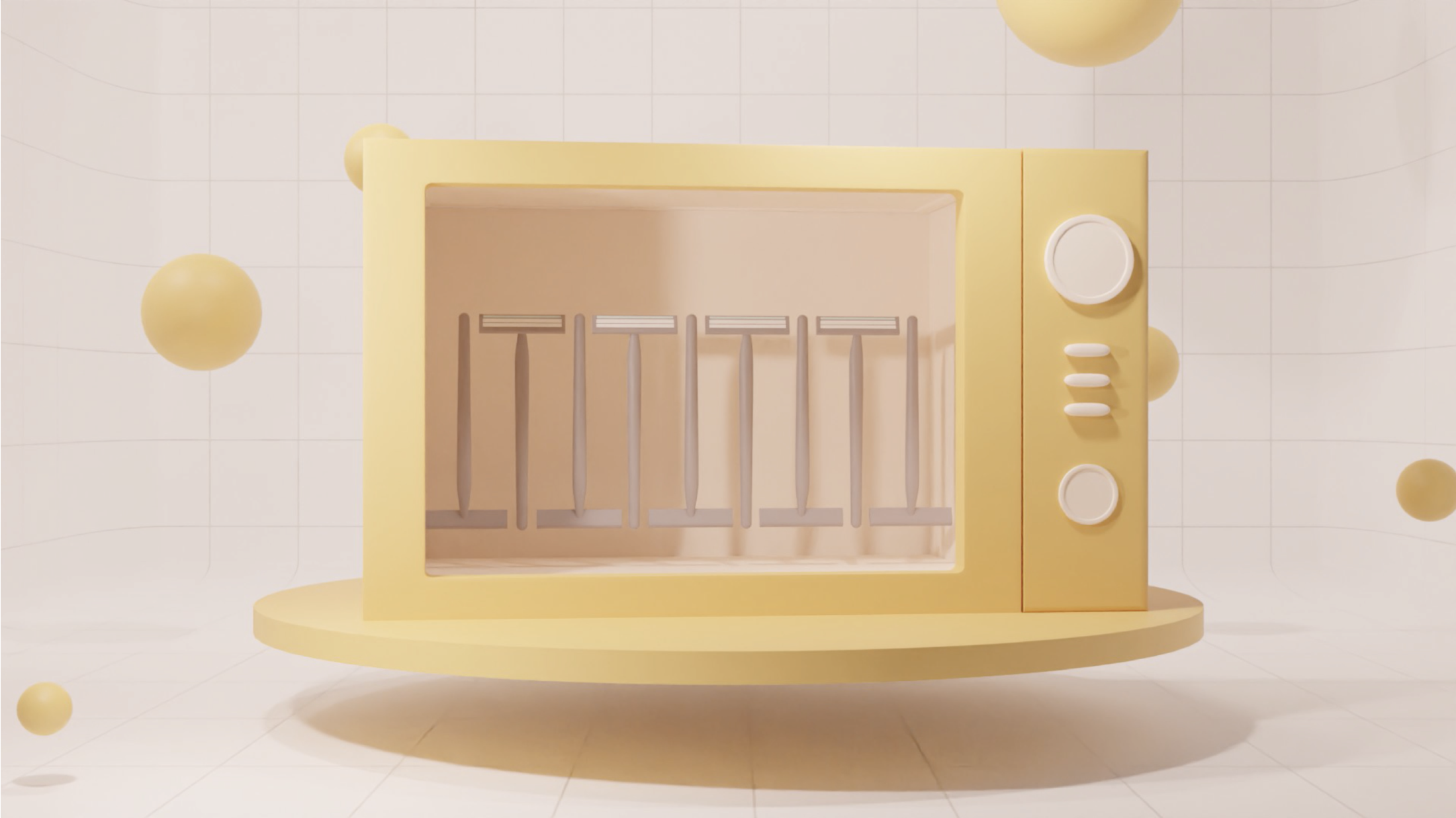
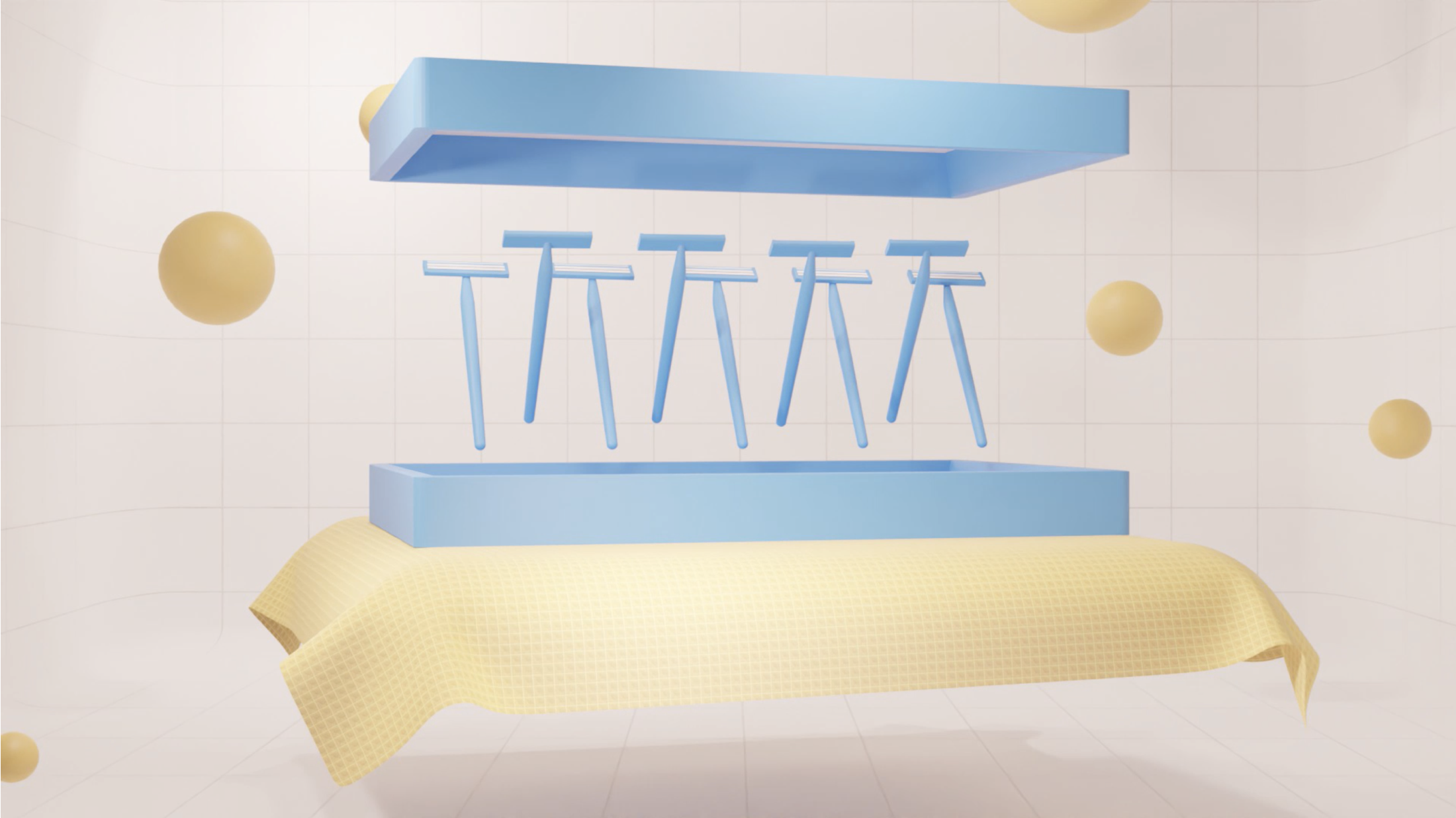
Polystyrene Plastic Recycling 3D Animated Explainer
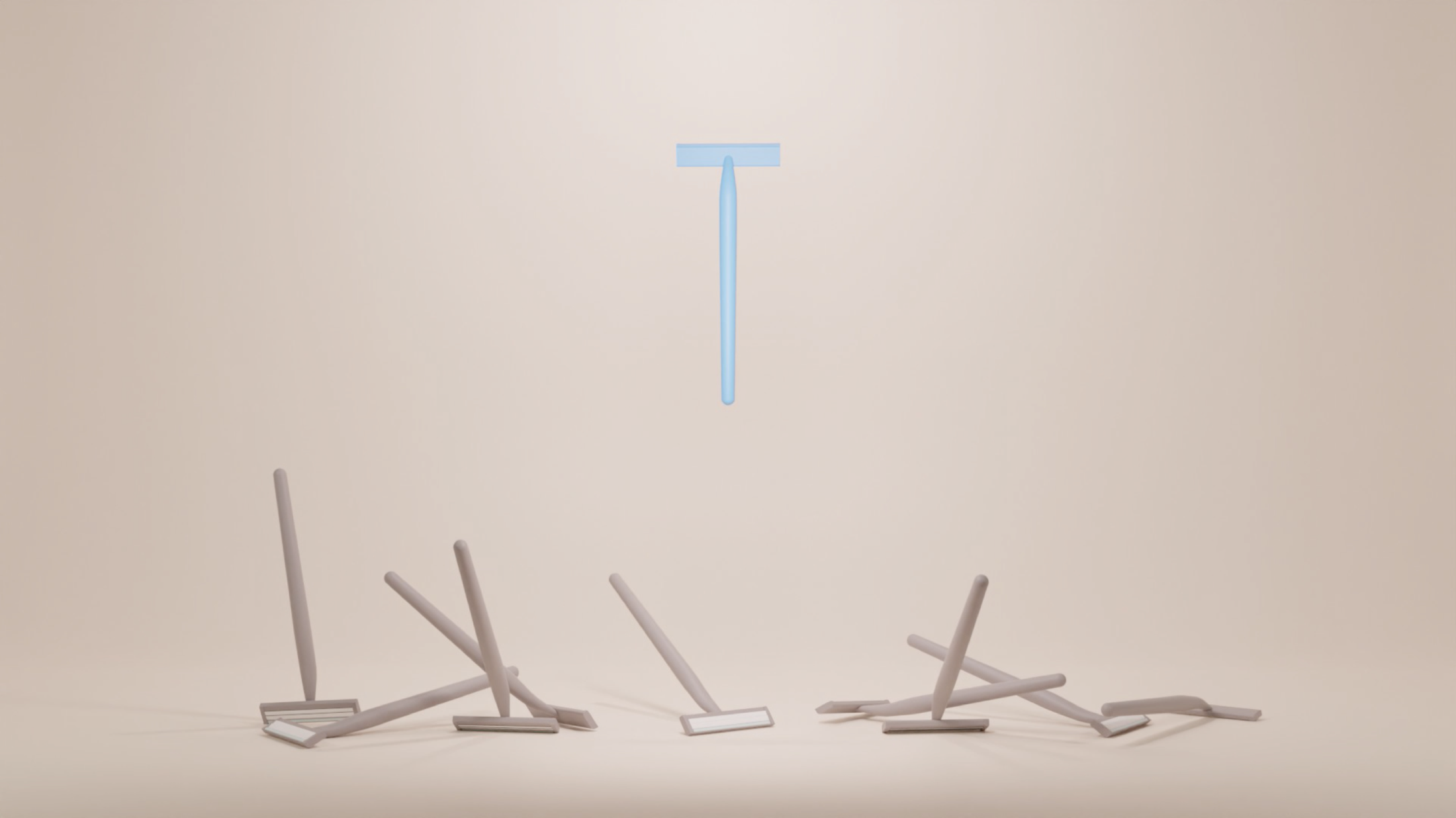
This project focused on creating a 3D animation that communicates a topic to the audience. The chosen topic was pyrolysis for recycling polystyrene plastics. The project deliverables included a script for narration, storyboards, style frames, Blender animation and final video.
Netflix App Feature
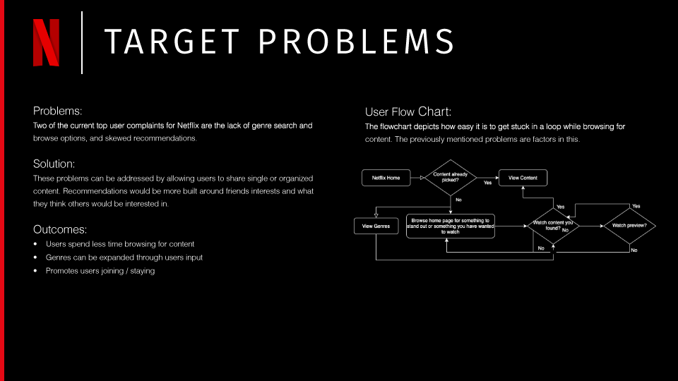
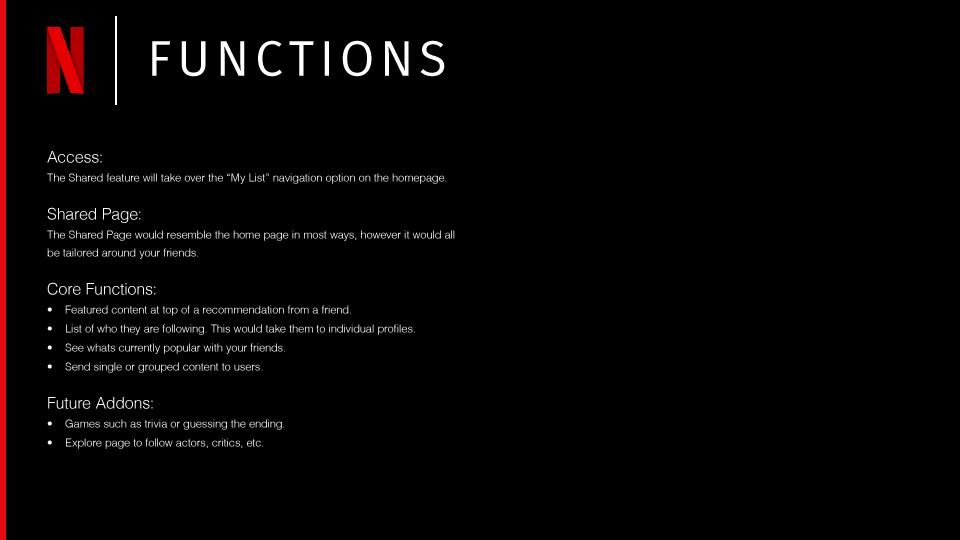
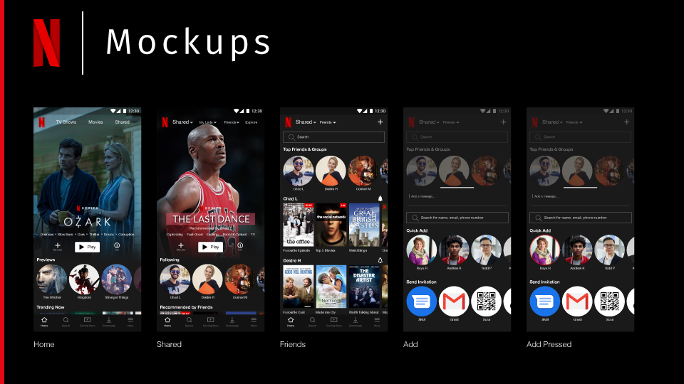
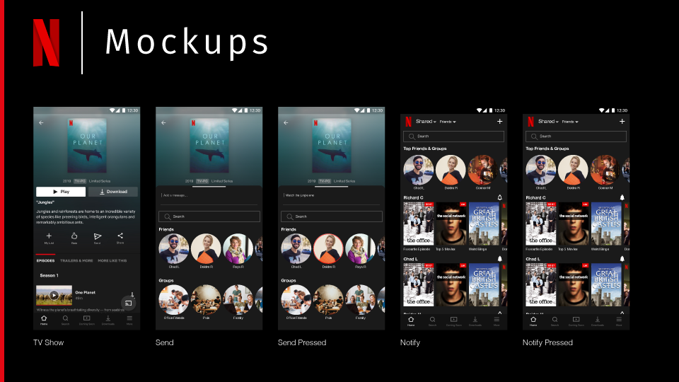
This project focused on finding new solutions to the existing Netflix product. Improvement is centred on enhancing the user experience through a new feature.
Initially, user needs are identified, translated into tasks and turned into design solutions. Two of the top user complaints were lack of genre search and browsing and skewed recommendations. Task flows, wireframes, mockups, and micro-interactions prototypes were created as deliverables.
Initially, user needs are identified, translated into tasks and turned into design solutions. Two of the top user complaints were lack of genre search and browsing and skewed recommendations. Task flows, wireframes, mockups, and micro-interactions prototypes were created as deliverables.


