Emma
Skogstad
Hello! My name is Emma Skogstad. I was born and raised in the Edmonton area and am a passionate and motivated designer. My background in photography is what initially led me to pursue graphic design. What began as an interest in strictly photography blossomed into a passion for all things visual communication design. I find that inspiration is often weaved through many mediums and I believe the most admirable solutions realize links between them. As a young designer, I really look forward to learning different crafts of design to realize these connections in new ways.
Lil Ladies Ice Wine
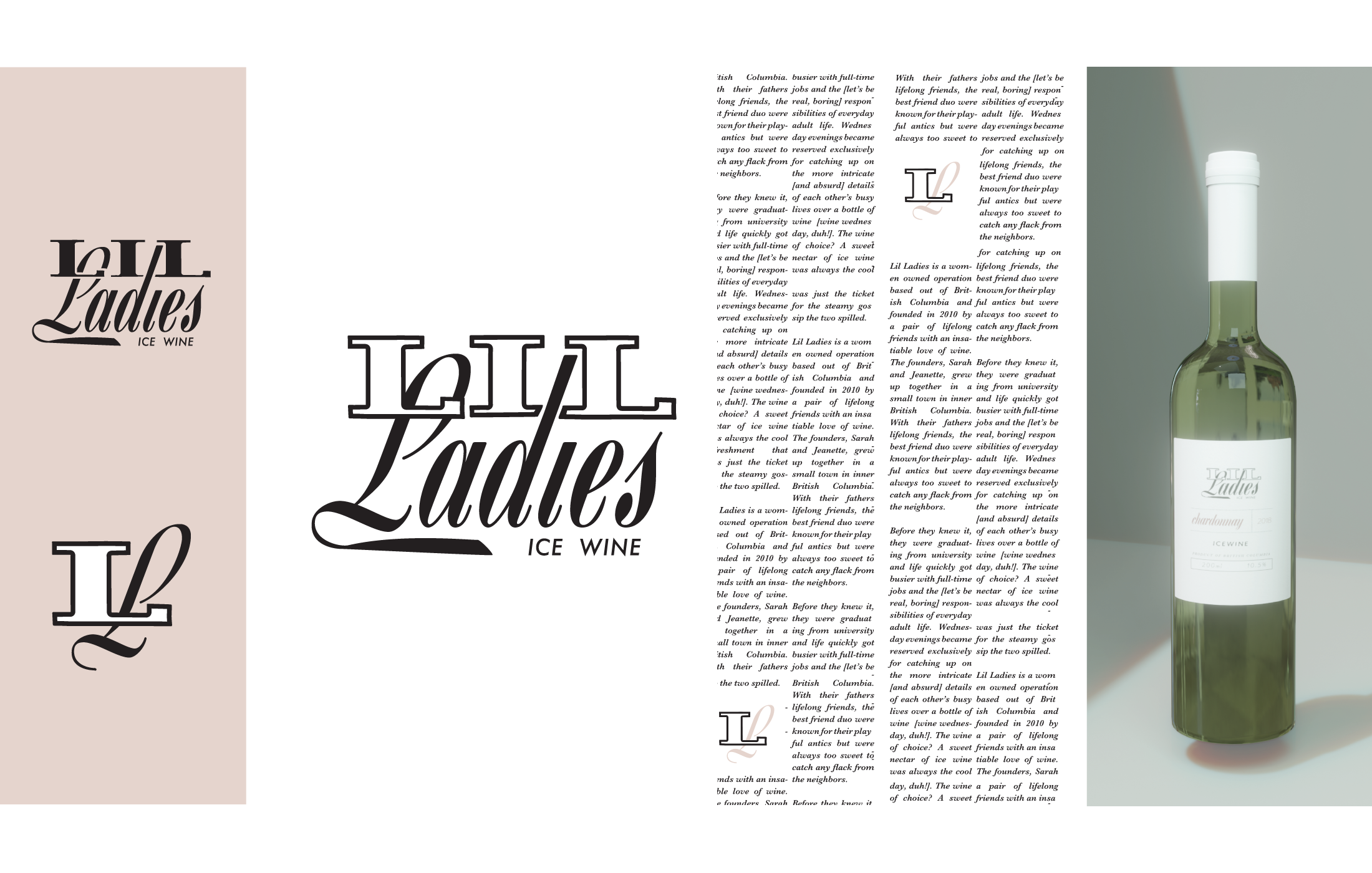
This project challenged me to create a brand offering instant recognition. I focused on creating a cohesive brand with a clear voice, then applied it to a strategic campaign.
I targeted Canadian women 18-30 with an approachable ice wine in order to boost sales of wine with young consumers. The final brand is the perfect combination of classy and sweet, approachable and affordable, but refined enough to appeal to young female consumers.
I targeted Canadian women 18-30 with an approachable ice wine in order to boost sales of wine with young consumers. The final brand is the perfect combination of classy and sweet, approachable and affordable, but refined enough to appeal to young female consumers.
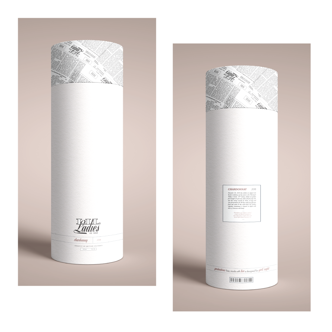
Keeping the packaging simple with mostly clean lines creates an approachable brand. The logo pulls inspiration from the era of crowded busy newspapers, with its heavy serif fonts contrasted with clean lines. Pairing this with a feminine script helps to balance the mark, while typing it back to the target audience. Two thirds of the colour palette focuses on modern pinks, while the last third pulls this back with a deep muted blue.
The tagline of the advertising campaign “We know you're a little extra”, ties this motif into the company’s slogan is “Sweeten up your story”. Overall the ad concept suggest that the viewer may “sweeten up” (ie; make it either more enjoyable or elaborate) their story by including Lil Ladies Ice Wine in their own girls night.
Dynamic Type Specimen
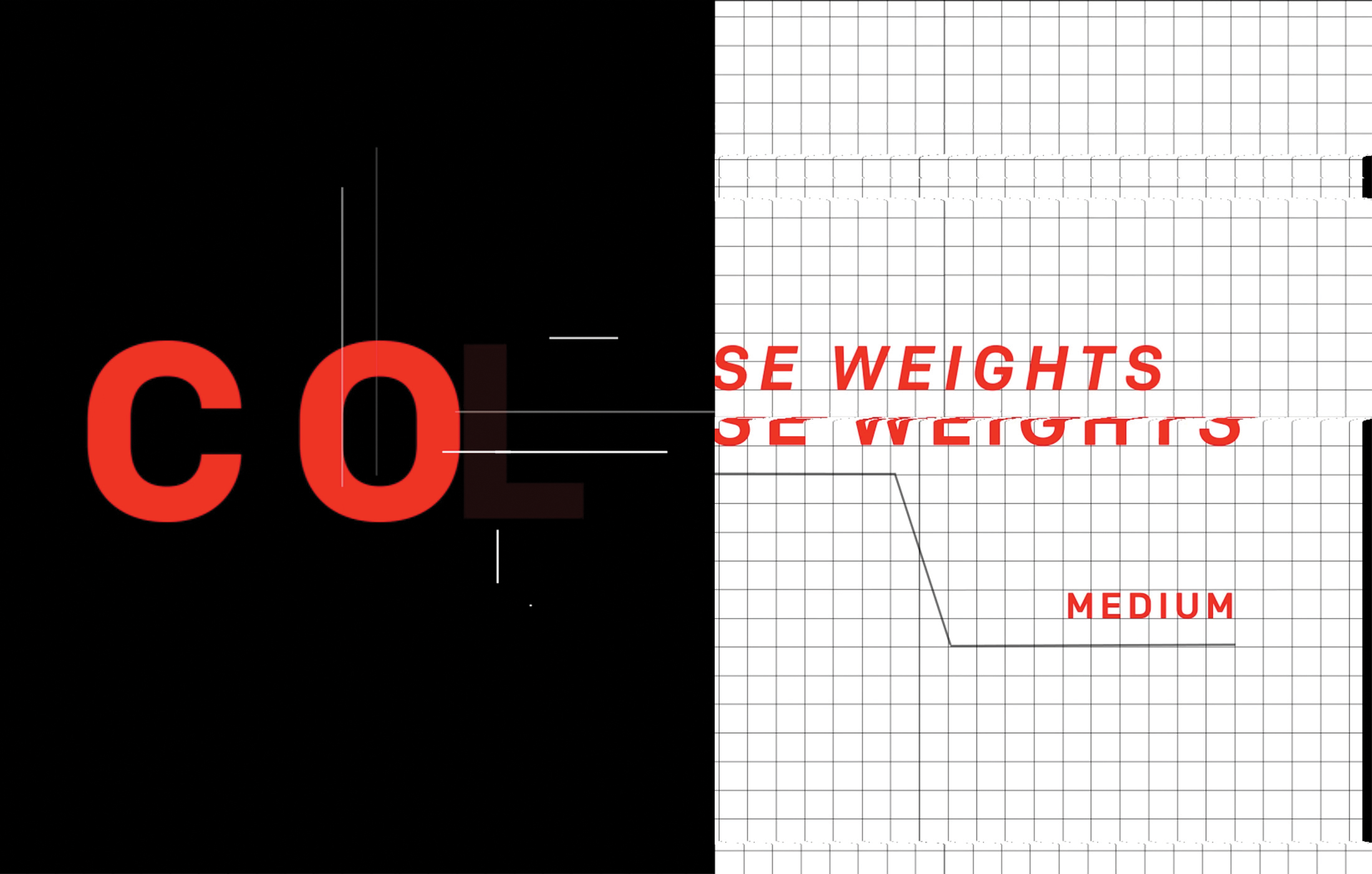
This animation project is an exploration of the typeface Colfax, designed by Eric Olson in 2002, with the intention to create a dynamic type specimen. Type specimens are fascinating documents to me, outlining the framework and form of a family but often used to translate the typeface's character to the designer. By bringing this to motion, I hoped to help strengthen the integrity of the typeface.
The goal was to outline the geometric and linear properties of a versatile san-serif like Colfax. Using consistent elements to assemble each part of the animation alongside a mechanical rhythmic soundtrack helps to reinforce the geometric personality of the typeface. Grids used throughout provide the typography with structure; glitches offer a seamless transition between screens and repeatedly copy types out letter by letter to allow the viewer to preview the entire alphabet in each weight.
Flux
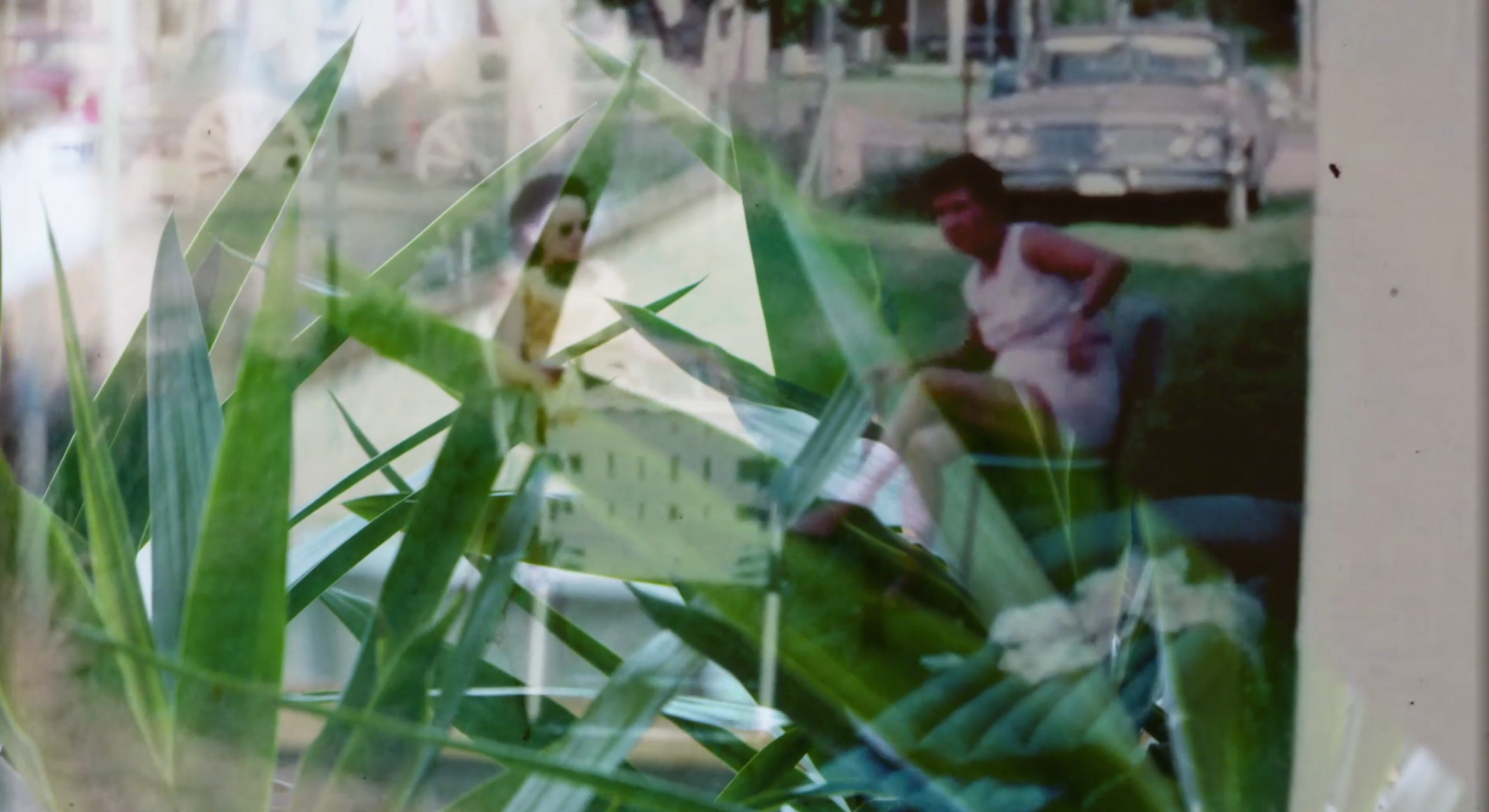
Flux is a short film exploring the connections we build to the spaces which we inhabit and our lives' circumstances that become unintentionally defined by their structure. In a time where we are spending more and more time in our spaces, yet simultaneously more isolated from loved ones than ever, these connections to the space we inhabit will build deep roots in our memories.
The first half is a conversation of man's control over architecture. Sweeping shots of strong, dark structures carve the cityscape, erecting the framework that directs our lives' scenes. The second half of the film layers video of greenery with family movies. This combines thriving life with precious memories to construct the emotion and memories which synthesize the spaces we live in our minds to become much more than the sum of their parts.


