
Carolina
Odashima
I am Carolina Tiemi Odashima (aka Chi). Having always been drawn to creating, Art and Design are my life-long passions. After graduating with a Bachelor of Visual Arts, I started working in graphic design and apps and games development. These work experiences led me to pursue a Design education at MacEwan. As an art enthusiast, I find inspiration in traditional and contemporary art to create eye-catching visuals and compelling designs. I aim to create purposeful and well-tailored solutions that help people's lives. Over the pandemic, I found joy in reorganizing my home so that humans and cats could coexist peacefully.
Branding: Immunization Awareness Organization
This project consisted in developing a made-up NGO focused on a current global social justice issue, which included the name, tagline, and branding.“Vaccinfo” is an organization that aims to raise awareness about vaccination and immunization, and debunk myths to reduce vaccine hesitancy. The name "Vaccinfo" is straightforward and memorable, making it accessible and inclusive. The tagline, “Don’t be Immune to Facts,” refers to the unwillingness to accept information, and serves as a call-to-action.
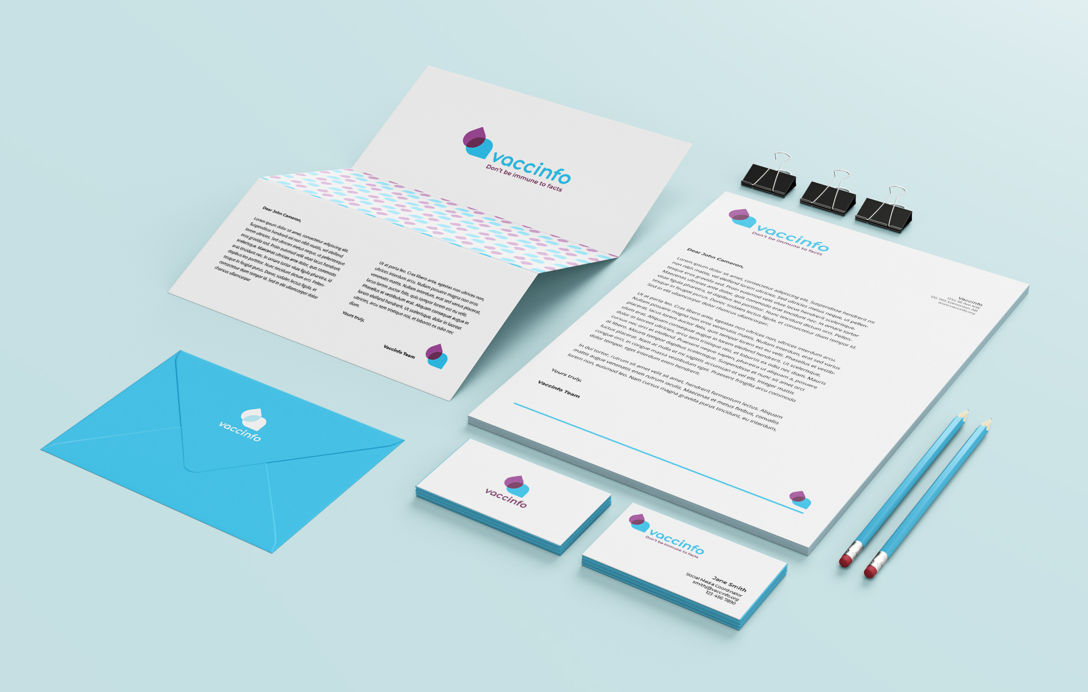
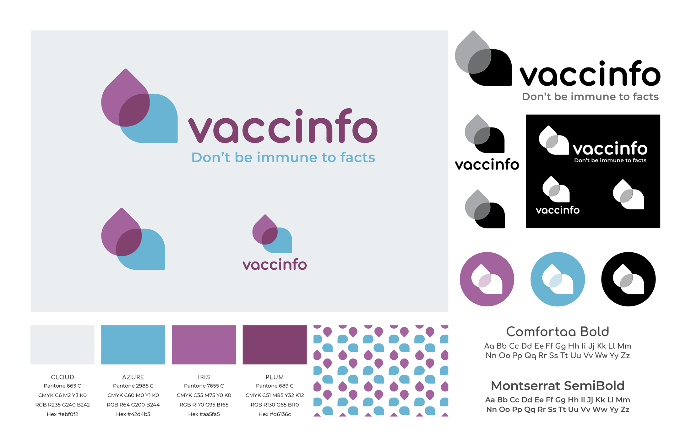
Branding elements: this concept utilizes the speech bubble as an allusion to information, communication, and education. Whereas the drop signifies immunization, which is implied by the organization’s name, “Vaccinfo.” The branding is welcoming and fun, to appeal to a large audience and invite people to get involved.
Brochure Design: ConnectEdmonton Annual Report
This project is a brochure design for the ConnectEdmonton Annual Report. The graphic elements chosen are bold and solid, and convey trust and strength. The numbers in the cover were blown out to the point of almost abstraction. They look like continuous lines, giving the idea of development and movement. The colour yellow transmits optimism, creativity and excitement, appealing to those who are hoping for a brighter future for the city of Edmonton.
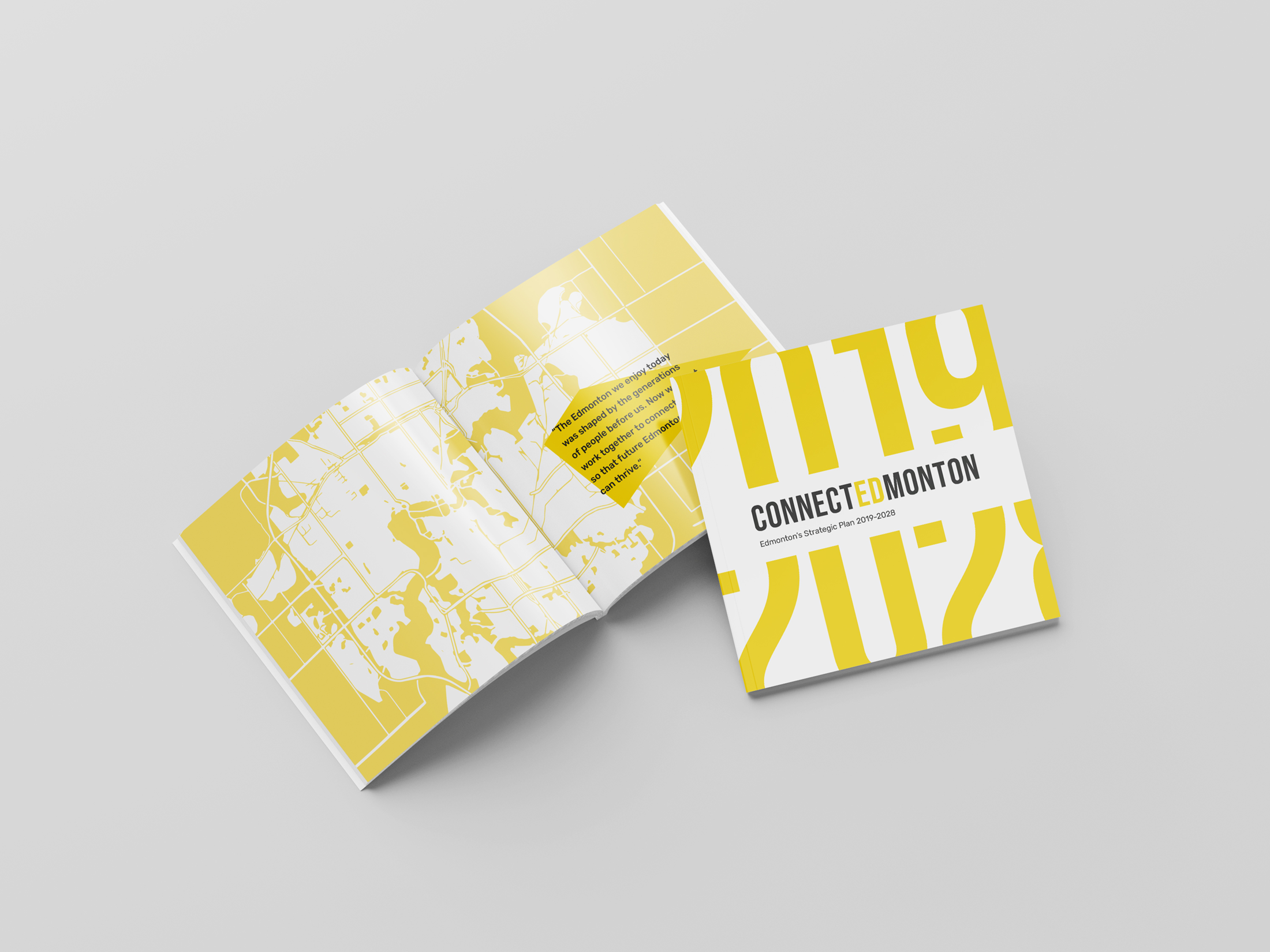
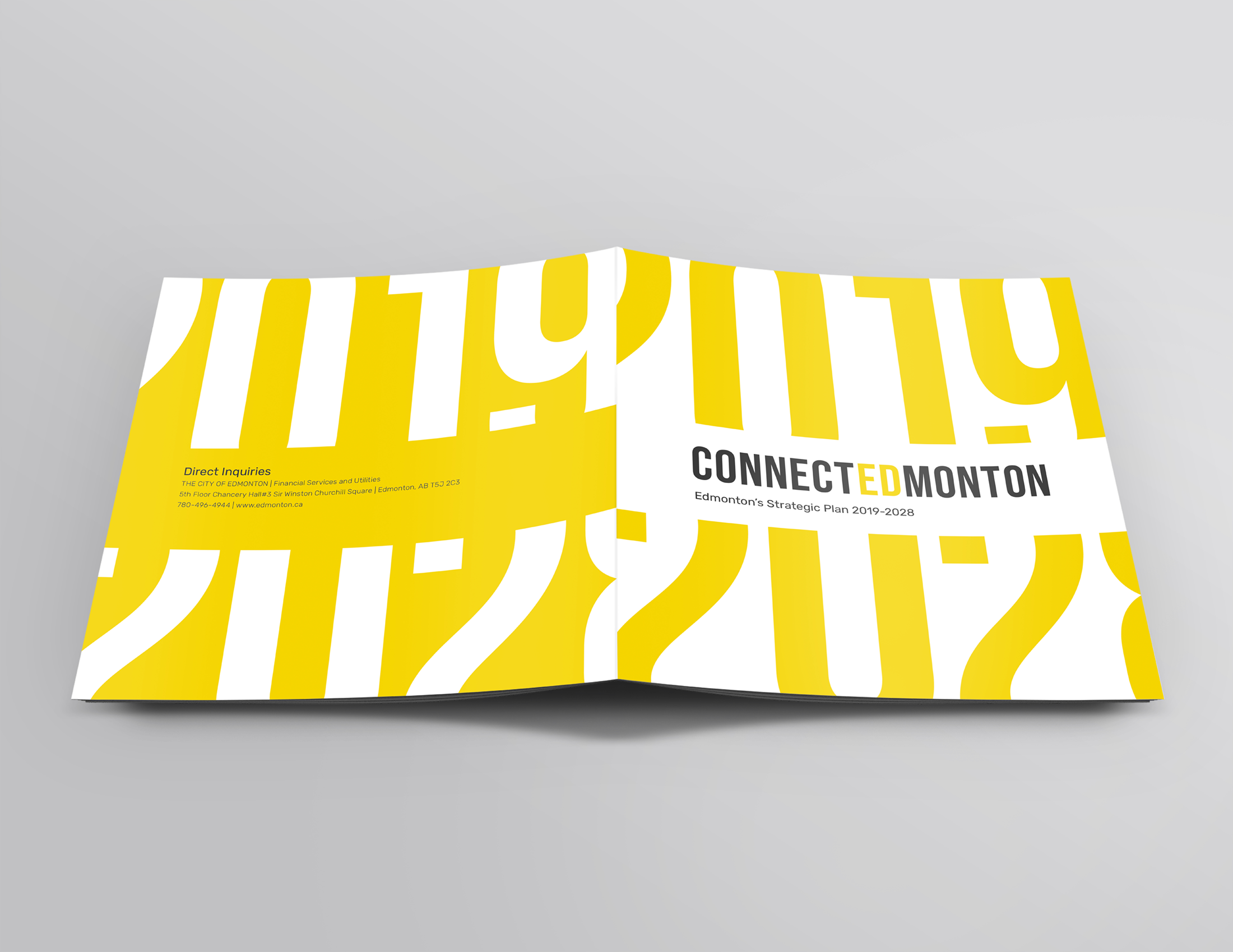
Brochure's front and back cover: the illustrations of both sides are connected, which gives the whole design continuity and flow.
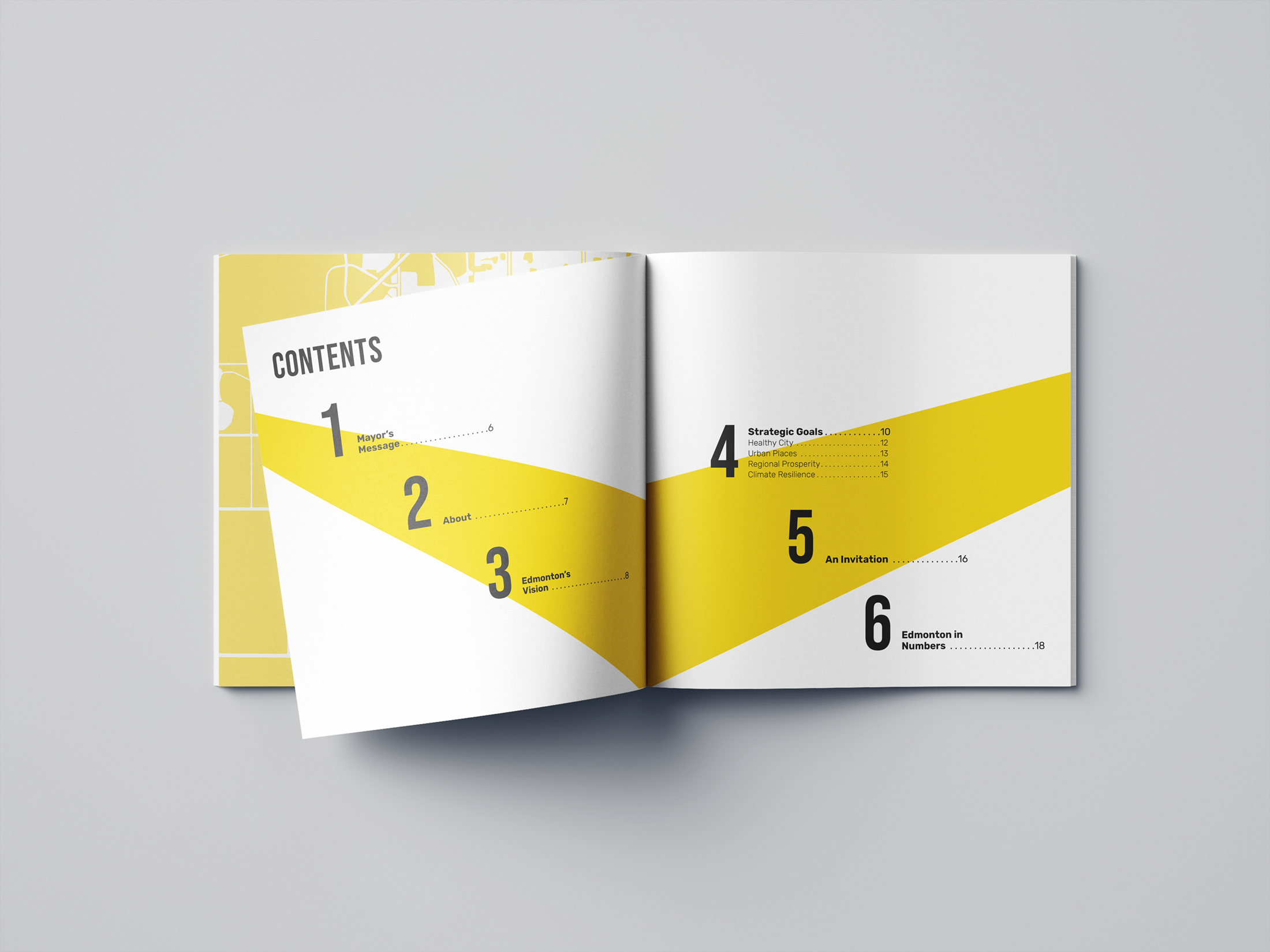
Table of content: the geometric shapes are bold and dynamic, which is aligned with the ideas in the city's plan described in the report.
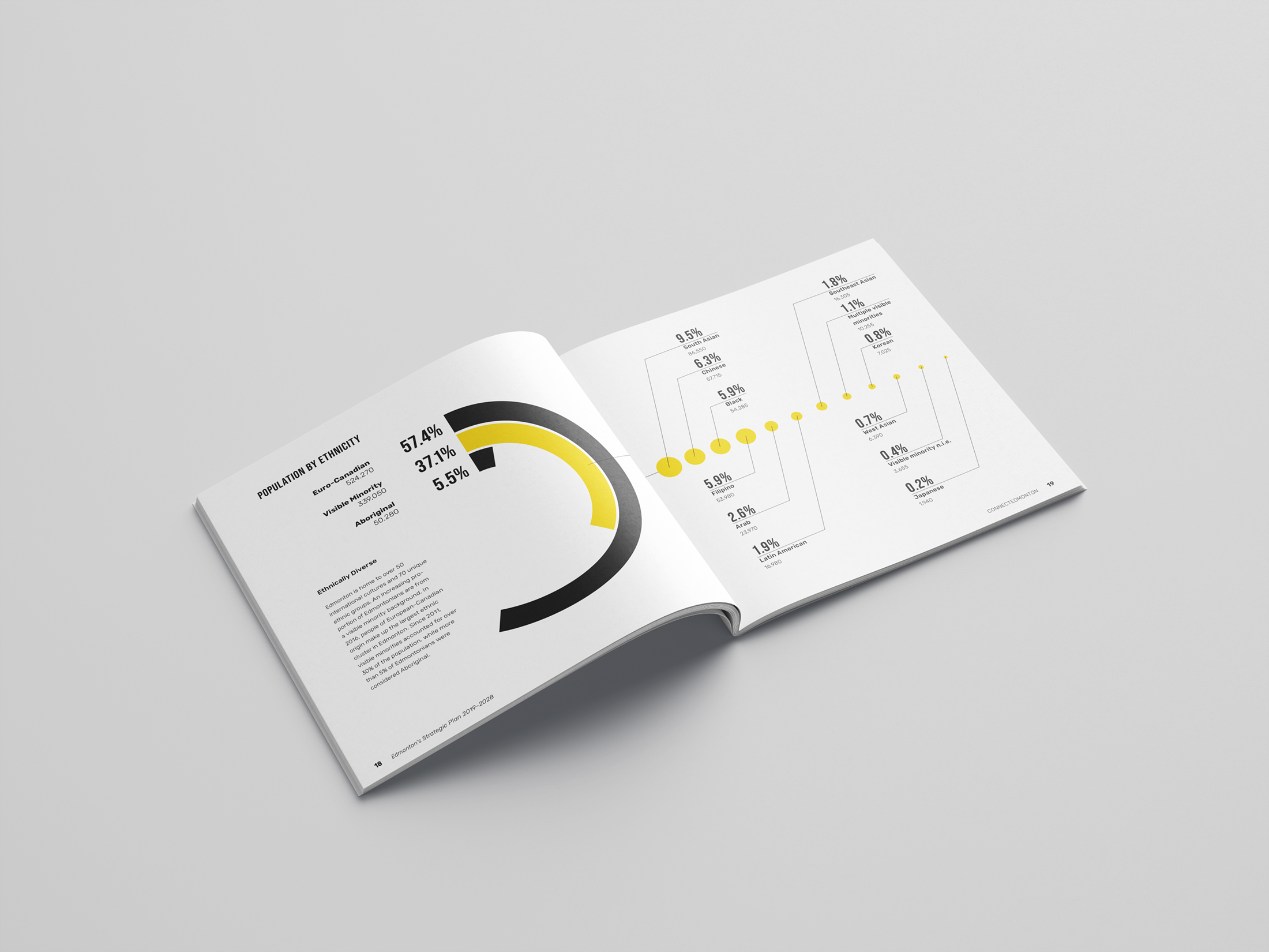
Information design: graphs are clean and easy to read.
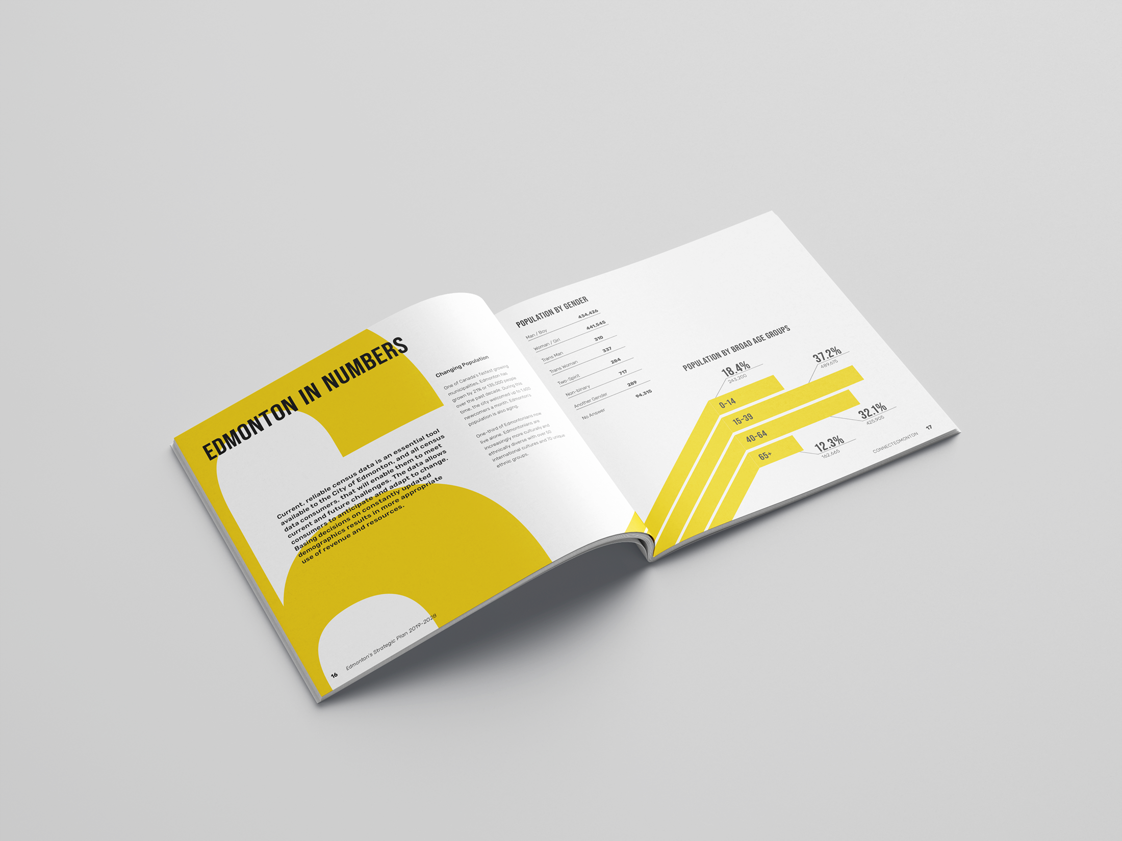
Information design: the bold shapes are cohesive to the system but also make information more dynamic and engaging.
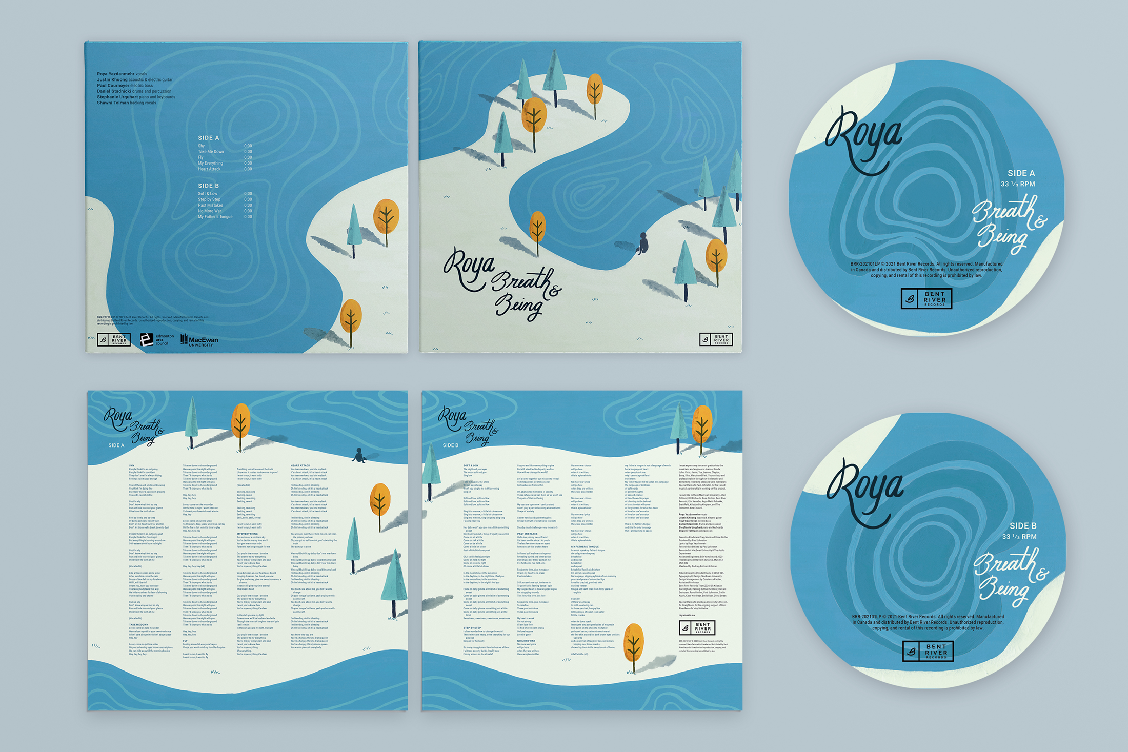
Vinyl Record Design: Roya's Breath & Being
This project was developed for Roya’s debut album “Breath & Being”. It has a casual and intimate aesthetic that denotes playfulness. The Illustrations were hand painted, and the album title and artist’s name were handwritten to allude to self-expression and spontaneity. Elements like brush strokes, layers of colours, and gestural imprints reinforce the idea of a “personal mark.” Ripples in the water are dynamic and fluid, acting as visual representations of melody and harmony.
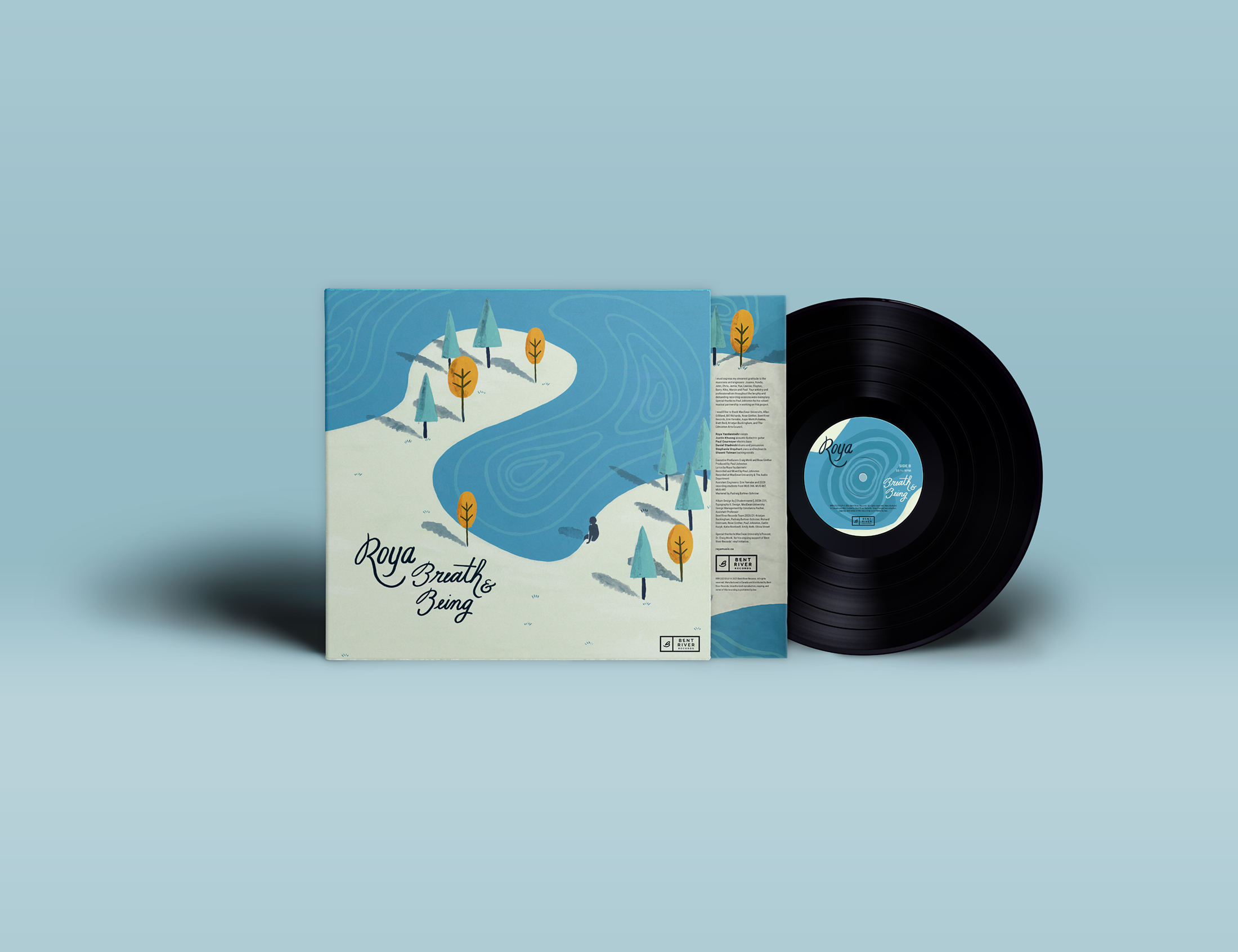
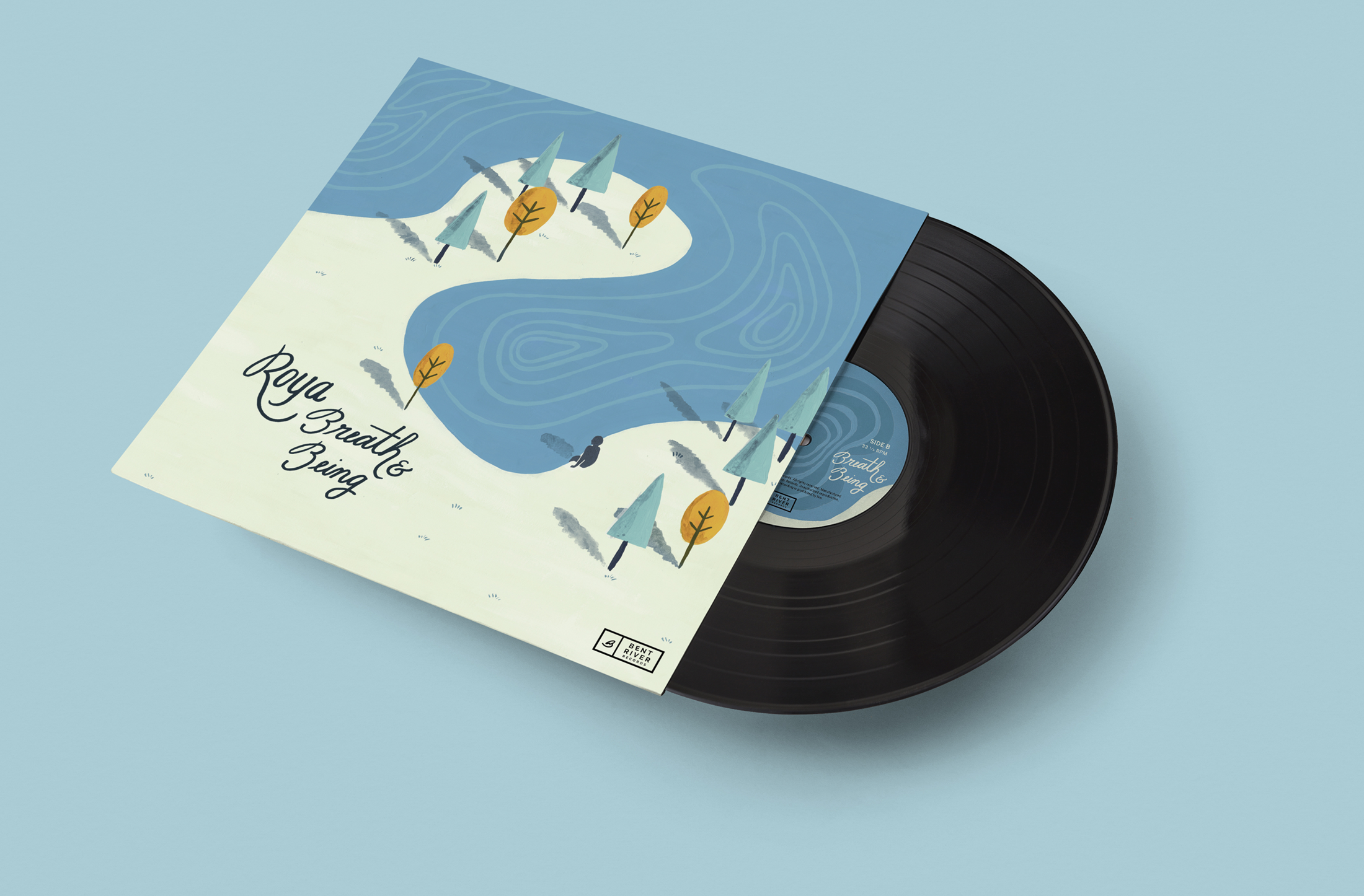
The packaging design includes the front and back designs of the jacket, the vinyl labels for sides A and B, and the insert that displays the lyrics and technical information.
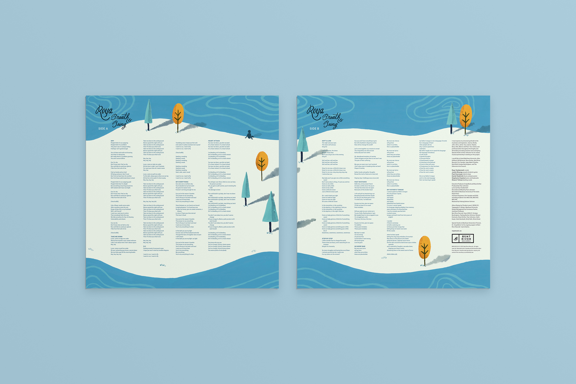
The whole system is cohesive: all visual elements are present throughout the pieces. Both jacket and insert have a continuous illustration front and back, making it fluid and purposeful.
The listener is carried on a journey while listening to Roya's album and reading the lyrics.
App Redesign: Edmonton Public Library
This app redesign aimed to provide an uncomplicated and fun experience at EPL's app. The visual style conveys excitement and boldness. The bright colour palette derives from EPL's logotype and library cards. The app promotes user engagement as well as it portrays EPL in an uplifting and modern way. The main target for this visual approach would be a young adult audience, who constitutes the age group that reads the most.
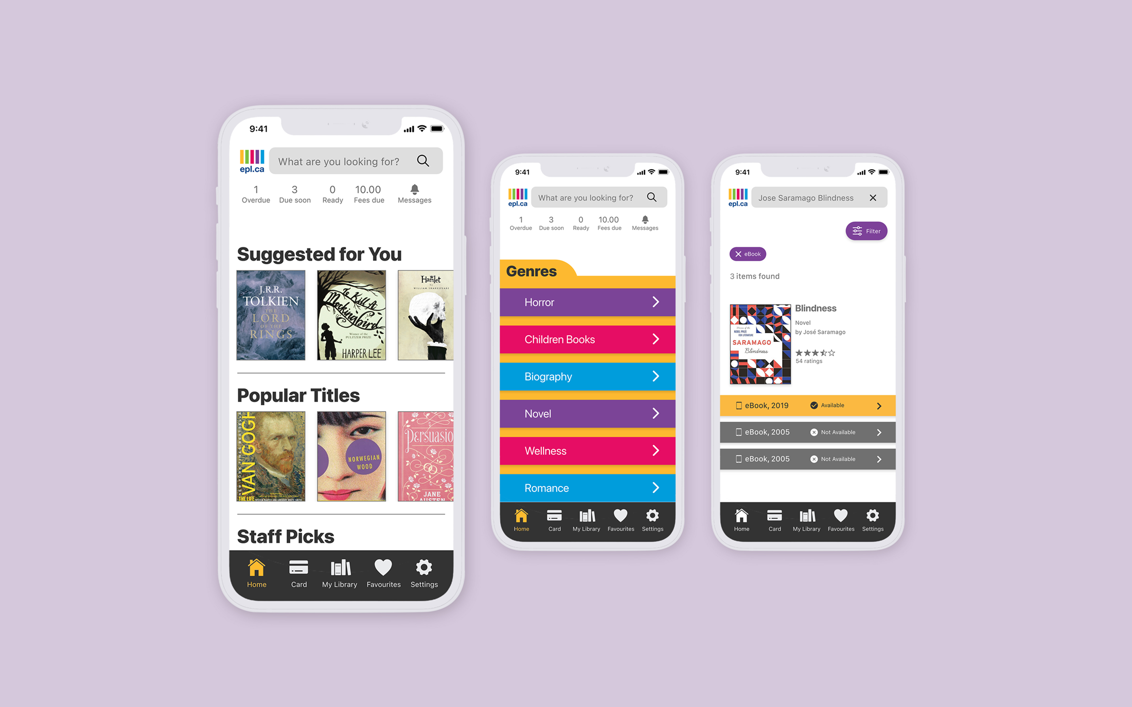
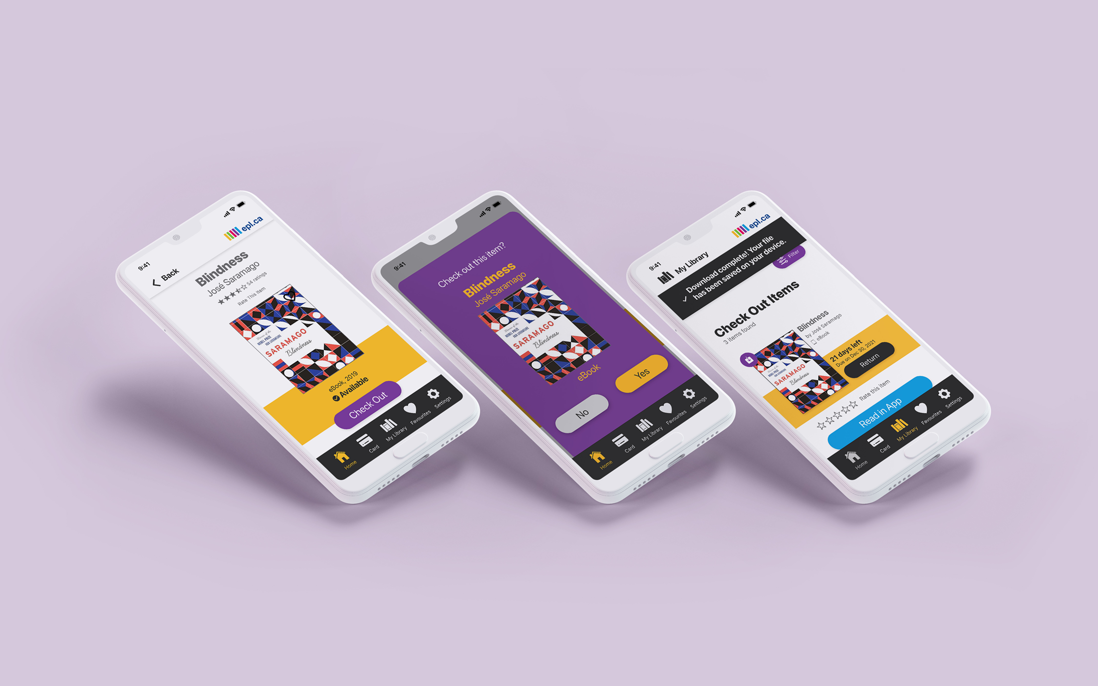
Checking out an item at the redesigned EPL's app is a smooth process that requires less clicks than its original version. In this project, the main focus was checking out an ebook and downloading it.