Brett
Johnson
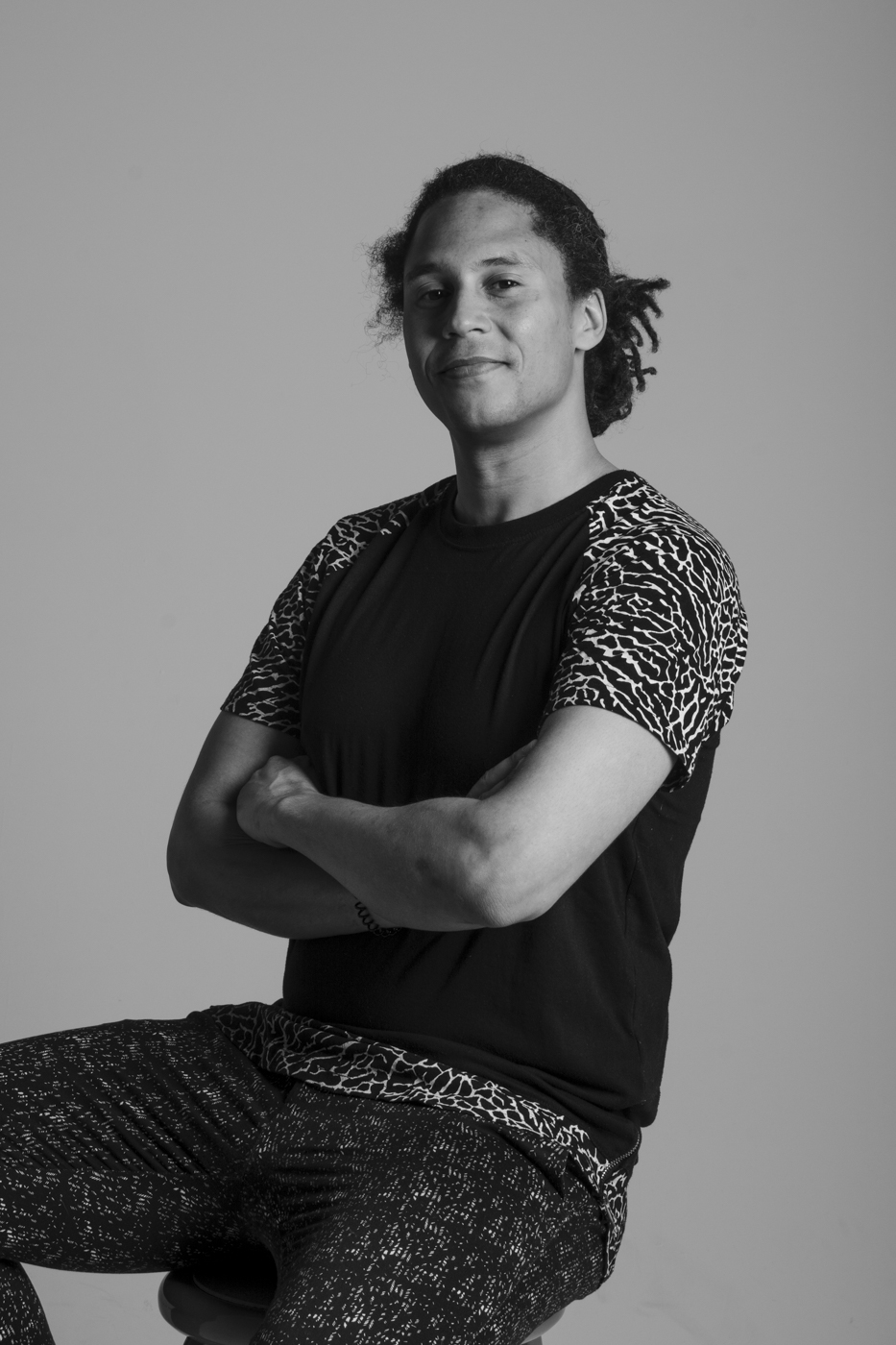
My name is Brett Johnson and I am in my final year of my Bachelor of Design Program at MacEwan University. My previous careers in the hospitality and oil industries honed my creativity and love for problem-solving, which led to my interest in design. Through my degree, I discovered a passion for research and analyzing systems, which inspired me to focus on environmental and UX design. My goal is to pursue a career as a UX designer. Over the pandemic, I worked on improving my personal health, small personal UI projects, and pasta making skills.
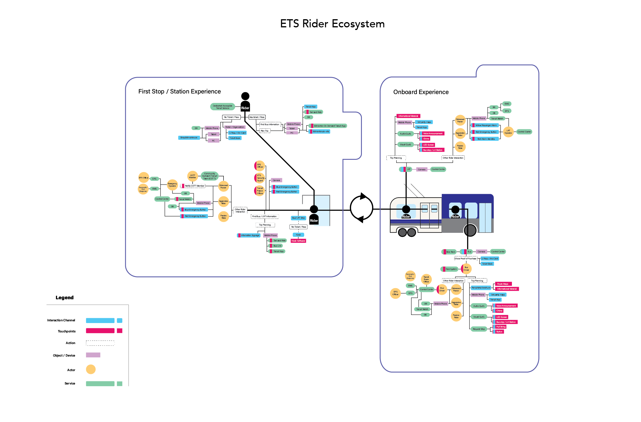
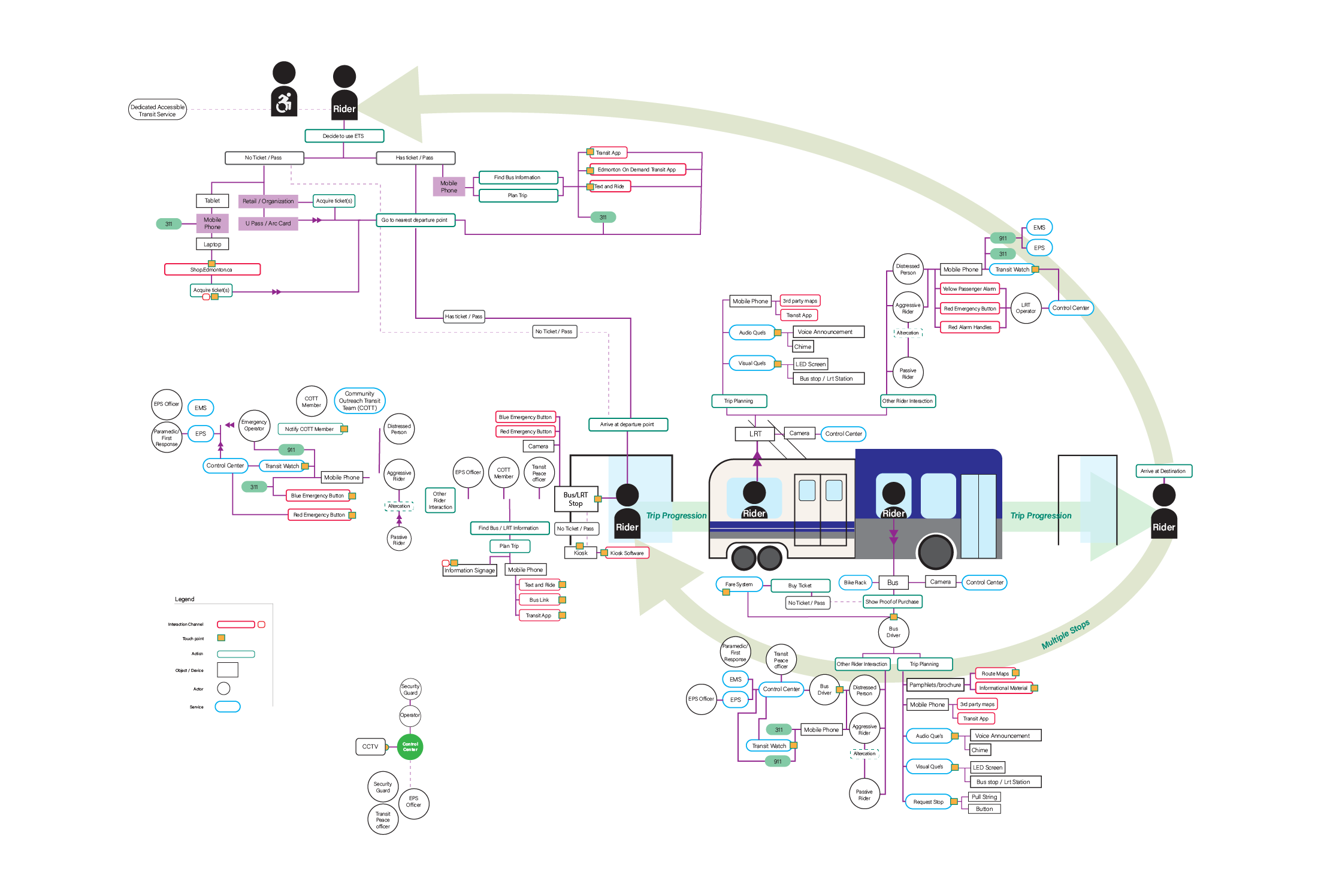
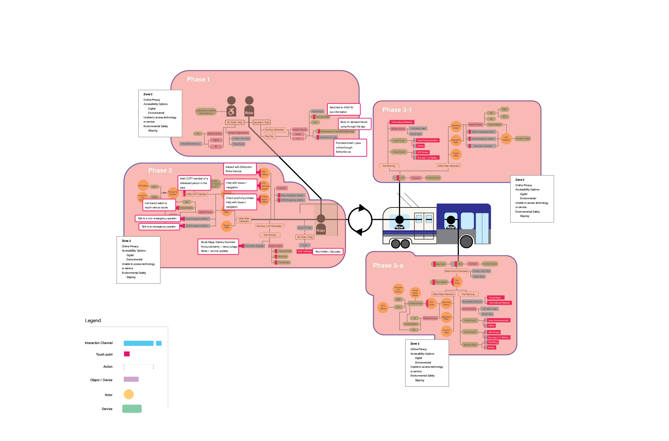
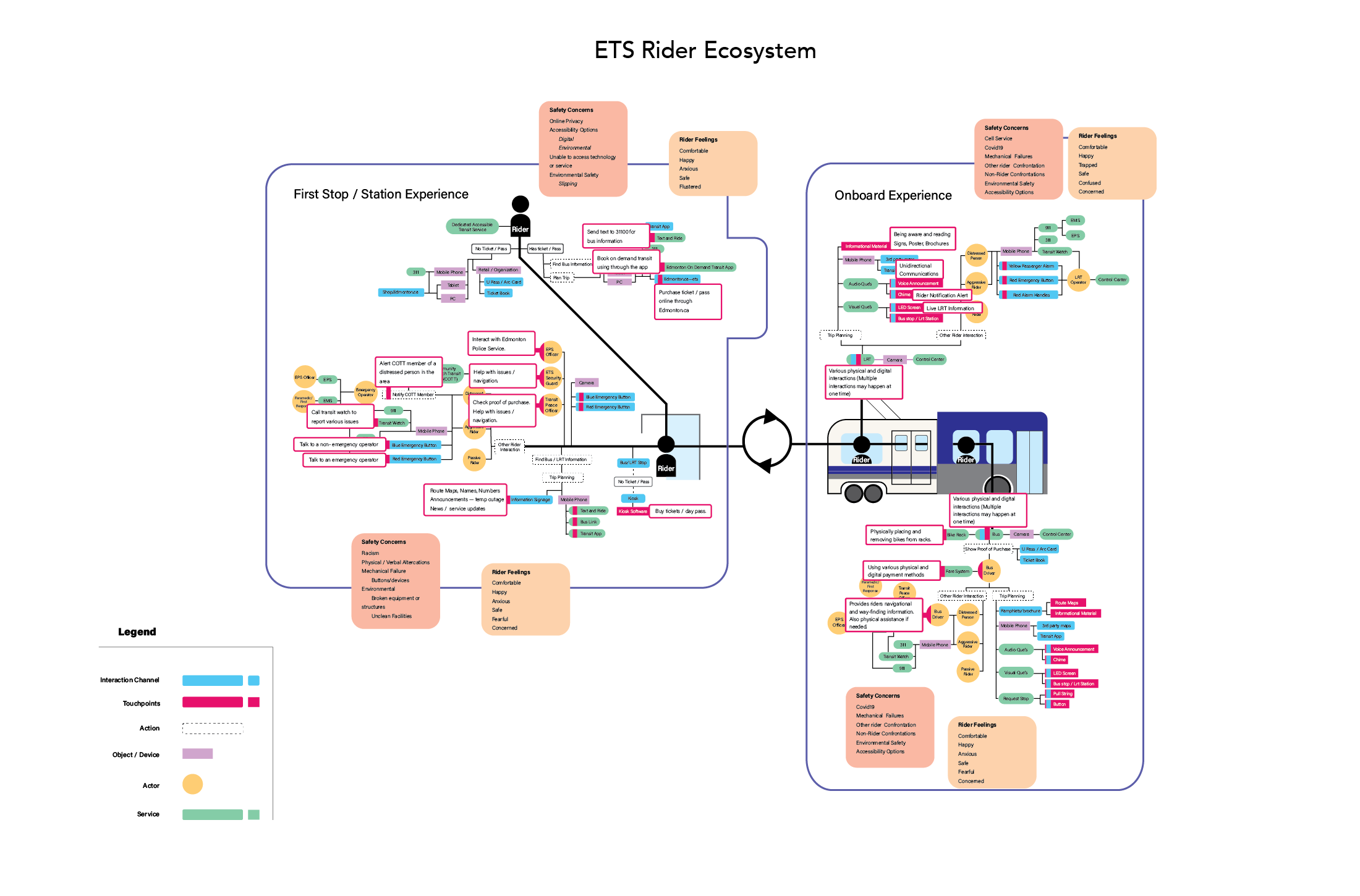
ETS Ecosystem Map
This project challenged me to create an ecosystem map of the current Edmonton Transit System, focusing on rider safety and security based on our research and information provided by the ETS. The goal for my project was to create an easy-to-read and flexibility in the granularity of information shown to the reader.
Link to interactive map https://xd.adobe.com/view/cfed8894-043e-4e48-afd0-4b50179b4e02-9abe/?fullscreen
Link to interactive map https://xd.adobe.com/view/cfed8894-043e-4e48-afd0-4b50179b4e02-9abe/?fullscreen
The final version of the design meets my goals of creating a highly flexible and easy-to-read ETS ecosystem map. The map incorporates both phases identified by the ETS journey map and can become increasingly granular when using the overlays. Illustrations help provide a visual reference of the various microsystems within the ecosystem, making it easier to identify the potential relationships within the ecosystem
Since the rider is the focus of the ecosystem, my first design took elements of a user flow and user journey to create the ecosystem. To increase the readability and granularity of information on the map, I used illustrations and overlays. My goal was to have an easily updatable map while also allowing the user to pick the level of granularity.
As the design progressed, the information heterarchy was refined along with the structural foundation of the map. This version also shows both the touchpoint and safety overlays.
Album Cover Photo Essay
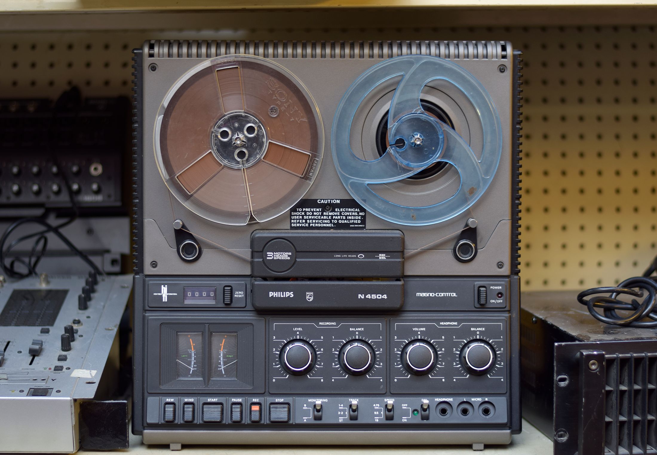
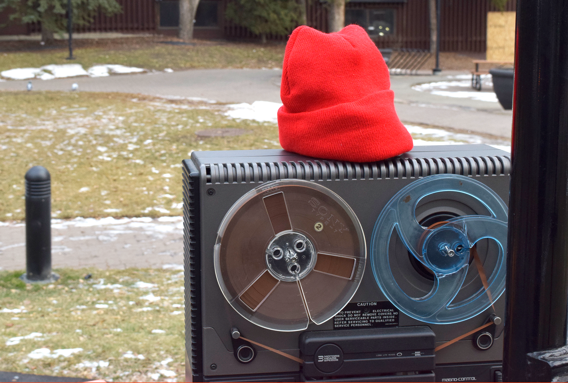
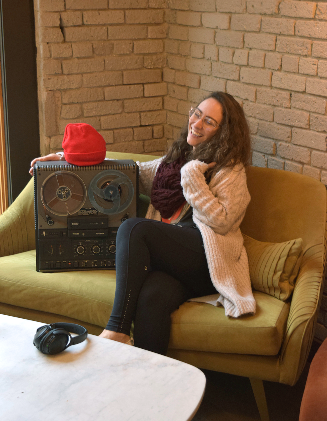
Taken initially for an album cover, this photo essay presents a day in the life of Frank, who represents the lead singer and songwriter of the band, as their life was the inspiration for the album. Frank is a direct representation of the songwriter's methodology for creating music. Recording and later playing back meaningful memories of the days past to make music.
At Home AR Dashboard
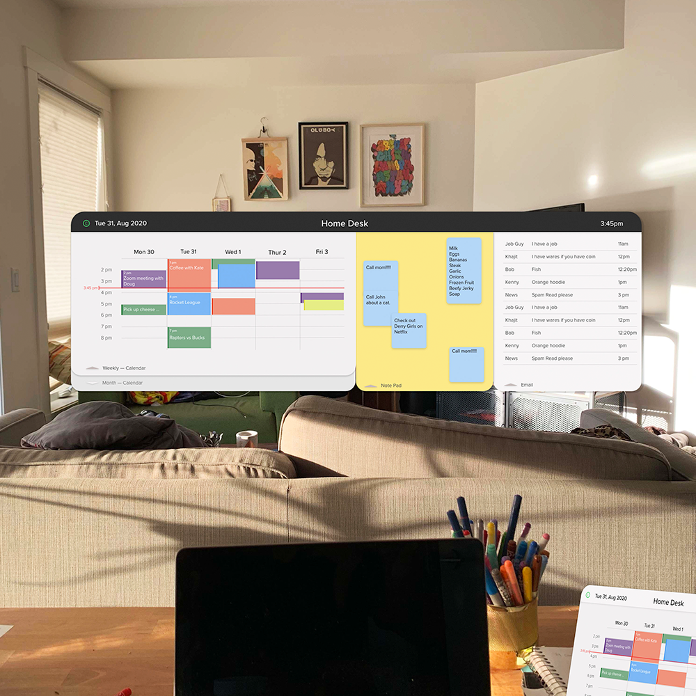
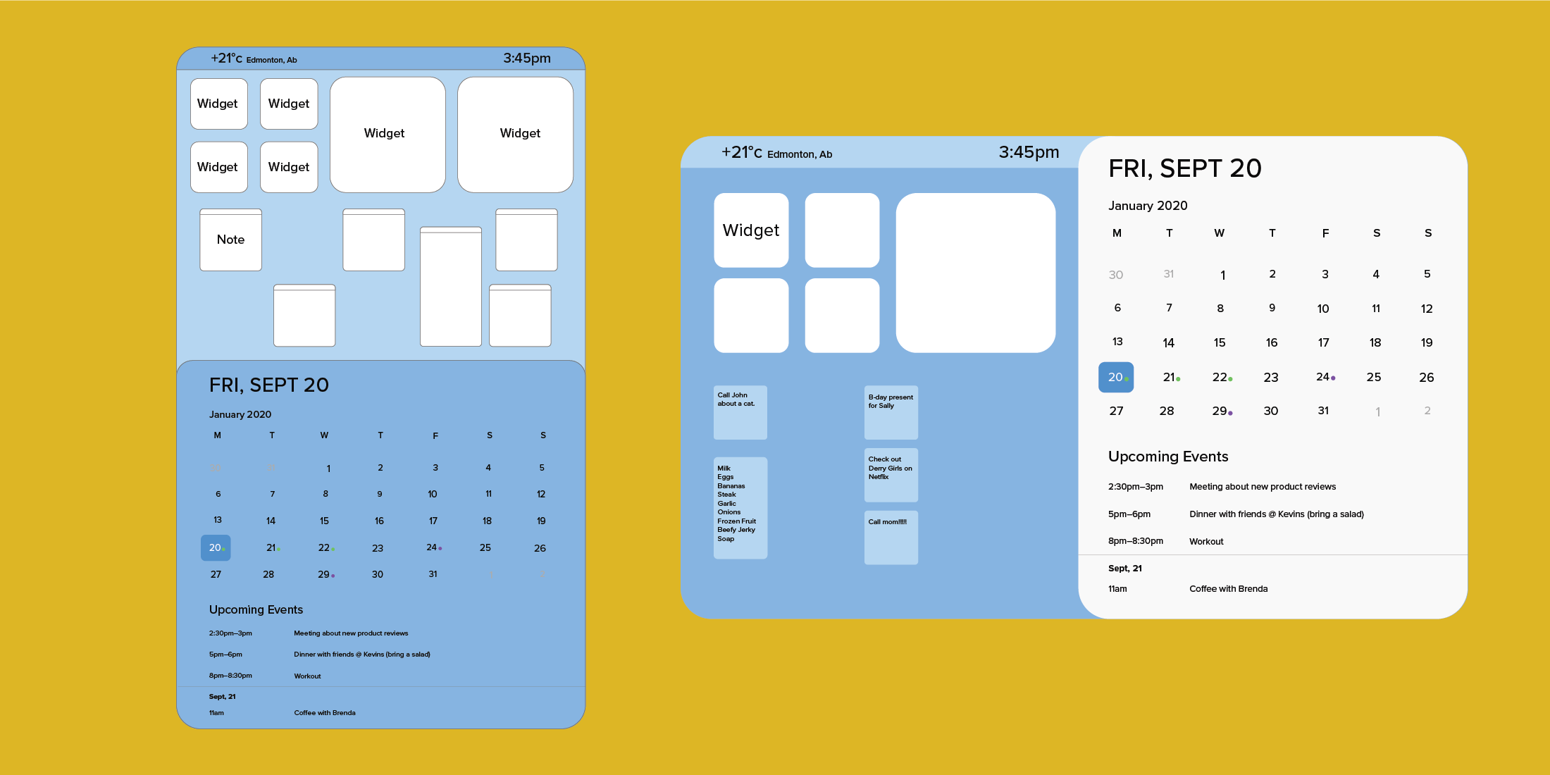
This project challenged me to create an AR design that would improve the user's productivity thorugh organizational tools. The concept for my design was to incorporate simple administrative tools, such as a calendar, email, and note pad into a system that would easily be placed around the home and office—providing extra organizational materials without adding to the physical space to increase productivity.
This AR application is marker-based, which allows the user to place customizable markers around their home and office, which then can be synced to the specific organizational tools. The reduction of clicks to perform major tasks is fundamental to UX design; my design takes this concept and applies it to reduce the amount of screen switching the user needs to complete tasks.
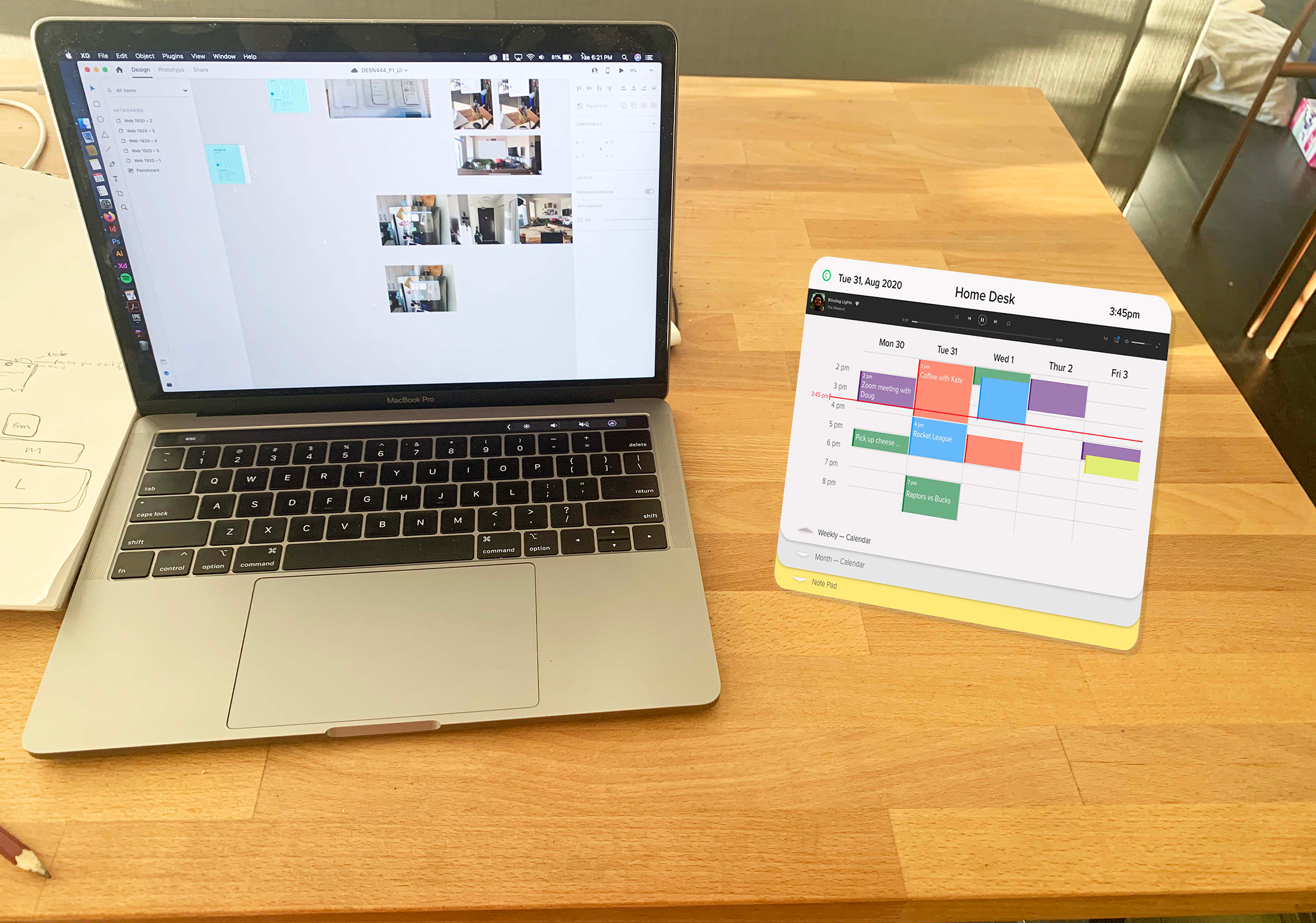
Early mockup of the design. It is meant to be placed beside the computer to access the user's calendar and other organizational tools easily.
Product Video
Allard Hall Wayfinding Redesign
This project had a team of designers redesign Allard Hall’s wayfinding system. Each team presented one main navigational tool and a variety of other sub tools to help visitors navigate through Allard Hall.
Role: Team lead, materials and construction designer
Role: Team lead, materials and construction designer
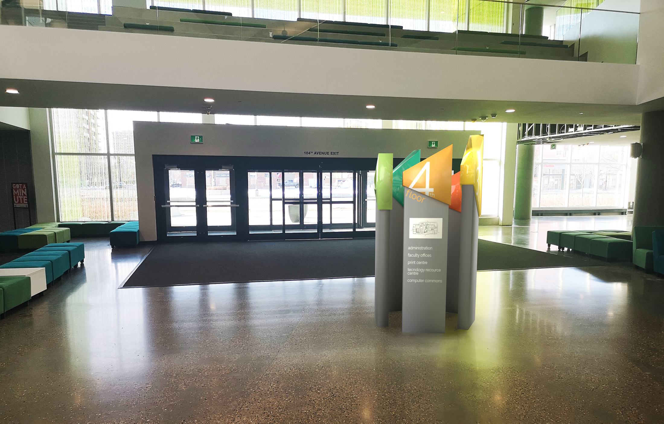
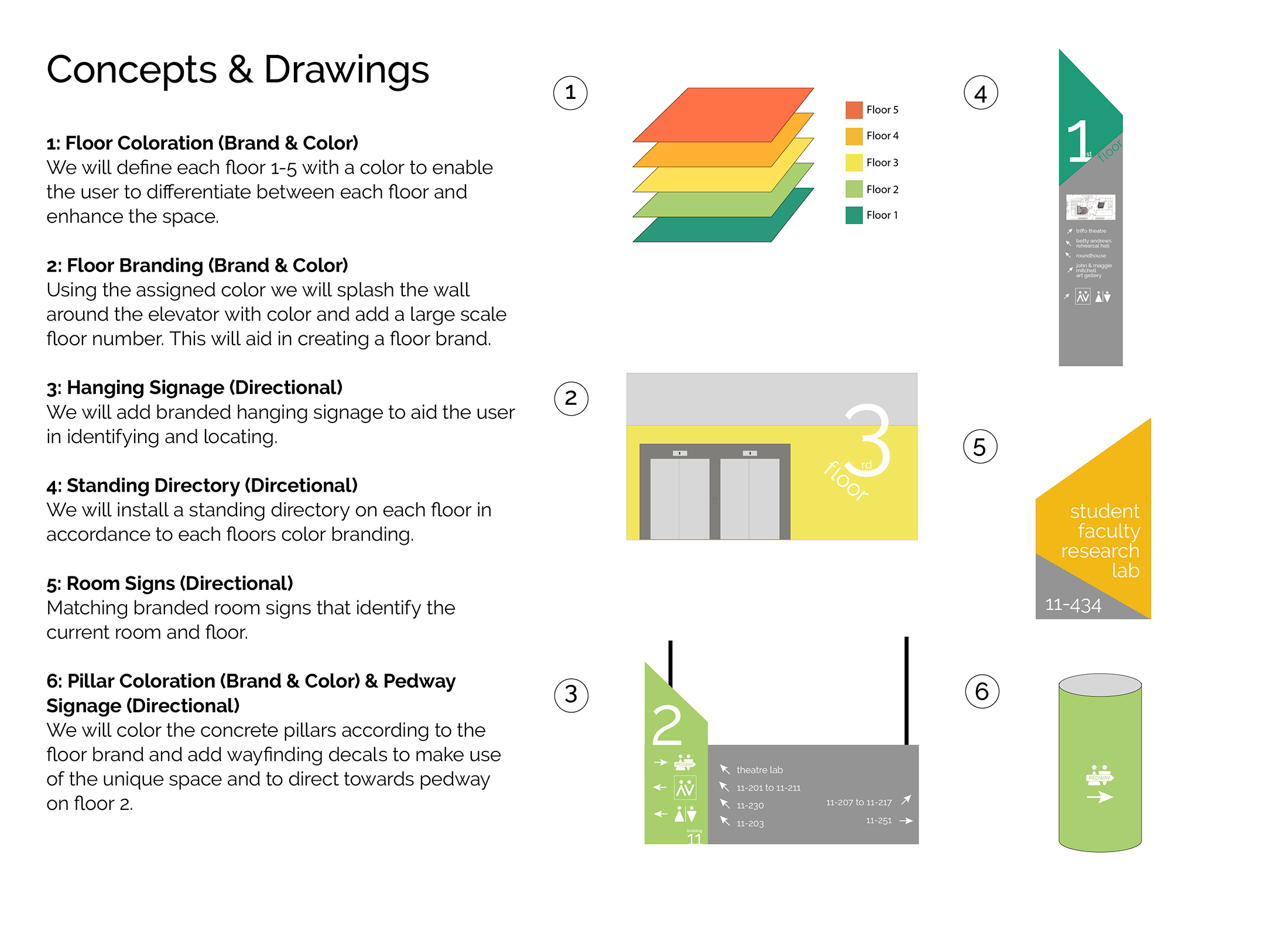
The team decided to implement a color-coded navigational system to Allard Hall. We identified the lack of identifying landmarks and differing visual features as the main contributor to a decrease in a visitor's wayfinding ability. Our featured navigational tool is a removable directory located in the entrances of the main hall. The directory is made up of 5 columns that form the MacEwan logo when placed beside each other. The top of each panel corresponds to the floor information on the panel.
The color system would be applied to various spaces and navigational elements within Allard hall. Each floor would be color-coded to help the visitor identify their location within the building. Another objective of our design was to give Allard Hall a more creative space by reducing the amount of white space in the hall.
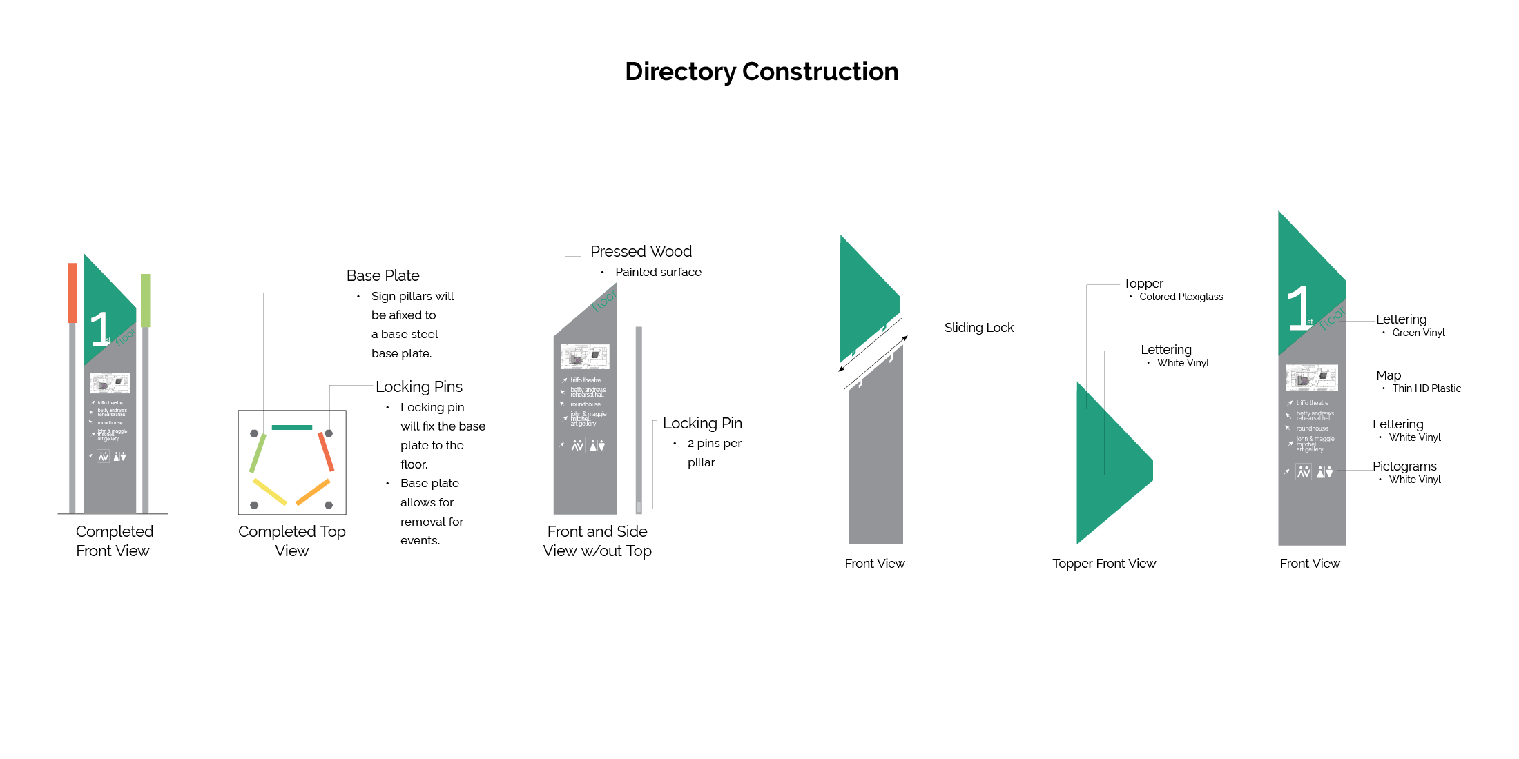
Besides my role as team leader, I was also tasked with identifying the materials used to create each navigational tool and designing how the directory would be assembled. Since Allard Hall is used as an event center, I designed the directory to lock into a base that could be removed when there is an event.
Remote work: Using AR to improve Work-Life-Balance
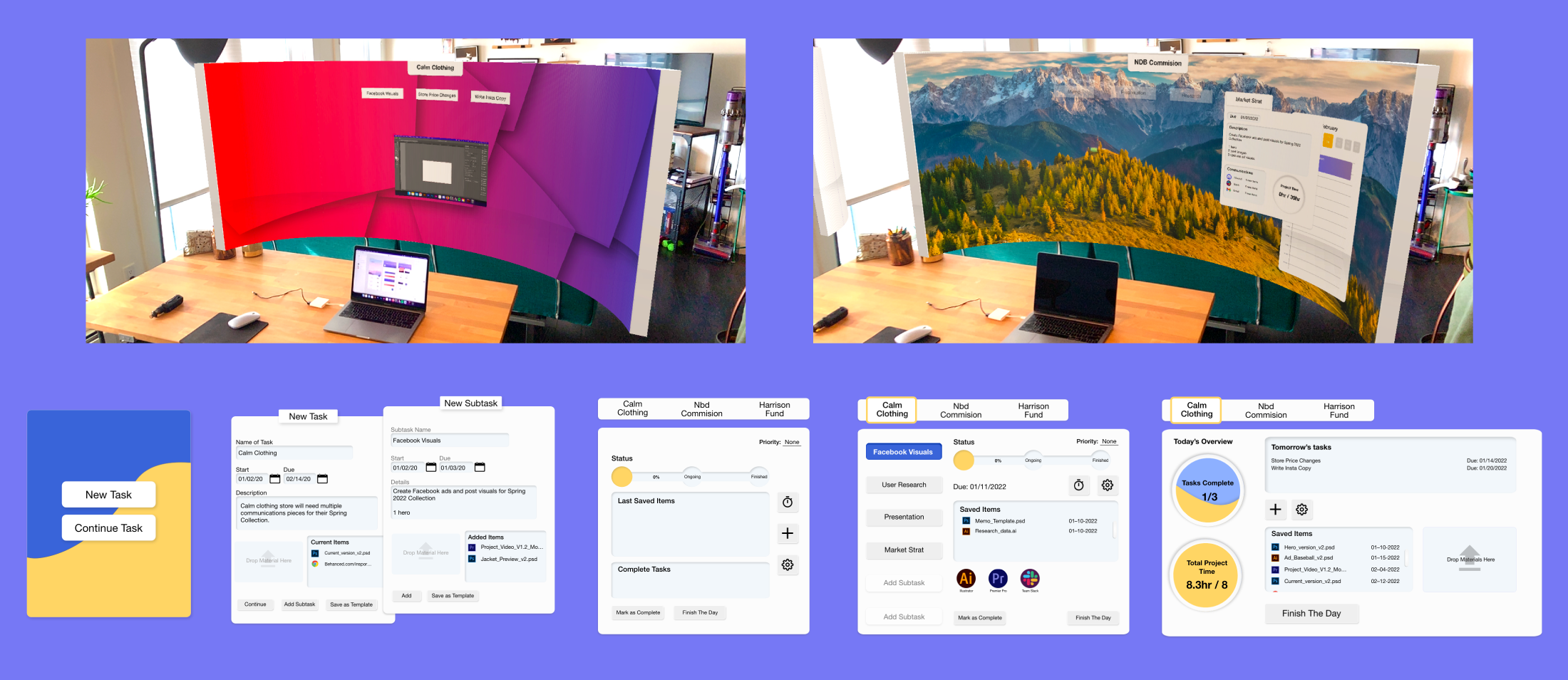
My project centers around the paradigm shift in work culture brought on by COVID-19, and explores a future solution using glasses-based augmented reality to help alleviate issues highlighted by remote workers. This project specifically focuses on reducing remote workers’ anticipatory anxiety and tasks residue, which are suspected causes of being unable to “unplug” from work.
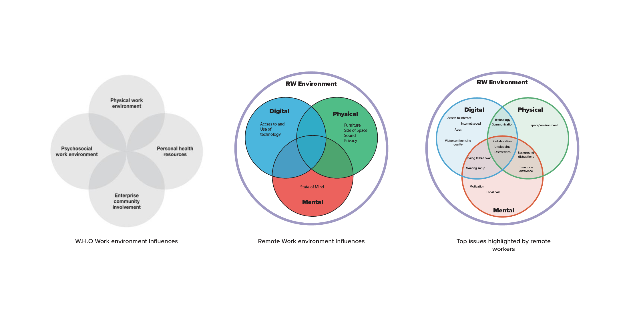
In the Fall 2022 semester, I studied what defines a healthy work environment as well as key issues brought up by remote workers. My research discovered very little material that centered the needs of the employee rather than the employer. Furthermore, there wasn’t a clear definition as to what constitutes a remote work environment, leading me to develop my own definitions based on W.H.O guidelines fora a healthy workplace structure.
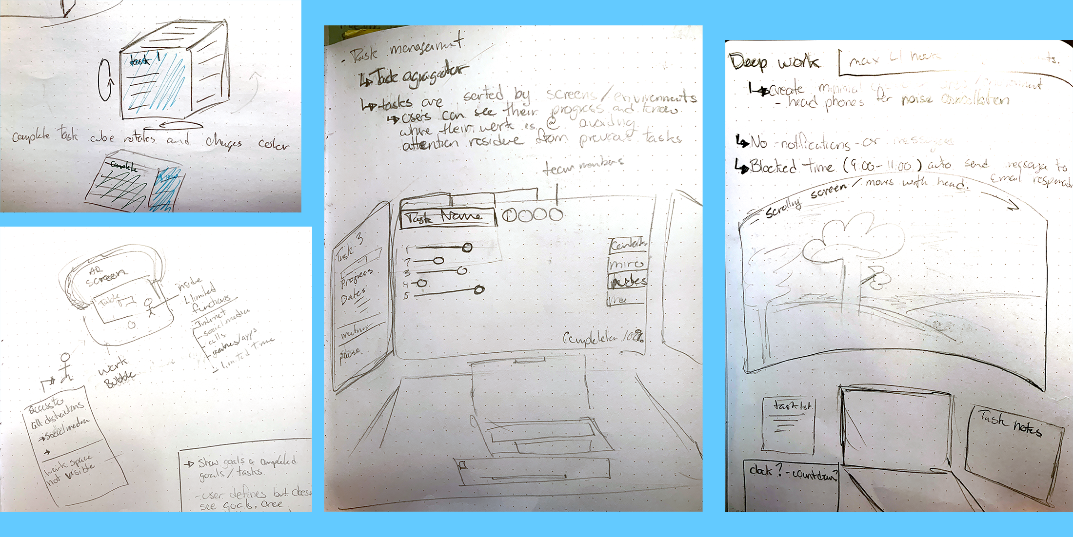
Based off my research, my ideations centered around helping individuals track and complete their tasks. I decided to create a glasses-based AR personal task manager. The idea is to move the physical and digital home workspace into the AR space. The goal is to give the individual the tools and space to customize and store all aspects of their digital working environment to create a more productive remote workspace.
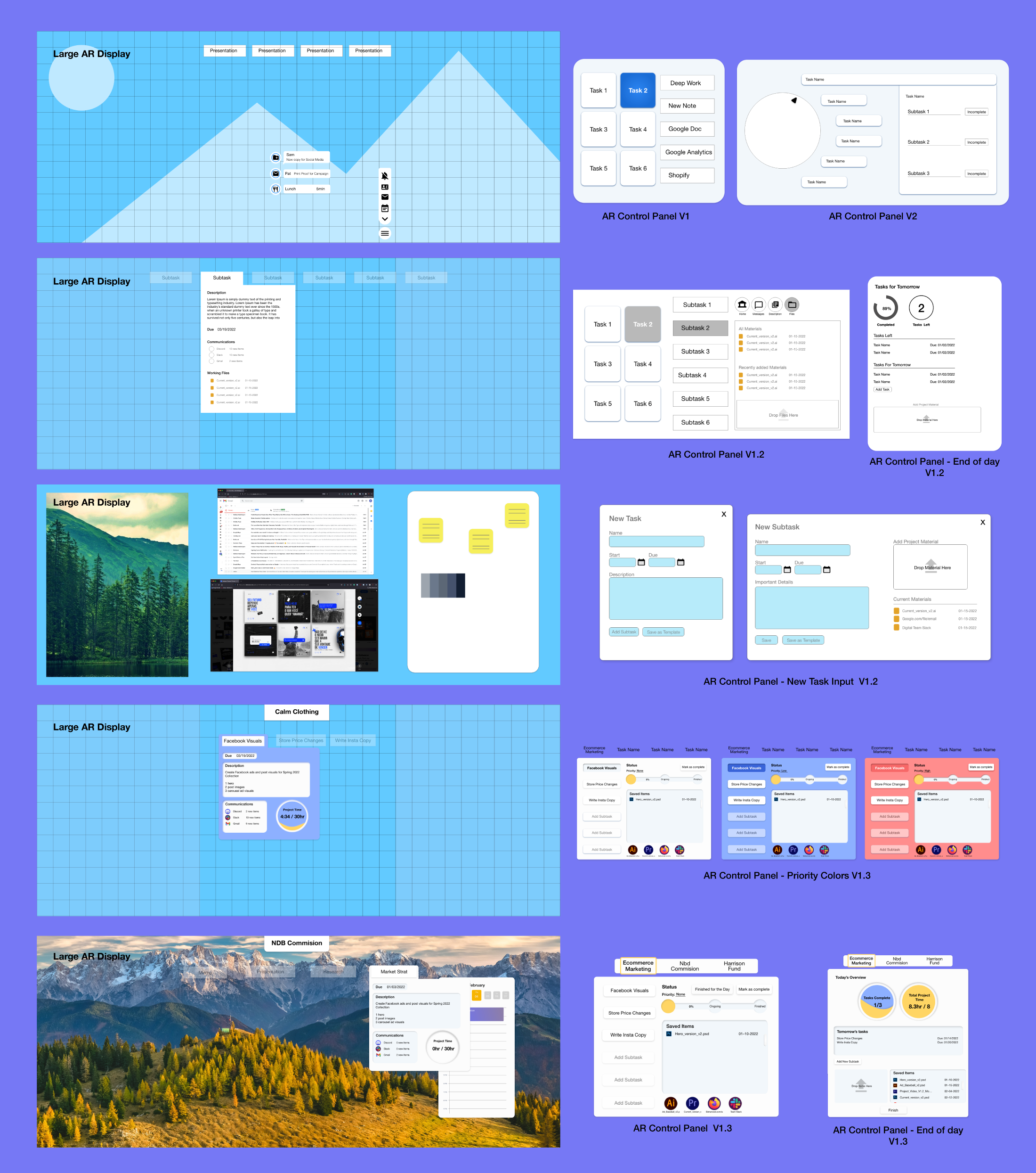
My final solution creates individual digital task environments for the user where they can store and access task-specific materials (programs, files, links, email, communication threads, etc.) Contained task environments give the user easy access to the materials needed to complete the task as well as limit non-task-related distractions.
The contained digital environments limit the need for the user to mentally keep track of each project’s progress and material, which; reduces task residue in the user. My solution to address the user’s anticipatory anxiety after work hours is to provide them with an overview of their day and prompt them to input their known task for the next day. I ultimately wanted my solution to carry some of the mental burdens that come with managing work tasks while also providing tools for users to work productively.


