Tinuoluwa
Olabimtan
Greetings! I am a Nigerian-born and raised designer, with an inclination for fashion, technology and research. My interest in design started at a young age, and now find inspiration in my nostalgic experiences, fashion and technological advancements. Design has allowed me to combine both my creative and analytic ways of problem-solving into a singular expression. Over the pandemic, I was fortunate enough to gain experience by working with both profit and non-profit organizations. I hope to progress in my career as a UI/UX designer and eventually end up designing operating systems for aerospace technology.
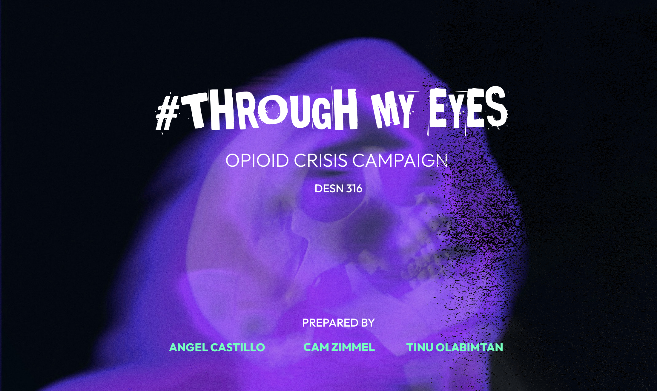
#ThroughMyEyes Opioid Crisis Campaign
#ThroughMyEyes enlightens the public about the social and emotional roadblocks against recovering opioid addicts. The campaign creates public awareness and ignites collective empathy toward the challenges opioid users face while trying to integrate back into society. It is our aim to put the public in the shoes of the opioid user and enable them to experience the challenges of recovery while shaking off psychological and physiological damage. In collaboration with Angel Castillo and Cam Zimmel.
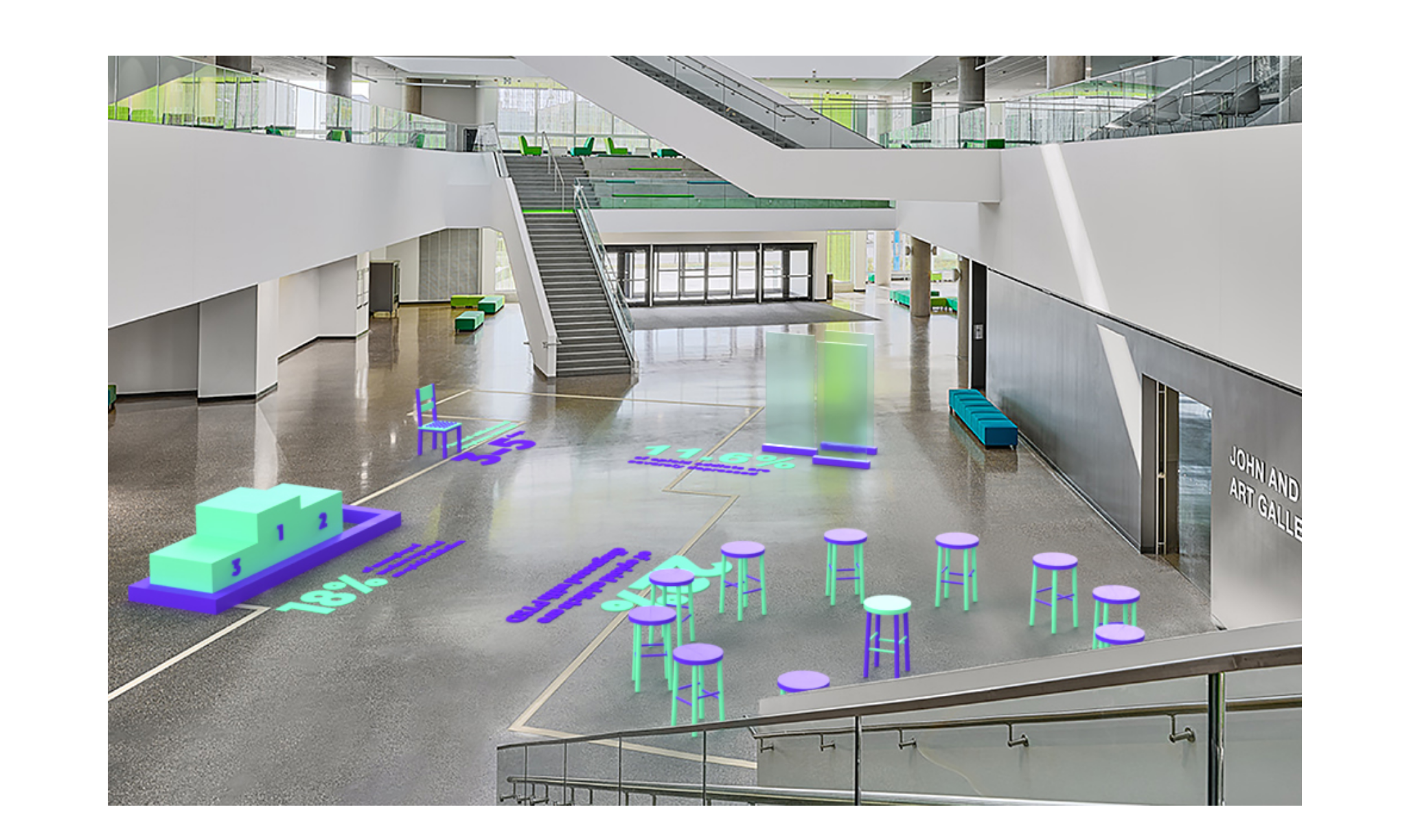
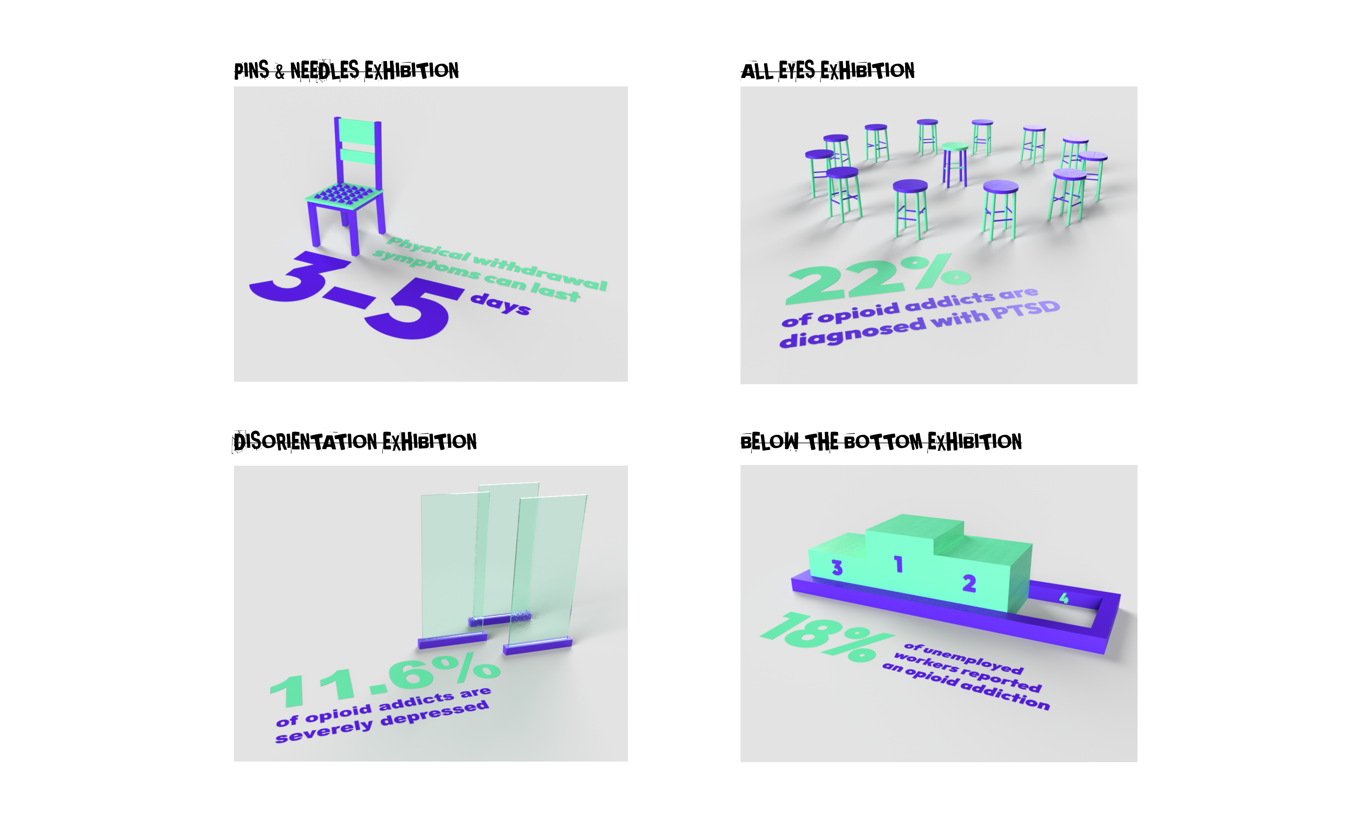
The #ThroughMyEyes exhibition is a collection of small exhibitions that put society in the shoes of opioid addicts. The exhibition hopes to communicate the struggles and plights of the addicts, and how the negative response and stigma from society worsen their conditions. The text on the floor also aids this goal by giving viewers information to think about while experiencing the exhibition.
The Pins-&-Needles exhibition simulates the restless itchy feeling that opioid addicts feel during withdrawal.
The All-Eyes exhibition simulates the negative attention addicts (both recovering and using) are given.
The Disorientation exhibition uses altered glass to mimic the hallucinations & confusion of opioid use & withdrawal.
The Below-The-Bottom exhibition references the fact that opioid addicts are viewed as the last of the last in society- having no standing and little to no respect in the community.
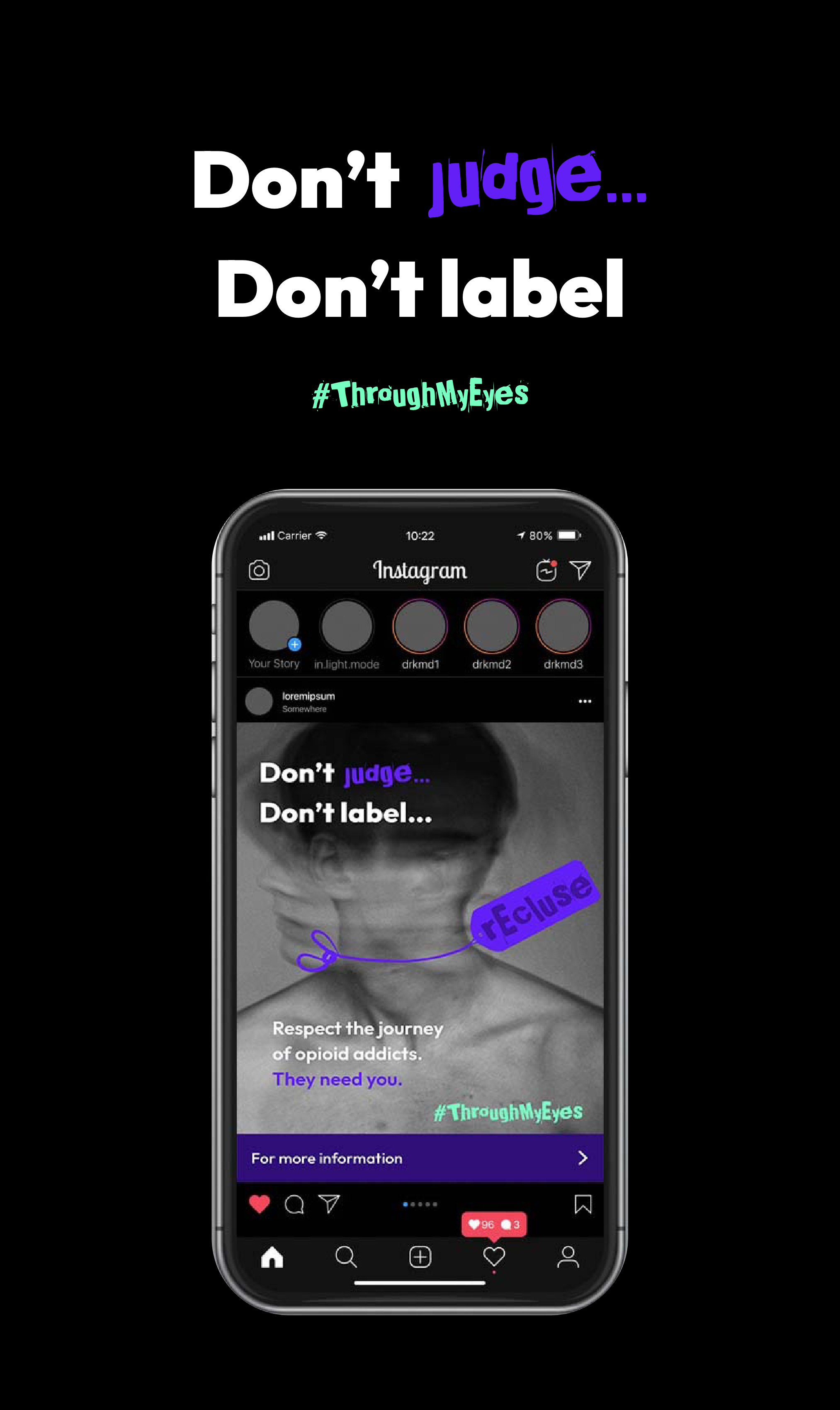
“Don’t _____, Don’t label” is the primary slogan of the #ThroughMyEyes campaign. It encourages society to play the role of a support system for opioid addicts and to understand their plights and struggles. Rather than judging and making assumptions, the campaign aims to redirect society’s attention to what can be done for the well-being of addicts.
S.F-Squared Branding
S.F -Square is a sci-fi and fantasy publishing conference located in London, UK. The conference aims at motivating leading authors and aspiring writers as well as publishers and aspiring publishers to take their work to the next level through workshops set in place to inspire creativity and exploration and also encourages networking.
S.F -Square targets industry leaders to share their experience and tips; aspiring authors to discover new ways of approaching the genre and learning from the best; and the publishing industry to discover new talents. This is the landing page for the website of the conferences
S.F -Square targets industry leaders to share their experience and tips; aspiring authors to discover new ways of approaching the genre and learning from the best; and the publishing industry to discover new talents. This is the landing page for the website of the conferences
Portrait Photography Collection
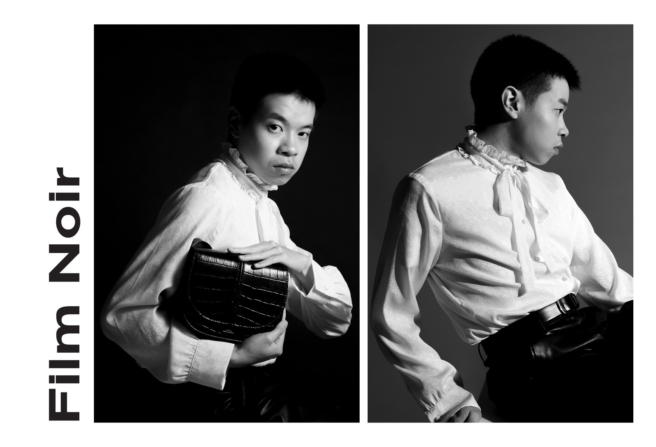
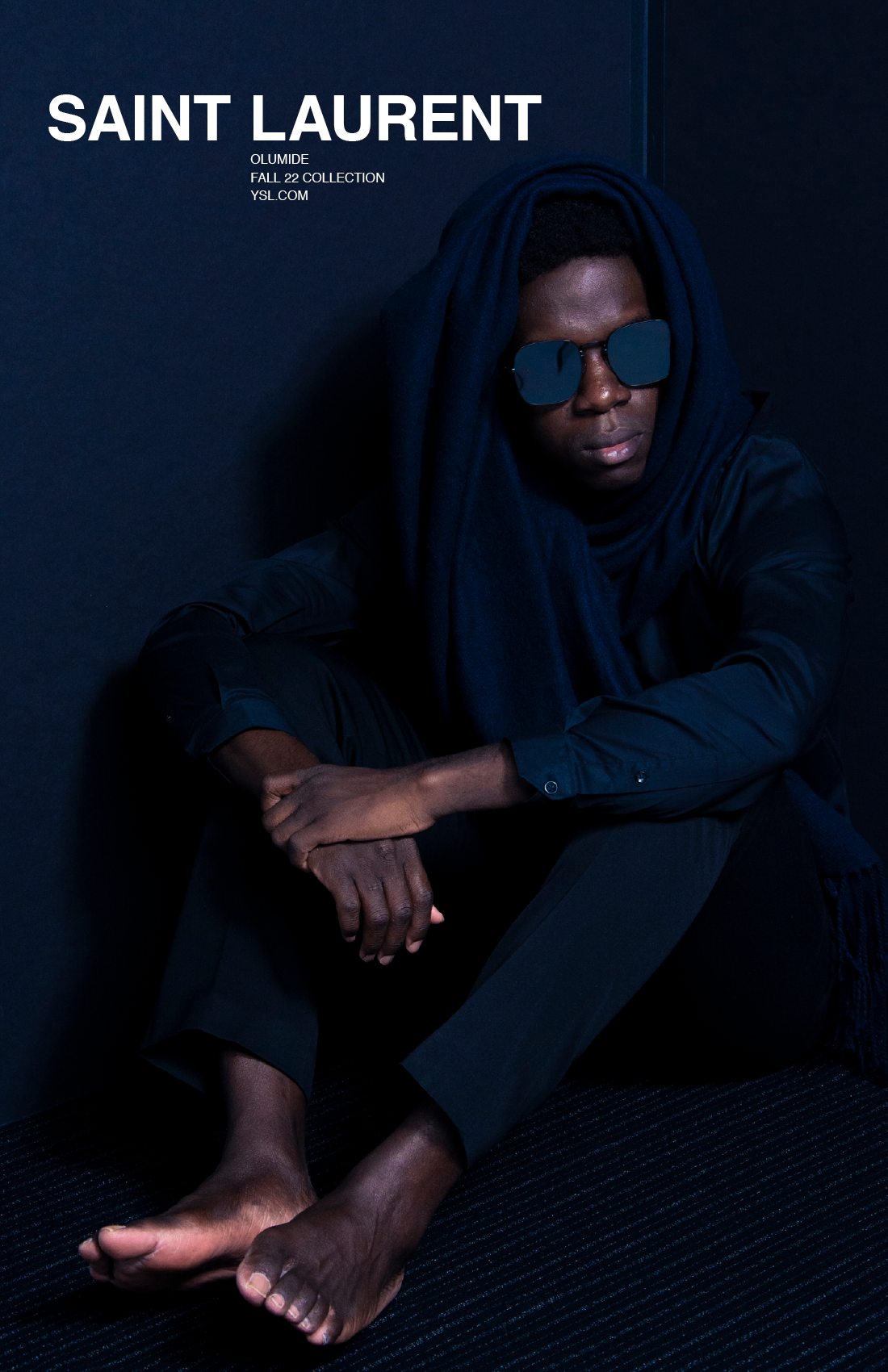
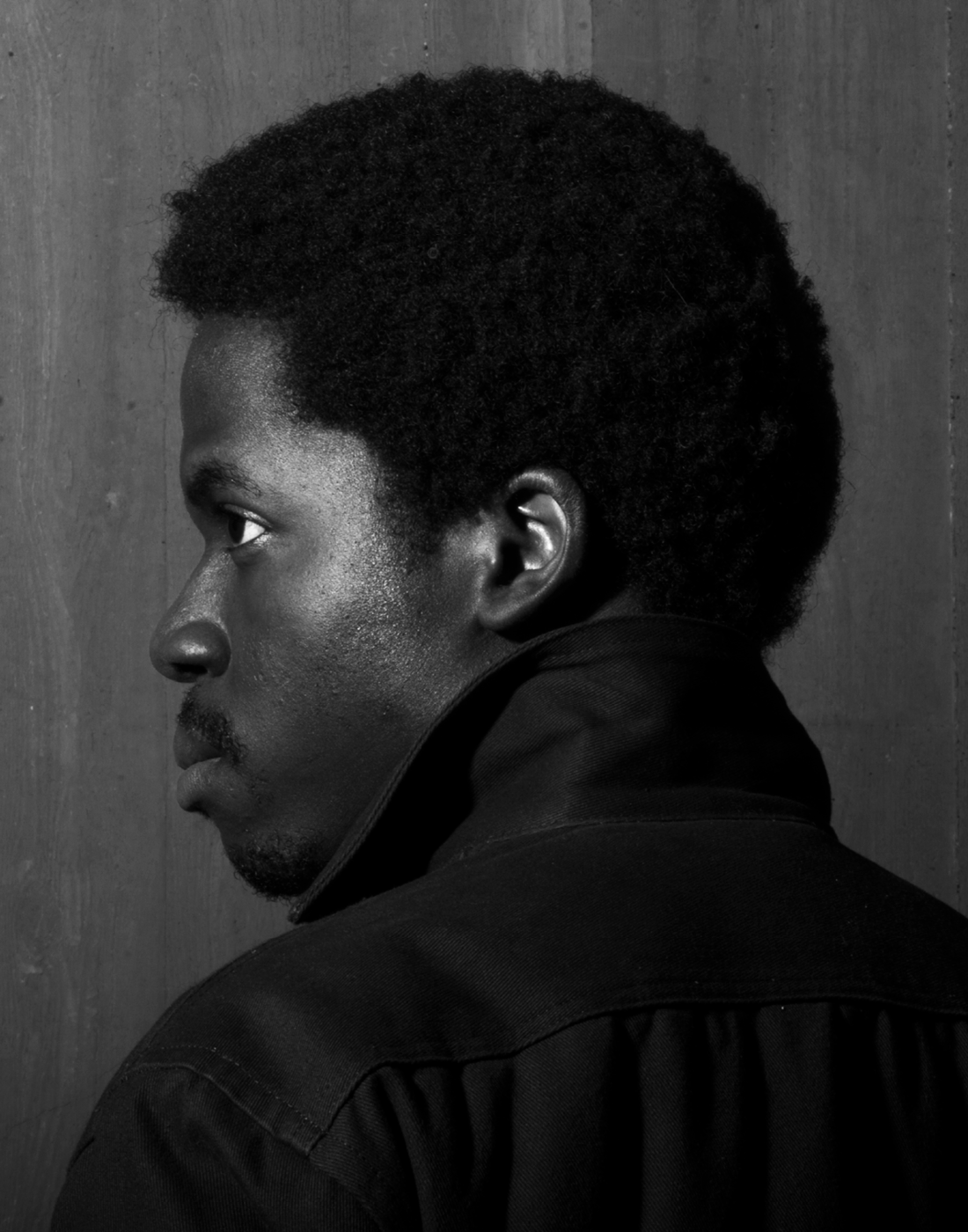
My portrait photography consists primarily of images shot in low-key lighting, with an emphasis on shadows and depth. This image in a film-noir style portrait that focuses on the models clothing and accessories (i.e, his bag).
Japan Tourism Exhibition
Japan is one of the most populated countries in the world, coming eleventh with a population of over 125 million inhabitants. The country is known globally for their traditional arts (such as calligraphy, nature arrangements, tea ceremonies and art) as well as their rapid technological advancement. The country’s unique sense of modernity coexists with its traditional heritage. This is an attribute that attracts thousands of tourists annually.
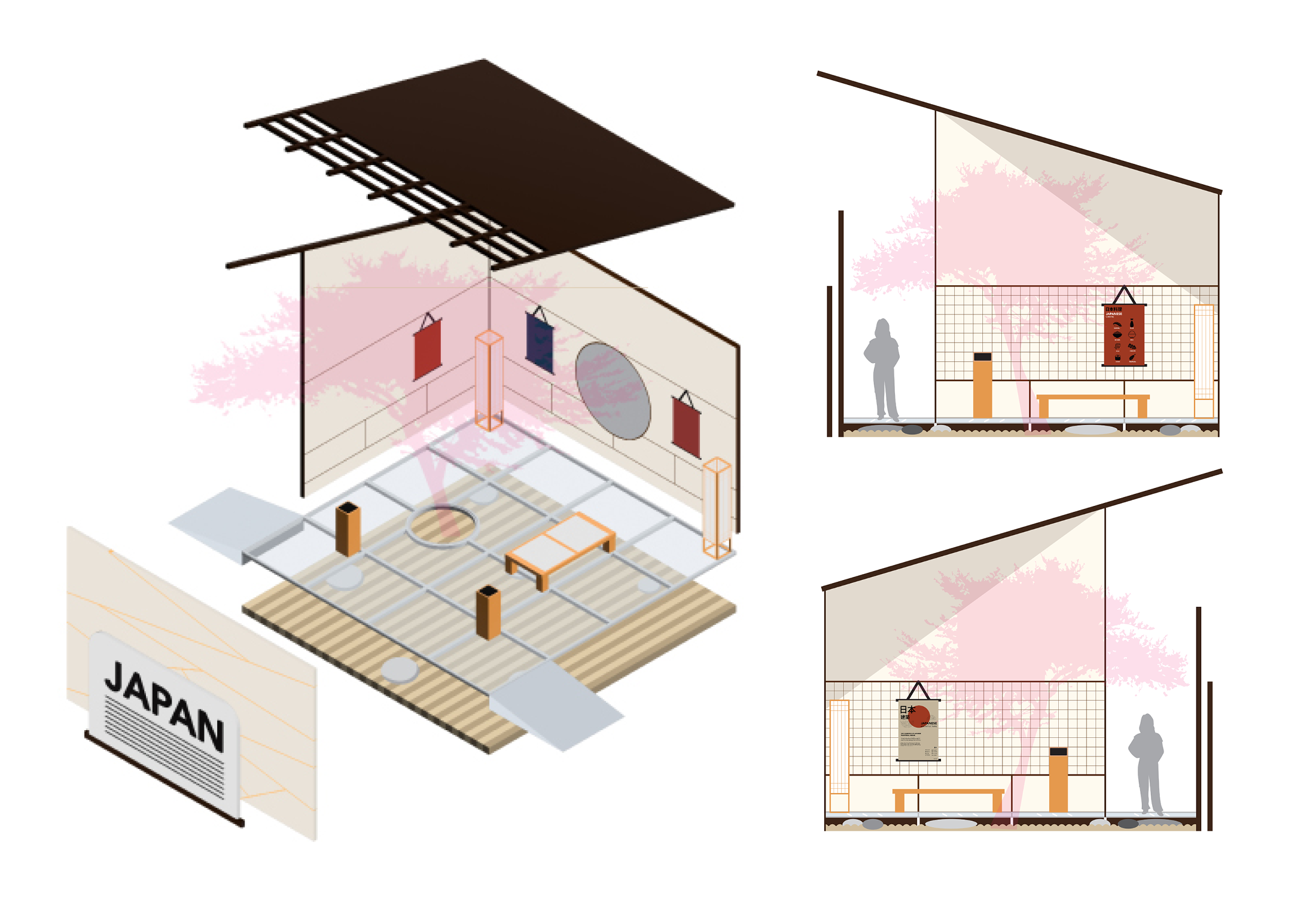
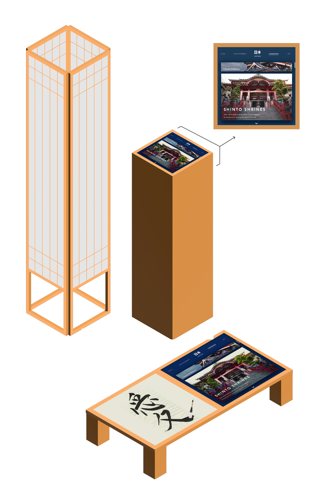
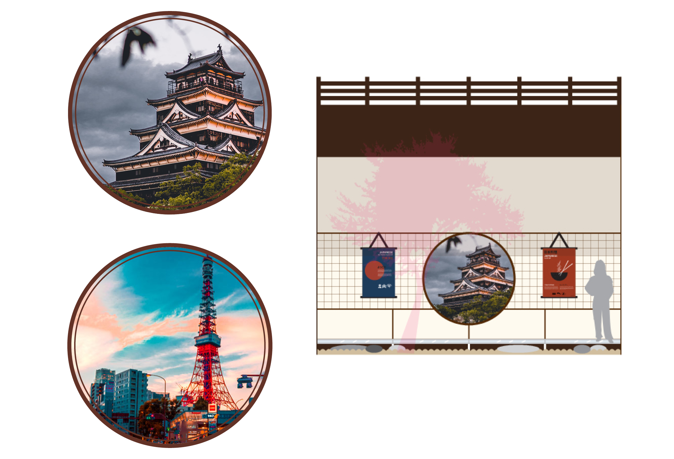
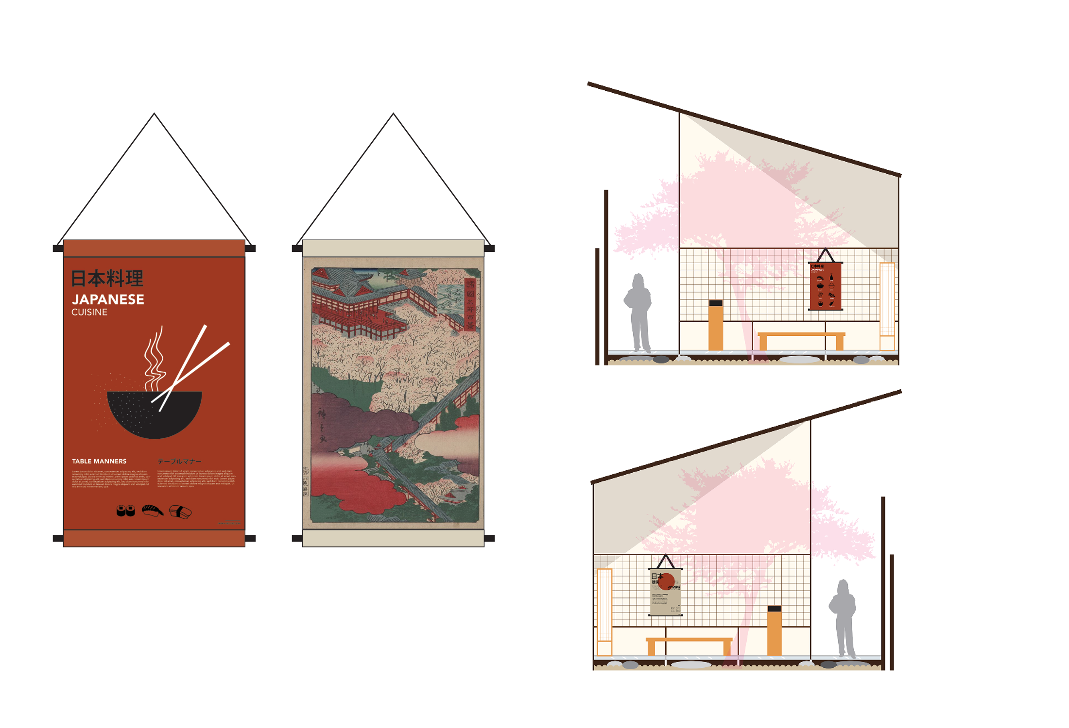
The final exhibition plan unites the ideas of traditional and contemporary Japan in a simplistic yet effective manner. The space is hidden by a large shoji frame and a plexi-glass display of general information about the country and its tourism. The exhibit presents itself as a quiet, intimate experience with Japan’s heritage and advancements. In collaboration with Angel Castillo and Cam Zimmel.
Chabudai Interactive Tables allow users to explore what Japan has to offer its tourists through the exhibition’s user interface. The interactive panels give visitors the opportunity to experience a digitized form of traditional Japanese calligraphy. The Standing Kiosks are situated at the entrance and exit of the exhibition, and have an attendant managing the flow of visitors. The LED Shoji Lamp mimics the traditional floor lamp while maintaining the modernity of current Japanese furniture
“The circle window is often named “the window of spiritual enlightenment”. In Zen Buddhism, the circle represents an innocent figure without any prejudices. This window expresses the final stage of spiritual enlightenment.” In the exhibition, this window display-screen adds to the intimate atmosphere of the exhibition by displaying pictures of Japan’s divers outdoors. It is made of an LED screen embedded in a dark-oak frame
The Kakemono Display Screens resemble the traditional Japanese scrolls used to mount paintings and calligraphy in homes. These screens will display posters to the exhibition as well as traditional Japanese paintings and calligraphy to emphasize the intimate atmosphere. It consists of an LED screen with an iron rope-like mock-up on the top.
Virtuwell Branding and App
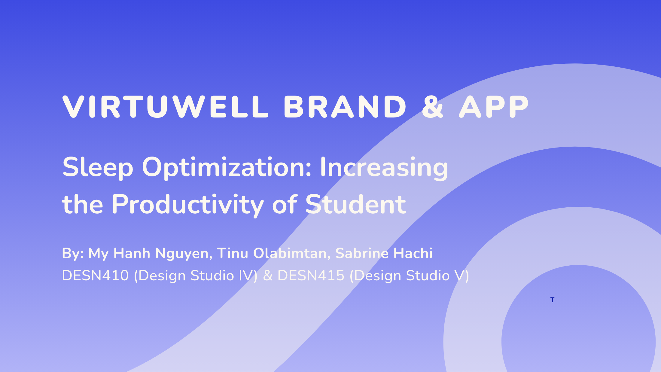
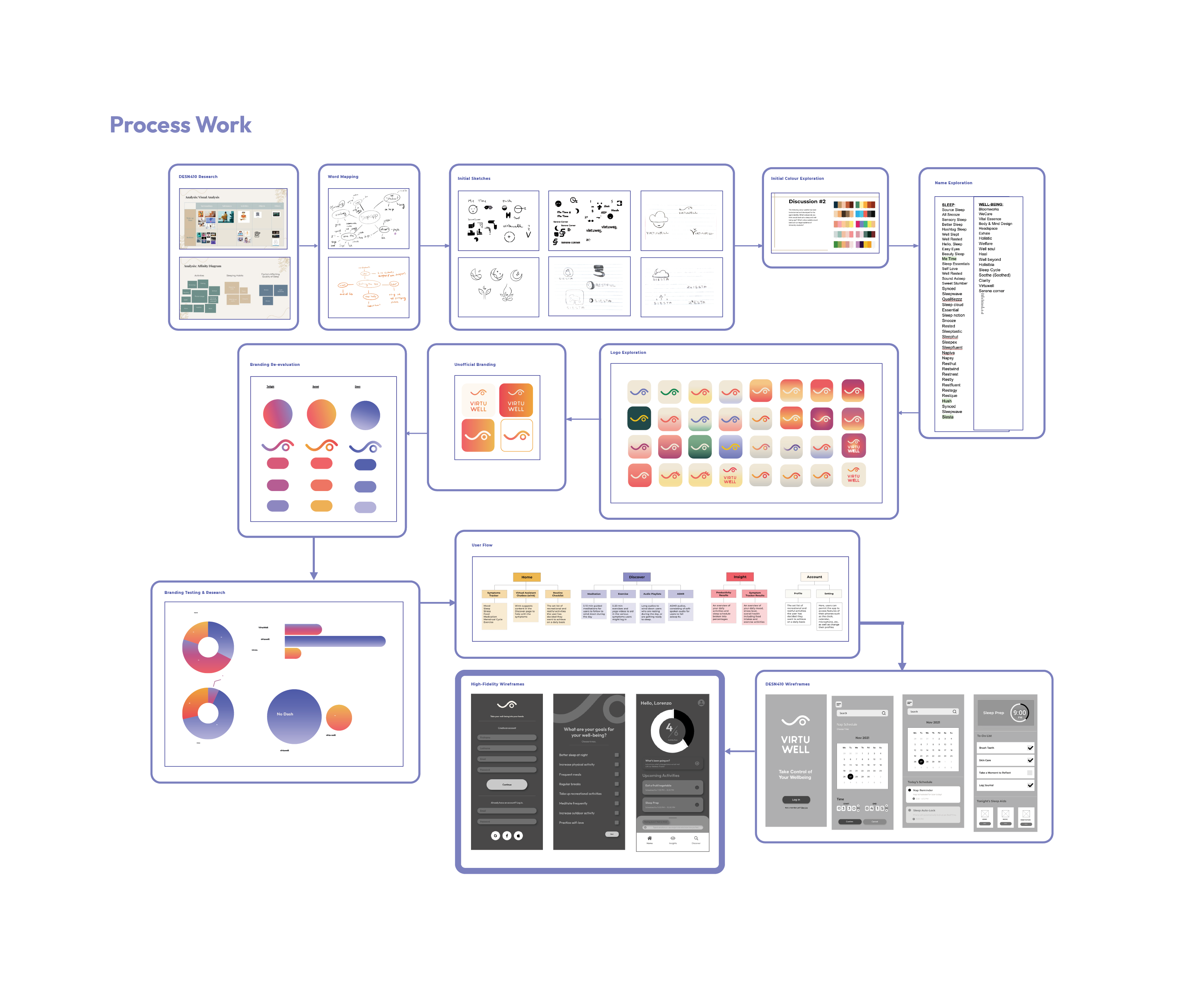
In this project, we studied the issue of bad sleep quality in post-secondary students. While many factors contribute to the unrestful state of most students, the primary cause is lousy sleep hygiene, which is caused by several habits and behaviours on the part of the students. As a group, MyHanh Nguyen, Tinu Olabimtan and Sabrine Hachi challenged themselves to find a design solution to the observed problem.
In DESN410, a better understanding of students’ lifestyles concerning sleep quality has been acquired. Further in-depth knowledge of the cyclical relationship between sleep and productivity and their codependent nature resulted in an app that addressed holistic well-being, as opposed to sleep strictly. In DESN415, the team has addressed the user experiential and interactive aspect by creating an application that compels its users to develop good habits that are beneficial to their daily rest.
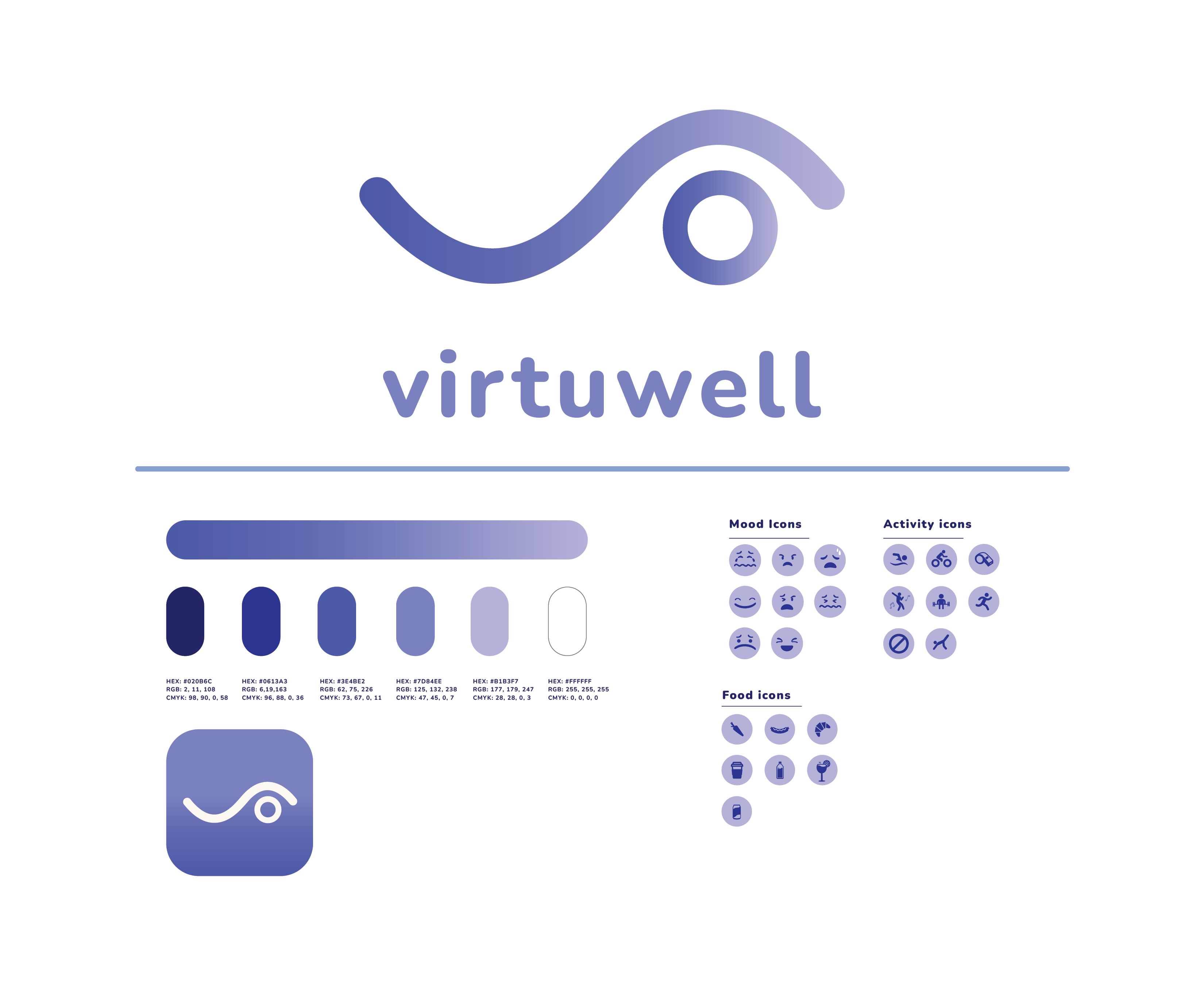
The branding represents the organized, polished feeling that Virtuwell hopes to bring to its users’ lives. Research shows that aesthetics and functionality drive younger audiences. The logo consists of well-rounded edges and curves that represent ease and fluidity while also keeping the viewer grounded with the presence of the circle. The logo (Wink) represents how the app intends to help its users- with better sleeping habits (the closed eye) and improved daily routines (the open eye).
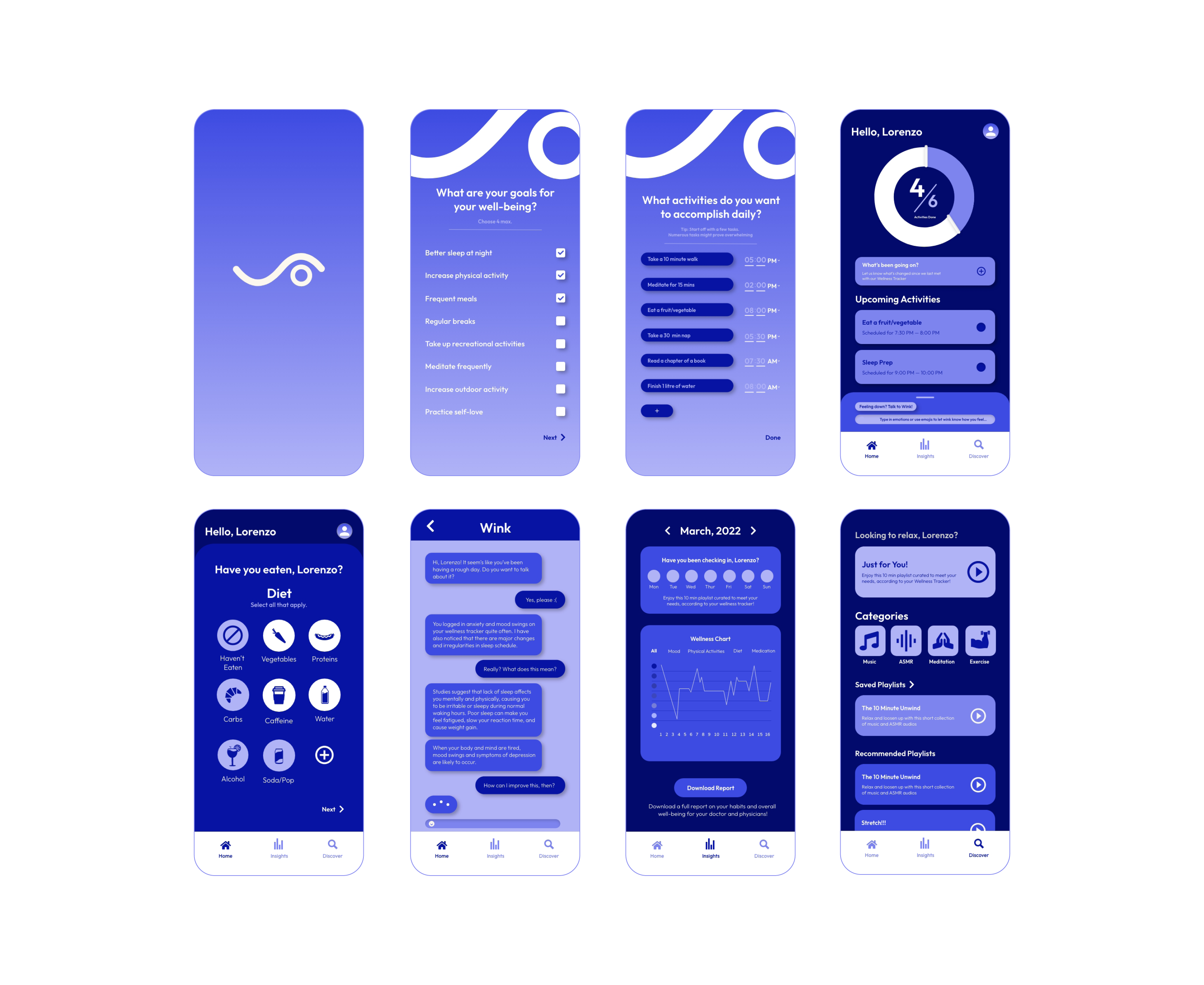
The app provides a feature to let students maintain proper sleep hygiene and provide tools for optimizing a healthier lifestyle and well-being. It offers a new virtual assistant to help individuals who require emotional support. Virtuwell also has a customizable feature for users to input their own goals, providing a more personal experience. This idea was drawn from research, where participants voiced the importance of a personalized experience in a self-care app.


