Sabrine
Hachi
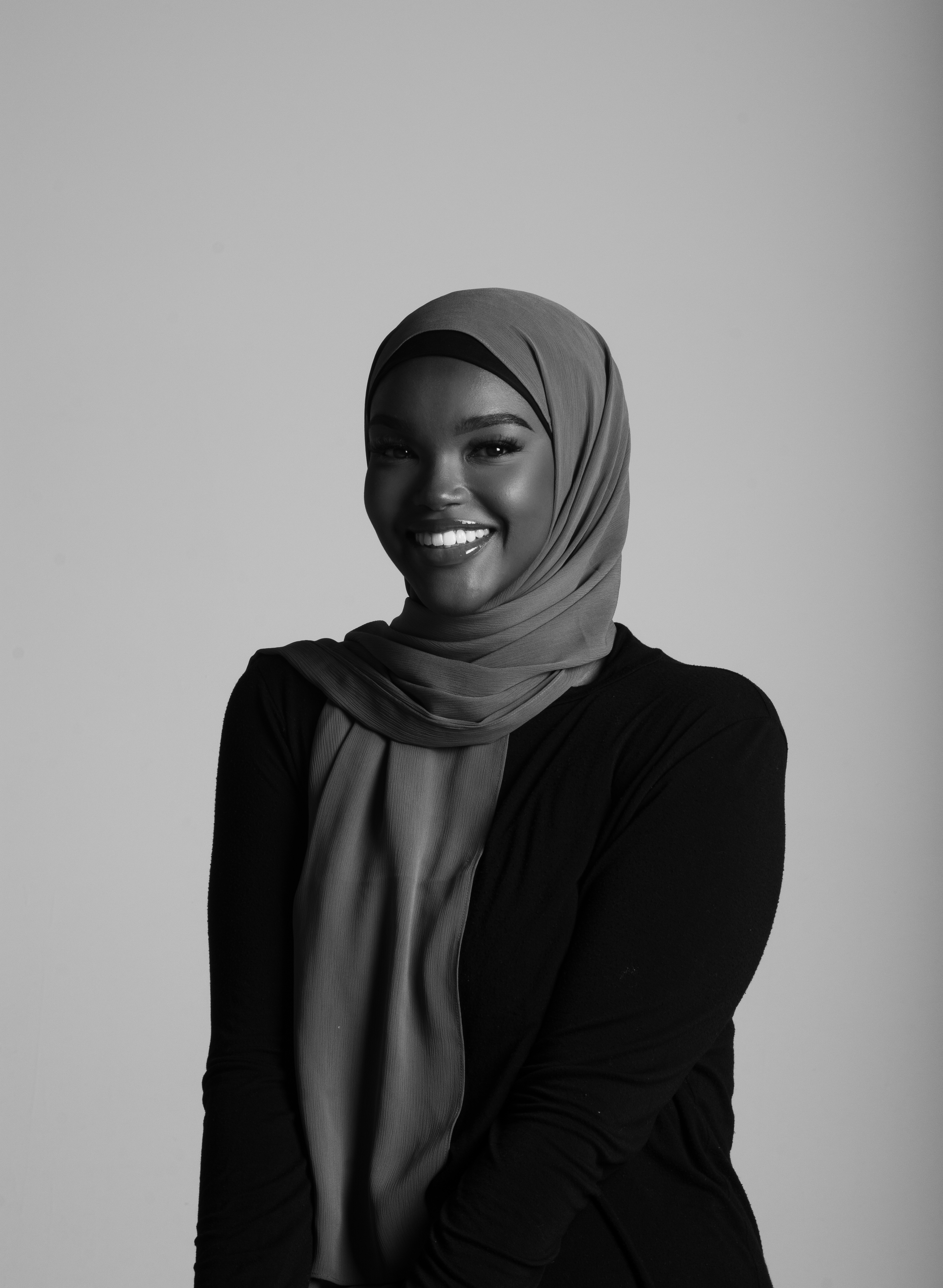
My name is Sabrine Hachi. My journey as a designer began in the first grade, when my older sister praised me for my art on Microsoft Paint. Since then, I’ve been interested in anything and everything design. Which led me to enroll in the Bachelor of Design Program at MacEwan University. I find inspiration through my friends and family, as well as other designers of colour. I love design because it holds the power to improve lives, create opportunities, and to bring people together. My goal is to become a stronger and more successful designer by doing projects that benefit different communities as well as unite them (especially the Black Community). The pandemic allowed me to expand my skills in design as well as learn new ones. I’m grateful because it allowed me to grow as a designer.
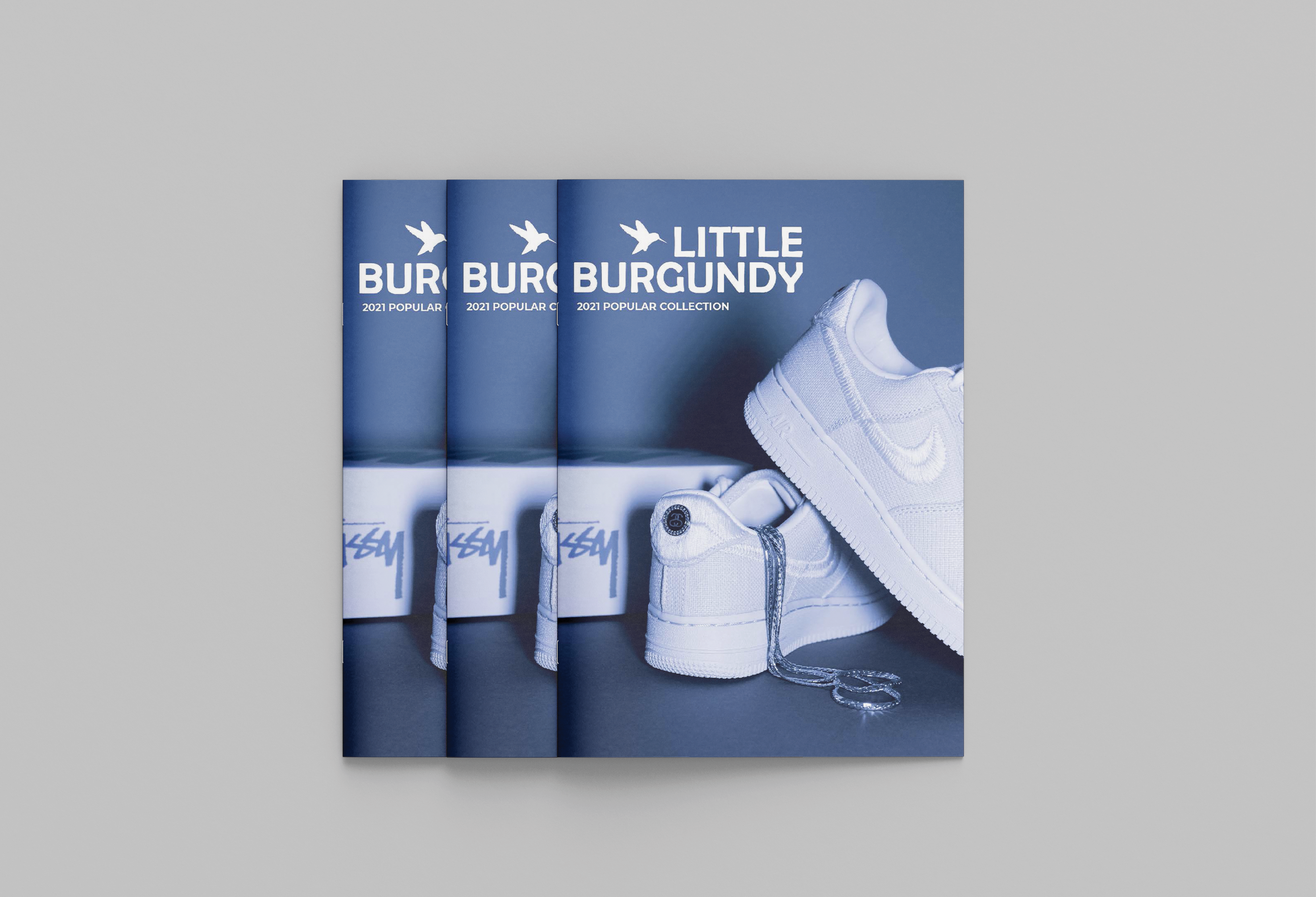
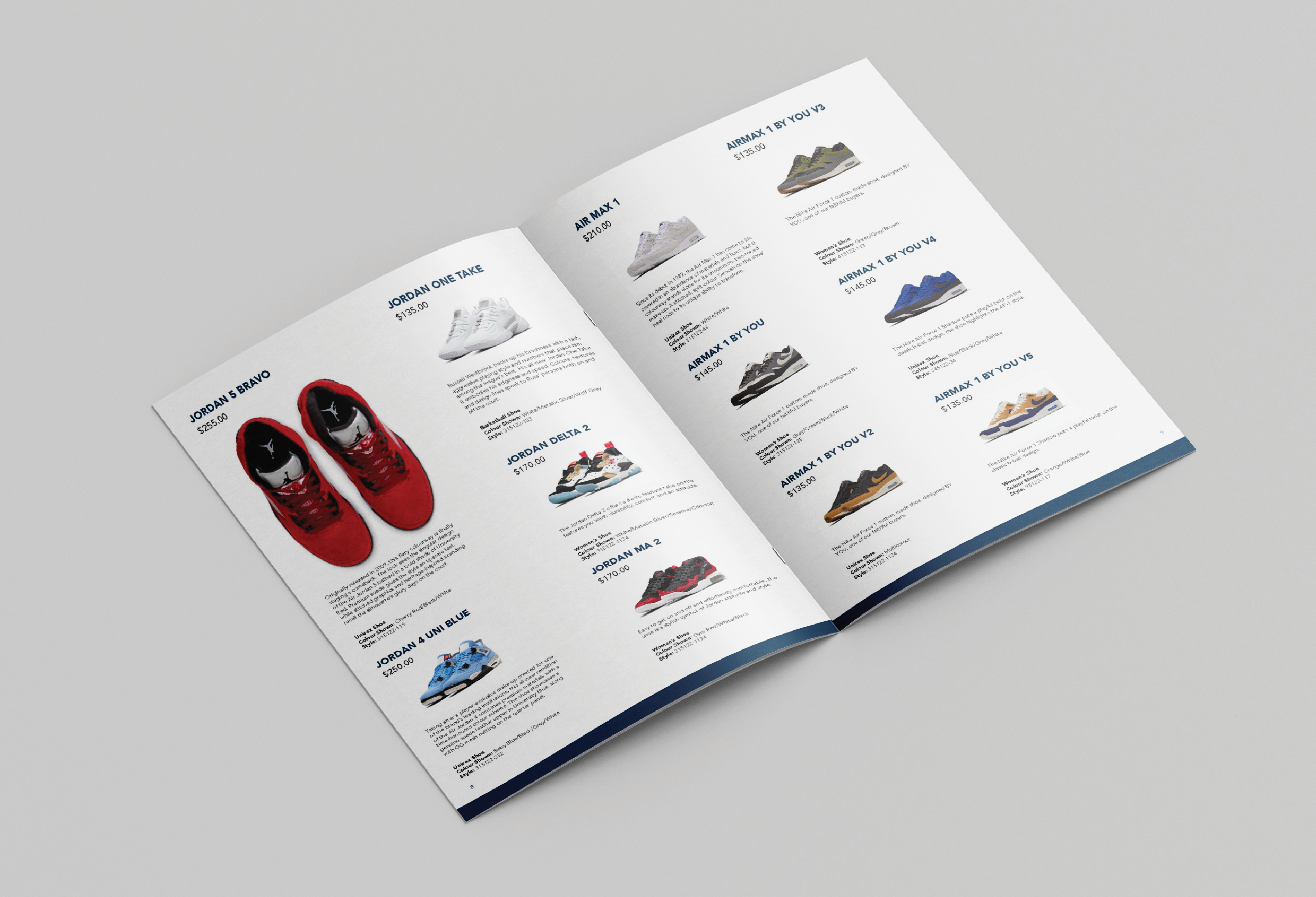
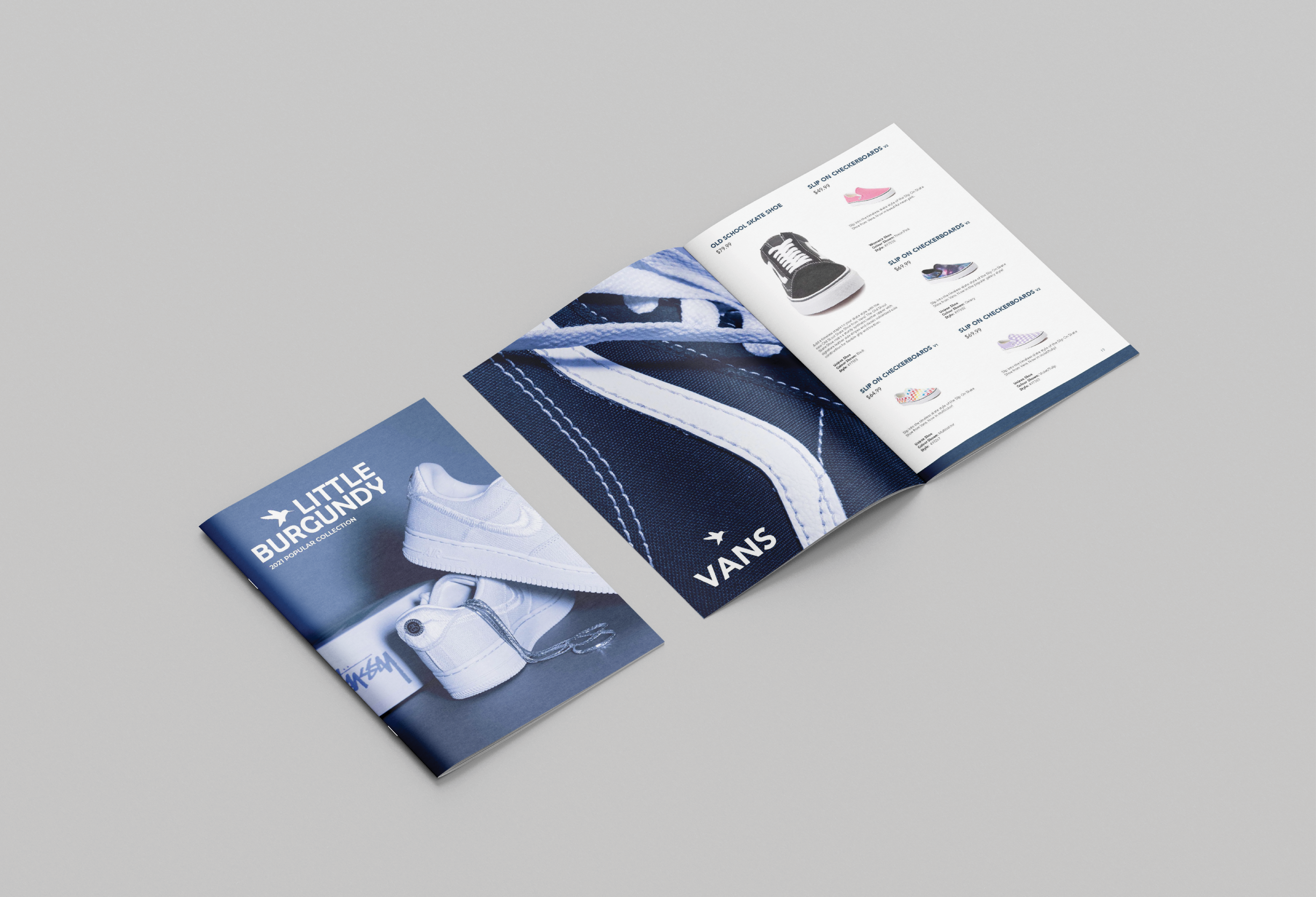
Little Burgundy 2021 Collections Catalogue
This project involves the design of a multiple-page product catalogue of any kind, or a comparable piece that contains different hierarchies of rich information content interacting with images and/or graphics. The goal for this project was to design a product catalogue to accompany an existing website, for this project, it was Little Burgundy.
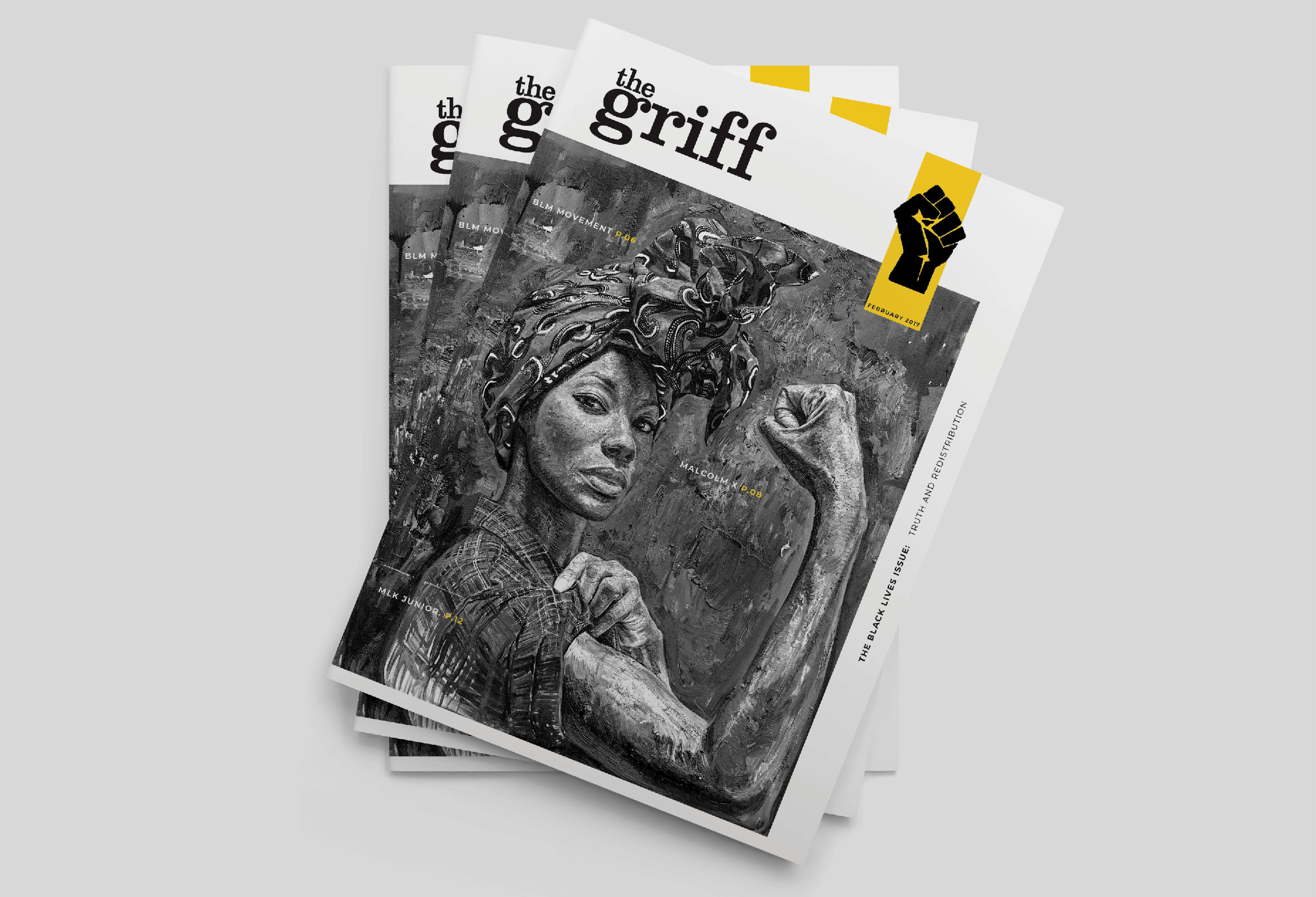
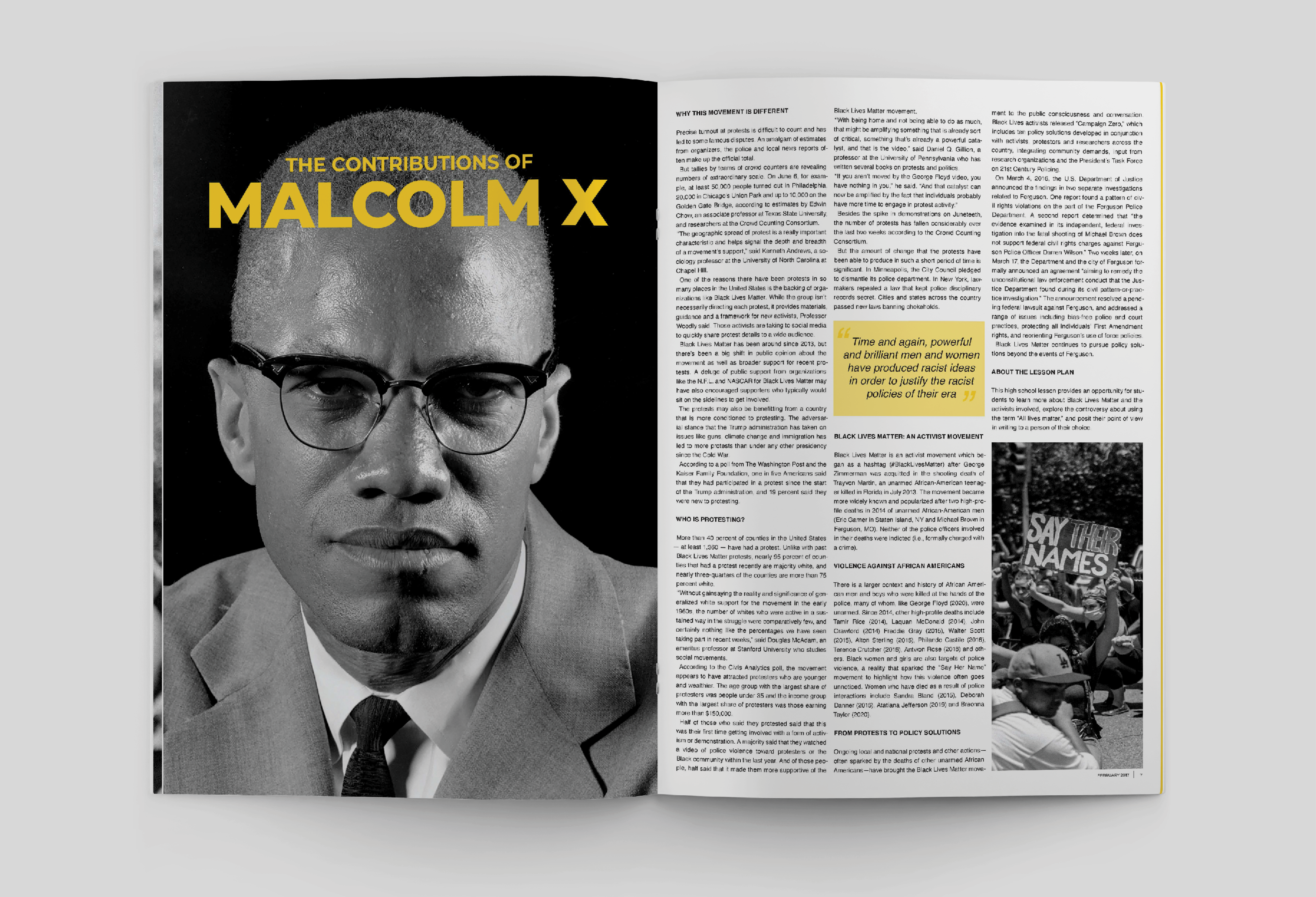
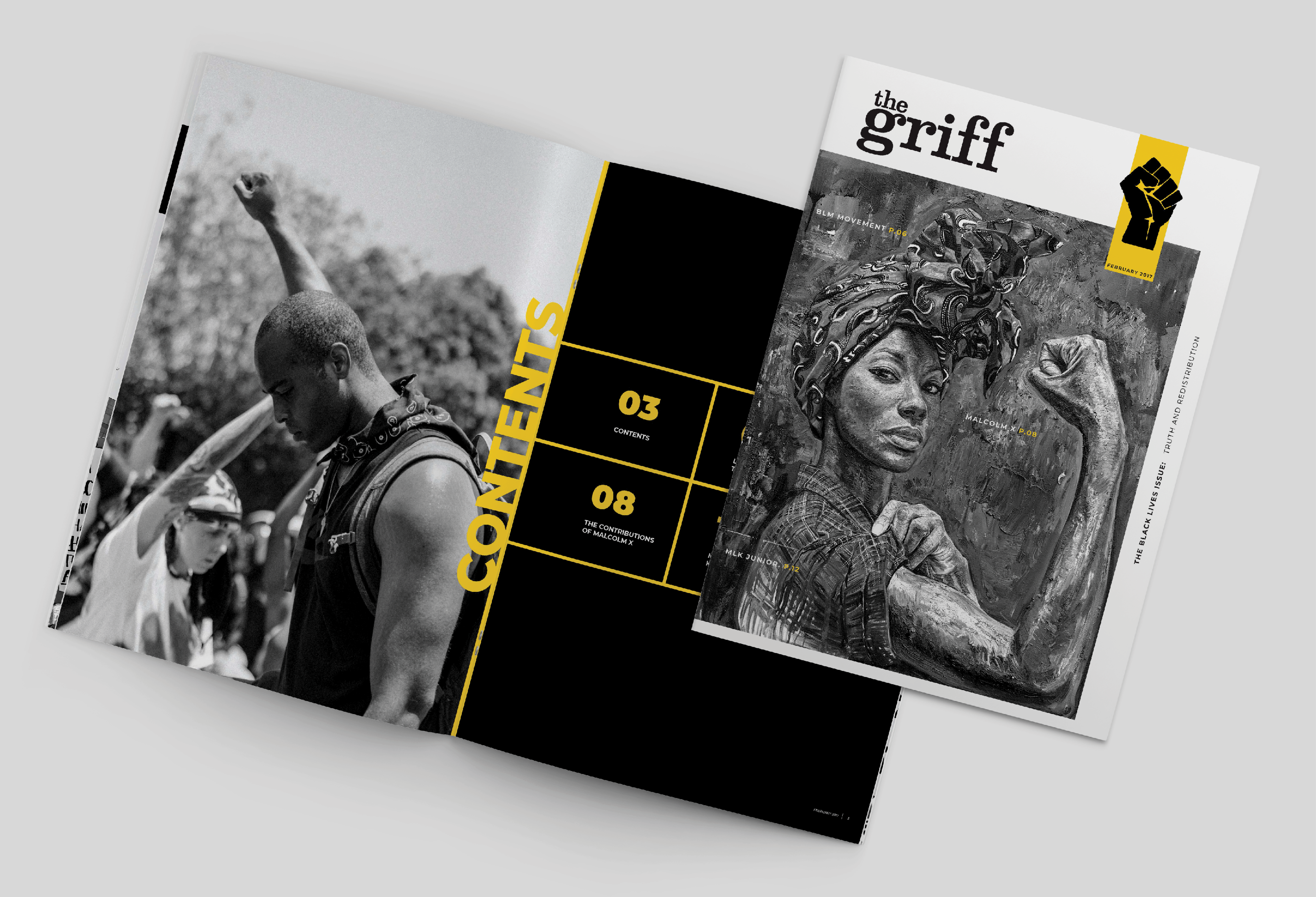
The Griff Magazine Black History Month Edition
This project involves conceiving a complete re-design of the griff: MacEwan University’s student magazine. This project allowed for creative freedom as well as the responsibility of
acting as the editor, the creative director, and the designer of the magazine, and therefore giving me the opportunity to select the content, establish a direction in terms of style and
point of view, and design the main components to reflect this direction. For this project, I decided to design the griff in a Black History Month edition.
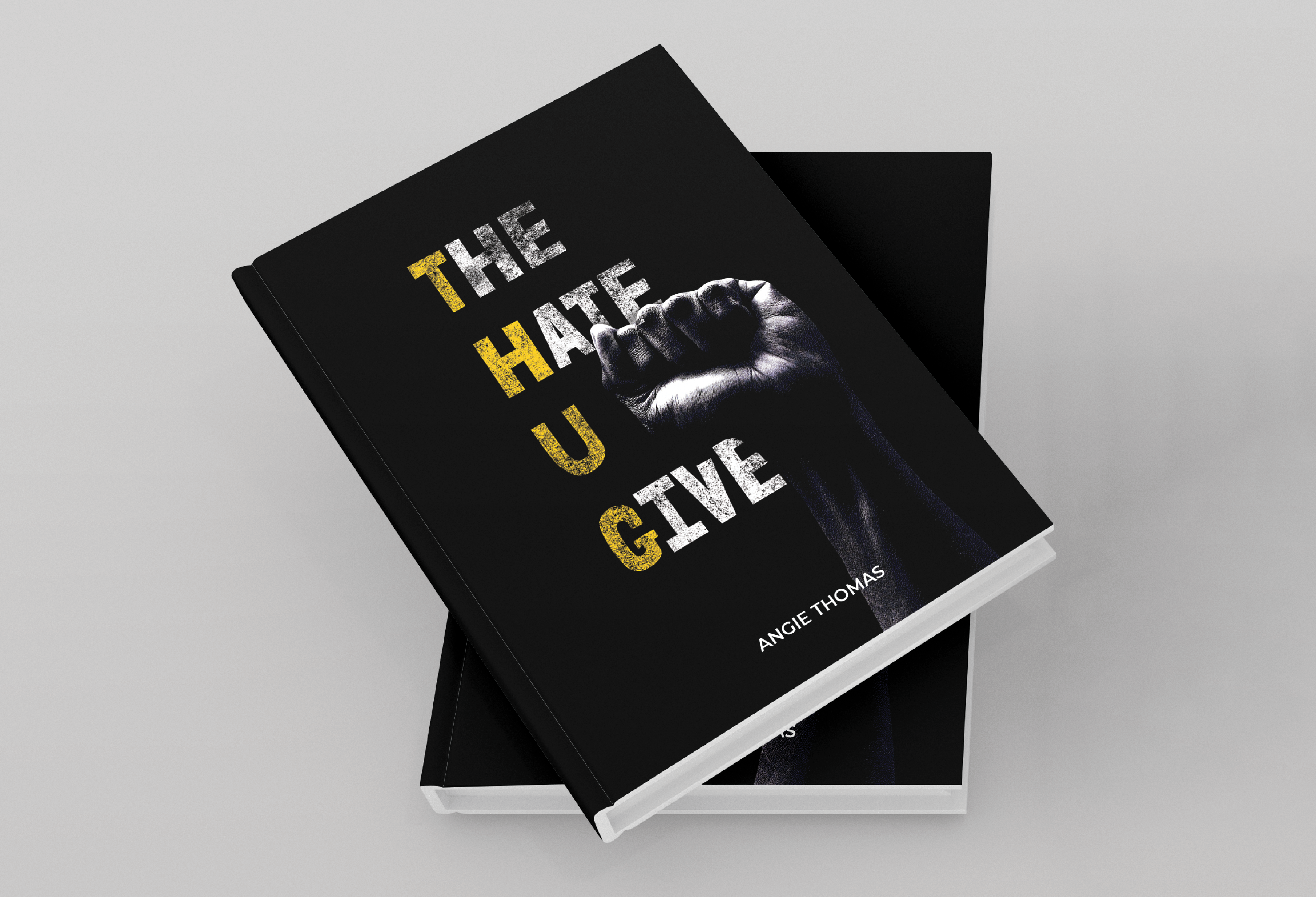
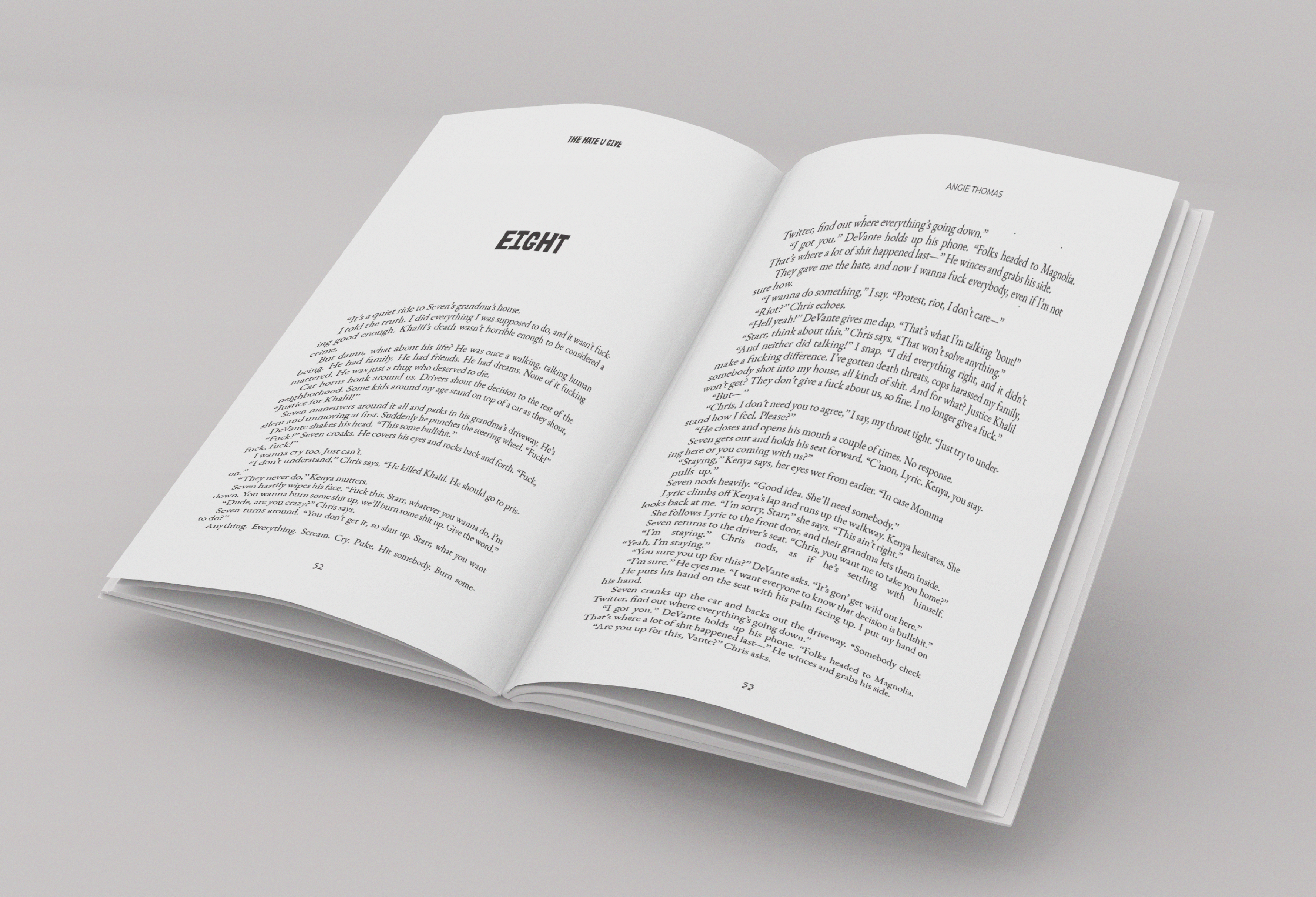
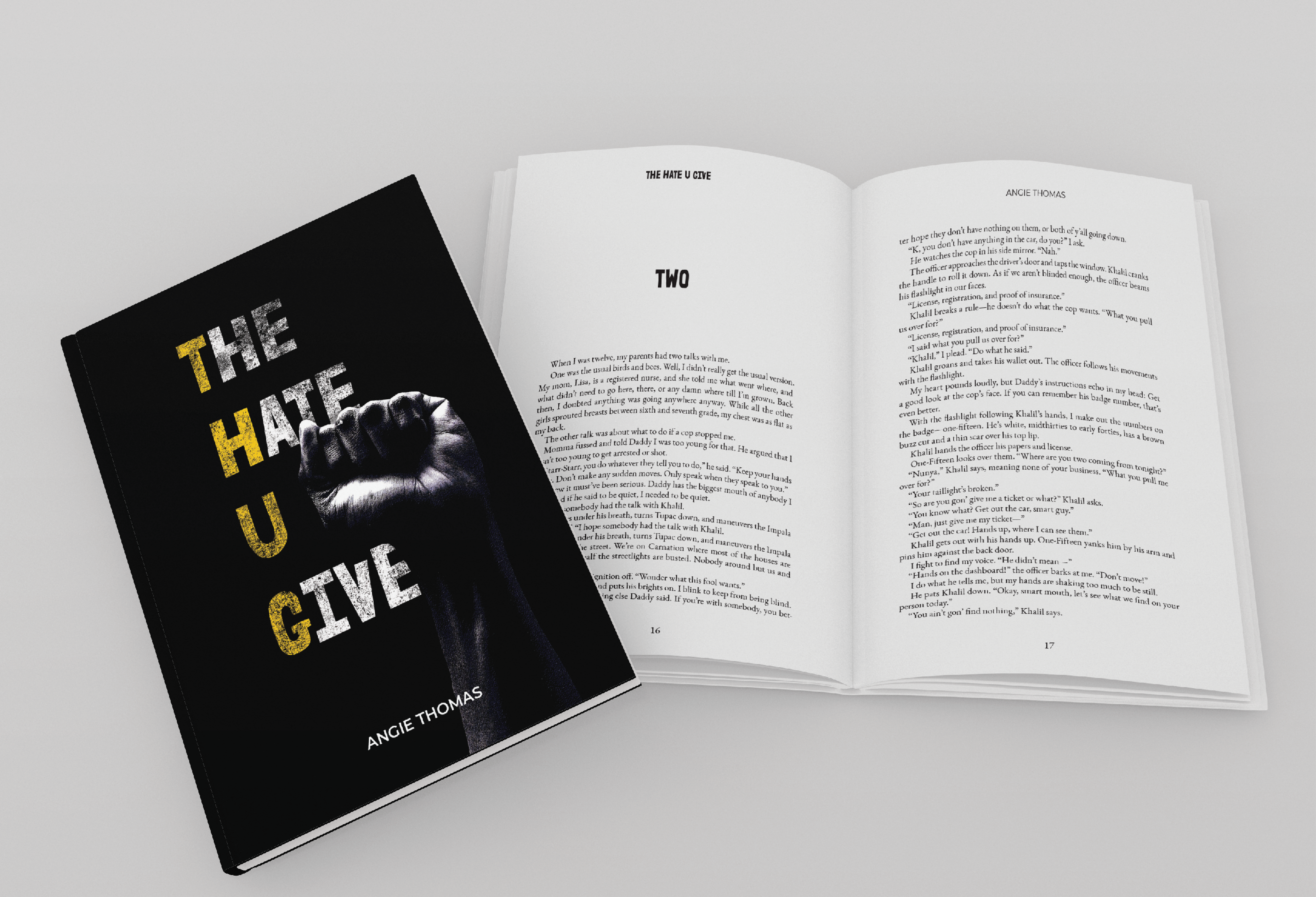
The Hate U Give Cover Redesign
This project consisted of designing a short book from cover to cover, complete with all the
components that are conventional to the design of books, all while offering a fresh perspective on book design. The book chosen for this project was The Hate U Give, this book examines the way society uses stereotypes of black people to justify violence and racism against them. It touches on themes of police brutality and being a minority, and especially on being a person of color. With that in mind, I incorporated those themes into the book cover.
components that are conventional to the design of books, all while offering a fresh perspective on book design. The book chosen for this project was The Hate U Give, this book examines the way society uses stereotypes of black people to justify violence and racism against them. It touches on themes of police brutality and being a minority, and especially on being a person of color. With that in mind, I incorporated those themes into the book cover.
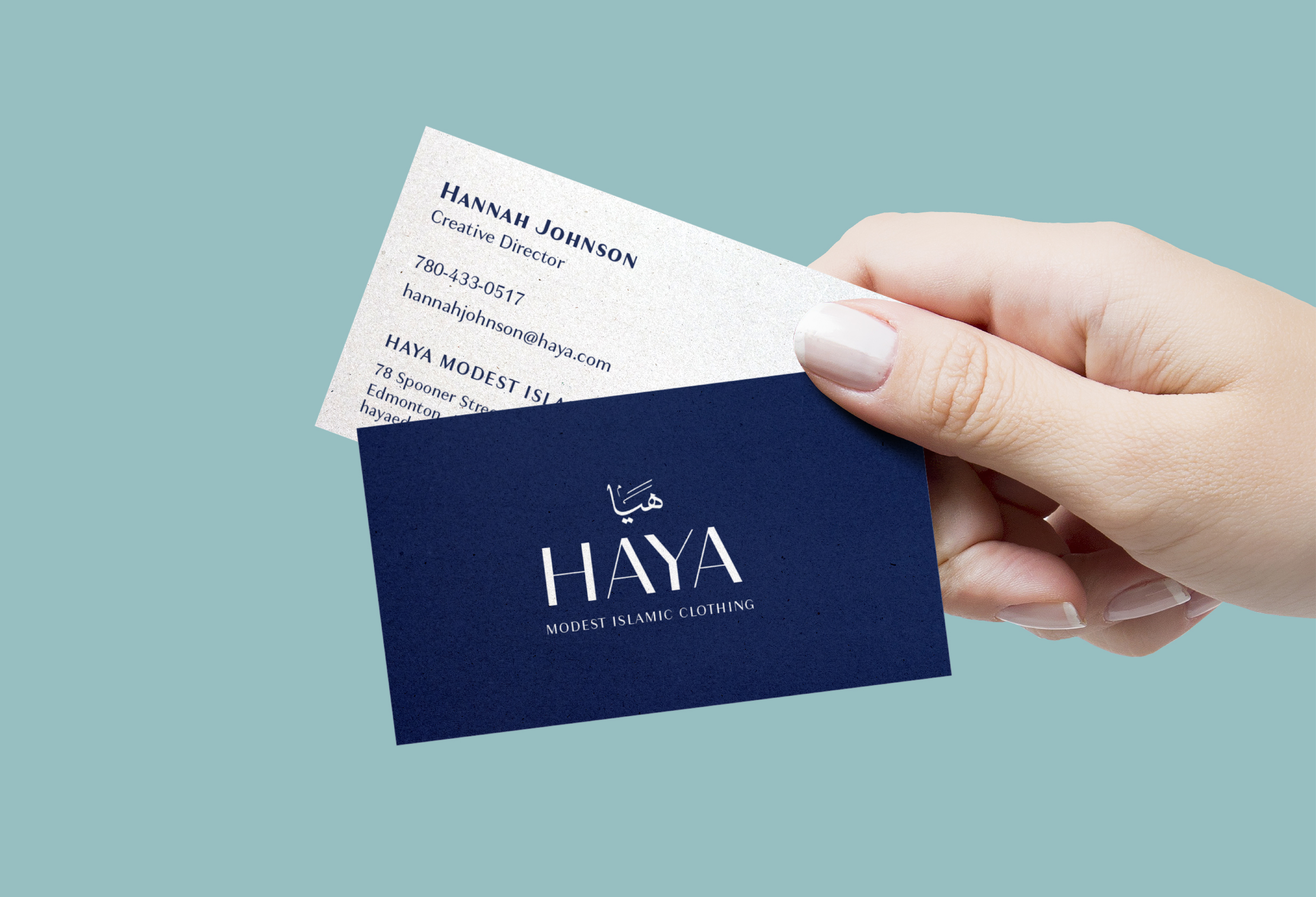
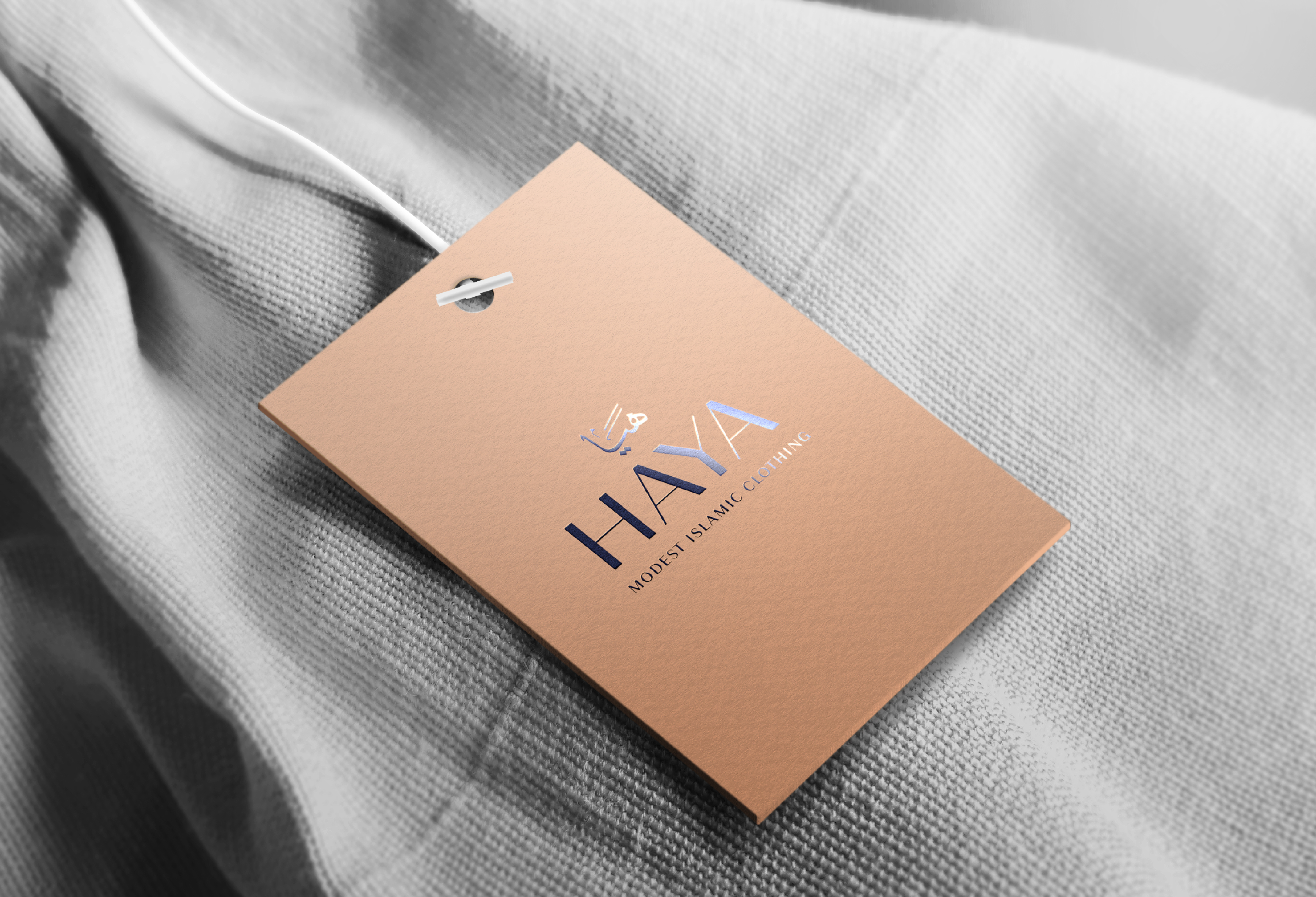
Yasmin House of Islamic Clothing Brand Redesign
This project consisted of re-inventing as well as completely redesign and rebrand an existing store located in Edmonton, Alberta. The store chosen for this redesign was Yasmin House of Islamic Clothing’s current brand identity. The goal was to create a visually appealing system as well as reposition their presence in the market. Helping them appeal to new clients and
customers. Giving the store a brand new identity.
customers. Giving the store a brand new identity.
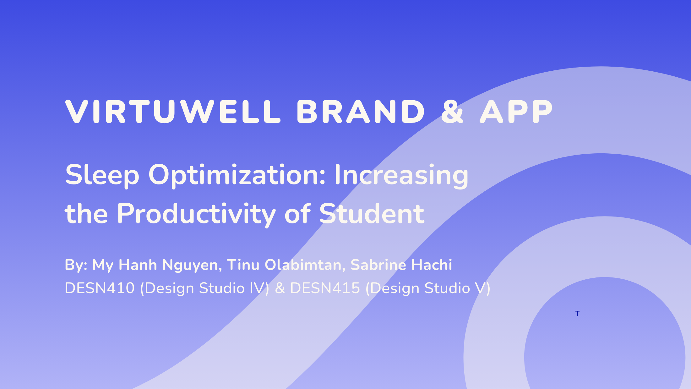
Virtuwell Branding and App
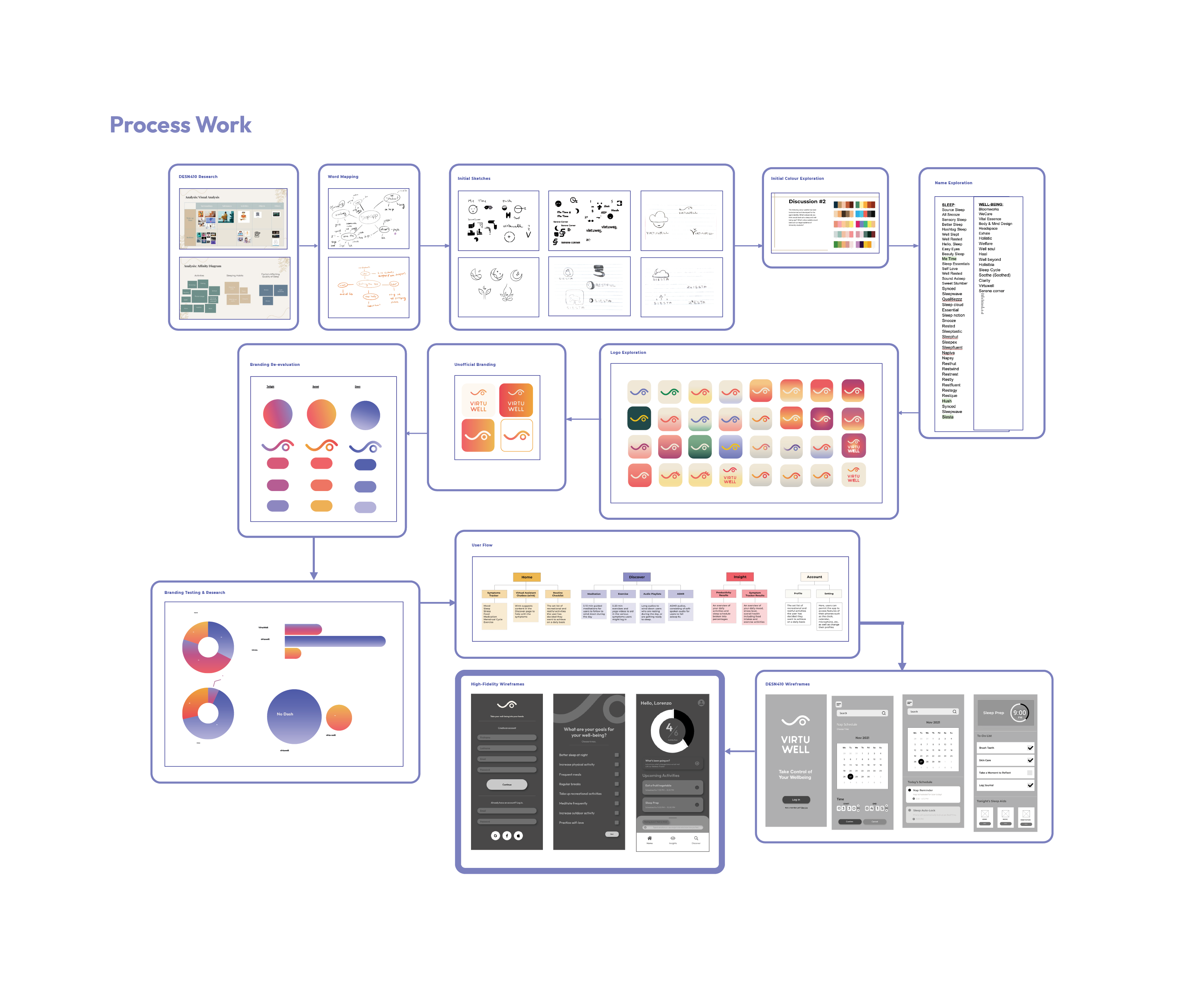
In this project, we studied the issue of bad sleep quality in post-secondary students. While many factors contribute to the unrestful state of most students, the primary cause is lousy sleep hygiene, which is caused by several habits and behaviours on the part of the students. As a group, MyHanh Nguyen, Tinu Olabimtan and Sabrine Hachi challenged themselves to find a design solution to the observed problem.
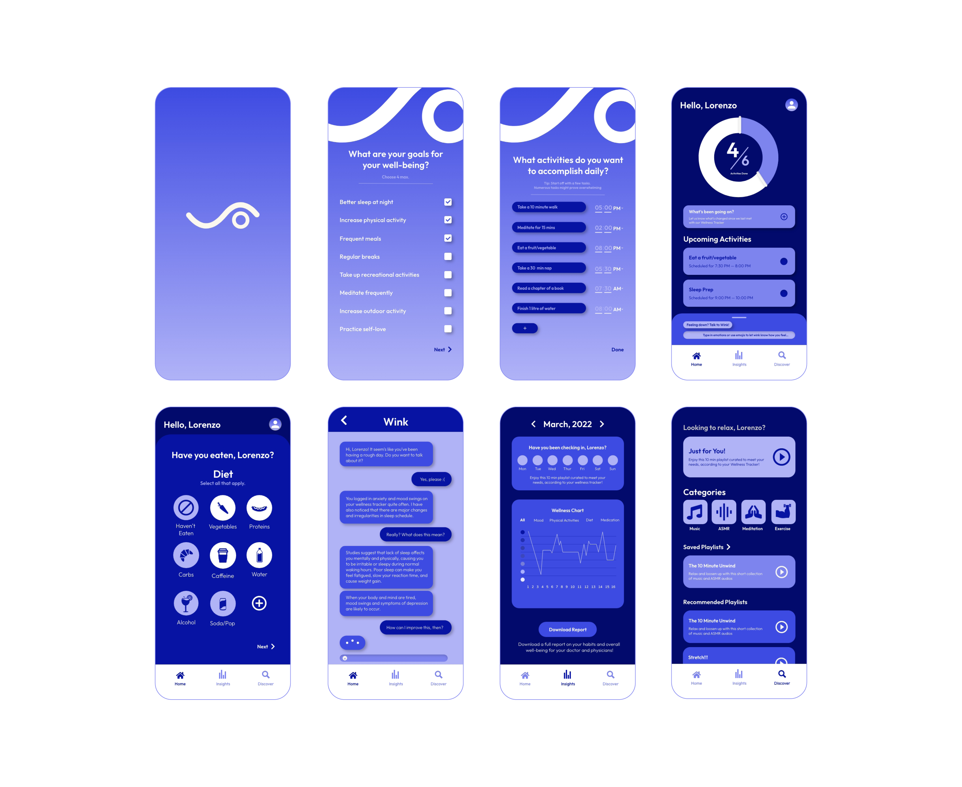
In DESN410, a better understanding of students’ lifestyles concerning sleep quality has been acquired. Further in-depth knowledge of the cyclical relationship between sleep and productivity and their codependent nature resulted in an app that addressed holistic well-being, as opposed to sleep strictly. In DESN415, the team has addressed the user experiential and interactive aspect by creating an application that compels its users to develop good habits that are beneficial to their daily rest.
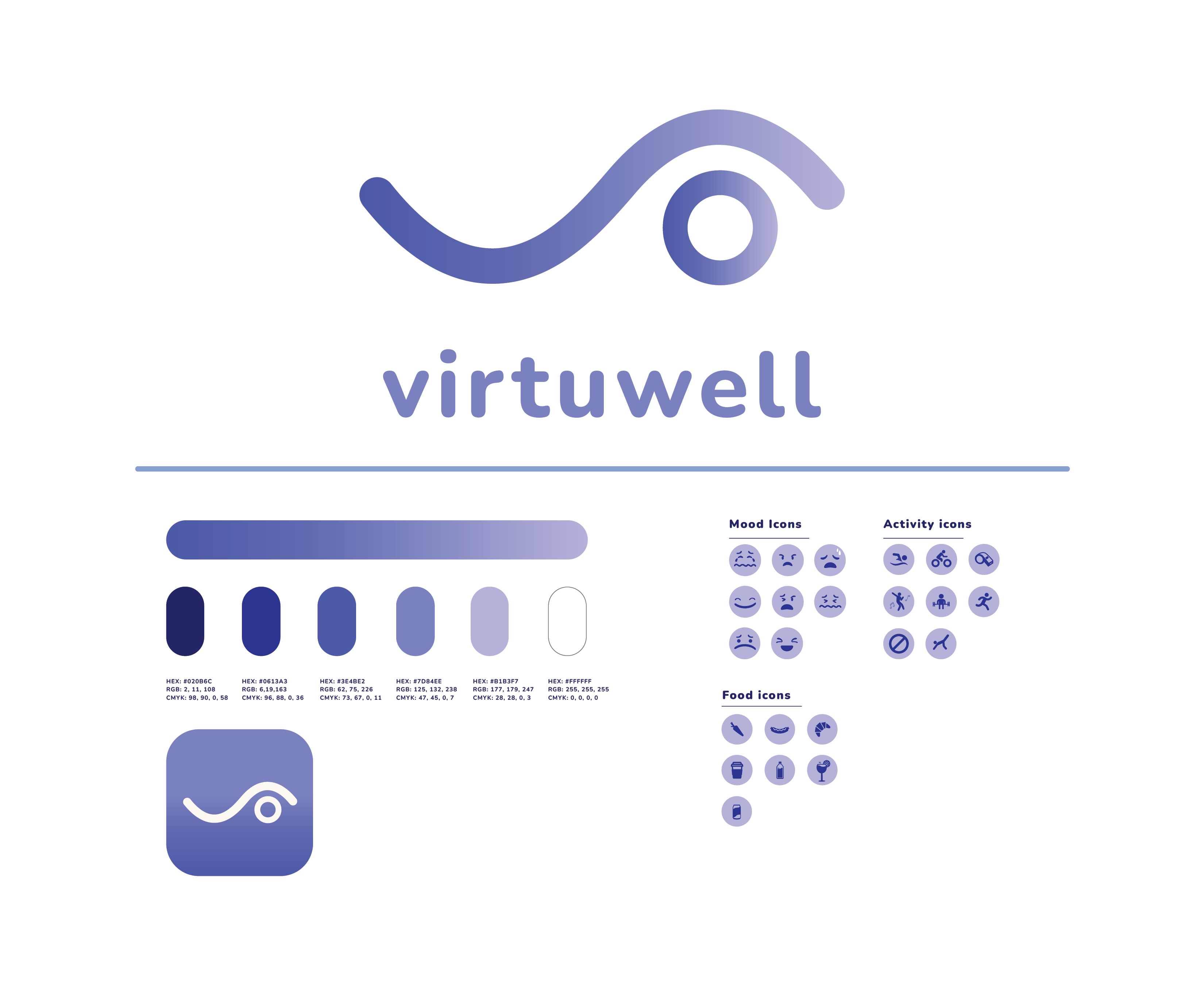
The branding represents the organized, polished feeling that Virtuwell hopes to bring to its users’ lives. Research shows that aesthetics and functionality drive younger audiences. The logo consists of well-rounded edges and curves that represent ease and fluidity while also keeping the viewer grounded with the presence of the circle. The logo (Wink) represents how the app intends to help its users- with better sleeping habits (the closed eye) and improved daily routines (the open eye).
The app provides a feature to let students maintain proper sleep hygiene and provide tools for optimizing a healthier lifestyle and well-being. It offers a new virtual assistant to help individuals who require emotional support. Virtuwell also has a customizable feature for users to input their own goals, providing a more personal experience. This idea was drawn from research, where participants voiced the importance of a personalized experience in a self-care app.


