
Community Partner
Ignite Fairview
My partner Ignite Fairview is a non-profit offering free programs to youths, and they needed a new marketing strategy. The goal was to redesign their logo, website, and promotional material to help increase their engagement and organizational awareness.
This video specifically better contextualizes the whole deliverables and shows a comparison of the current website and logo versus the redesign. It also gives the audience a glimpse of what Ignite Fairview is about.
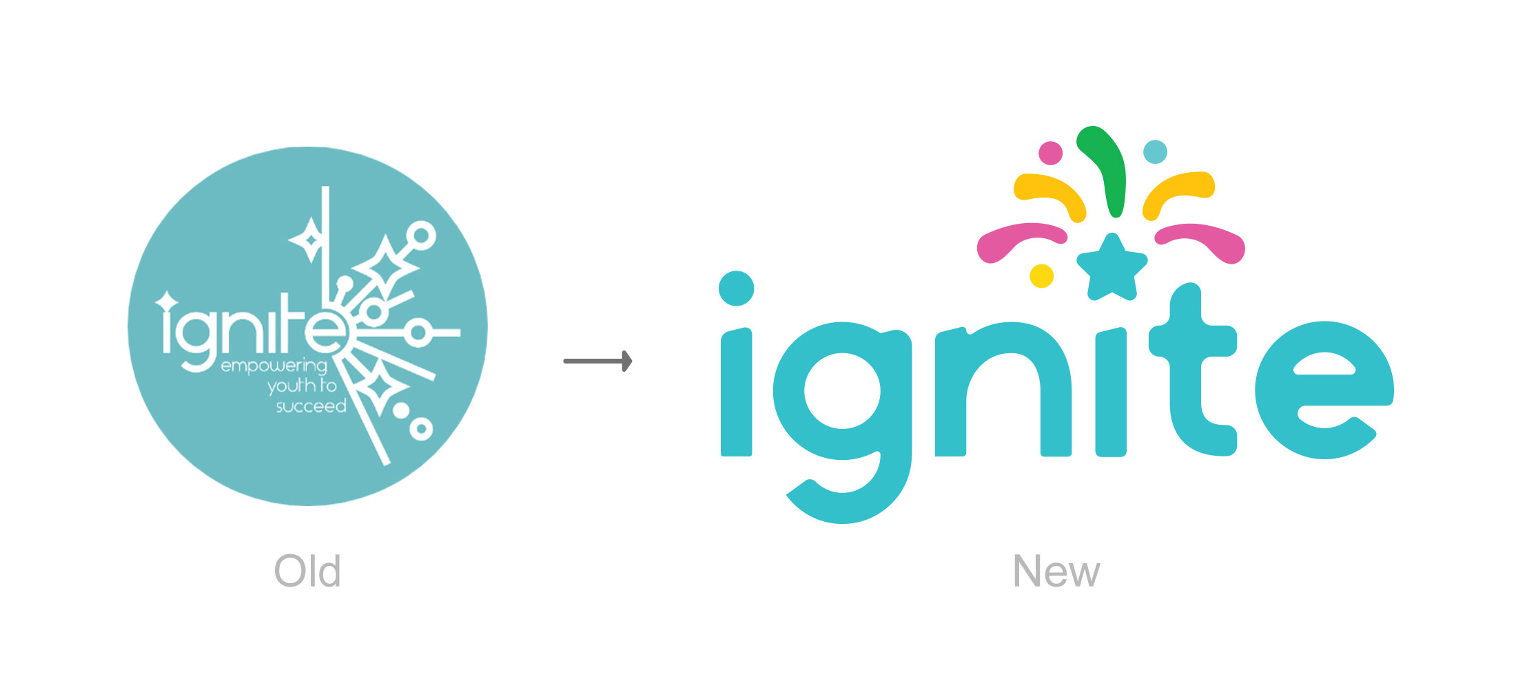
For better comparison, the original logo is on the right side. The logo faces major legibility issues when scaled down, especially on the firework lines and the tagline. From my user interviews, many mentioned the logo being too busy and the fireworks being somewhat abstract. Also, some participants thought this logo was an actual fireworks company due to the literal representation of fireworks.
While the redesign logo, from my interviews, everyone said the playful portrayal of fireworks provides an immediate word association to the organization's name. They can also immediately sense the youthful aspect from the choice of colours and star element. Overall, the review is positive, and there's a clear understanding of what the organization is about.
While the redesign logo, from my interviews, everyone said the playful portrayal of fireworks provides an immediate word association to the organization's name. They can also immediately sense the youthful aspect from the choice of colours and star element. Overall, the review is positive, and there's a clear understanding of what the organization is about.
Here is the redesign logo! From my previous interview with parents and staff of Ignite, all of them mentioned ‘fireworks’ is what they think of when hearing the organization's name, which is clearly reflected in the new logo. Fireworks also happen to represent hope and milestones. Much like Ignite Fairview's mission, they empower the youth to succeed and prepare for adulthood. Lastly, I used vibrant colours for the fireworks to reinforce playfulness and display the youth focus of the organization.
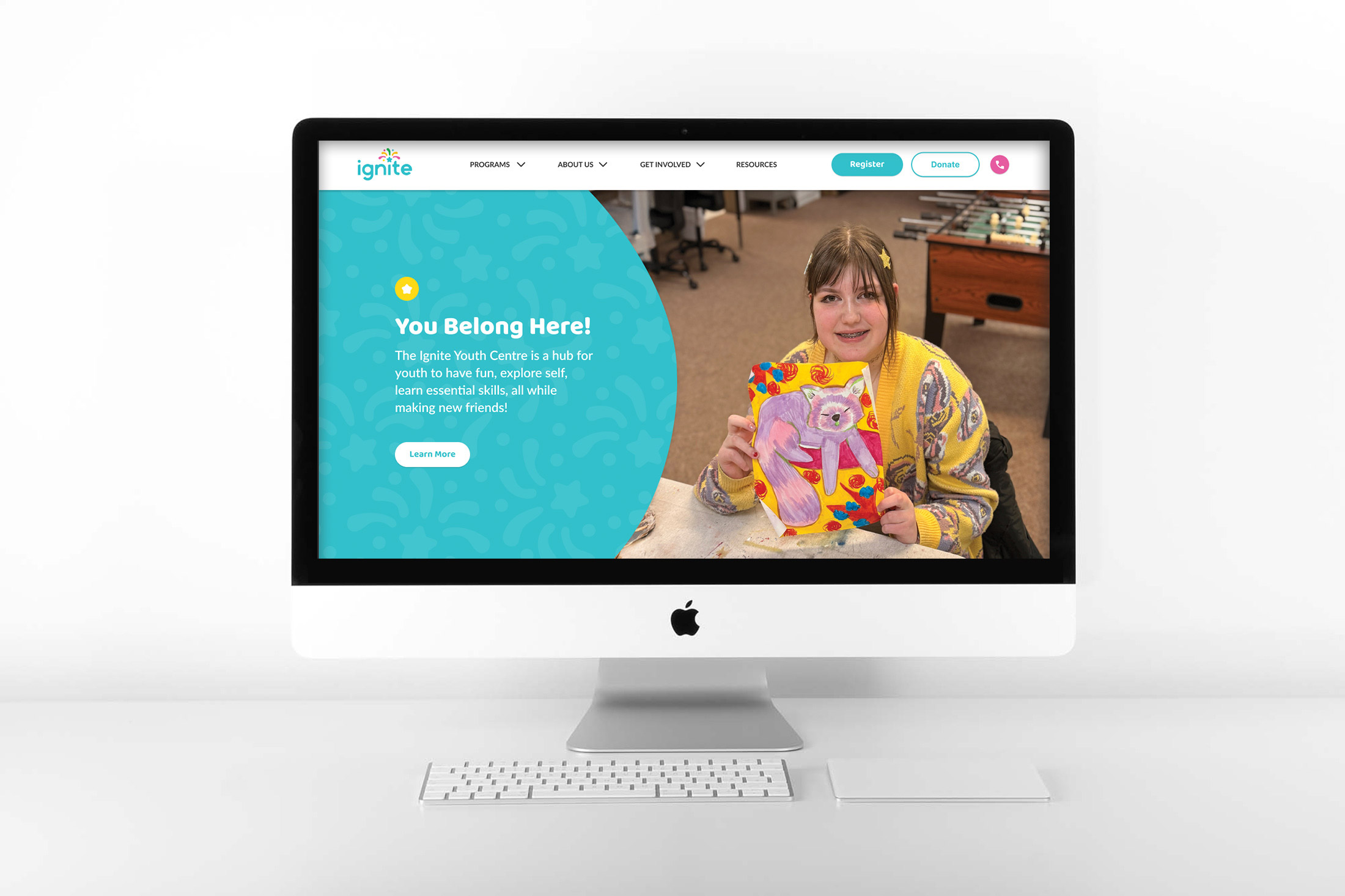
The homepage reflects the new branding, ensuring the page is visually interesting and youthful. The hero specifically encapsulates the branding and what Ignite is about. From the logo, pattern, and picture, everything works together to showcase the energetic and youthful aspect of the organization. There is a sense of friendliness that invites the audience to get to know Ignite better.
The primary aspect of this redesign was reconstructing the sitemap. Here, the sitemap has clearer labels and grouping of items, plus call-to-action buttons. As a result, during my user test, they were able to immediately find donation and registration, which are the essential functionalities of the site. In the future, users can easily engage with the organization as the usability is more streamlined. The next step will be building this on Squarespace and publishing it, which will put my capstone into full effect. "
The primary aspect of this redesign was reconstructing the sitemap. Here, the sitemap has clearer labels and grouping of items, plus call-to-action buttons. As a result, during my user test, they were able to immediately find donation and registration, which are the essential functionalities of the site. In the future, users can easily engage with the organization as the usability is more streamlined. The next step will be building this on Squarespace and publishing it, which will put my capstone into full effect. "
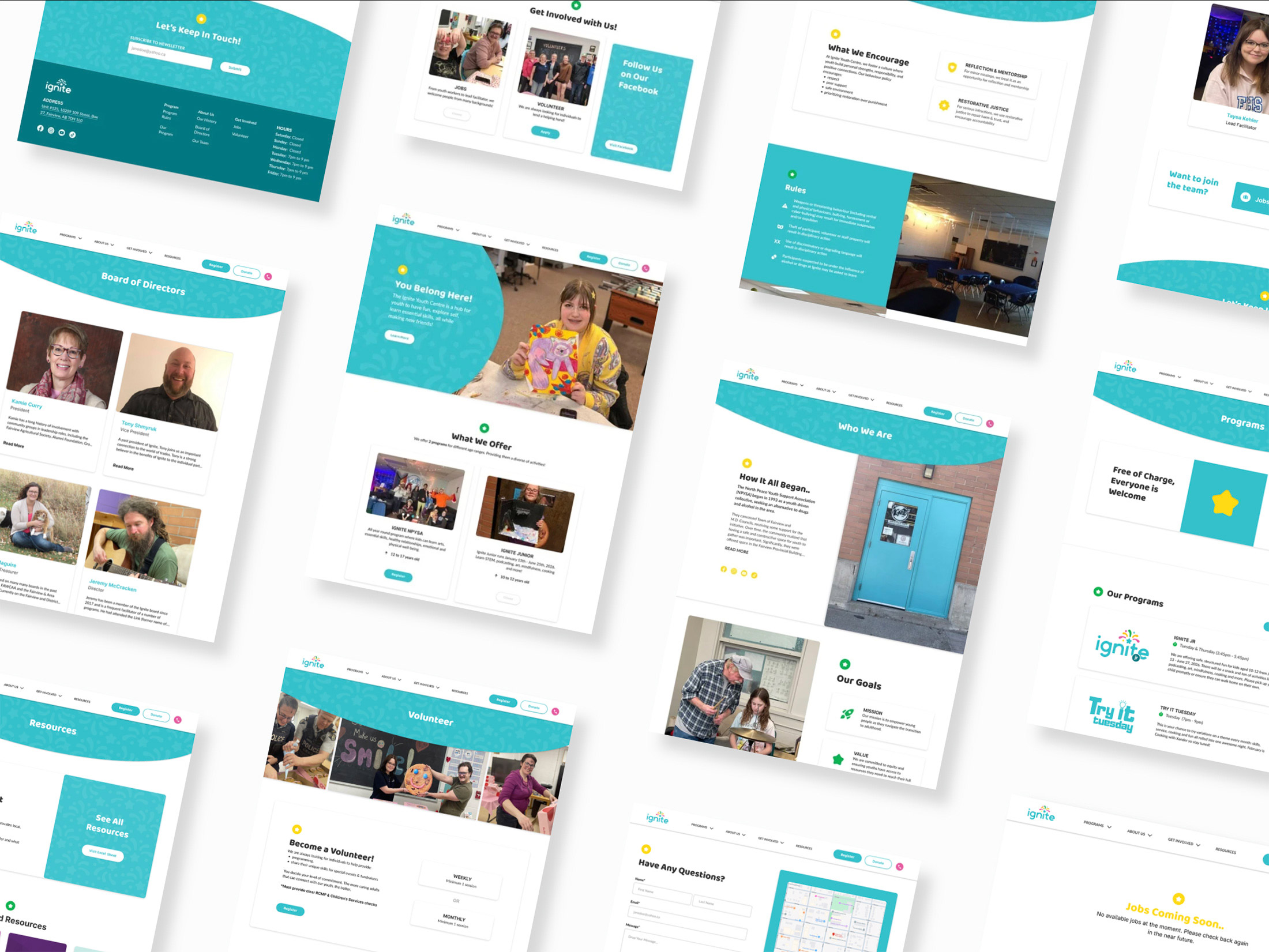
Here are the rest of the pages. I redesigned all 10 screens, ensuring everything is clean and organized. I focused on ensuring there are no text-heavy pages, instead implementing more icons or images to reduce mental overload. Every section is a structured layout to keep all information cohesive and easy to find.
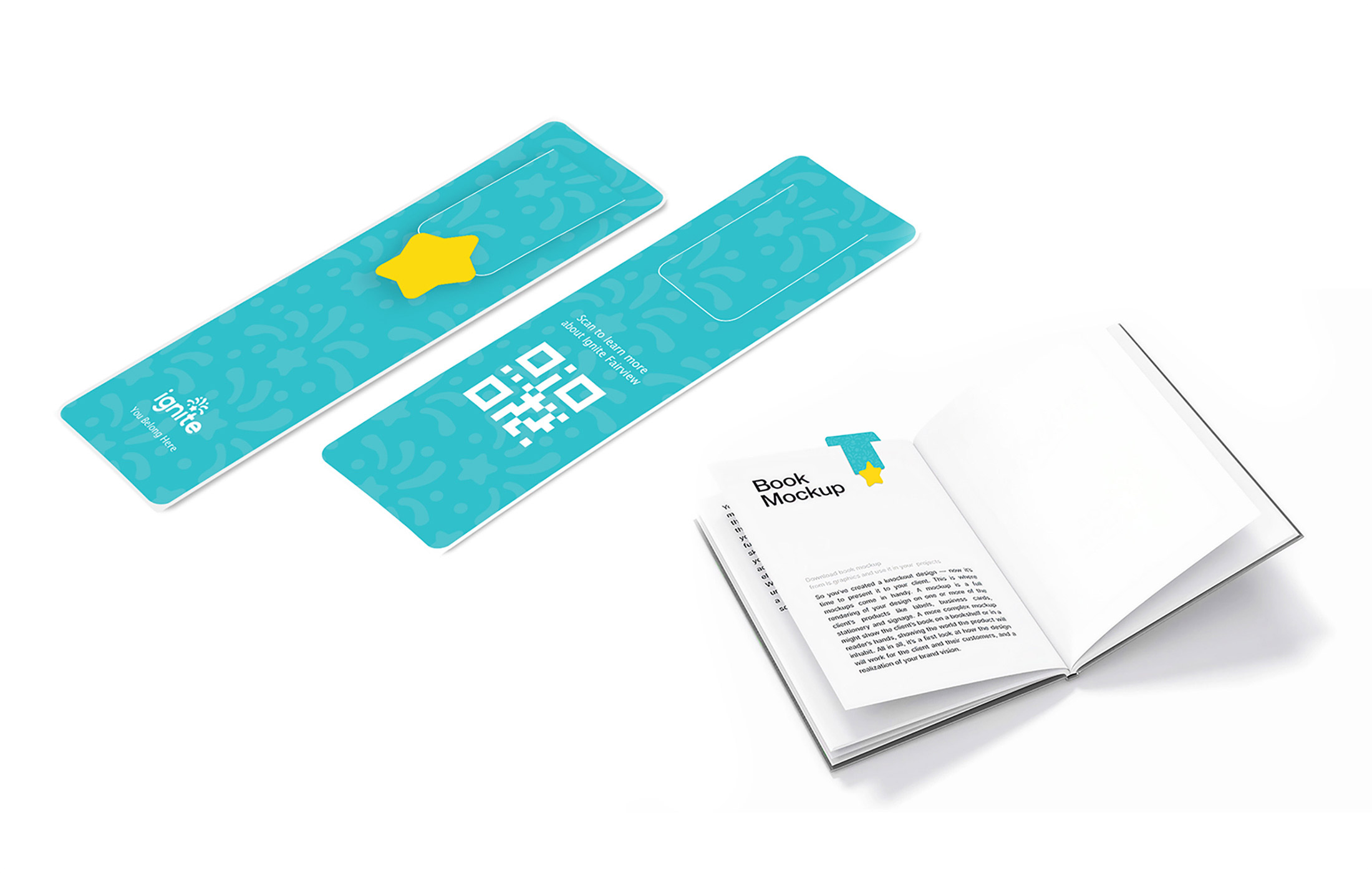
My last deliverable was a promotional material, specifically a bookmark. I implemented the fireworks elements from the logo as a subtle texture to provide depth. On top is the star for visual interest and reinforcing the youth aspect of the organization.
The goal is to hand this out in public and have people scan the QR code at the back, which will take them to the website. This deliverable is extremely important as it acts as a bridge to encourage actionable engagement on the site, simultaneously spreading Ignite's name in the community.
The goal is to hand this out in public and have people scan the QR code at the back, which will take them to the website. This deliverable is extremely important as it acts as a bridge to encourage actionable engagement on the site, simultaneously spreading Ignite's name in the community.