
Research conducted in DESN 415, together with the identified problem, focused on supporting immigrant women in Canada through the development of a cookbook and a service catalogue. Both outcomes are rooted in the lived experiences of the women involved, capturing their stories, emotions, and cultural identities. The purpose of these projects is to create a sense of home and belonging by preserving traditional recipes, sharing personal narratives, and strengthening community connections. While the cookbook allows women to maintain and celebrate their cultural heritage through food, the service catalogue serves as a practical resource where they can access support for their everyday needs, helping them navigate new environments and situations with greater confidence.
Following an extensive process of iteration and refinement, the final outcome materialized as a 188-page cookbook that combines storytelling, cultural identity, and visual design. The book introduces the origins of the organization and its founder, and is structured through different countries that reflect the diverse backgrounds of the participants. Each section integrates personal stories, traditional recipes, and visual elements that highlight both cultural richness and individual experiences. The design incorporates warm tones and adaptable visual systems to represent each culture, supported by photography that enhances authenticity. Overall, the project achieves a balance between design and narrative, resulting in a meaningful piece that fosters connection, preserves heritage, and supports immigrant women in building a sense of home.
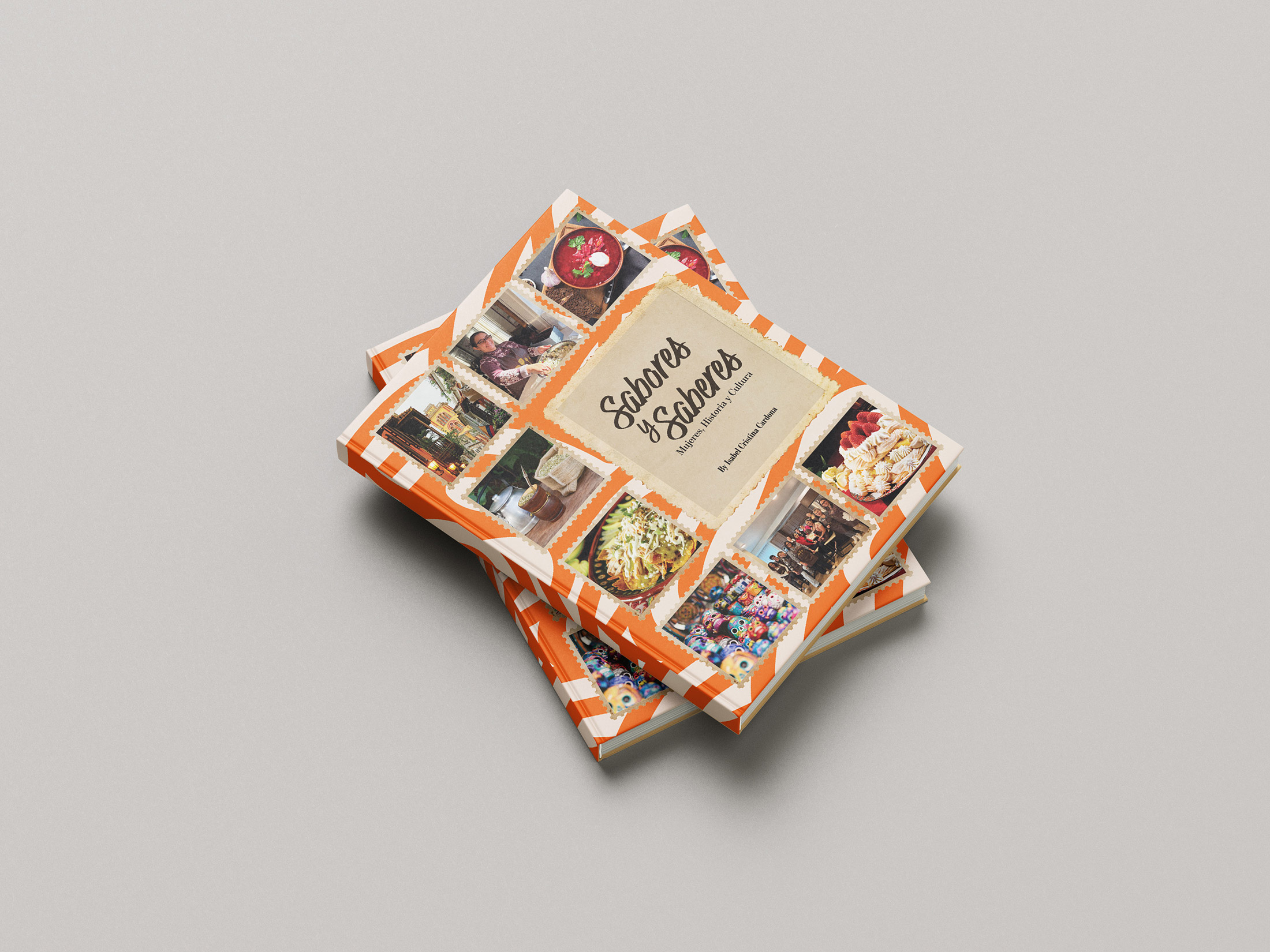
The overall aesthetic communicates warmth, community, and cultural richness. The use of vibrant orange accents evokes energy and familiarity, while the collage of images reflects diversity and lived experiences. The stacked arrangement of the books adds a sense of tangibility and completion, emphasizing the project as a physical outcome. Altogether, the image captures not only a cookbook but a designed artifact that embodies storytelling, identity, and connection through food.

The composition emphasizes the narrative and human-centred aspect of the project, highlighting how design is used to amplify individual voices and shared experiences. The inclusion of portraits, handwritten-style headings, and floral or cultural graphic elements reinforces themes of identity, memory, and community. The varied layouts suggest different sections within the publication, each maintaining a cohesive visual language while allowing for cultural expression. Overall, the image reflects a thoughtful editorial system that blends storytelling, design, and cultural representation into a unified and meaningful outcome.
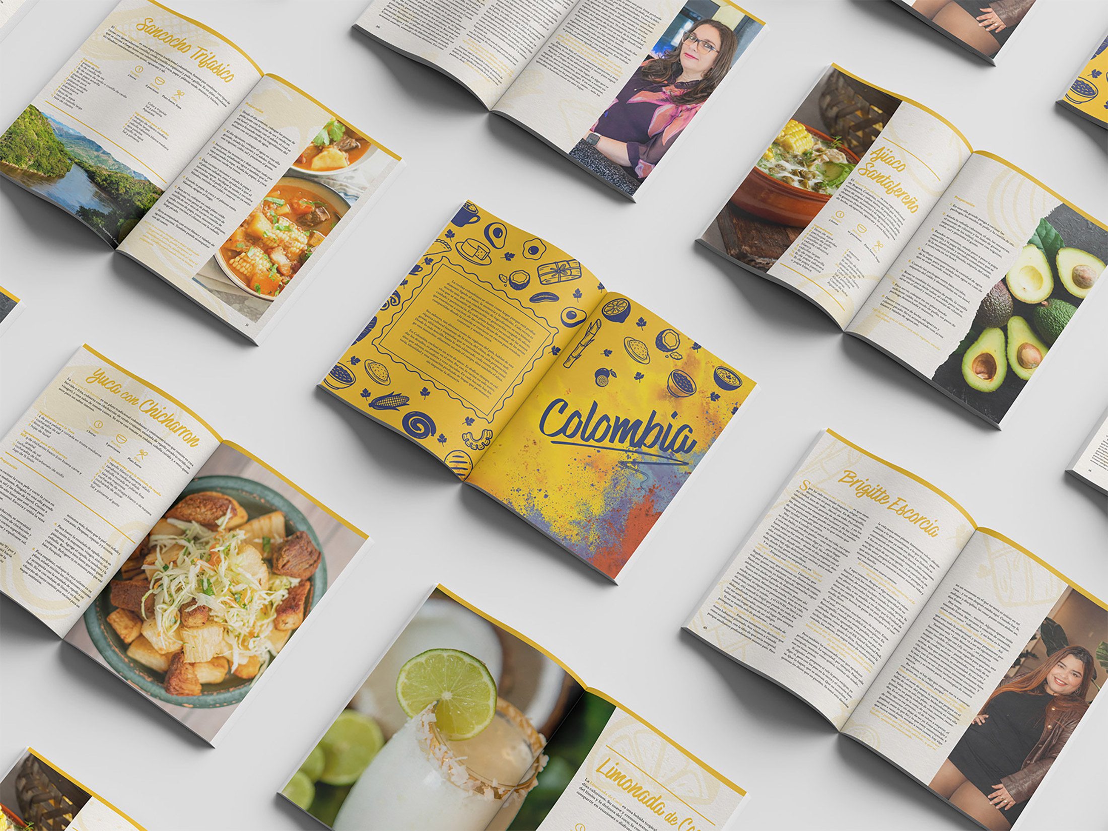
The design emphasizes cultural storytelling through a combination of colour, imagery, and typography. Each section appears to represent a different country, using distinct visual elements while maintaining an overall cohesive style. The inclusion of portraits alongside recipes reinforces the human aspect of the project, connecting food with personal narratives and identity. Overall, the image communicates a rich, immersive editorial experience where design and content work together to celebrate heritage, community, and the shared language of food.
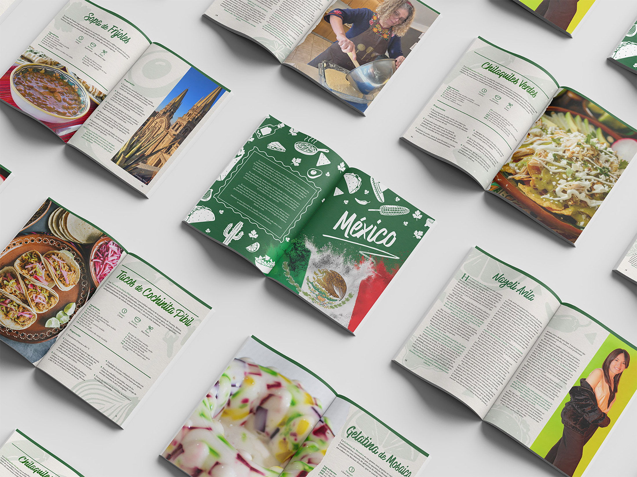
The design highlights cultural identity through a cohesive yet adaptable visual system. Each spread maintains a consistent editorial structure while allowing for distinct cultural expression through colour, imagery, and graphic motifs. The presence of personal narratives and portraits within some pages reinforces the connection between food and lived experience. Overall, the image reflects a dynamic and immersive publication where design, storytelling, and gastronomy come together to celebrate heritage and community.
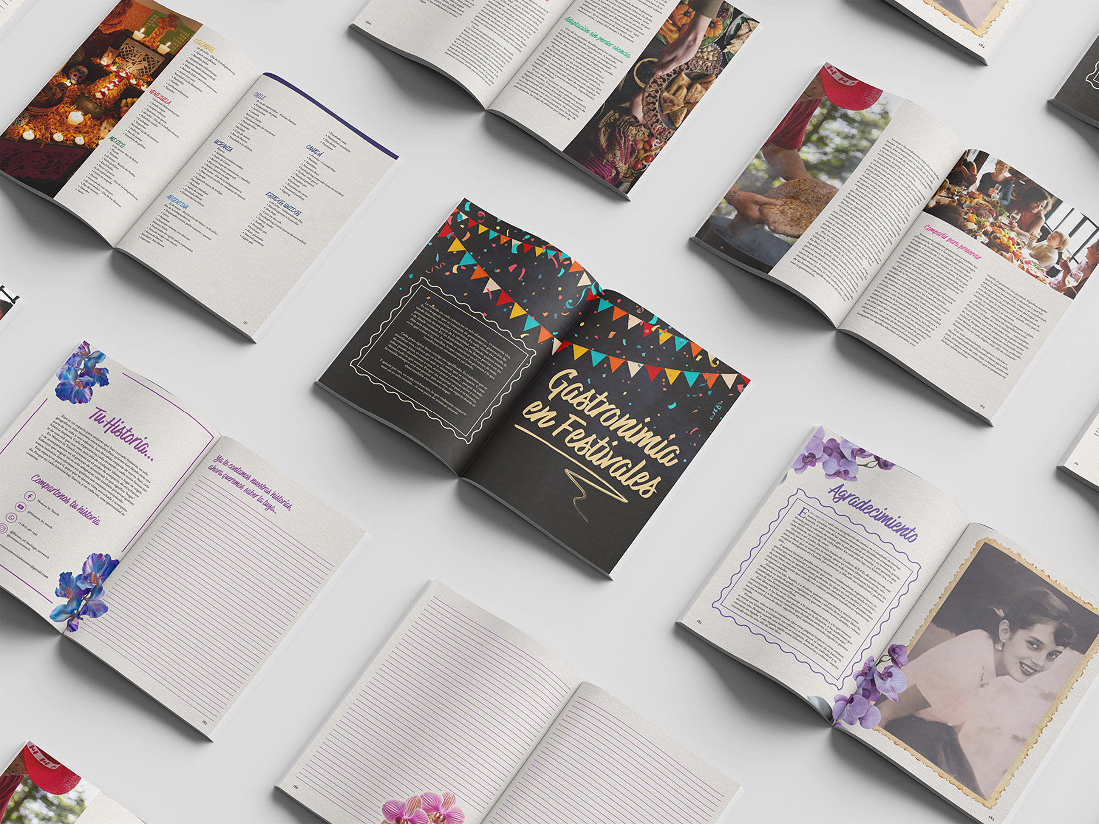
The overall design emphasizes storytelling through a balance of cultural expression and editorial consistency. Softer spreads with floral accents and handwritten-style headings contrast with the bold central page, reinforcing the diversity of themes within the book. The inclusion of personal sections such as acknowledgments and narrative entries adds depth, connecting the reader to individual experiences behind the recipes. Altogether, the image communicates a rich and immersive publication where food, memory, and community are interwoven through thoughtful design and visual storytelling.