
Community Partner
AdaptAbilities
This project was completed for DESN410/415 and focused on redesigning the AdaptAbilities website. The outcome was a full redesign, with a focus on improving information architecture, navigation, and overall usability.
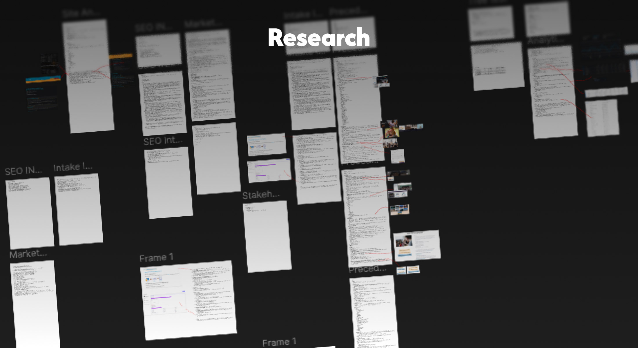
Deliverables included a restructured sitemap, a lean design system, a custom component library, and revised IA. Research was the foundation of every decision, from stakeholder interviews and analytics through GA4/Calirty to a tree test through Lyssna.

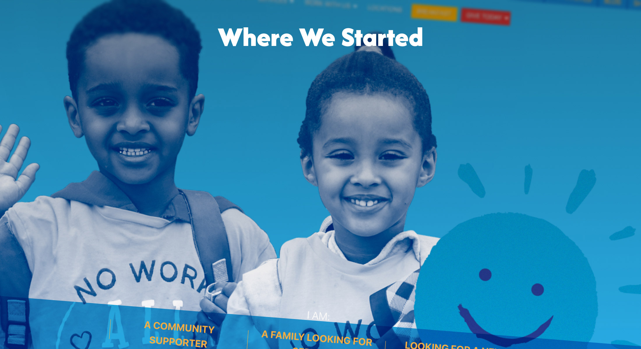
Before I could understand the problem, I wanted to understand AdaptAbilities, who they serve, and what was getting in their way.
The Organization:
AdaptAbilities is an Edmonton-based nonprofit, providing inclusive programs and supports for individuals with disabilities and they families across Edmonton.
The Problem:
Program details, pricing, and eligibility information were fragmented throughout the site, leaving families without the answers they needed to drive action.
The Challenge:
Designing for a wide range of visitors, including: families, donors, caregivers, and job seekers, each with different needs, levels of digital literacy, and reason for being there.
From four main methodologies, I discovered consistent and recurring issues.
Stakeholder Interviews:
Families couldn't find program information without calling staff directly.
Analytics:
High friction despite high intent. Deadclick and quickback rates pointed toward navigation and labelling as core problems.
Tree Testing:
Program information pathways failed, with rates as low as 47% despite users feeling confident they were in the right place.
Precedent Analysis:
Six comparable nonprofits confirmed what data showed. Fragmented IA and text-heavy pages are consistent with lower performance.
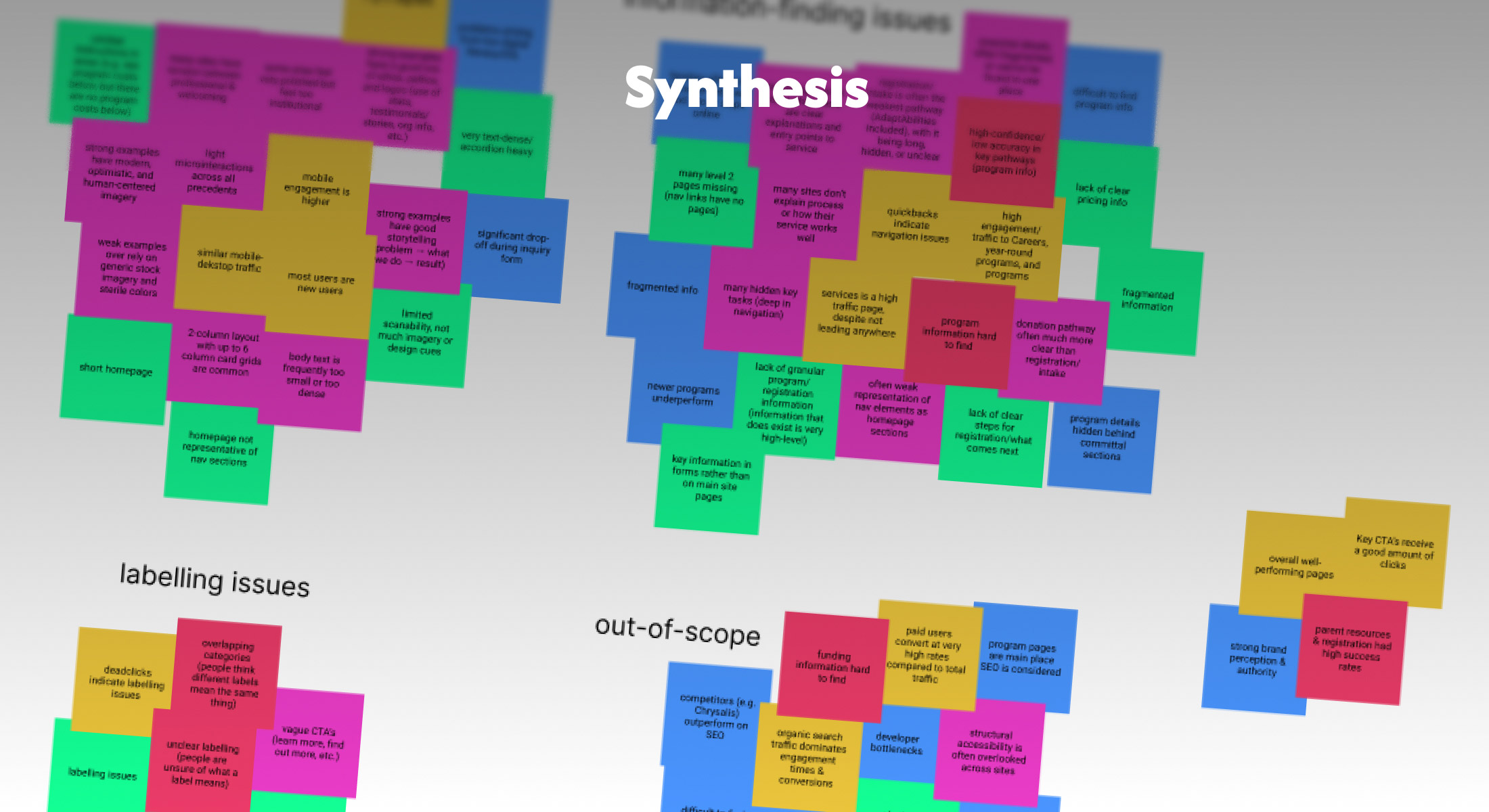
Insights across all methodologies were organized into themes that shaped design decisions.
Information-Finding Issues:
Fragmented program pathways, hidden tasks, and unclear copy are driving drop-off.
Design Considerations:
Device profiles, text density, and layout patterns that informed design direction.
Labelling Issues:
Navigation terminology that didn't match the users' mental models, compounded by a large ESL audience.
Out of Scope:
Organizational constraints, third-party limitations, SEO/Ad considerations, and technical debt. Documented and sent as recommendations rather than design solutions.
A restructured information architecture and consolidated information in key locations to help visitors get the information they need without friction.
Shallower Structure:
A wider, shallower sitemap reduces the number of steps between landing and finding.
Information Right in the Program Page:
Funding, eligibility, schedules, and locations are consolidated so families aren't hunting across the site for information.
Clear Starting Points:
Second-level hub pages route each visitor type toward what they actually need, and are setup with a strong cross linking strategy in case someone ends up in the wrong place.

A reorganized and expanded resource hub that feels less like a file dump and more like a destination for everything families need to know for their continuing journey with AdaptAbilities.
For New Families:
Guides, funding information, and next steps in one place.
For Existing Families:
Forms, calendars, and ongoing support resources are organized and easy to return to.
A Reduced Staff Burden:
Self-serve access to key resources, like how to receive funding, means fewer calls and emails to intake staff.
Less Searching
Funding guides, forms, and support materials are consolidated into a grid so that families can find what they need.
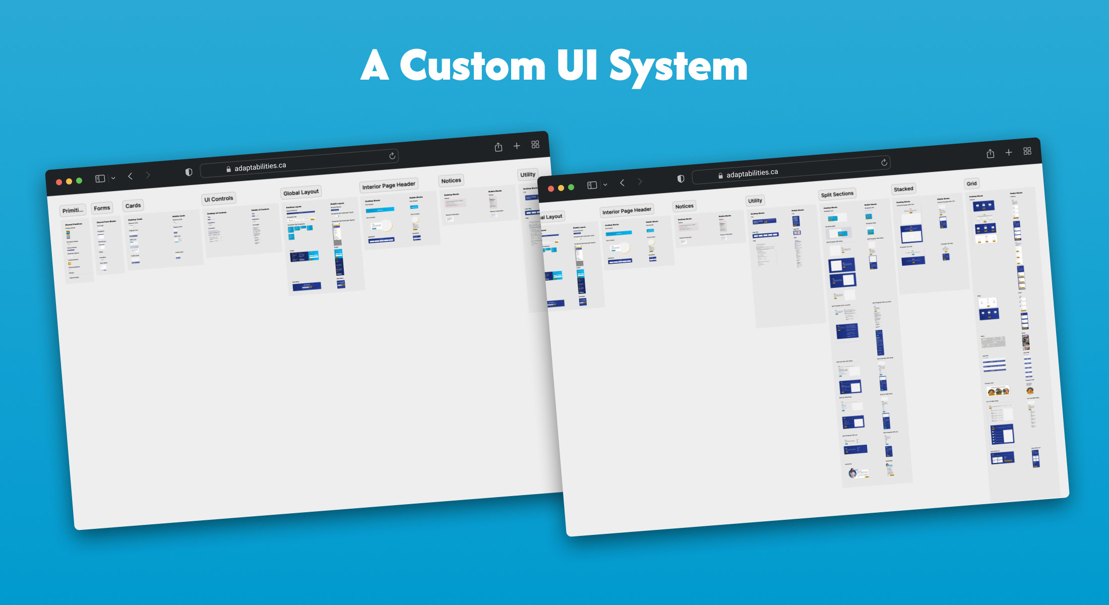
A fully custom UI component library built from scratch to bring consistency and scalability to the site.
A Bespoke System:
Templated sections that match AdaptAbilities branding and voice.
Tokenized:
A full token system that covers brand & semantic colours, type scale, elevations, border radiuses, and spacing at different screen sizes.
Reusable Components:
Every button, card, form, and section pattern is built as a reusable component that translates to development, allowing for modular design & upkeep available to AdaptAbilities staff.
Flexibility:
Every component has a desktop and mobile version, as well as a light version and a card version, so that sections can be mixed and matched to content without losing visual aesthetic.

If I had more time, there are a few things I would push further...
Post-Launch Research:
A second round of analytics reviews and usability testing after launch to validate whether the redesign is working as intended.
Localization:
Plain language helps, especially with accessibility, but a proper localization strategy would more directly address the language barrier present in the audience.
Registration Flow:
The intake wizard and family portal were friction points, but outside the scope of the redesign. Reviewing the end-to-end registration experience would help complete the user journey.
External Site Consolidation:
Donation platform, intake, and the family portal live on separate third-party domains, creating a fragmented experience at a high level. Consolidating these through subsets or deeper integration within the main site would help close that gap.