Anne
Morin
She/Her
I have a passion for design thinking, philosophy, and the exploration of internal narratives. The way I design my external world is a reflection of my internal beliefs and values. I use design as a tool for self-expression and self-discovery, while philosophy and internal narratives play a crucial role in shaping my perception of reality. I believe that design can elevate our experiences and contribute to a more harmonious and meaningful existence. I also like illustration, publication, and motion graphics.
The Church of The Flying Spaghetti Monster
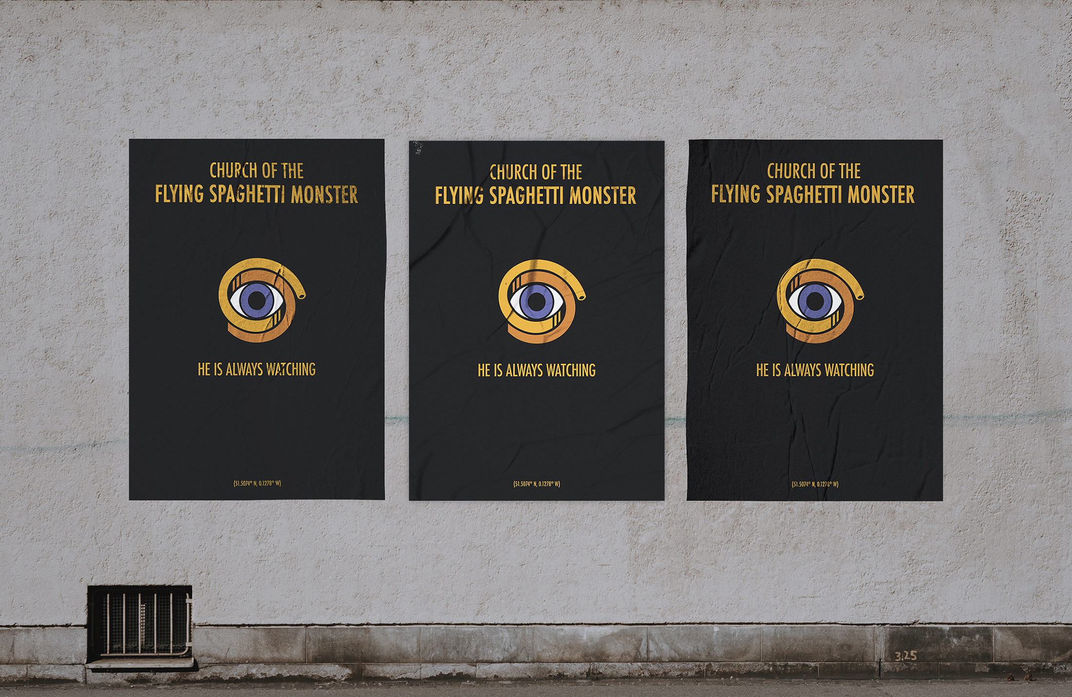
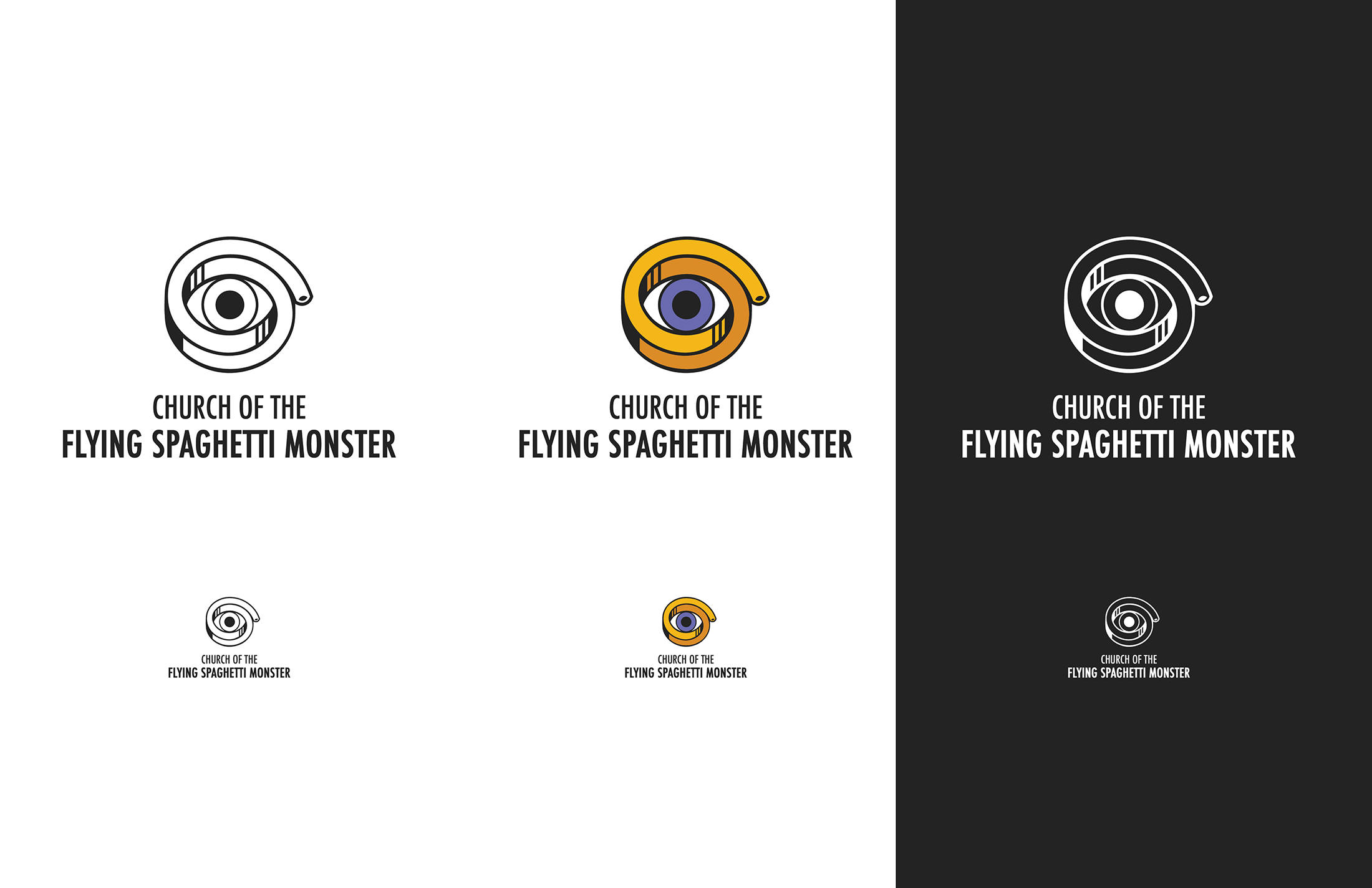
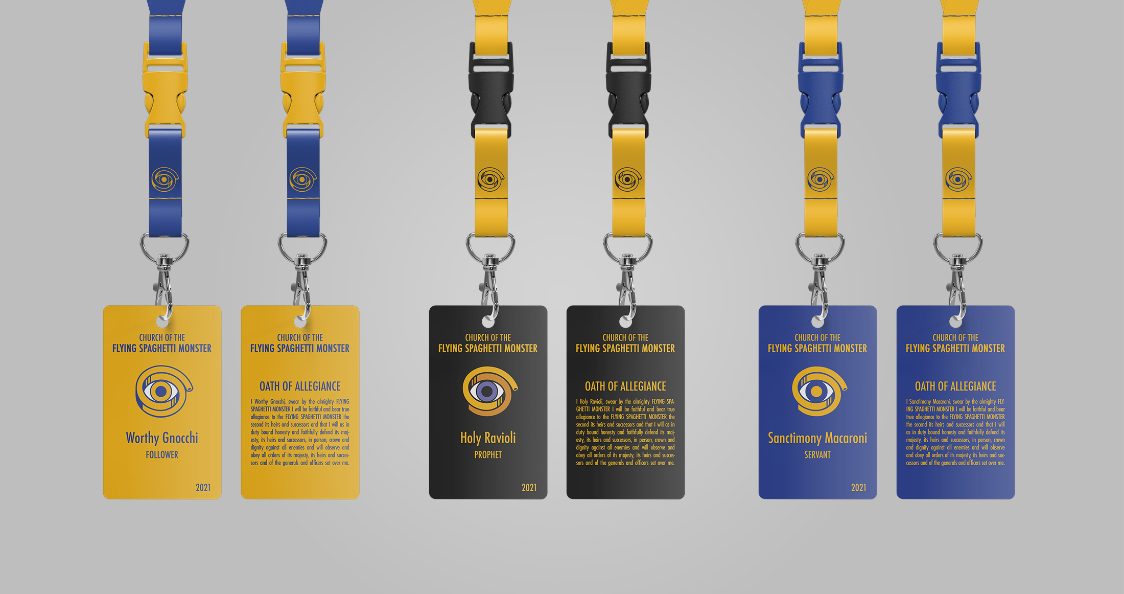
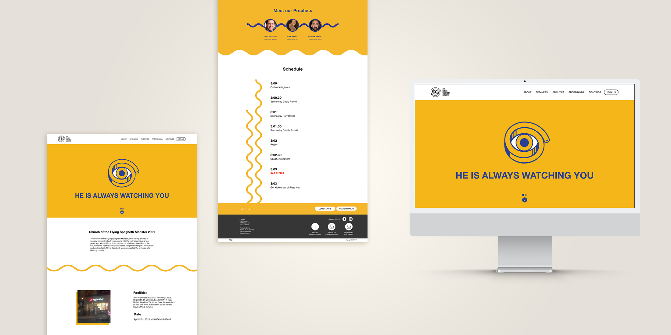
This project aimed to create a cohesive identity system for the Church of The Flying Spaghetti Monster conference. The Flying Spaghetti Monster (FSM) serves as the satirical deity and central figure of the Pastafarian religion, with a playful and satirical brand. The logo, represented by a spaghetti strand wrapped around an eye using illusionary imagery, engages newcomers by peering into their souls. This imagery is consistently repeated throughout the brand's deliverables, including a promotional video, event passes, and the homepage.
Scarabaeidae: The Family Scarabaeidae
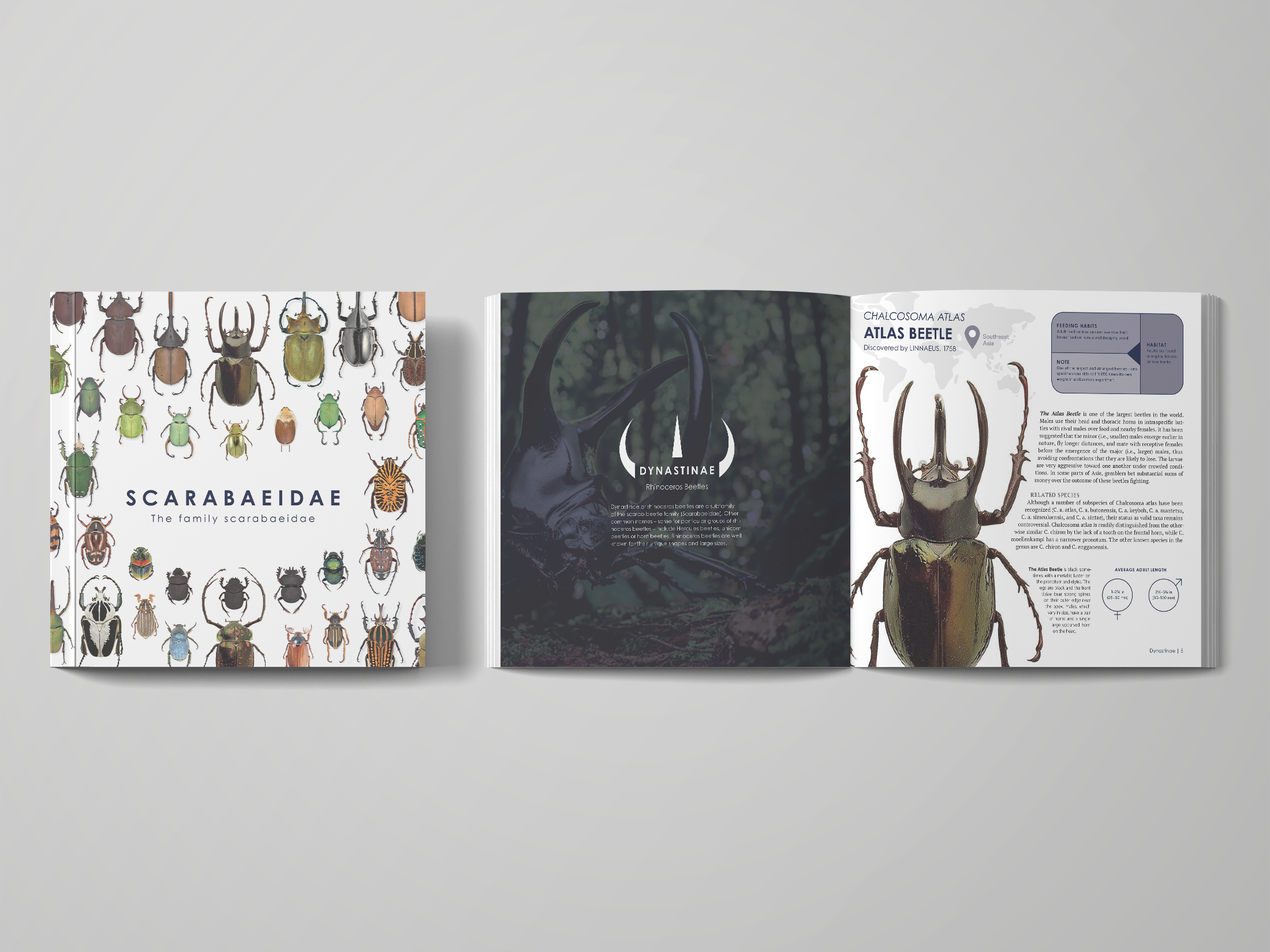
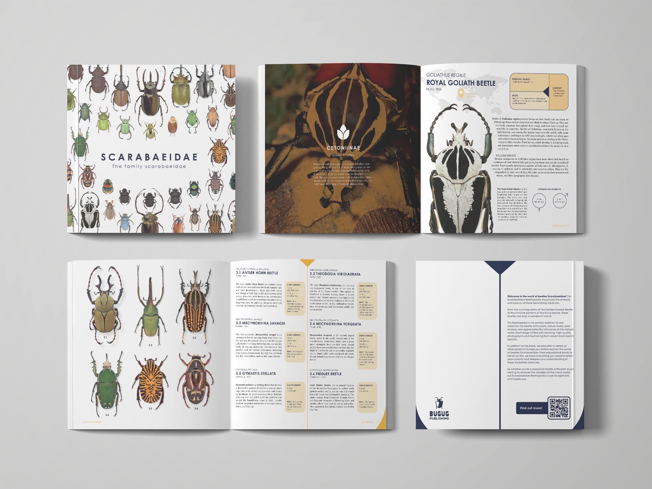
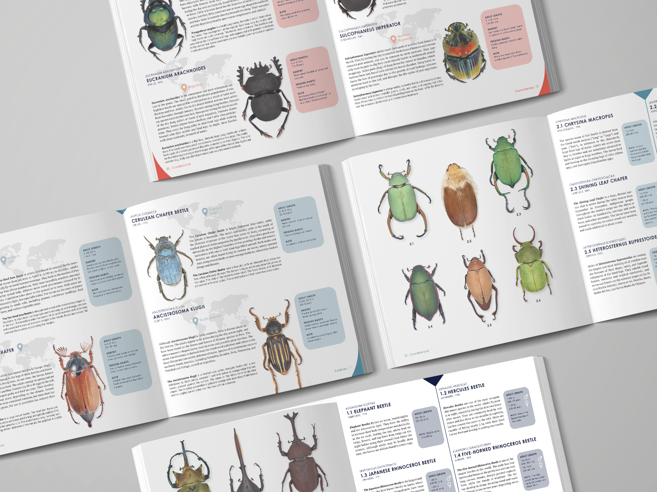
The goal of this project was to create a concise encyclopedia about beetles with a focus on the Scarabaeidae family. The encyclopedia shares fascinating facts about beetles clearly and engagingly, using distinctive imagery inspired by the shape of their back. The triangular, linear, and curved corners serve to organize information and add visual interest. Additionally, the back cover of the encyclopedia is designed to resemble the back of a beetle, adding a playful touch to the design. Overall, this project creates an engaging resource for anyone interested in learning about these fascinating insects.
Miss Snap
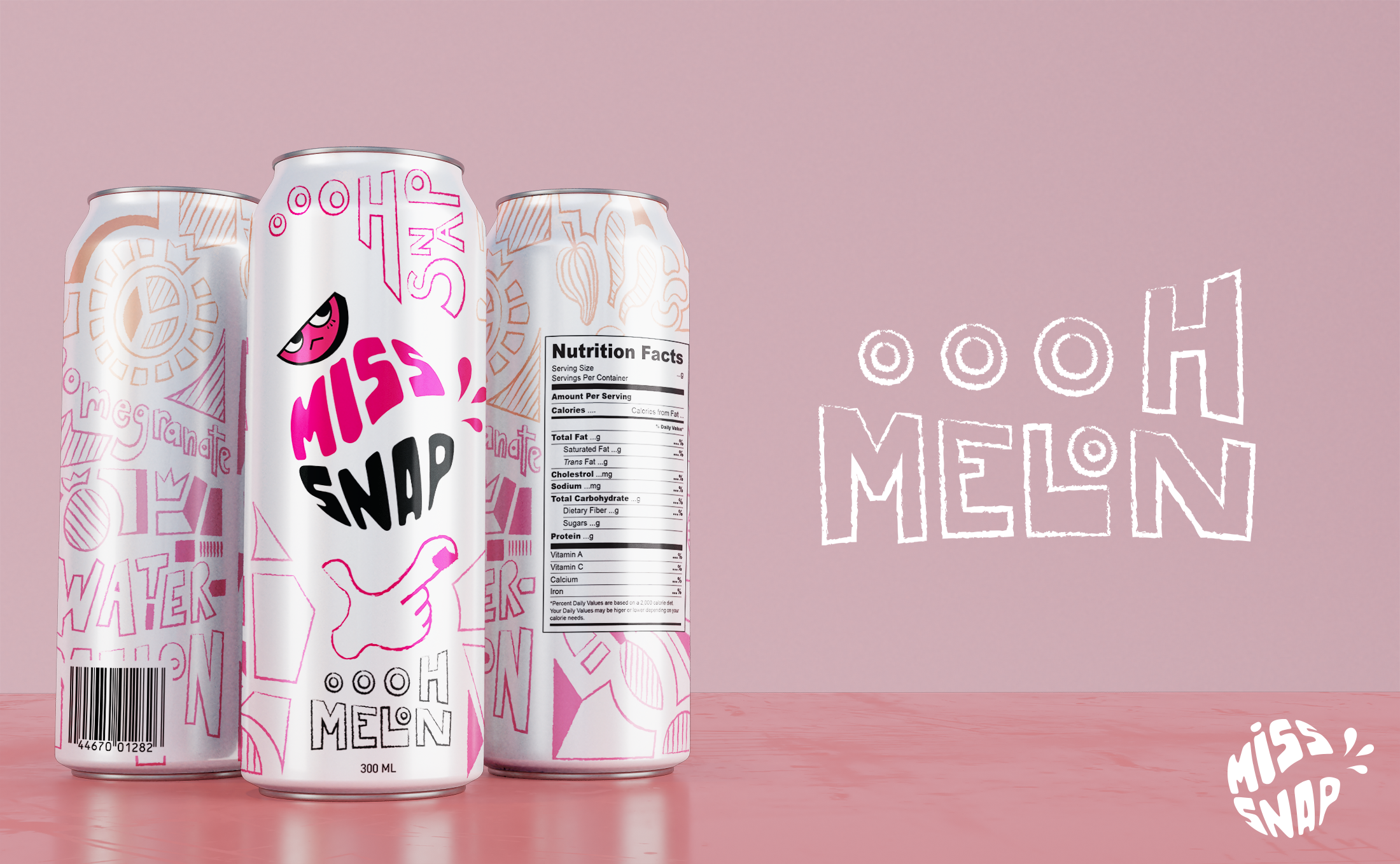
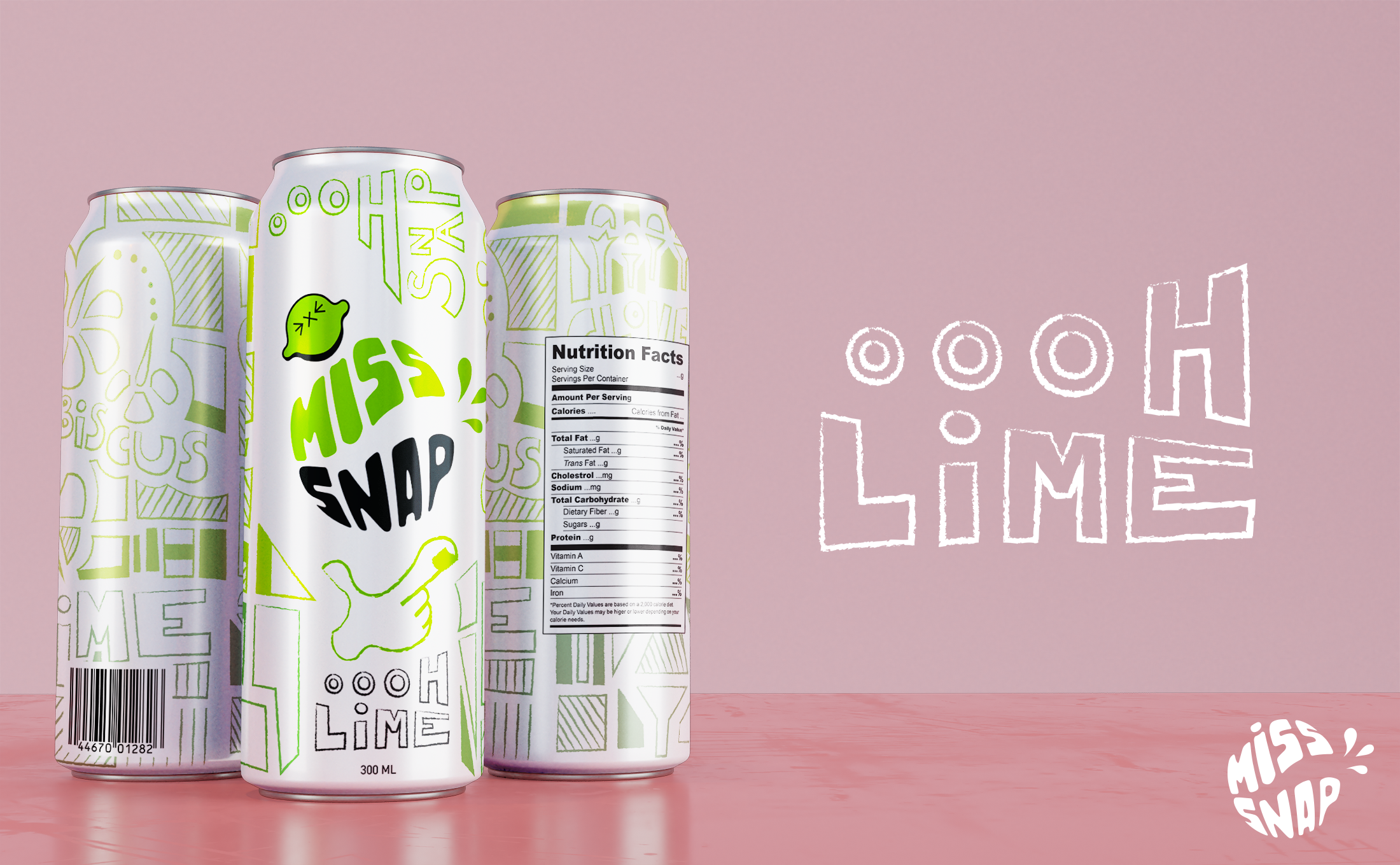
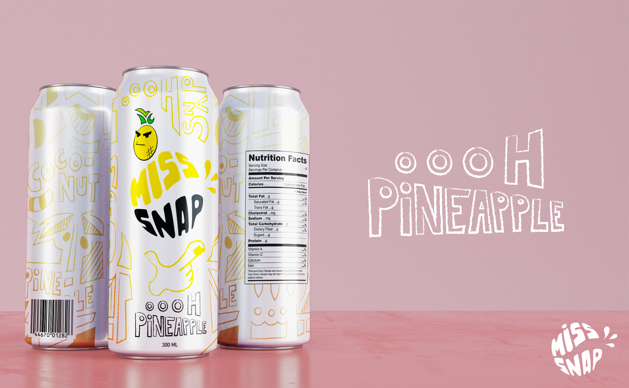
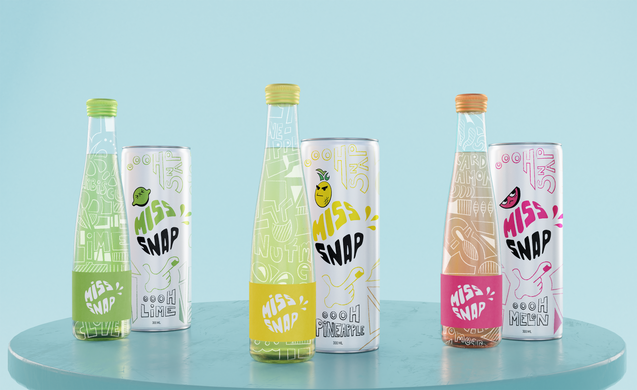
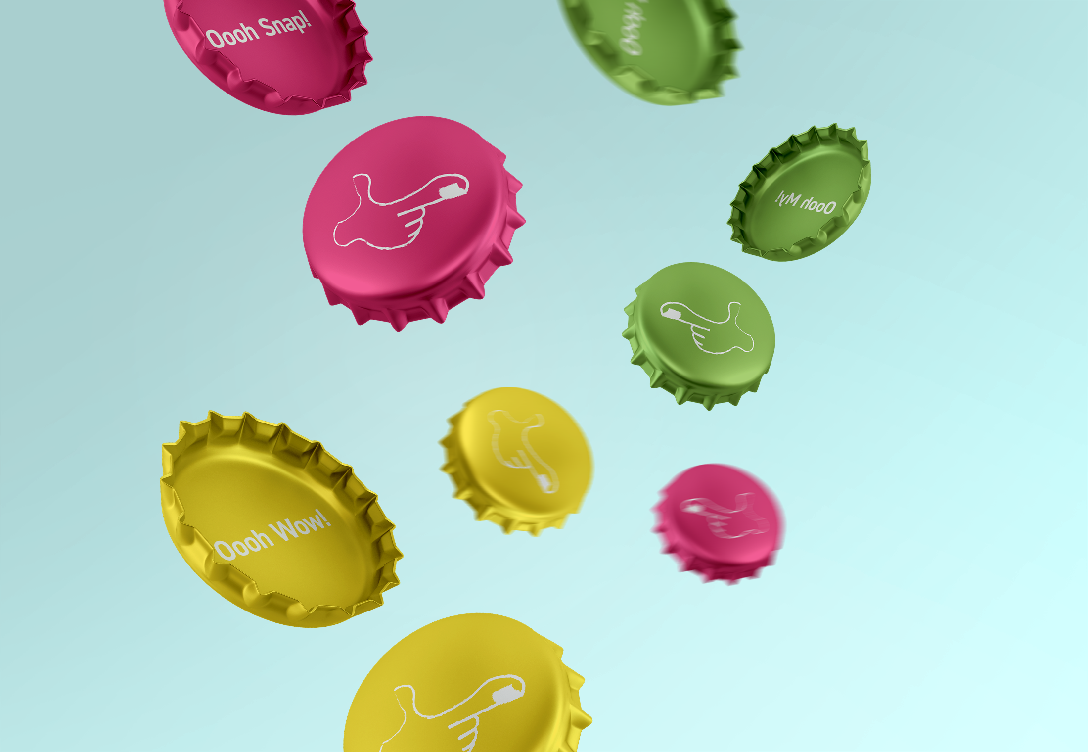
Miss Snap is an organic soda brand offering new-age flavours made from high-quality ingredients. The logo resembles a fruit snapping in half, with dynamic lines and bright colours. The labels are designed in a hand-drawn graffiti style to create a personalized and playful aesthetic, while the gradient colours in the back give a refreshing feel. Each flavour has a memorable caricature, adding variety for customers, oooh snap!
The image above is a can of Oooh Melon which is made of Watermelon, Pomegranate & Cardamom.
The image above is a can of Oooh Melon which is made of Watermelon, Pomegranate & Cardamom.


