Riley
Hildebrandt
My name is Riley Hildebrandt, and I was born and raised in Edmonton, Alberta. Before entering the Bachelor of Design Program, I obtained my Bachelor of Commerce Degree from Macewan, majoring in Marketing. This connection between design and marketing is where I find the majority of my inspiration, as they pair exceptionally well together. Understanding how a piece of media connects to the end-user through visuals or other means fascinates me. My goals in the near future are to improve and develop my skill set through work experience or online classes to become a more well-rounded designer.
Burrard Brewery - Branding & Packaging Design
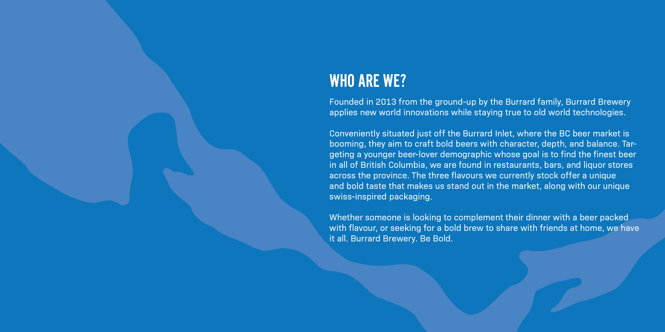
The brief for this project was to create a visual identity system for a fictitious craft beer company near Vancouver, British Columbia, called Burrard Brewery.
The deliverables consisted of developing a logo and brand guidelines, with three cohesive product names with packaging design.
The deliverables consisted of developing a logo and brand guidelines, with three cohesive product names with packaging design.
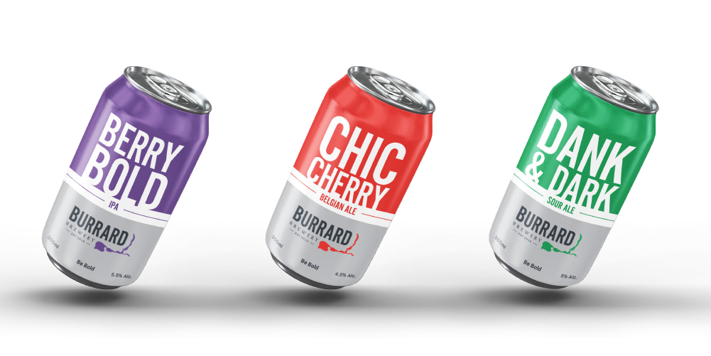
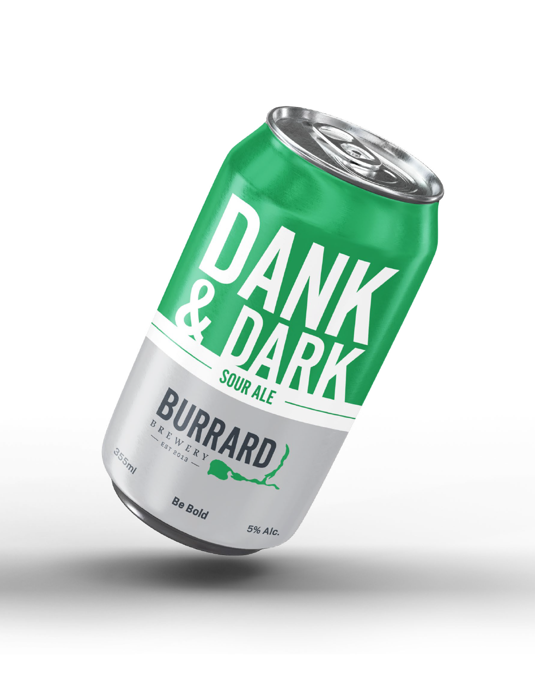
The packaging design for the “Dank & Dark” Sour Ale from Burrard Brewery. A consistent layout of bold type on the upper portion of the can, in which the bottom half hosts the logo in large with other information, all split by the type of bear contained within. The distinct change between flavors is the primary color used behind the type and in the logo, allowing each to stand out on their own or together.
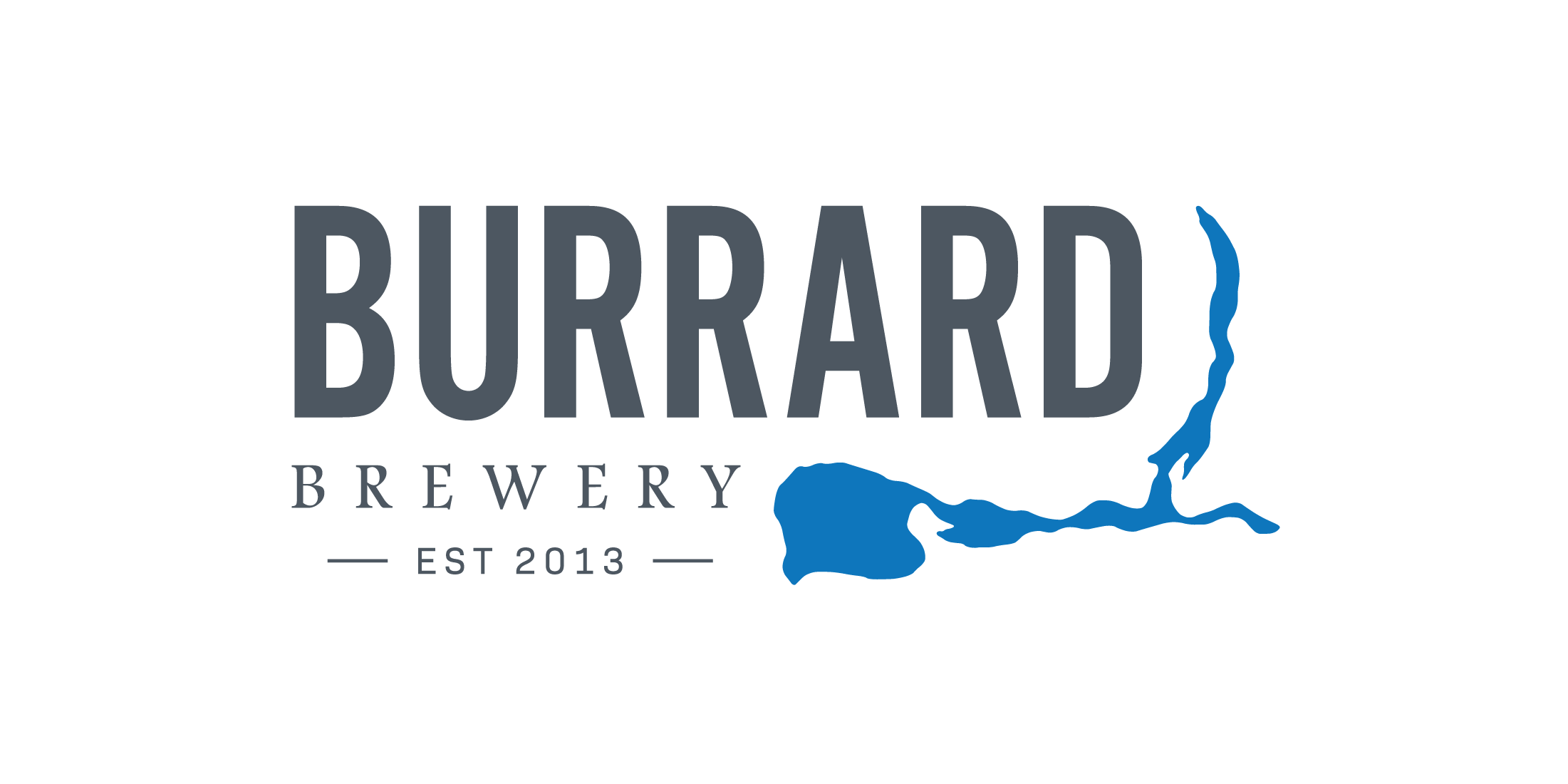
The main element of the logo is the silhouette of the Burrard Inlet, the body of water the brewery is located on. The bold typography matches the boldness of the brand, while the “Brewery” serif type portrays the experience and family side of the brand. Each element fits together nicely to form a cohesive logo.
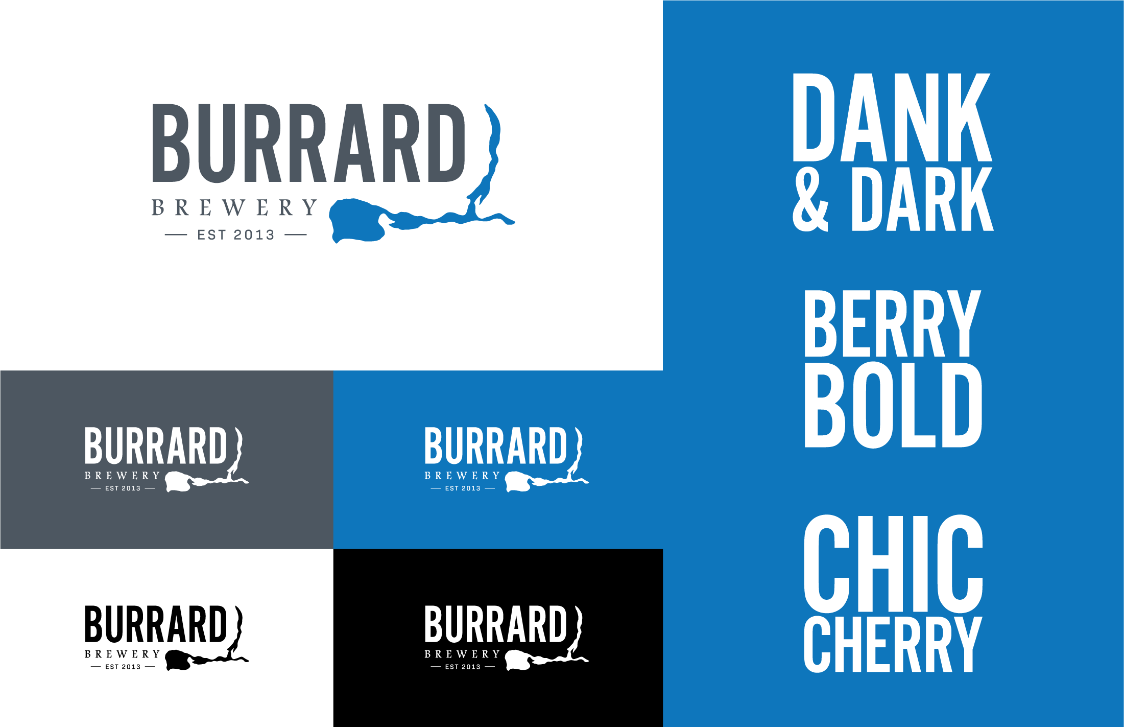
Showcasing how the logo is to be used under different conditions, and the wordmarks of the different flavors.
Driving High - Social Awareness Campaign
This project’s outcome was to develop an advertising campaign to increase social awareness of an issue local to Edmonton or the Alberta Region.
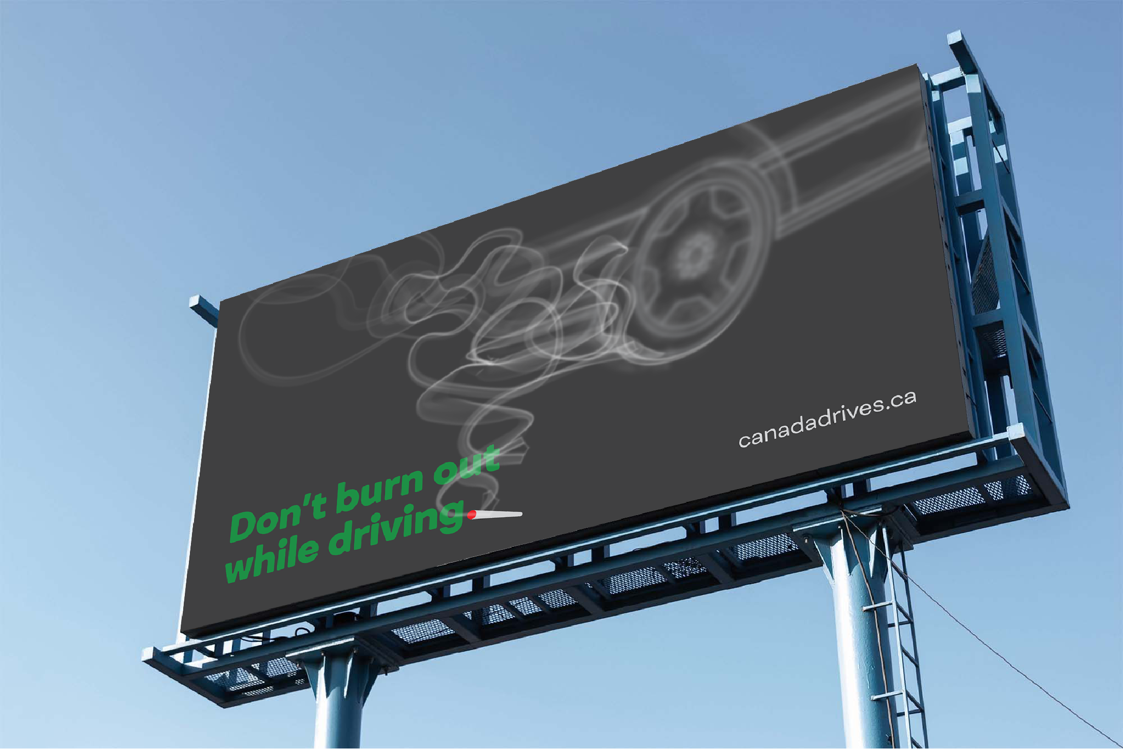
With the recent legalization of marijuana in Canada, an increased awareness of the dangers of driving high was the campaign’s direction. Utilizing puns and the visuals of smoke to directly connect with the younger demographic.
With the recent legalization of marijuana in Canada, an increased awareness of the dangers of driving high was the campaign’s direction. Utilizing puns and the visuals of smoke to directly connect with the younger demographic.
This poster utilizes the double meaning of the word “blunt”, and the tip of the joint becoming the period of the first sentence. The smoke leads up to the blurry visual of a car, connecting back to the dangers of driving high.
Similar to the poster, this digital ad would appear in feeds on Facebook or Instagram. The double meaning of “joint” and the foggy visual of the windy road are the focal points, with a small website call-to-action in the bottom right.
99.9 FMJ FM - Radio Station Branding
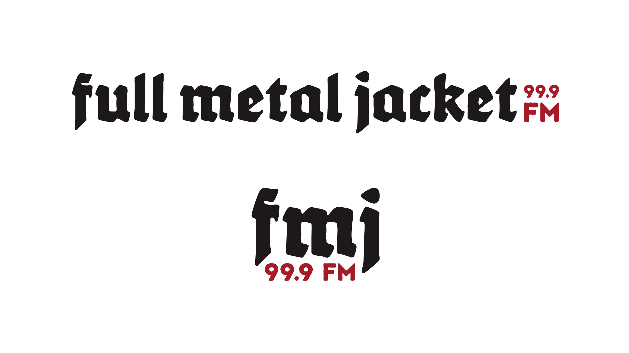
This project consisted of developing a radio station branding that caters to three different genres of music. We, as a group, were given the genre of metal, which was broken down into classic, thrash, and doom. The name, 99.9 FMJ FM, was derived from a type of ammunition related to military and firearm combat, which has strong ties to metal music.
This project was a collaborative effort with Alyshia McDonald and Cole Lockwood.
This project was a collaborative effort with Alyshia McDonald and Cole Lockwood.
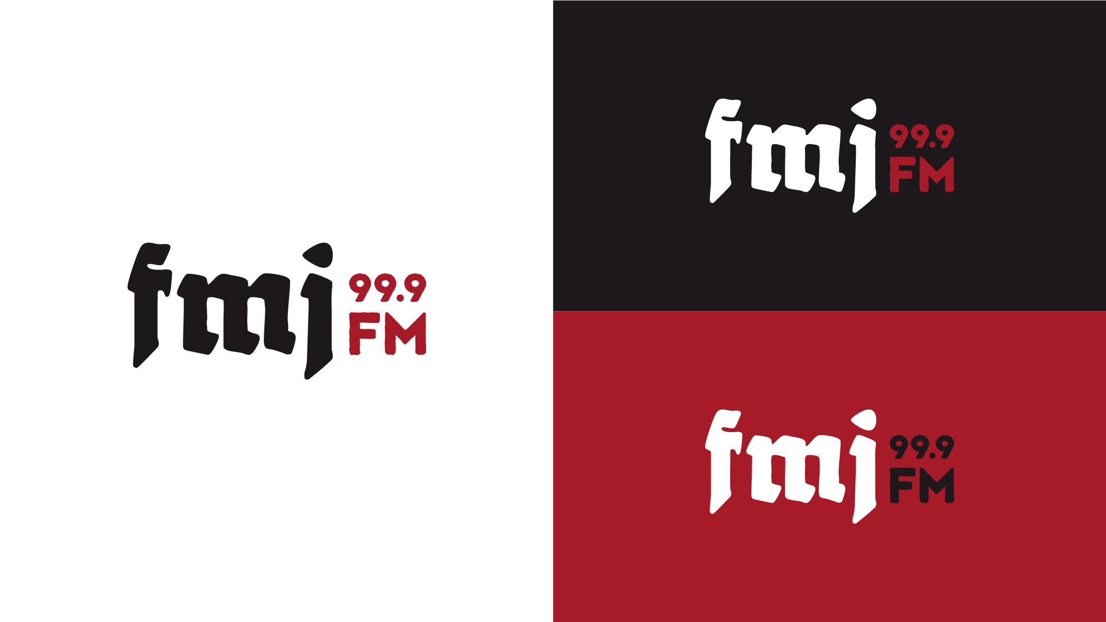
The main workmark for the radio station utilizing different backgrounds. The distinct black lettering style typeface dates back to the 16th century and is synonymously related to the metal genres. The non-uniform look and roughness of the letters give an overall vintage and grunge feel to the brand.
A longer logo with the “full metal jacket” spell out and a more compact version was created for different use cases when more appropriate than the primary logo. The toned-down red and black color choice allows them to mesh well together and have ties with metal music for a long time.
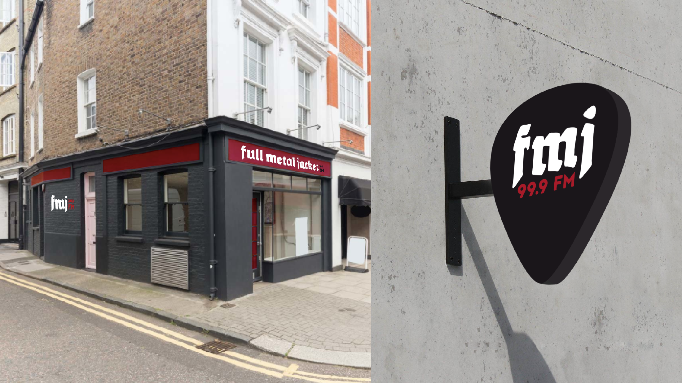
A building wrap for the physical space of the radio station, as well as an outdoor, wall-mounted sign. The wrap utilizes the black and red colors to stand out among the buildings around it and the more extended version of the logo, letting passersby know who they are. The sign is in the shape of a guitar pick, as guitars are one of the main standouts of metal music.
This Accident of Being Lost - Poster Series
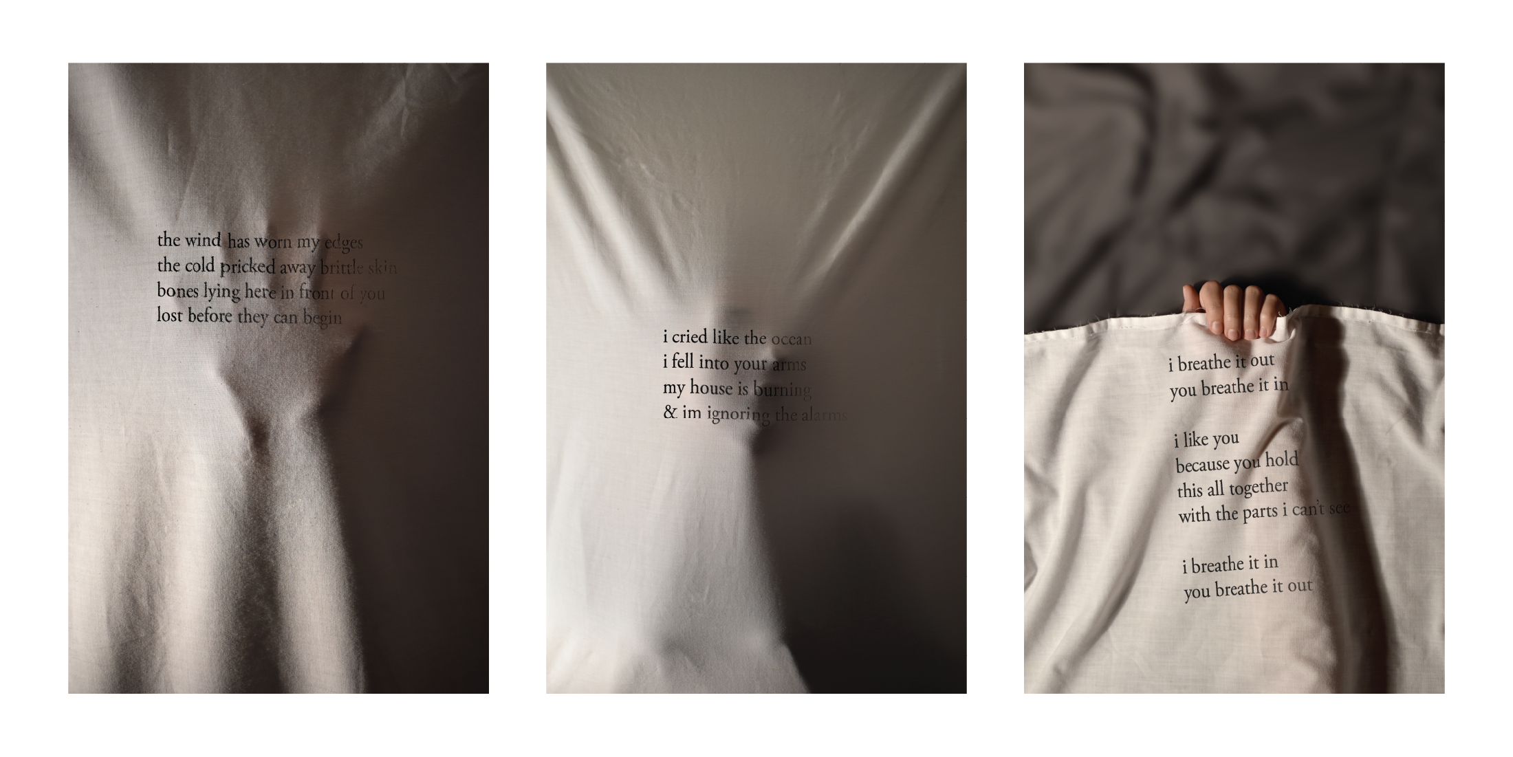
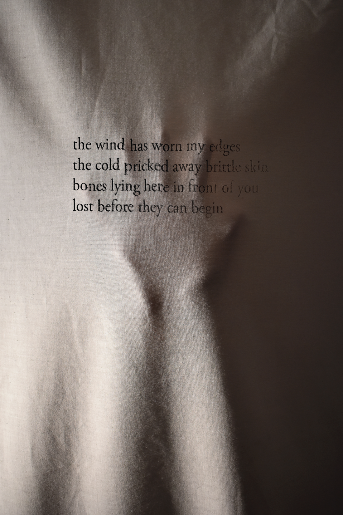
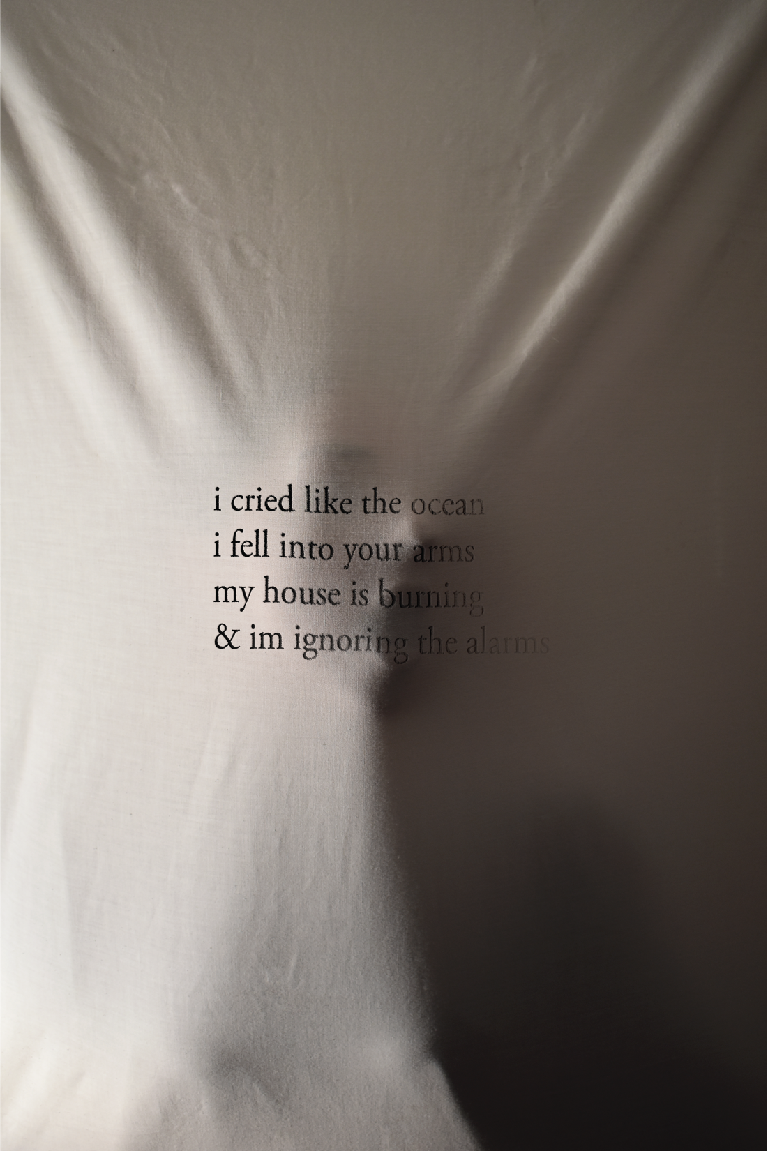
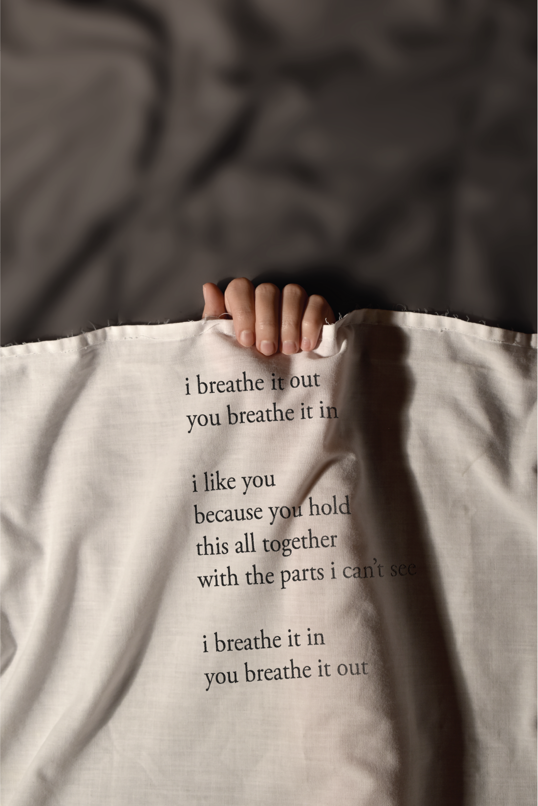
This poster series for the book of the year, This Accident of Being Lost by Leanne Betasamosake Simpson, communicates the female protagonist's struggle with her lover. The visuals and quotes on the posters summarize her feelings through the story and the progression from feeling trapped to breaking through with her lover.
Photographs were taken, then the typography was digitally added on top to give the feeling they are inked into the fabric.
Photographs were taken, then the typography was digitally added on top to give the feeling they are inked into the fabric.
The first piece in the series contains a dark quote and a visual of what she is going through, emotionally and physically trapped, unable to get what she wants.
The second poster is a progression from the first, describing her communicating the feelings and emotions inside her. Adding the human face behind the cloth creates a more personal and human connection to her.
Albertan Projects - Website Redesign
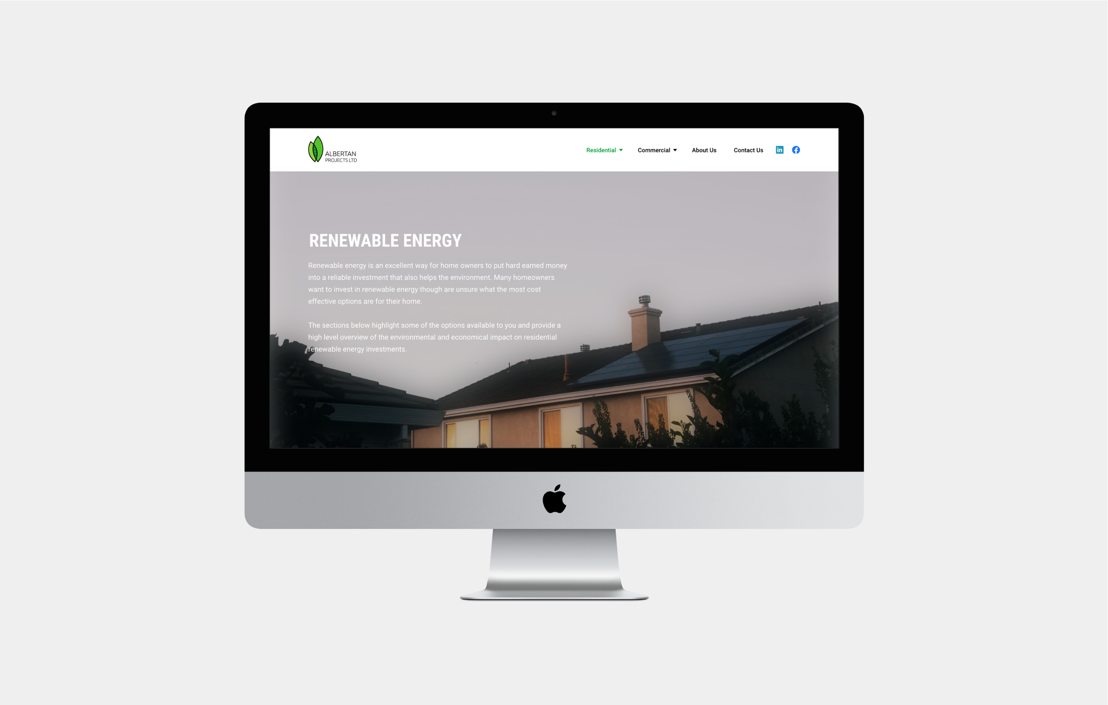
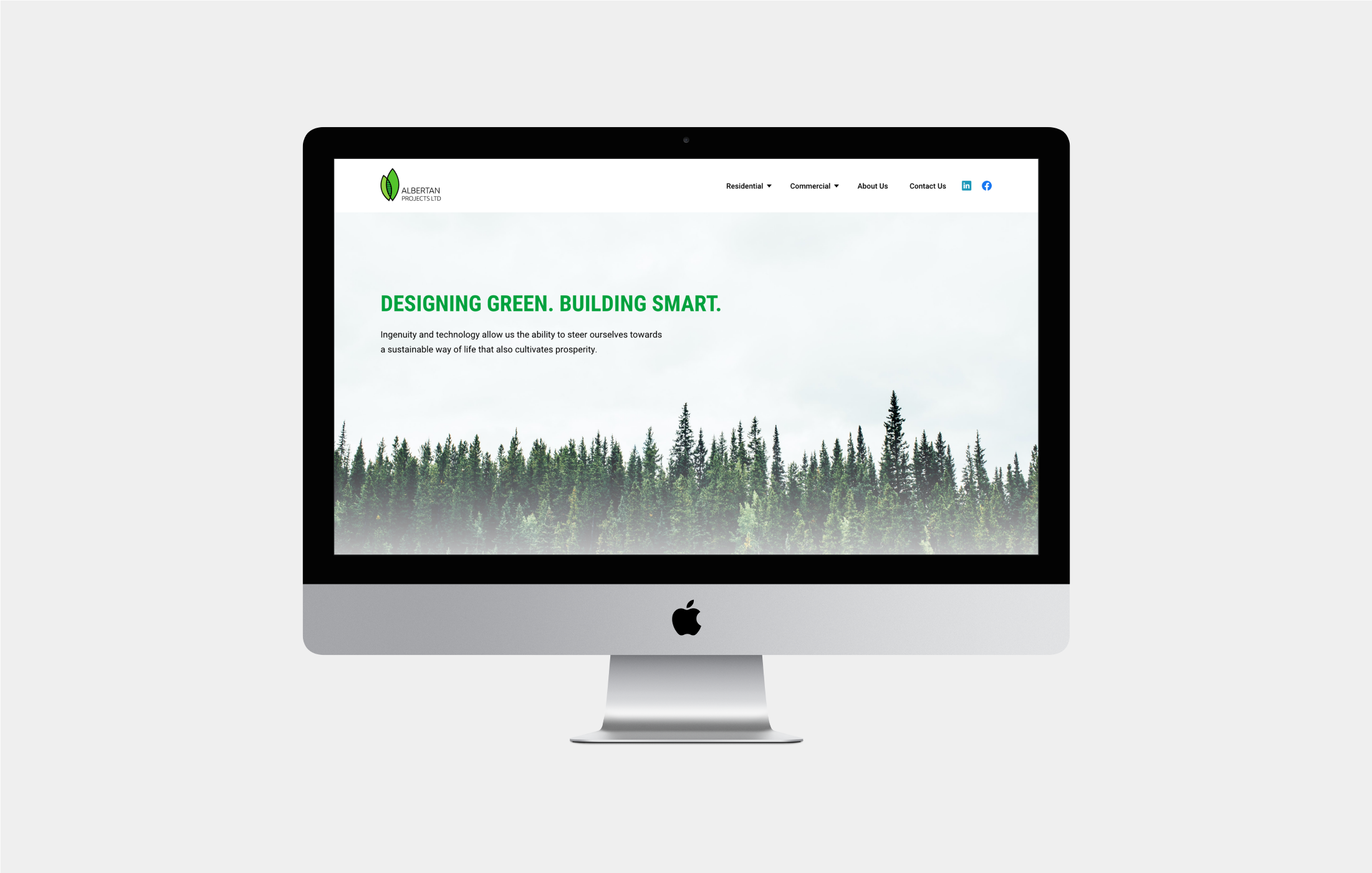
Albertan Projects mission is to help change the world by delivering high-quality, sustainable projects. They focus on delivering expert quality green building and renewable energy projects to help clients go green and become more environmentally economical.
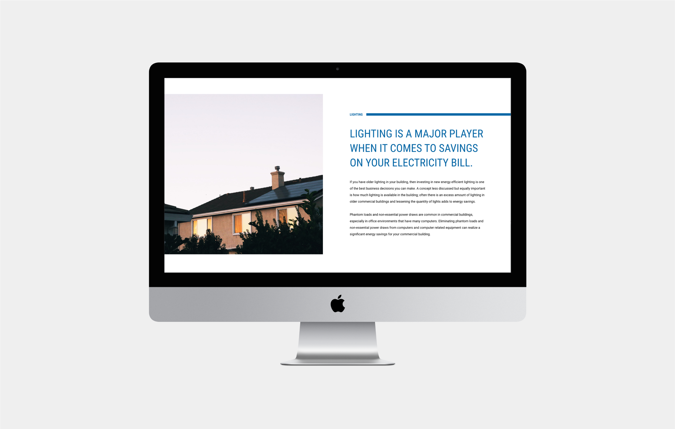
The objective for the client was to redesign the company’s website. Updating the content and refreshing visuals to bring it up to speed with modern website design.


