
Community Partner
ACUA
The final outcome of this project, a branded campaign, aims to bring awareness to the work of the ACUA by highlighting the vibrancy of Ukrainian culture in Alberta. It promotes cross-cultural understanding by sharing immigrant stories and encouraging others to reflect on and share their own experiences.
The campaign begins with a strategic approach, centred on an intentional message designed to resonate with its audience. The visuals use a collage-based approach that combines traditional Ukrainian art forms, such as embroidery, with contemporary design practices. This pairing creates a duality between past and present, emphasizing the continuity and evolution of cultural identity.
"The primary component of the campaign is a series of postcard flyers that can be distributed in community and cultural centres, cafés, and other public spaces. Postcards are typically used as a form of personal communication, and this association lends this channel of advertising a sense of intimacy and familiarity.
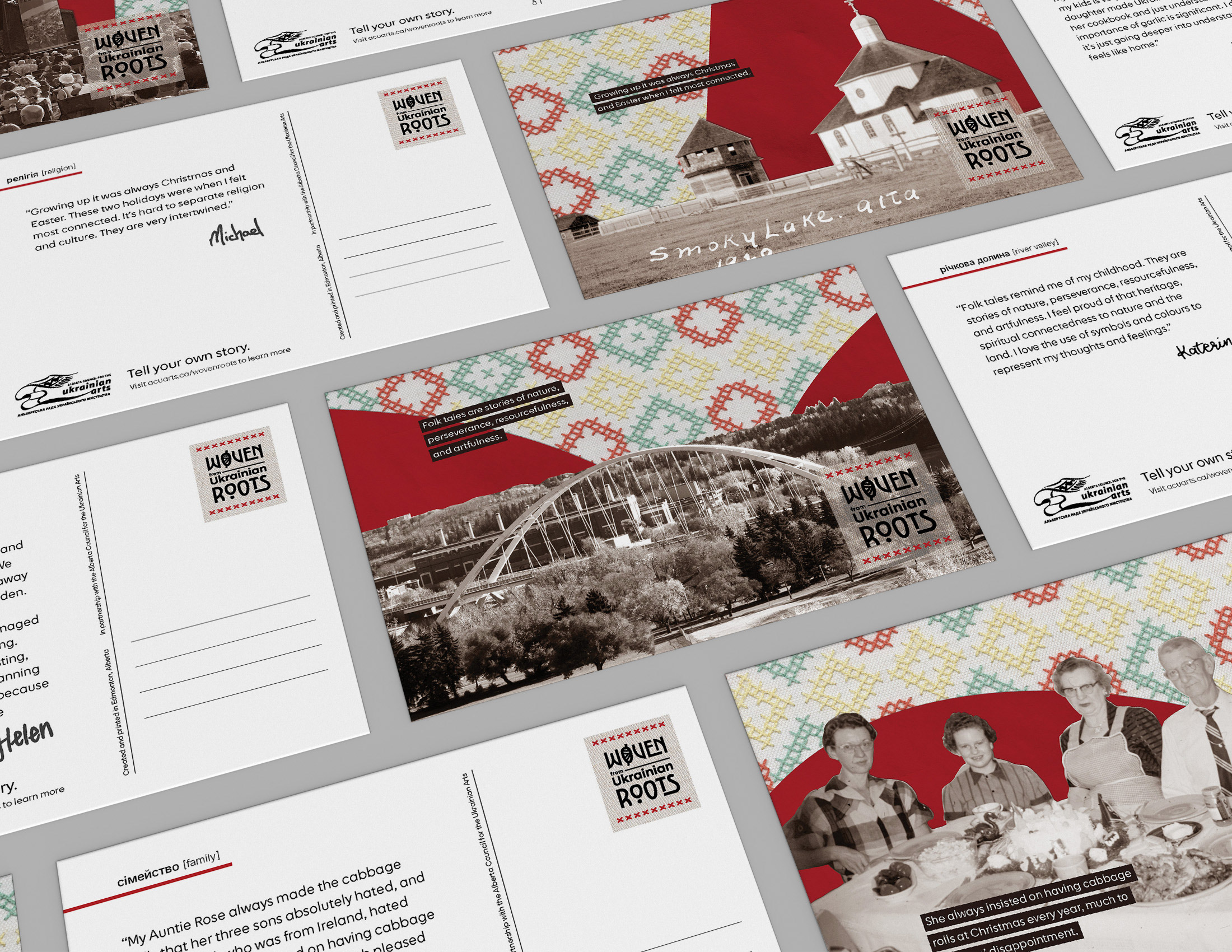
The front of the card is a collage-style image created using participants’ photos, archival and stock photography, my embroidery, and enlarged letters from the logo. A short part of the story is on the front and continues onto the backside. Each story is signed in the handwriting of the storyteller, which adds a personal touch. The back also has a Ukrainian word and English translation that encompasses the associated story."
The front of the card is a collage-style image created using participants’ photos, archival and stock photography, my embroidery, and enlarged letters from the logo. A short part of the story is on the front and continues onto the backside. Each story is signed in the handwriting of the storyteller, which adds a personal touch. The back also has a Ukrainian word and English translation that encompasses the associated story."

This is a necessary extension to the campaign as ACUA currently has a small online presence. Using social media would also engage a younger audience, a demographic that is currently being underutilized.

This is the landing point and collection site for the campaign. It still remains on ACUA’s website as an extension. It displays profiles of people who have shared their stories and acts as a way for others to join in.

The campaign is also extended to merchandise like tote bags or stickers, helping to further reinforce the message and build recognition among supporters.

I began my visual style exploration with material testing, as I knew I was interested in using embroidery, as it is a traditional Ukrainian craft. I started by printing photos and embroidering over top of them and then scanning them back to be digital. Unfortunately, that lowered the quality, so once I figured out my pattern, I ended up embroidering on paper, scanning that and then manipulating it digitally. The scan is the right-most photo above.