
This project explores how redesigning the brand identity of a community-driven organization can strengthen belonging, visibility, and engagement for local businesses. Focusing on a visual identity rebrand for Love Local, a non-profit organization, the work applied a design-led approach through a redesigned primary and secondary logo, brand patterns, brand guidelines, website landing page, and cohesive marketing materials, such as an advertisement, flyer, and business card. With large corporations like Shein, Temu, and Amazon overshadowing small businesses with their fast and inexpensive offerings, this capstone project addresses the growing challenge of visibility and recognition for local businesses. Developing a strong, genuine, and cohesive visual identity for Love Local can enhance trust, encourage community participation, reinforce the emotional connections that make small towns unique and support the resilience of local economies.
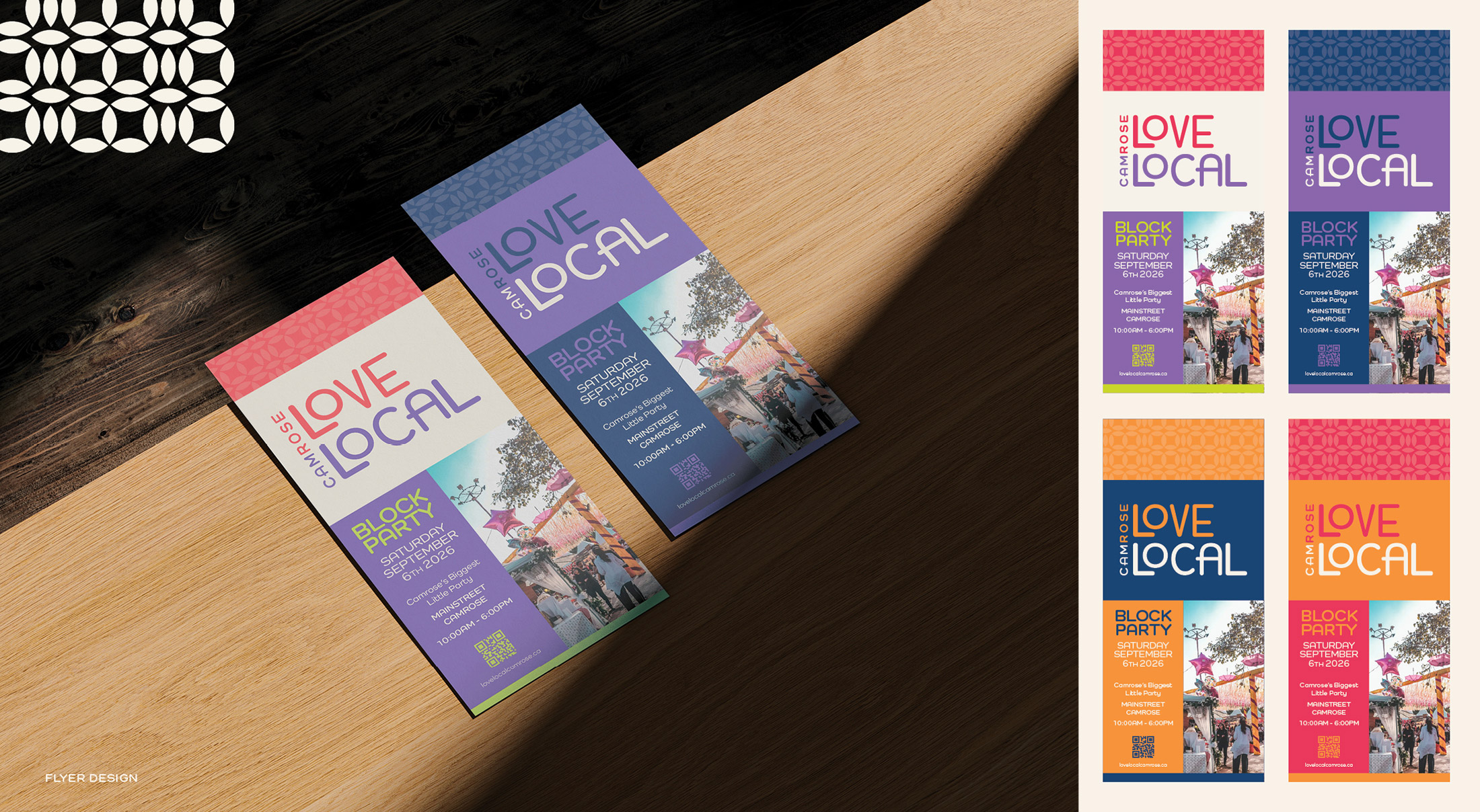
The image showcases the primary version shown larger, with smaller ads featuring the brand's inverse logo variations."
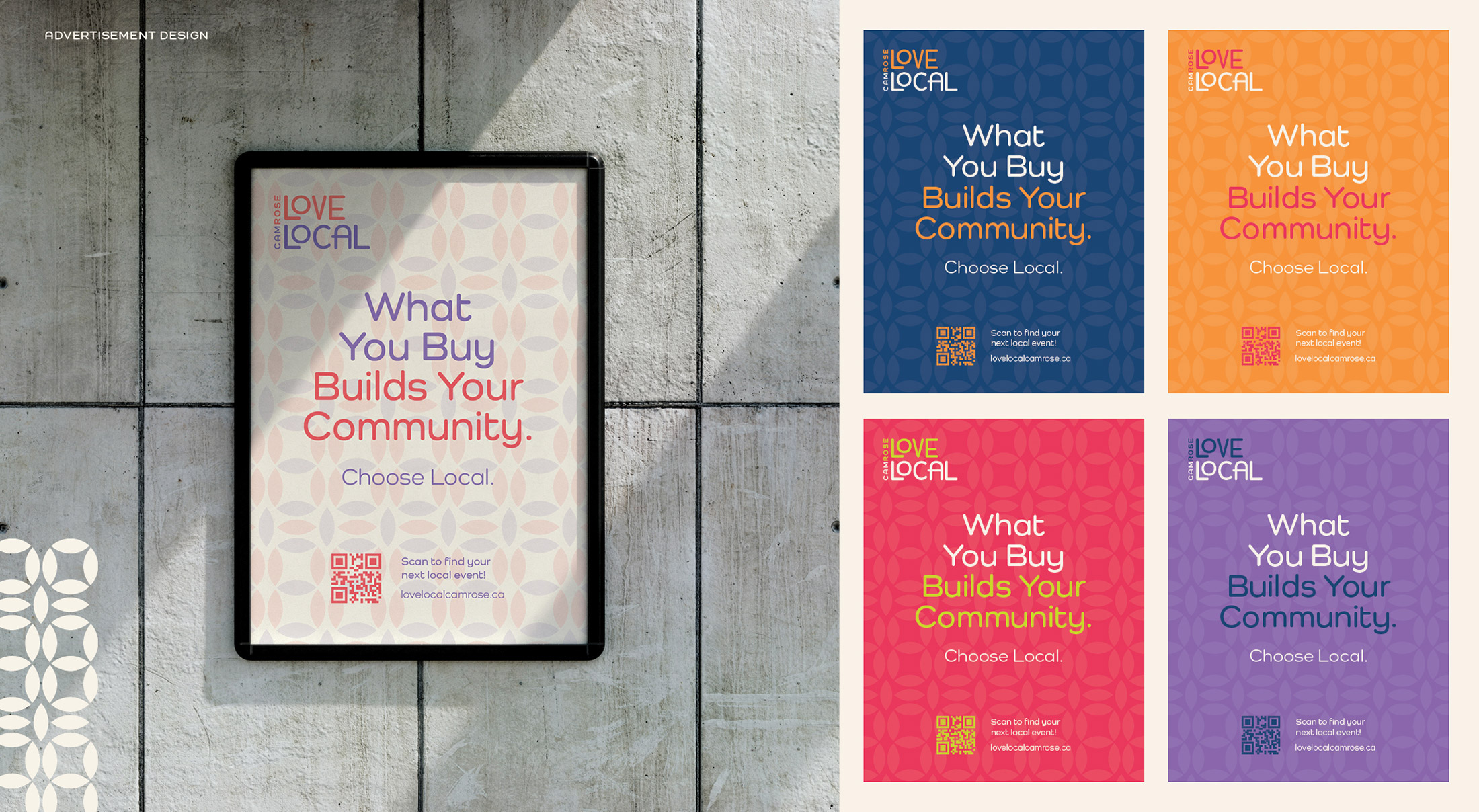
The image showcases the primary version in a larger size, with smaller versions featuring the inverse logo variations."
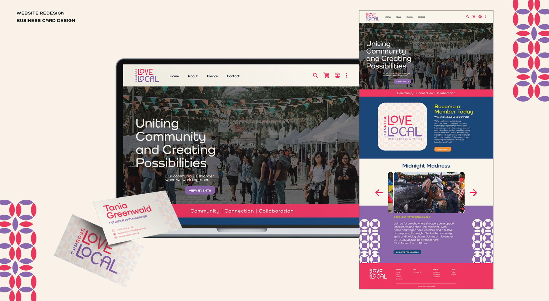
The business card is designed to create a strong, professional first impression while reinforcing Love Local's brand identity within the community.
The image showcases the website in a static homepage layout and the
business card in a smaller mockup."
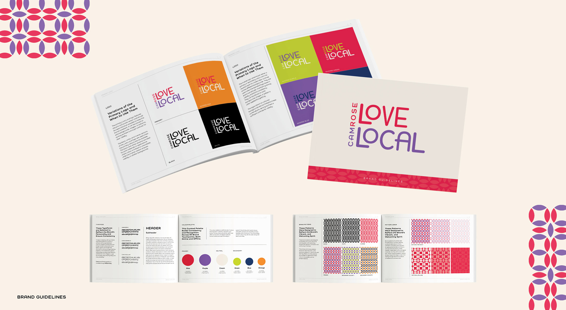
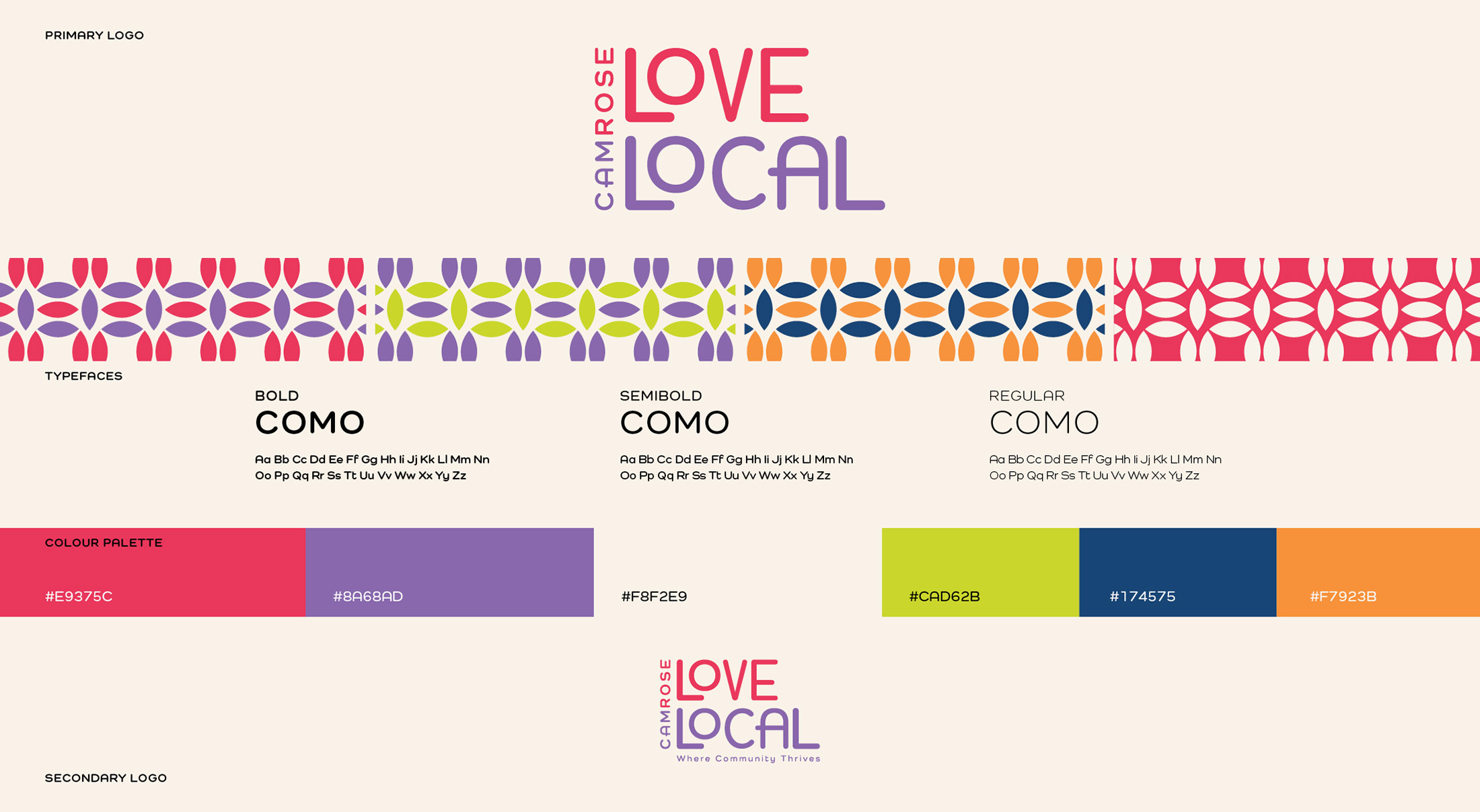
The image showcases select pages from the brand guidelines, featuring the use of colour, typography, pattern, and logo applications."