Brooks
Bunting

Brooks
Bunting
He/Him
I love typography, publication, and branding. As you can see, my portfolio pieces highlight these three pillars of my design practice. I have a developed eye for detail and compositional balance, which are vital when creating layouts of any kind. I’ve mastered Adobe Indesign, Illustrator, and Photoshop and have years of experience implementing that mastery in both professional and educational capacities. My eye for balance has proven to be the greatest tool in my kit. I’m ready to enter the realm of professional design, and I can’t wait to prove how necessary my skills are in today's world.
Projects
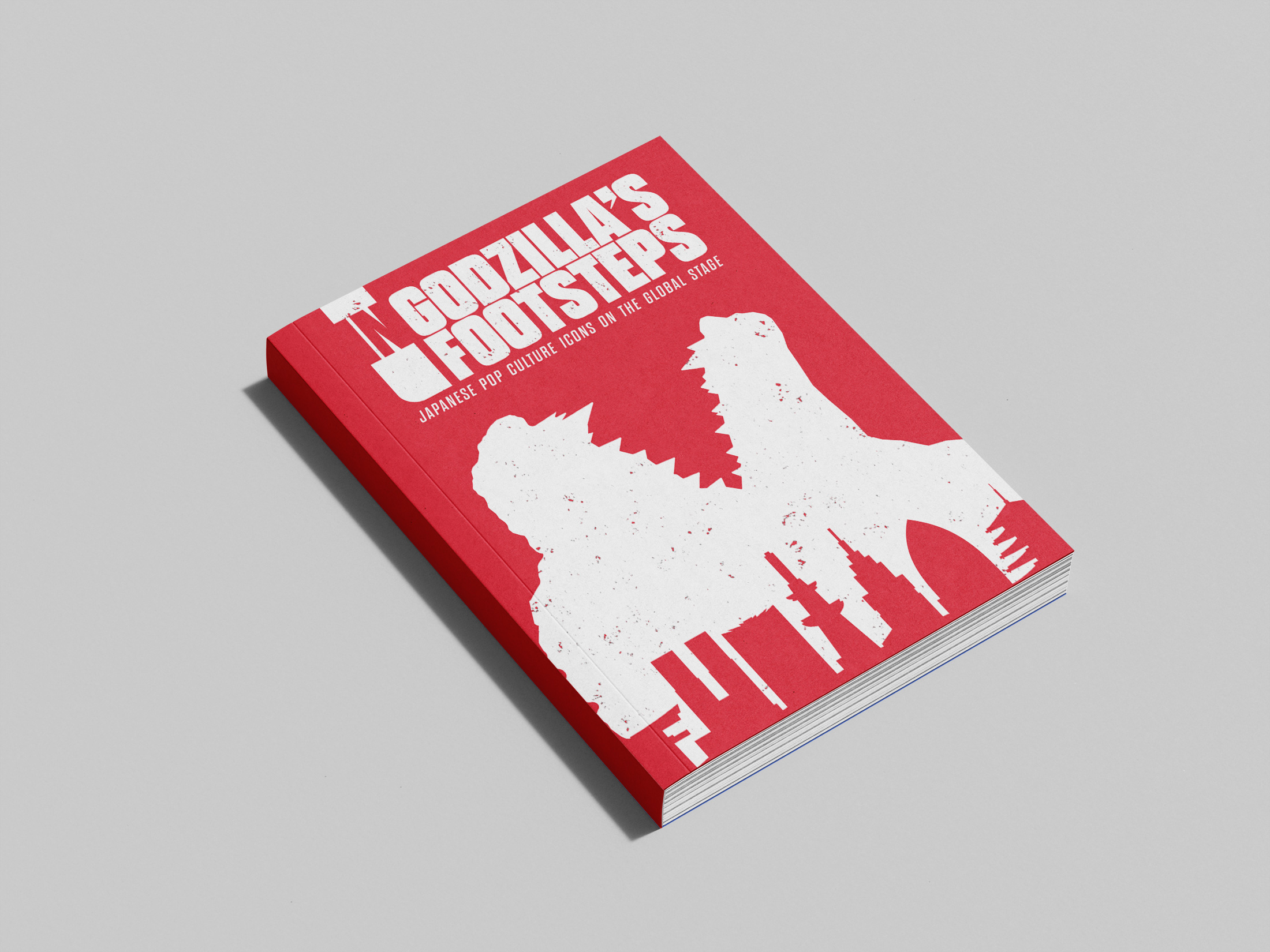
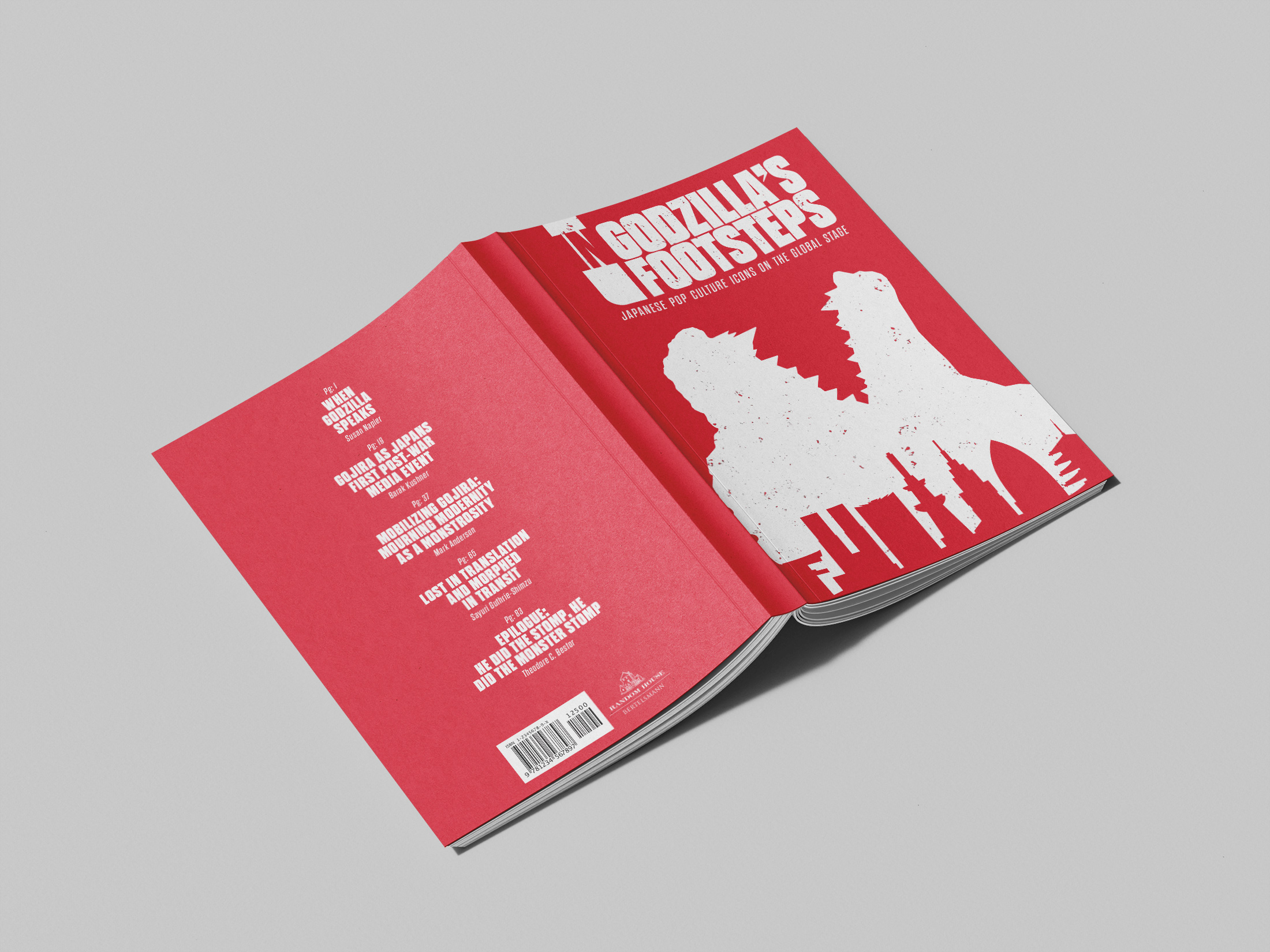
Book Design: In Godzilla’s Footsteps
This project consisted of both the exterior and interior design of a collection of essays about Godzilla and his impact on pop culture. To match his ever-present impact, his silhouette is the main feature of the front cover. He looms over Japan's skyline, roaring at the blast that created him.

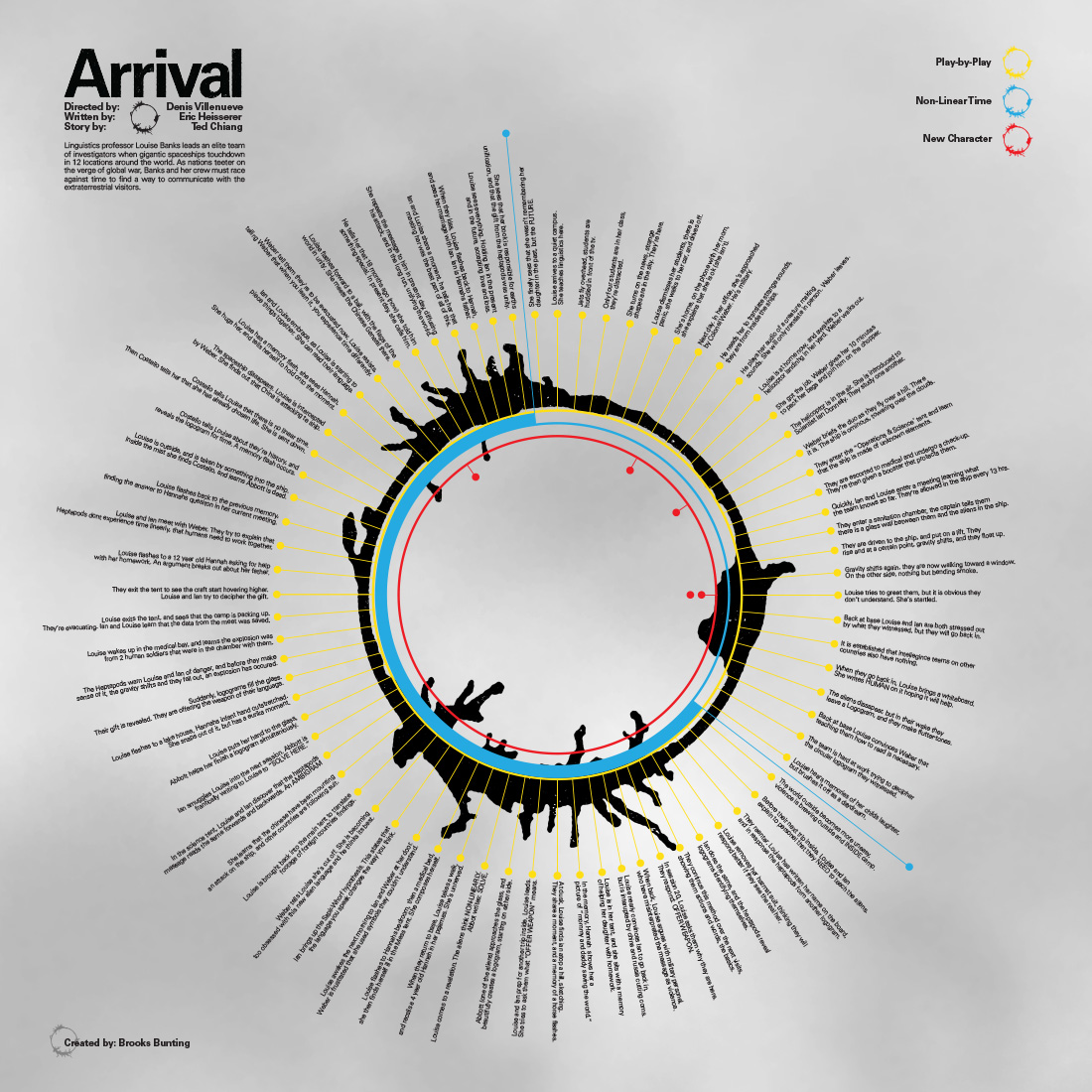
Timeline Infographic: Arrival
In Arrival (Spoiler Alert!), time doesn’t move in a straight line. The alien language in the film was created as complex and beautiful logograms. Each can represent a word, an idea, or even full sentences or concepts. This had to act as the centerpiece of the timeline. The data points jut out from the circle as the tendrils of the logograms do. The backdrop resembles the mist we see in the alien ship's habitat, aiding the ‘in-universe’ feel of the composition.
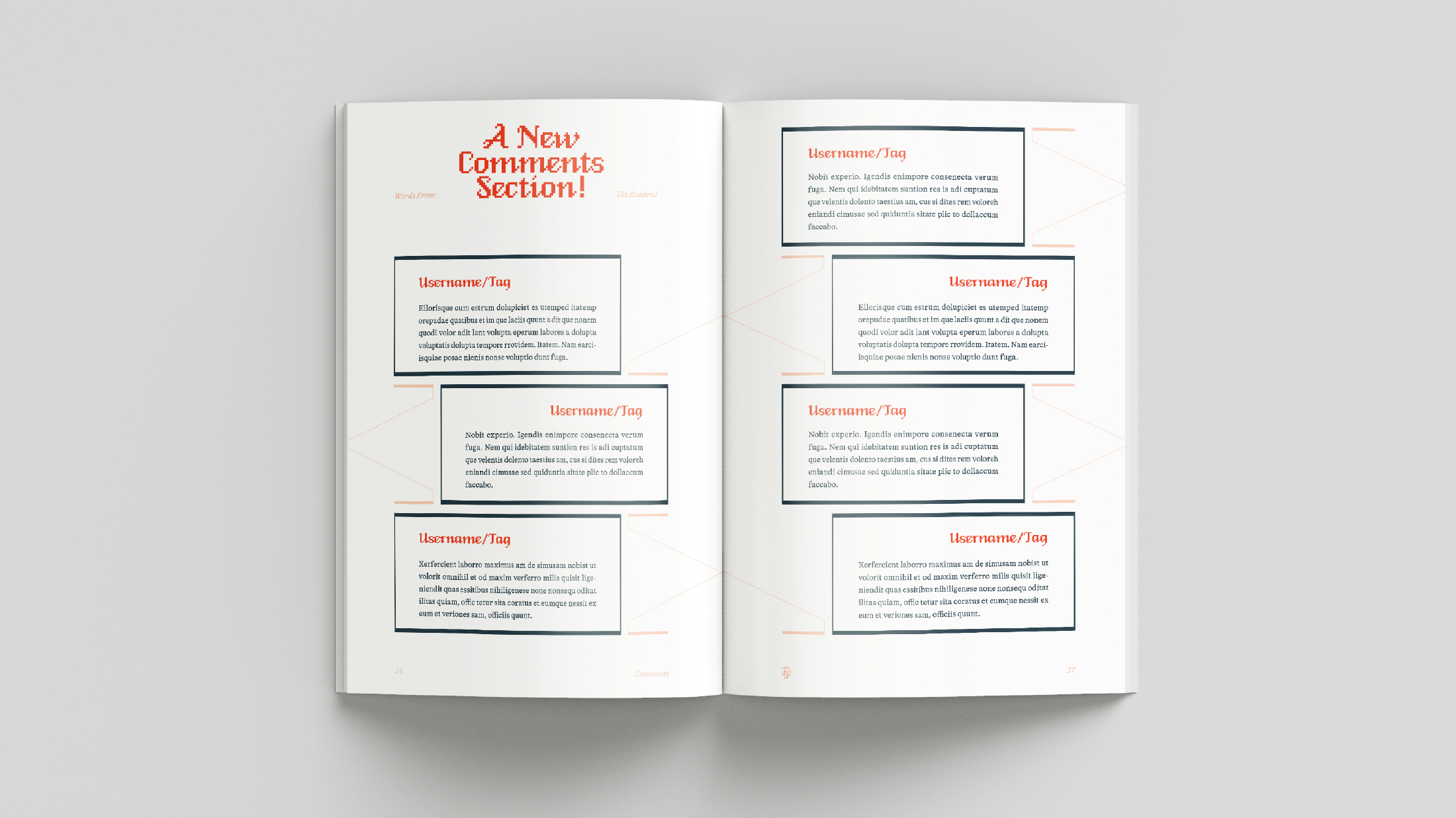
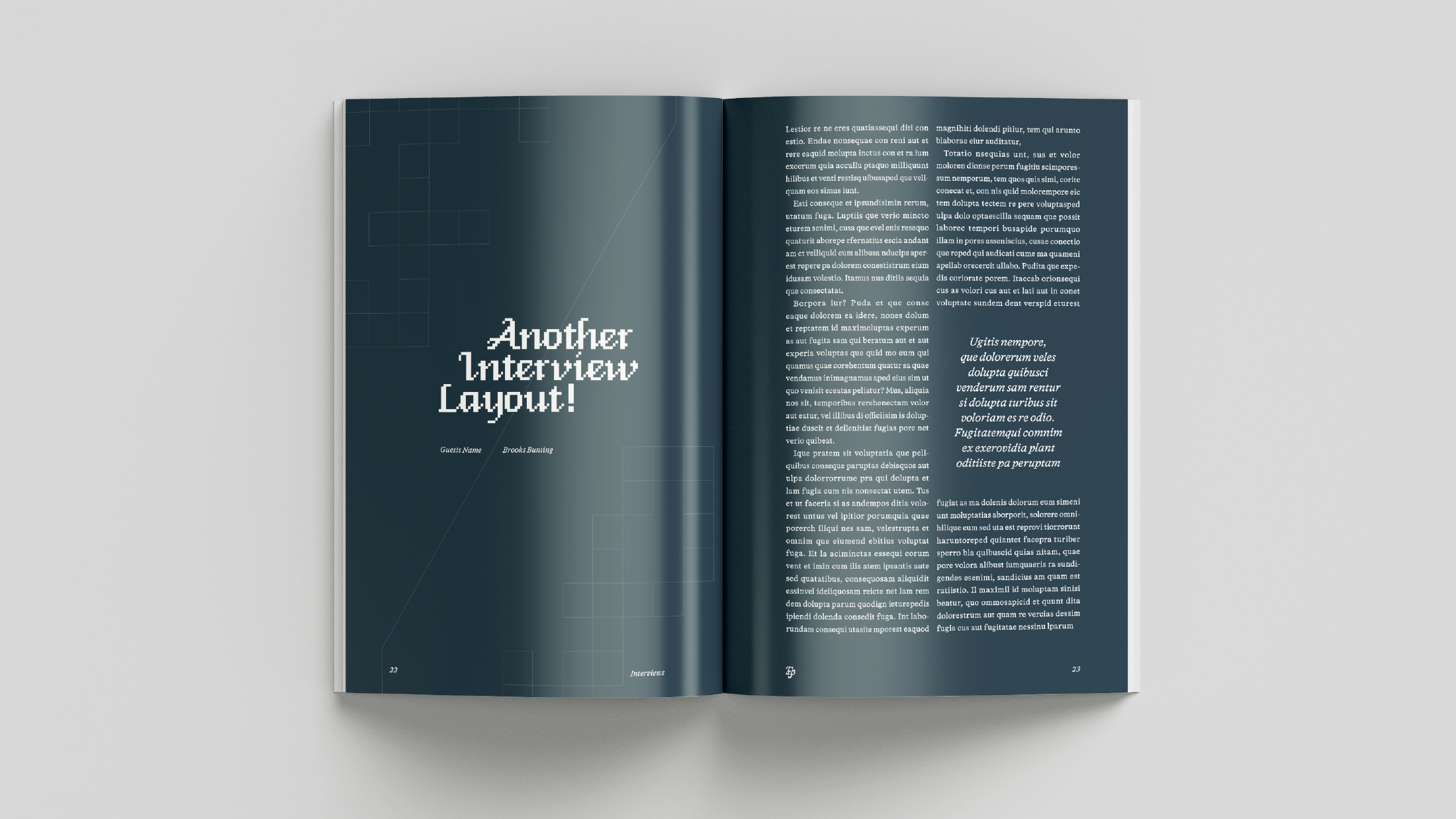
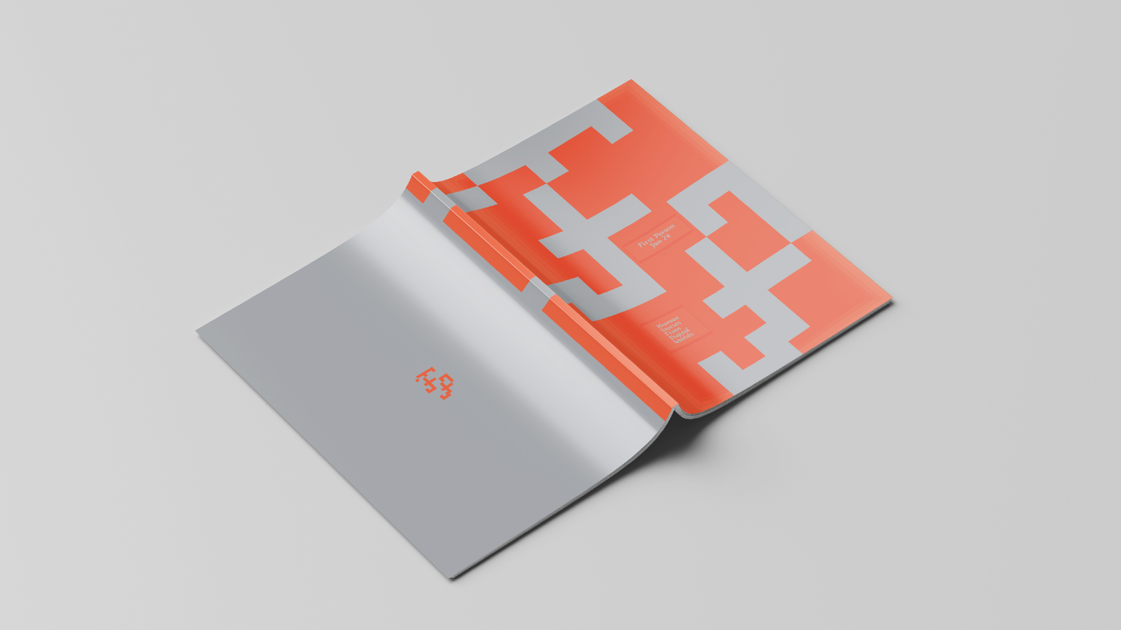
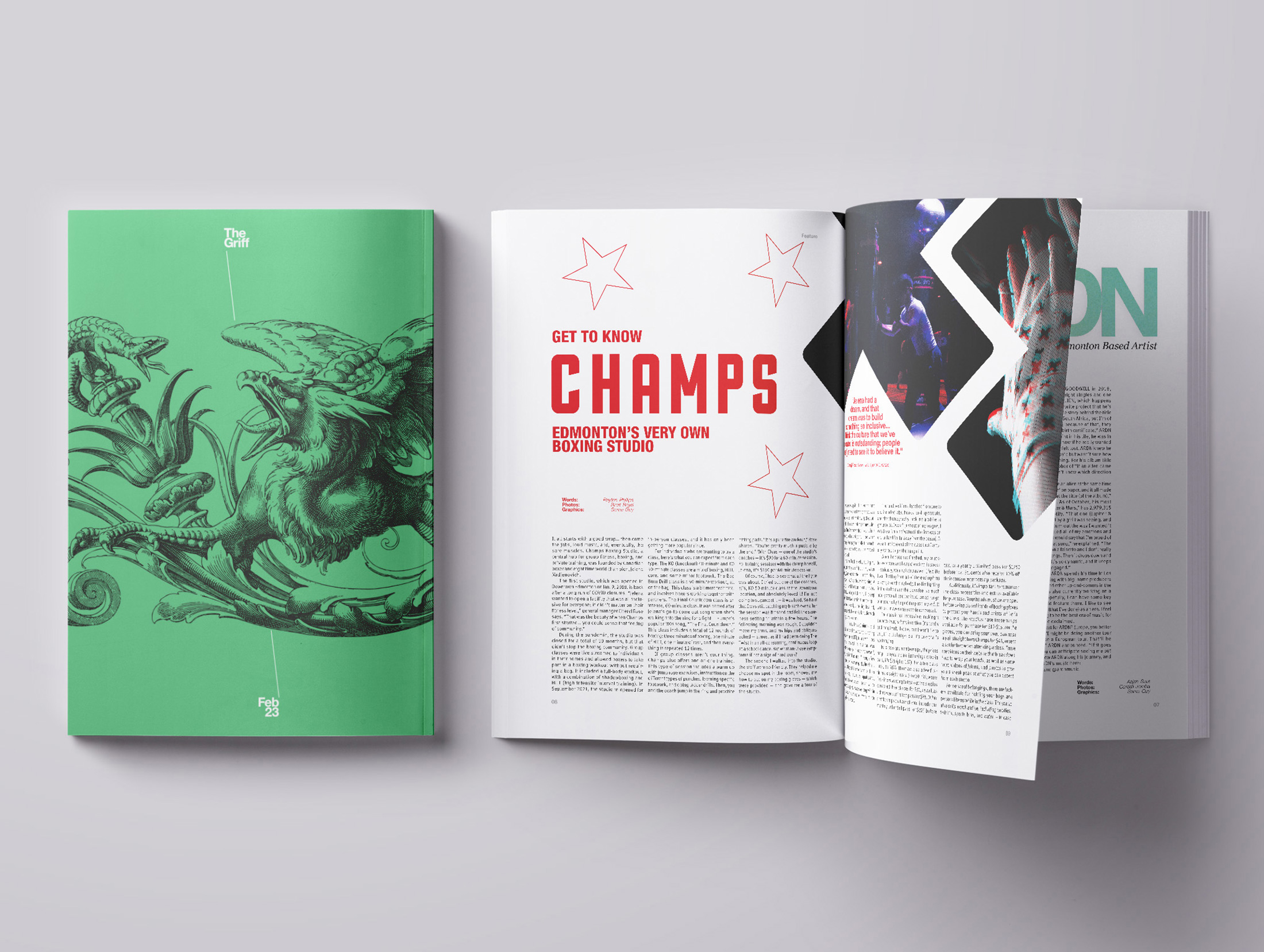
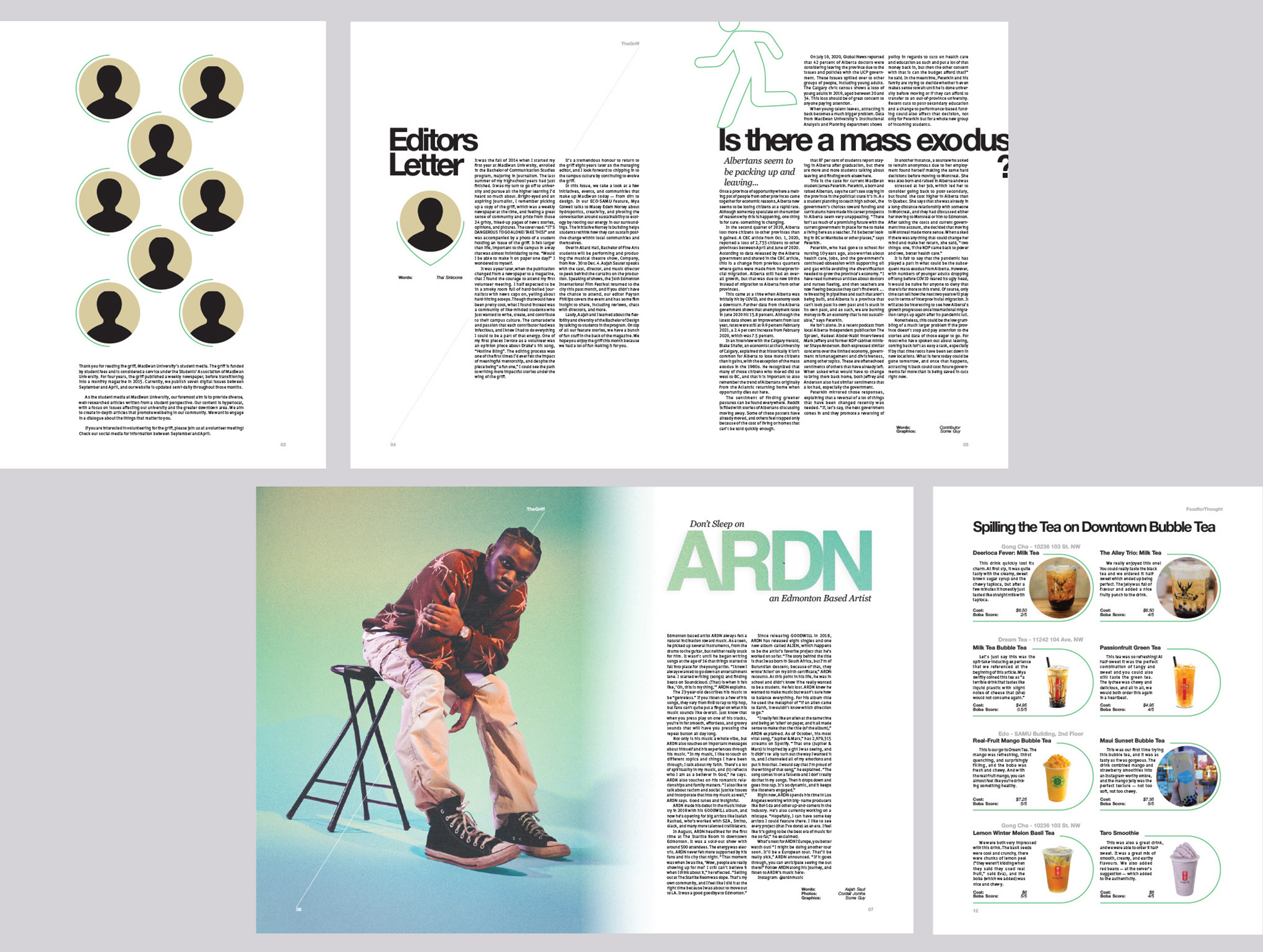
Publication: Griff Redesign
My hypothetical redesign of MacEwan’s student publication is bold, graphic, and deceptively expressive. Each monthly issue will be color “coded” and use the same dashed line and folio settings, with different art, items, or images appearing on the cover. Each spread sets an appealing stage for the varied and opinionated content of the Griff. The goal was to bring the content into direct focus without distracting from it, and this was achieved in this system.

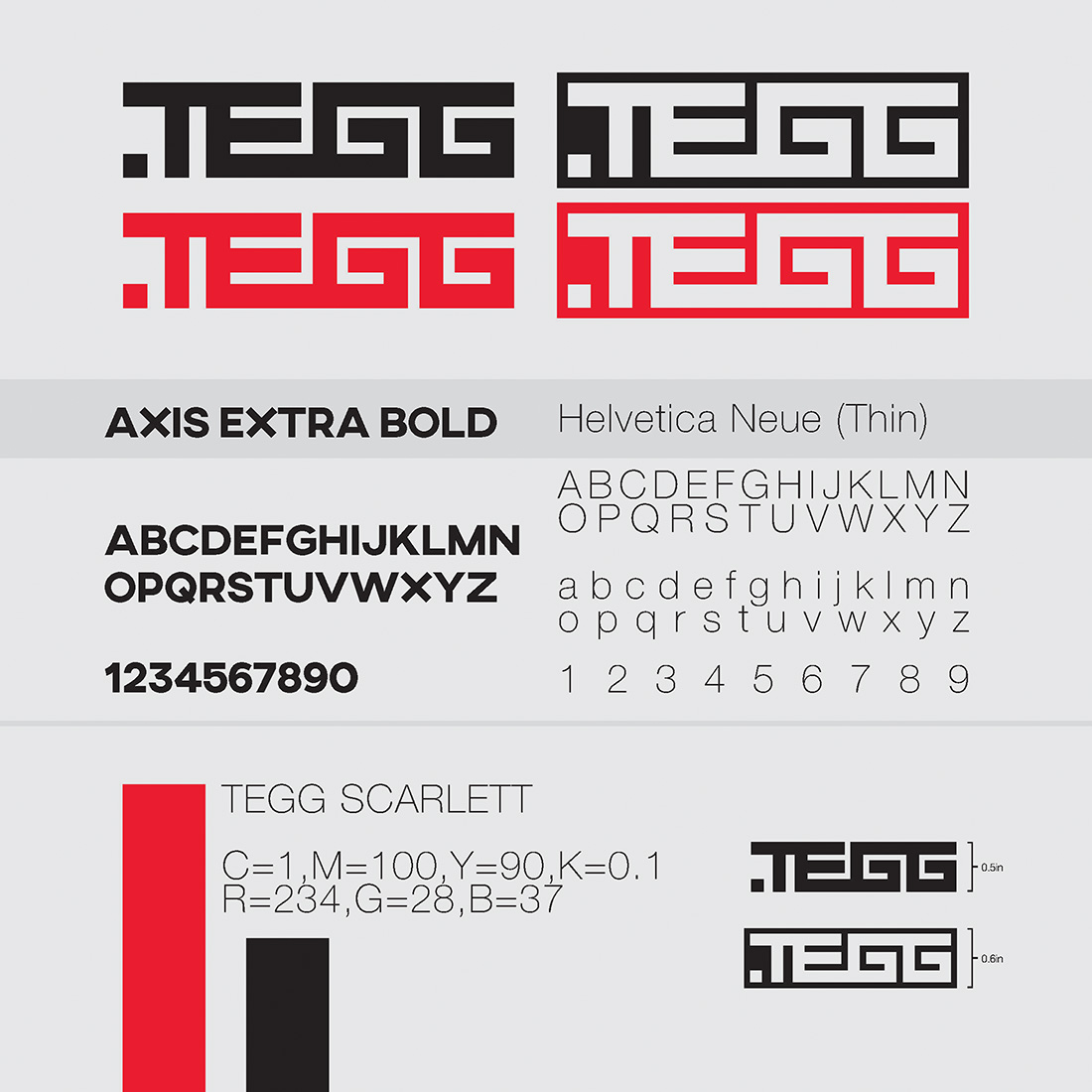
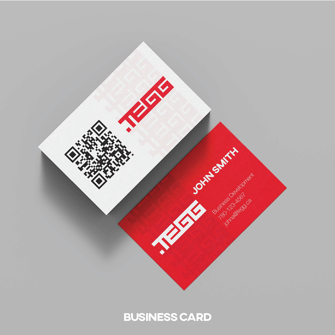
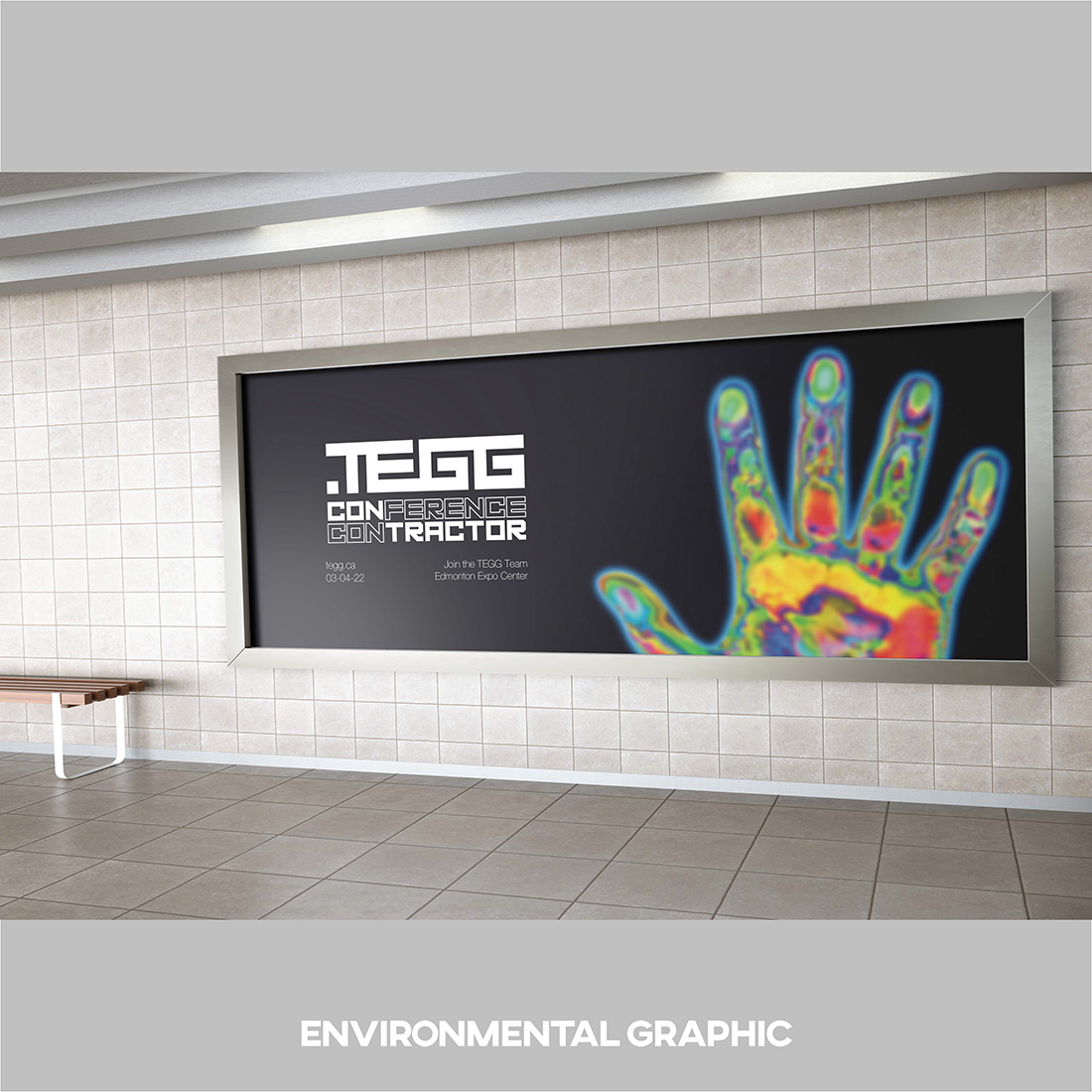
Branding: TEGG Redesign
The new TEGG logo flows as one piece, save for the period, which has been intentionally moved to the front of the word to reinforce the idea of preventative maintenance. Safety traditionally acts as ‘punctuation’ for electrical projects, coming at the end of the work, but TEGG changes that, and this mark represents that. The words seamlessly flow together to reinforce a TEGG inspection's step-by-step process.