Rachel
Blaak
Rachel
Blaak
She/Her
I am exiting this degree with a passion for illustration, branding, and typography. Proficient in Adobe Creative Suite, my skills extend to Photoshop, Illustrator, and InDesign. I excel in visual storytelling, and have a keen eye for detail, strong compositional sense, and ability to think outside the box. My portfolio reflects a blend of creativity and meticulous craftsmanship, showcasing my expertise in branding and illustration. What sets me apart is the harmonious fusion of creativity and precision. Excited about collaborating with industry professionals, I look forward to tackling new design challenges and making my mark in the dynamic world of design.
Projects
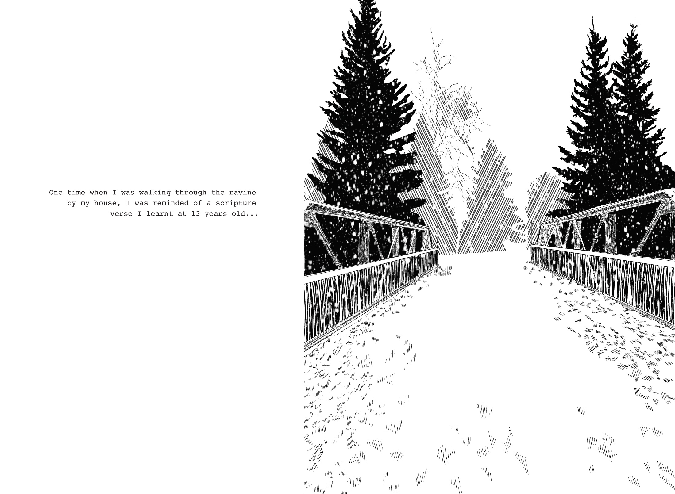
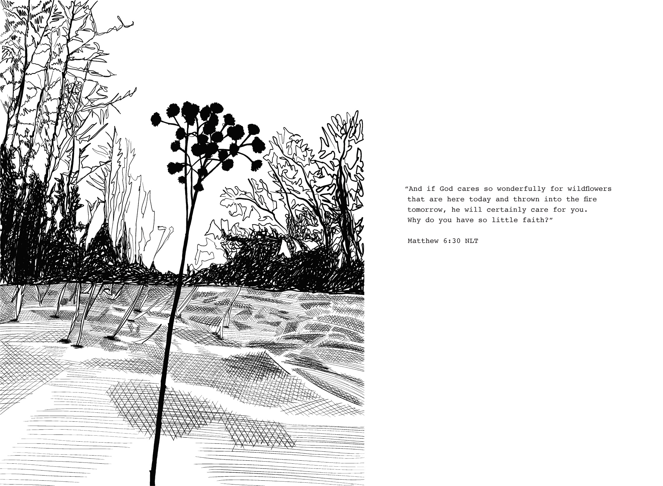
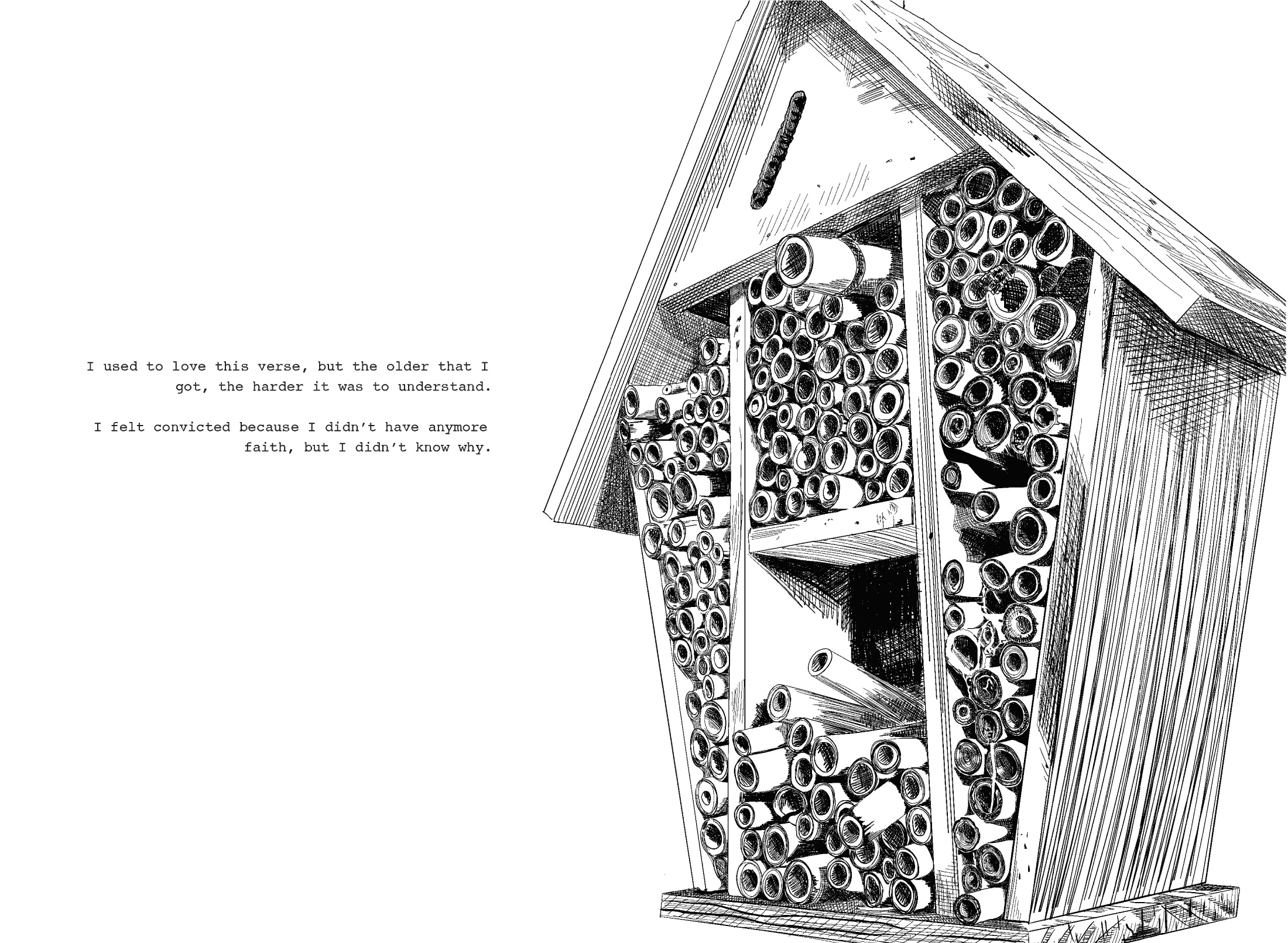
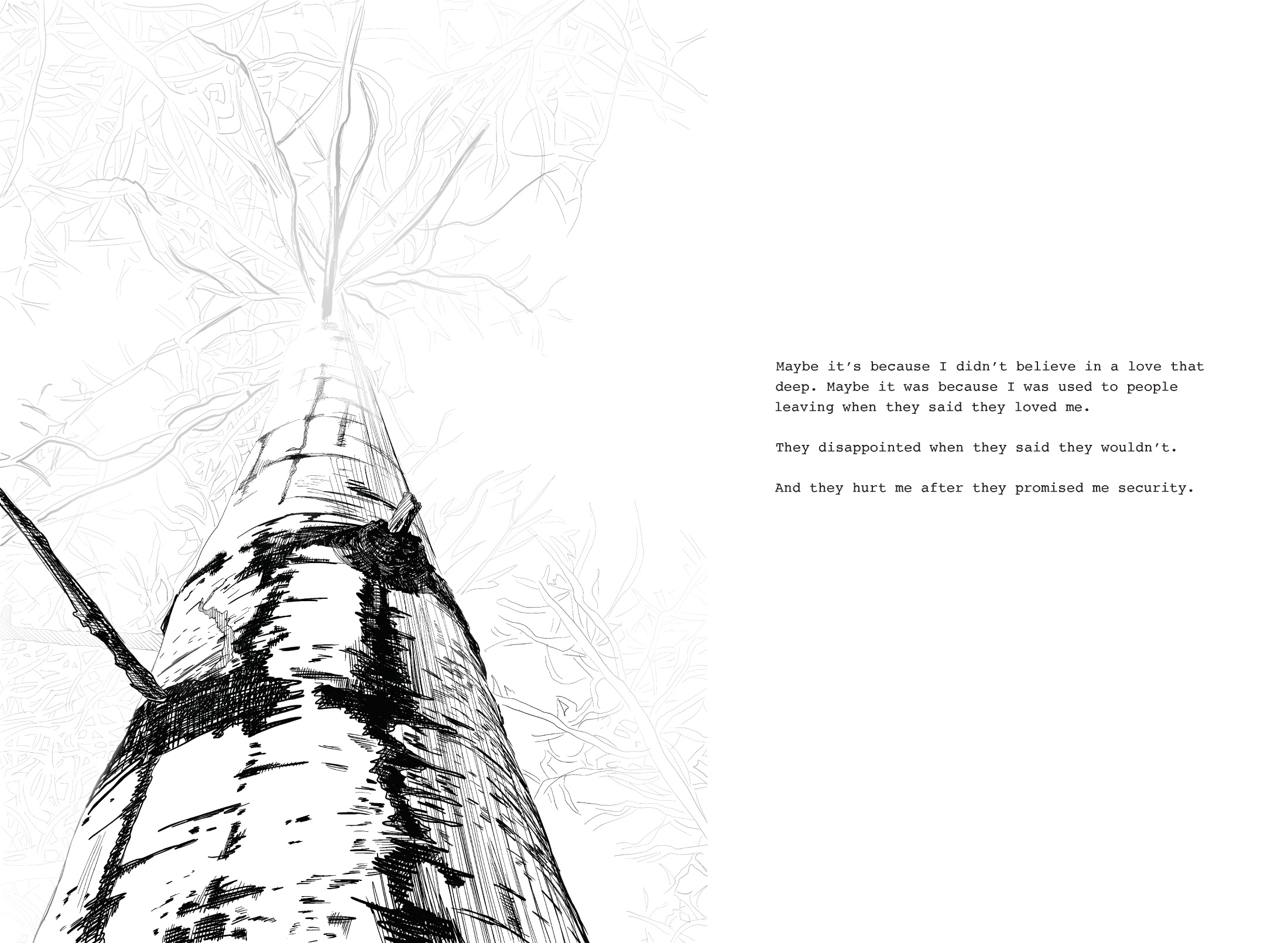
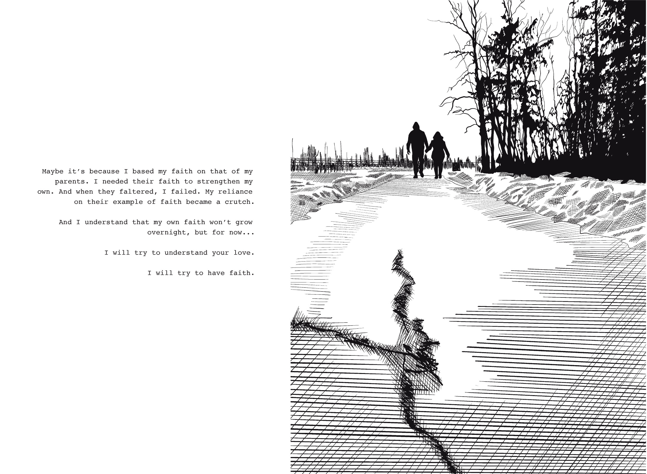
I Will Try to Have Faith
This project consisted of visualizing a journey that you had taken. While I could have described a physical journey, I decided to describe a more emotional journey. The images depicted are from a ravine near my house. It is such a welcoming and calming place to be and allows for plenty of thought. I have done plenty of contemplating in this ravine; this includes debating my religion.
Spread Size 11 x 15
Spread Size 11 x 15
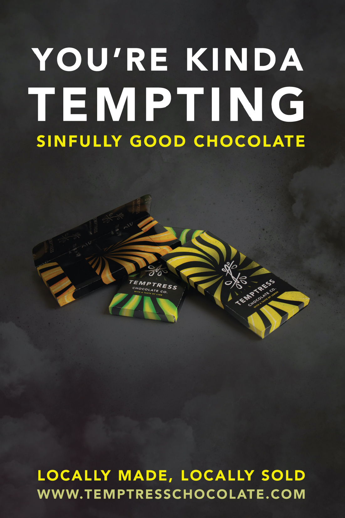
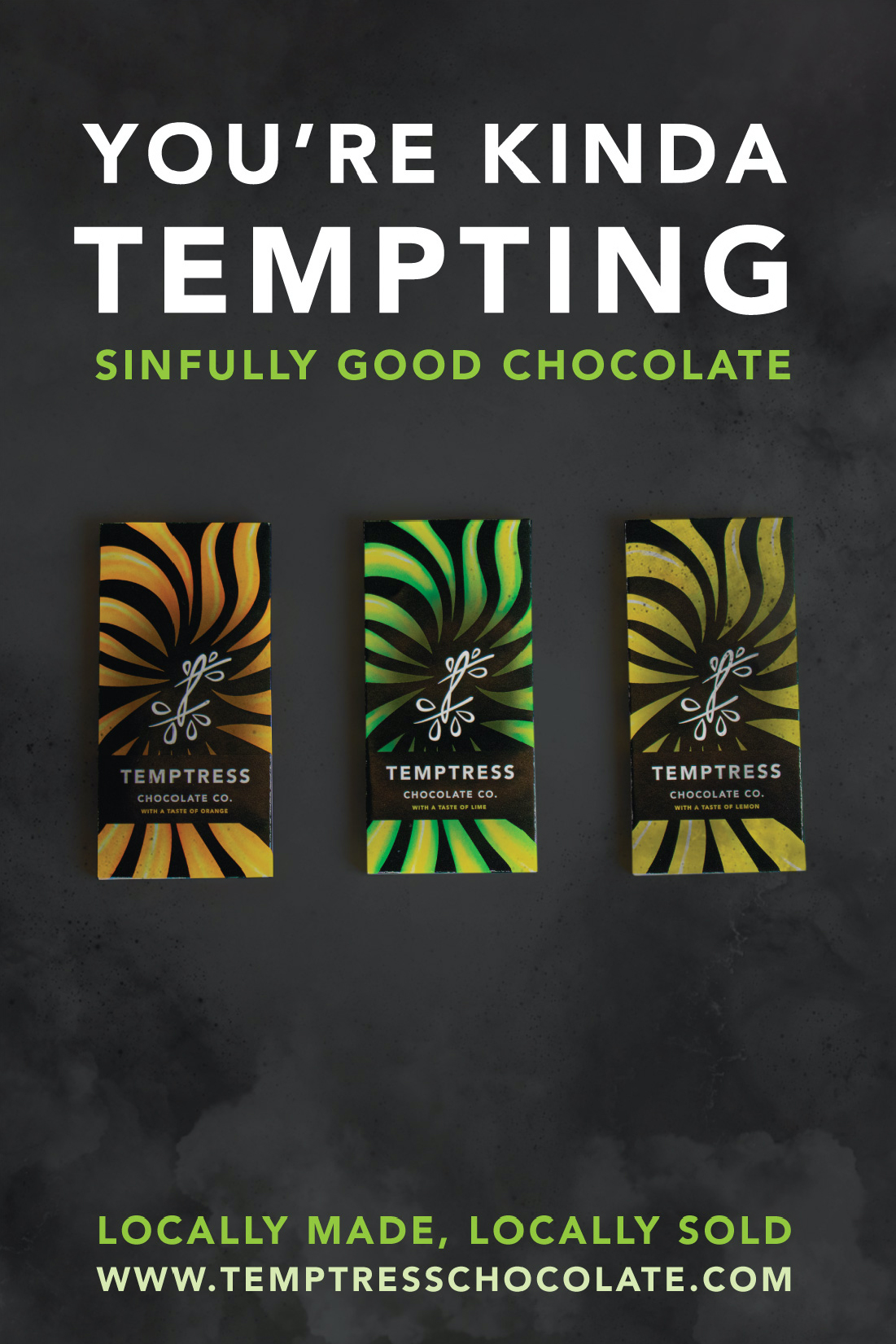
Temptress Chocolate Company
This project consisted of creating a company and product that you could brand and advertise. Temptress Chocolate crafts premium chocolates using clean, allergen-friendly ingredients, catering to those with food intolerances. Their commitment is to innovate flavours, handcrafting each creation for an exquisite and inclusive chocolate experience.


How to Pronounce Knife Postcard Series
Derived from How to Pronounce Knife by Souvankham Thammavongsa, a collection of short stories, this project entailed crafting a postcard series reflecting its essence. In "The Gas Station," Mary's perspective illuminates the overlooked. Many characters resonate as 'unseen,' yet their narratives offer visibility. Their quiet stories resonate louder, emphasizing the significance of their conclusions over the clamour of louder counterparts.


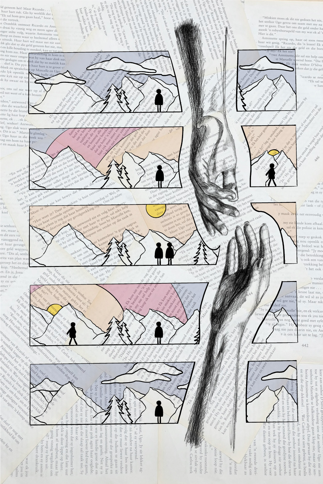
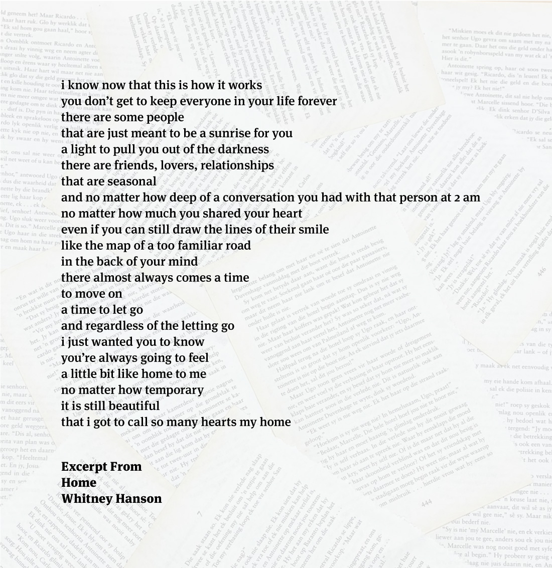
A Farewell to Those I Once Called Home
This project drew inspiration from a written piece. The illustration symbolizes seasonal relationships, with changing colours reflecting sunrise and sunset, mirroring stages of connection. Inspired by Whitney Hanson's quote, hands represent levels of connection, poised between reaching out and letting go. The book pages in the background highlight its literary inspiration. Temporal progression through colour signifies the cycle of coming together and separation, echoing themes of illumination and darkness, marking clear beginnings, middles, and ends.