

A video demonstration of the final prototype of the website. It talks about the design choices made across the website and how those features meet the needs of my community partner.
Navigate the prototype of the website here:
view prototype
Navigate the prototype of the website here:
view prototype
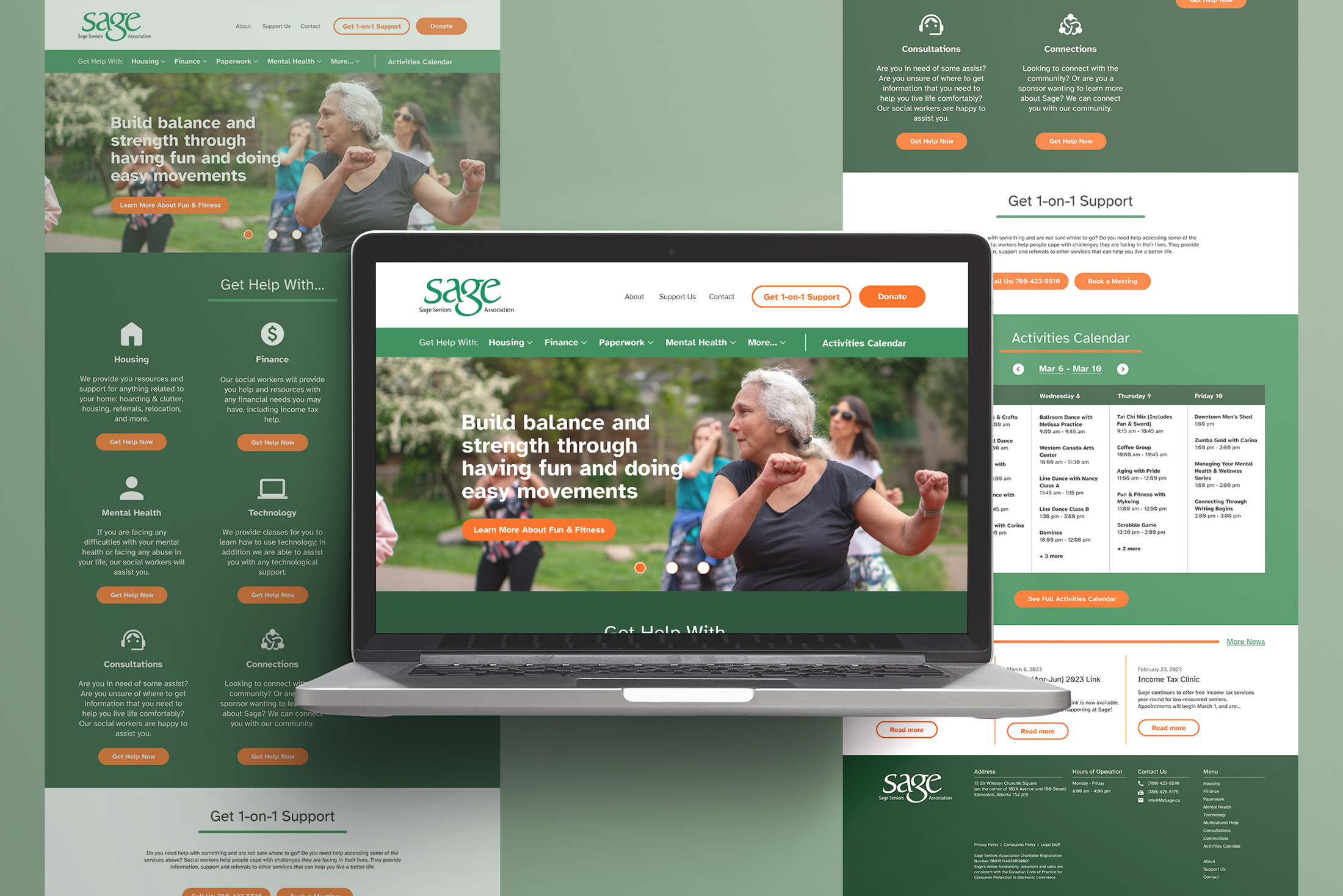

The navigation menu is an important feature in meeting my client’s goals.
Each item in the navigation menu is grouped by topic; the purpose of this design is that the users woujld try to find their solution by going through the topic of each navigation.
The navigation menu is an important feature in meeting my client’s goals.
Each item in the navigation menu is grouped by topic; the purpose of this design is that the users woujld try to find their solution by going through the topic of each navigation.
The purpose of the icons underneath each category is to create a mental set that users can easily connect to when they see the same icon in another page.
Each item in the navigation menu is grouped by topic; the purpose of this design is that the users woujld try to find their solution by going through the topic of each navigation.
The navigation menu is an important feature in meeting my client’s goals.
Each item in the navigation menu is grouped by topic; the purpose of this design is that the users woujld try to find their solution by going through the topic of each navigation.
The purpose of the icons underneath each category is to create a mental set that users can easily connect to when they see the same icon in another page.
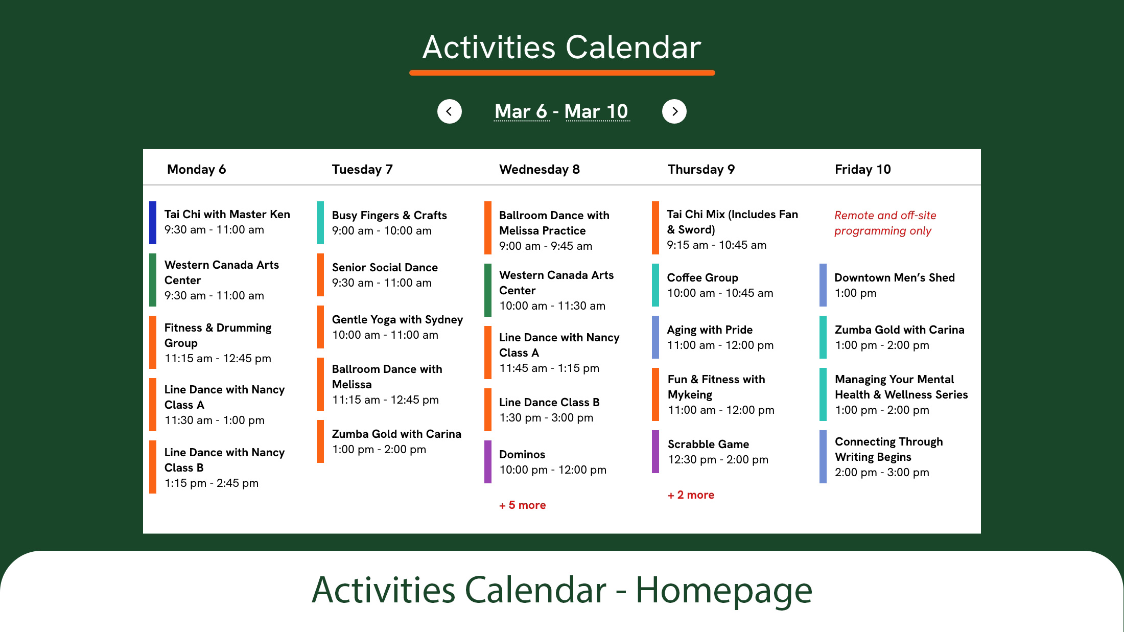
Another important feature of the website is the activities calendar.
Here, the calendar is portrayed in weekly view on the home page. Each activity is colour coded with how it is going to be delivered: remotely, online, hybrid, etc.
Here, the calendar is portrayed in weekly view on the home page. Each activity is colour coded with how it is going to be delivered: remotely, online, hybrid, etc.

The activities calendar is an important feature of this website.
The same as how its designed on the home page, the activities calendar page shows the calendar. The left column contains a legendon what each colour means.
The same as how its designed on the home page, the activities calendar page shows the calendar. The left column contains a legendon what each colour means.