We worked with Heartstrings Jewelry to envision a potential brand for the future of the company. The total rebrand includes the redesign of their logo, website, and packaging. We identified issues with the company’s branding relating to clarity and cohesiveness regarding their eco-conscious mission and market. By strengthening the branding of Heartstrings Jewelry, consumers will better understand the brand’s products and eco-mission. With our final outcomes, the company’s mission statement is better recognized by finding a balance within three different niche markets of Heartstrings Jewelry.
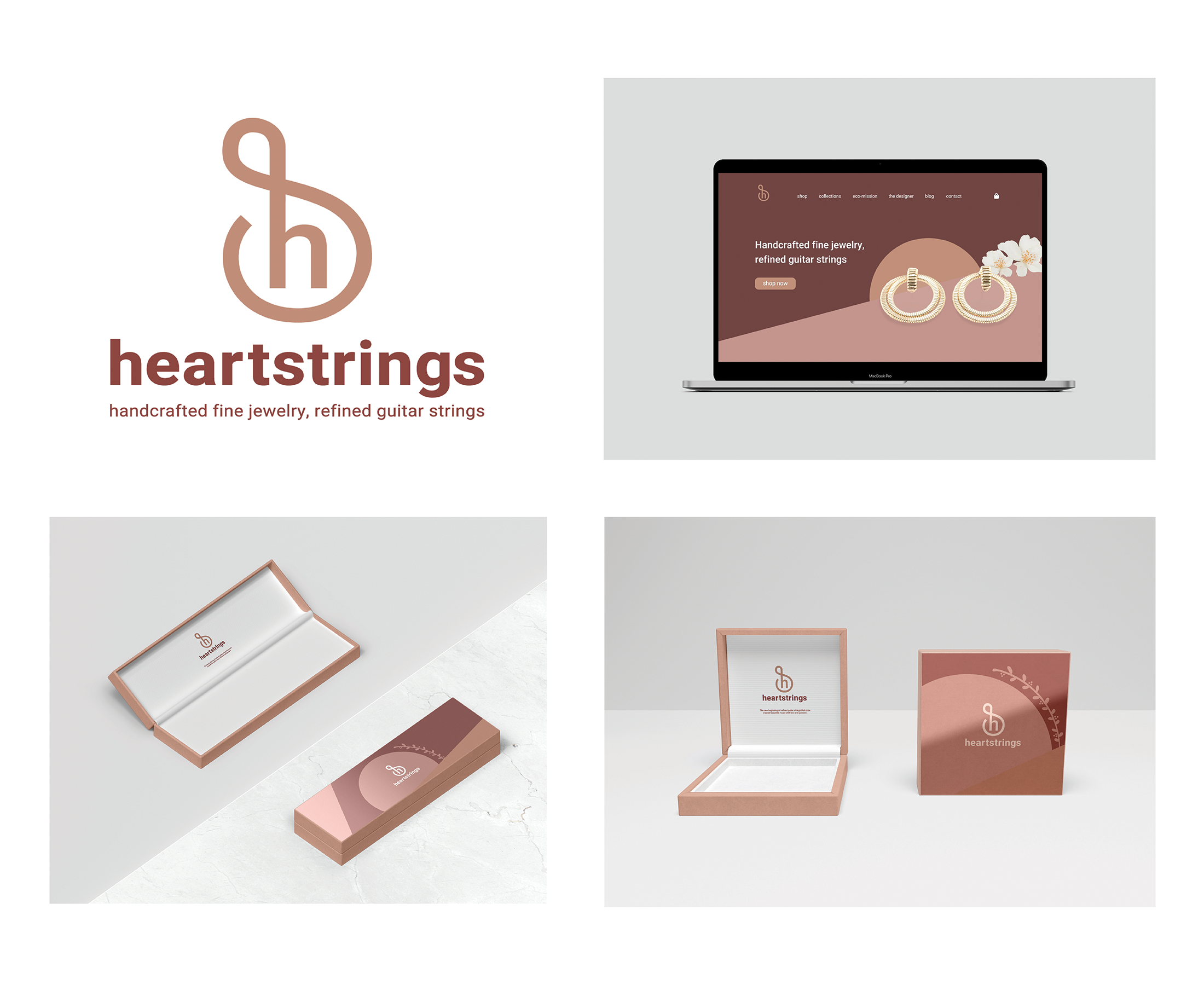
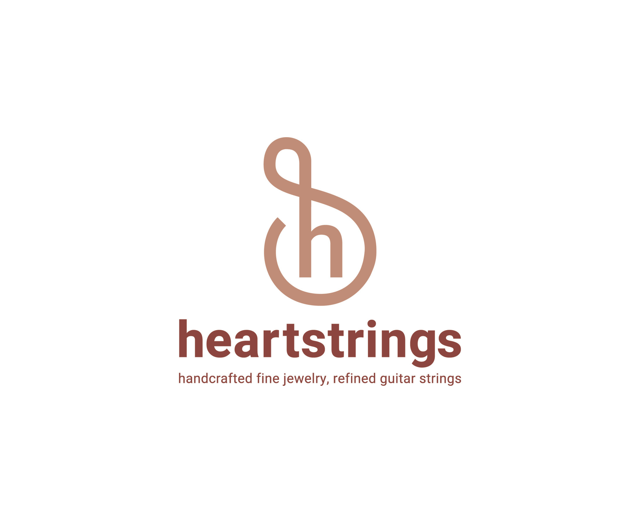
The logo embodies elegance and classy nature that reflects Heartstrings’ jewelry pieces. The ambiguous shape reflects the musical side of the company, where it alludes to a treble clef and the shape of the body of a guitar. The logo also reflects the jewelry and eco-friendly side in how it is a shape of an earring and the organic movement of guitar strings. The colours and sans serif work to create balance and overall matches the company because of its neutral tones.
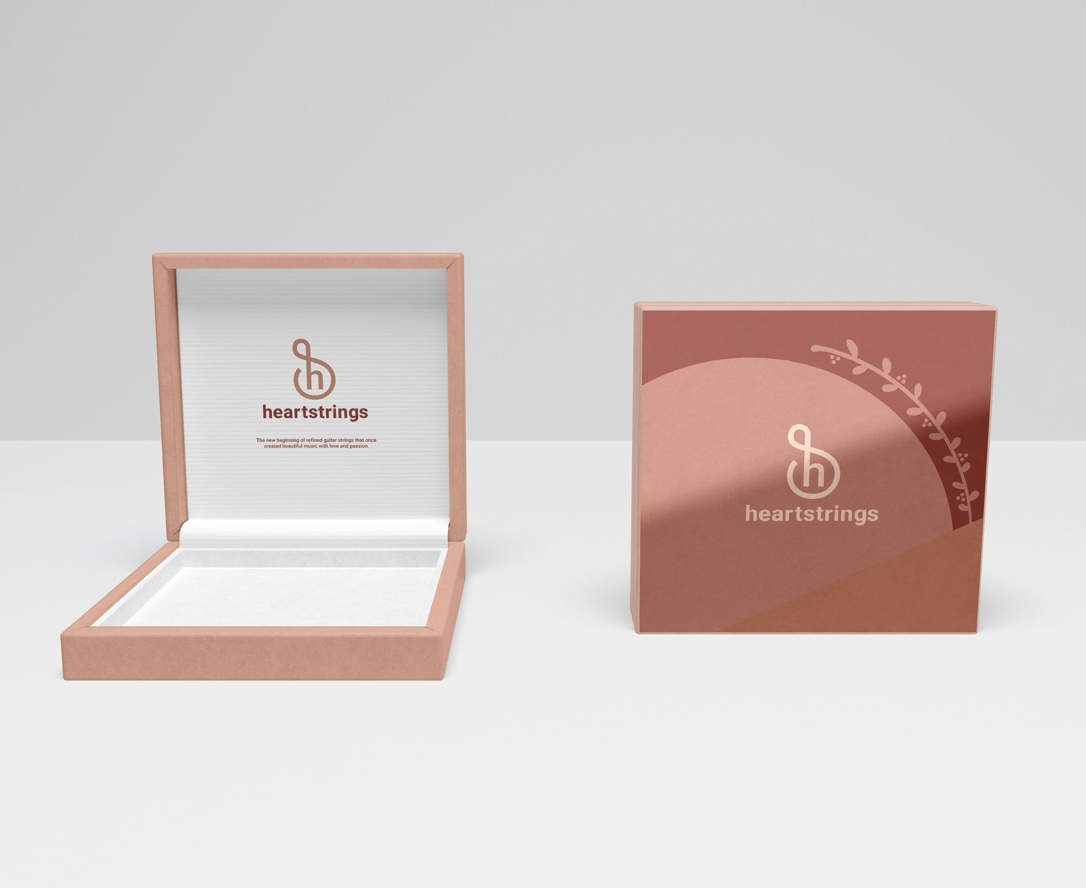
The inspiration behind the packaging design comes from Heartstrings’ jewelry pieces in how geometric they are. The design on the lid reflects the abstract pattern from the website with an added illustration of dainty leaves and tiny buds. Inside the lid, a short message reads: "The new beginning of refined guitar strings that once created beautiful music with love and passion.” The message on the lid connects better with the roots of repurposing the strings and reflects the company’s eco-mission.
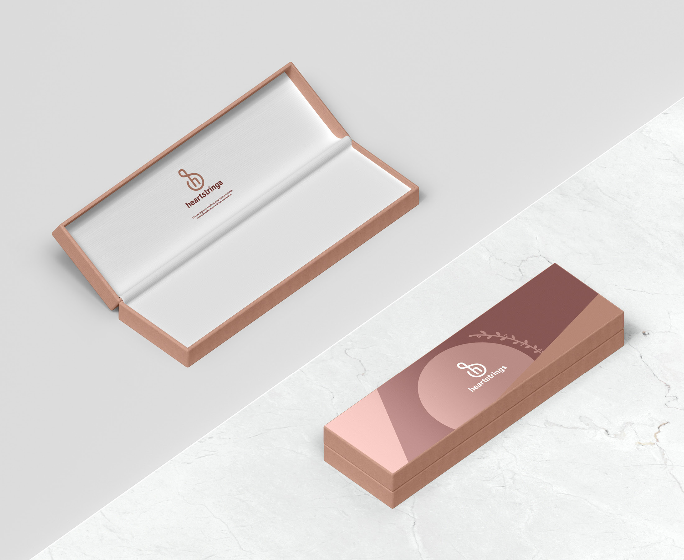
The other packaging design comes in a rectangular box. We decided to choose a thinner box versus a traditional bulky box with the mockups to produce less waste for the environment.
