Keys Nielsen

They/He
- graphic design
- motion graphics
- typography
Keys Nielsen
They/He
About
Hey! My name is Keys, and I specialize in typography, publication design, post-production editing, and motion graphics! I continue to improve and hone my design skills with everything I do—inside and outside of “typical” design—you never know when an obscure piece of knowledge or odd skill might come in handy. Learning new things is something I love; I absorb anything I can. And I take pride in refining the smallest details to elevate any project.


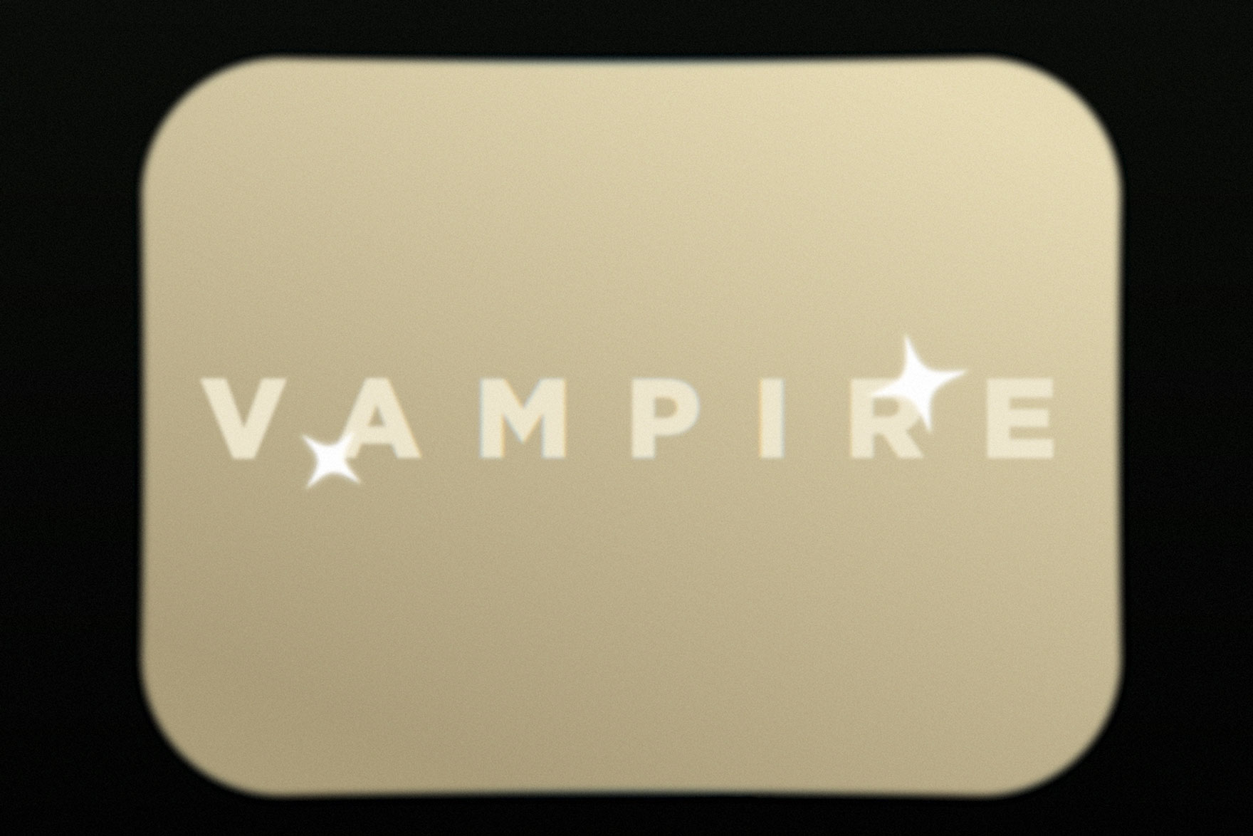
History of a Vampire
Vampires. Love them or hate them, they seem to be everywhere nowadays. But how did this immortal monster come to be what we know it as today? This short explainer video takes you through a brief history of where the vampire comes from.


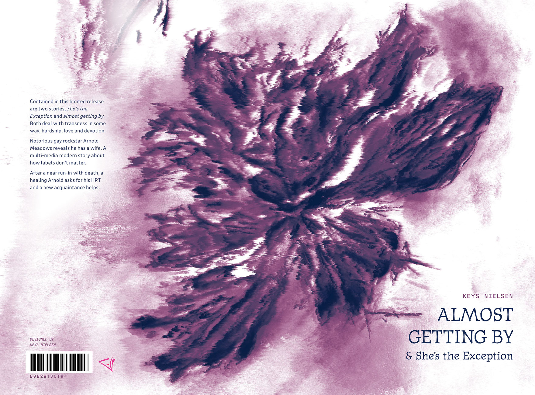
Almost Getting By
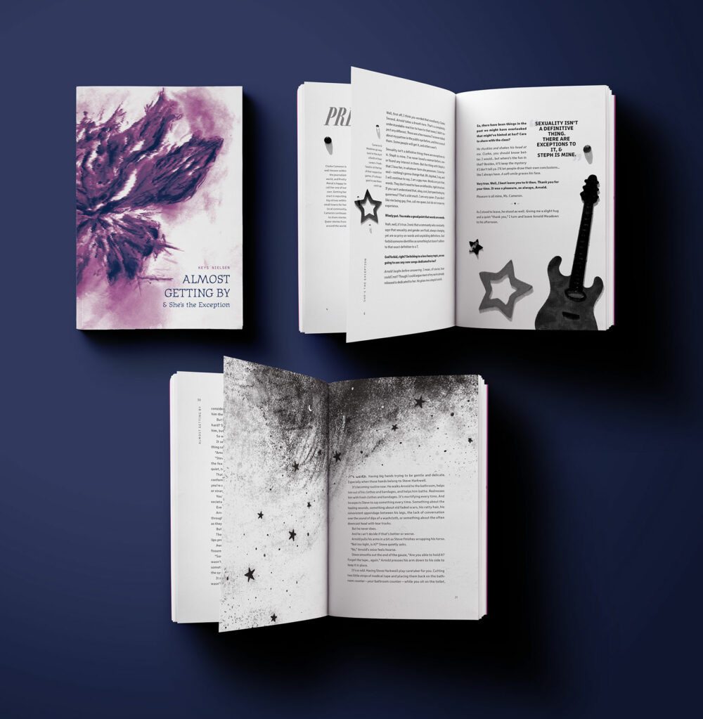
Meant to mimic reading a story online, the choices for the design were incredibly personal and specific to the stories at hand—both written by me. The first story is multi-media, so the layout and type reflect the change in that medium (magazine, social media post, transcript). The second story goes back to a standard layout of a typical novel.


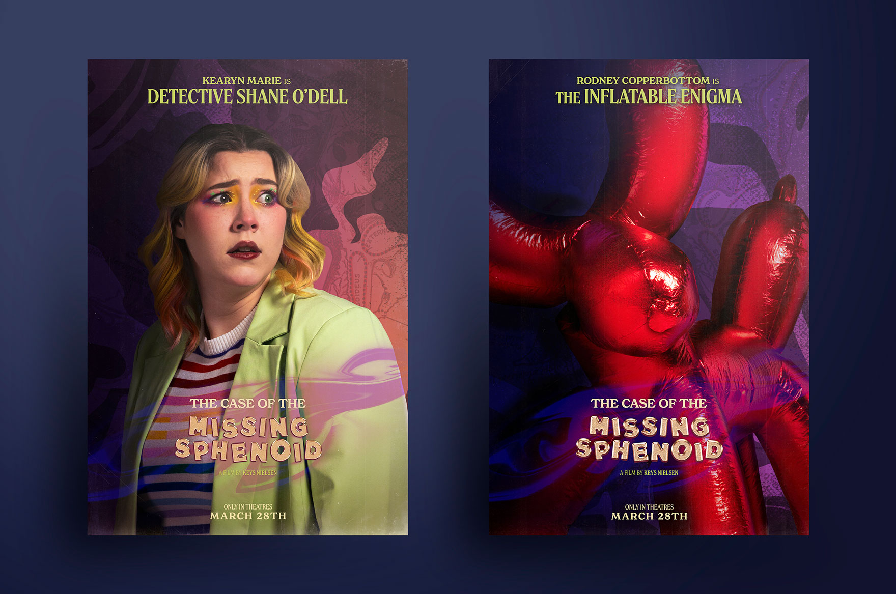
The Case of the Missing Sphenoid
"Key Art Posters for a fictional, campy, scooby-doo-esque mystery movie called “The Case of the Missing Sphenoid.” Detective Shane O’Dell and their sidekick, the Inflatable Enigma, stumble into a case when they get a mysterious call from the local history museum; someone has stolen the sphenoid from the skeleton of Sir Vero Daedalus. As the mystery
unfolds, Detective O’Dell discovers the motive may be far more sinister than they once believed...."
unfolds, Detective O’Dell discovers the motive may be far more sinister than they once believed...."


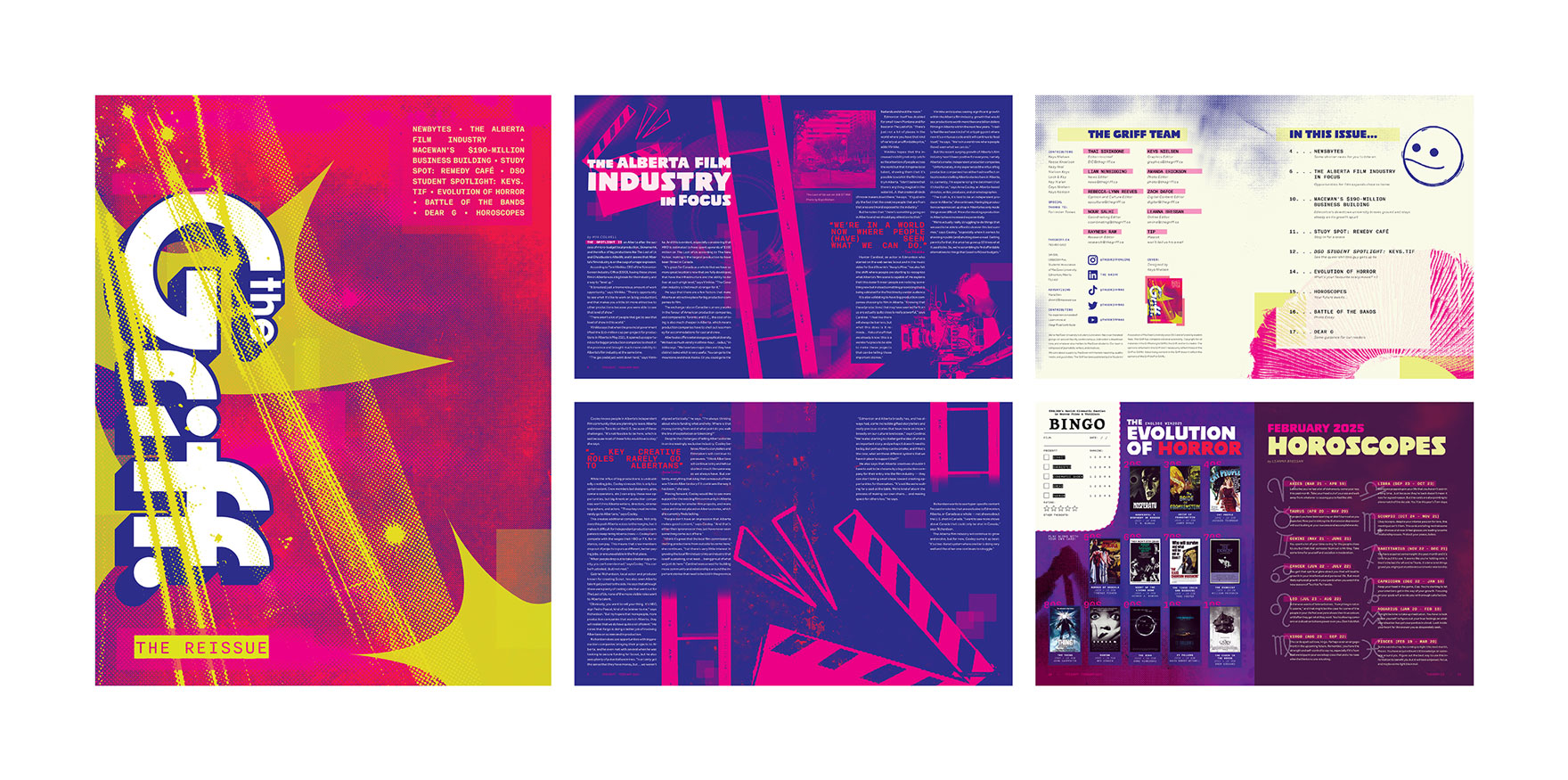
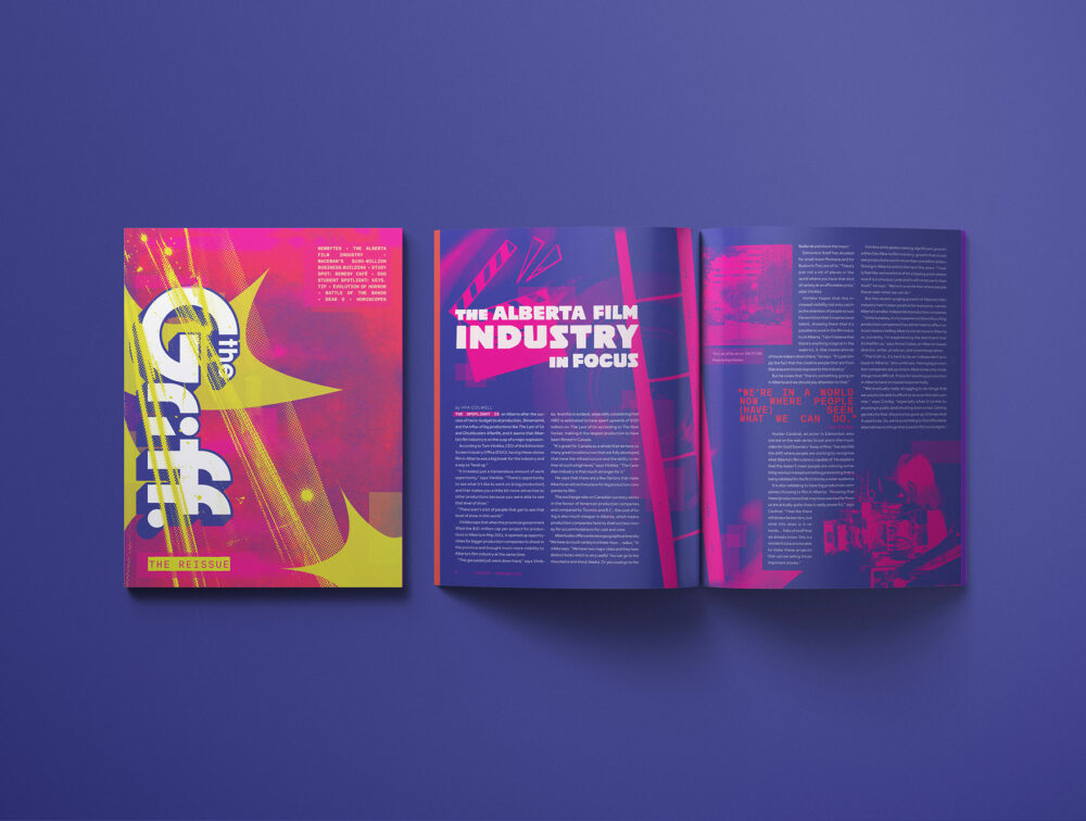
The Reissue
The current Griff style and my own are similar, so the dilemma was: how do I do “myself in a magazine” while making it different? How did I do that? By creating something that has a sense of nostalgia while still being modern. Highlighting the idea of tangibles, I made specific design choices: halftones, transparent squares and rectangles as a sort of highlight mark and grungy typefaces. With punchy colours and graphics that can spark inspiration in anyone, yet still read as sophisticated when needed.