Ayse Yesil

She/Her
- advertising
- branding
- publication
Ayse Yesil
She/Her
About
Hello there, I'm Ayse! During my 4 years at MacEwan, I've learned to embrace the unknown and see it as an opportunity to experiment and learn. I love to try, whether it's different design sub-disciplines, new aesthetics, styles, and media. My work spans branding, information design, advertising, publication, photography, and motion design, with some video and stop-motion experience. I have high standards, which push me to ensure the final output is always one that I'm proud of. I'm committed to lifelong learning and approach every brief with curiosity and precision to create impactful and intentional design!


Tea Talk Title Sequence
This is a title sequence for a hypothetical YouTube channel called "Tea Talk." It’s a stop-motion piece in which hand-crafted, playful paper-cutouts of pastries and tea sets assemble across a gingham backdrop, creating an inviting, whimsical introduction for viewers.

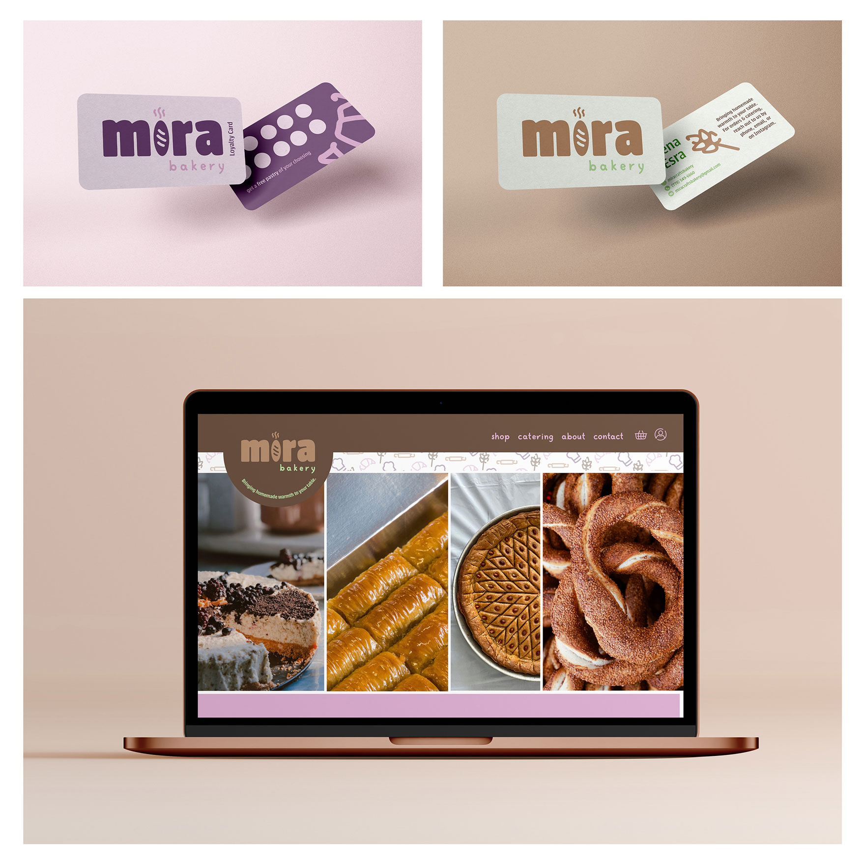
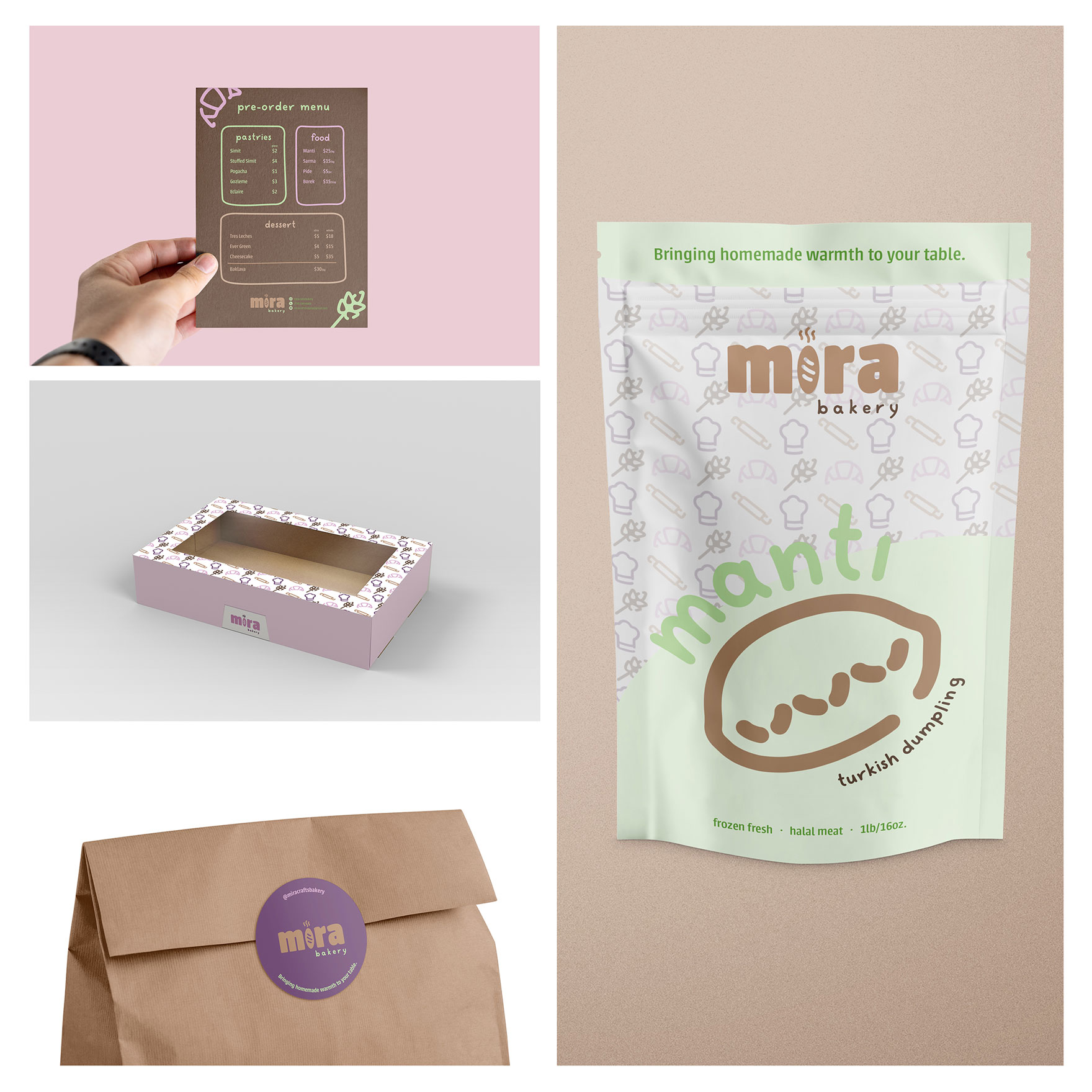
Mira Bakery Brand Identity
This project involved the brand identity development and collateral for Mira Bakery, translating the sensory experience of freshly baked goods into a cohesive visual system. The branding communicates a sense of homemade warmth and the signature fluffy texture of the bakery’s offerings by pairing a soft, pastel palette with “chubby,” rounded typography and graphics.


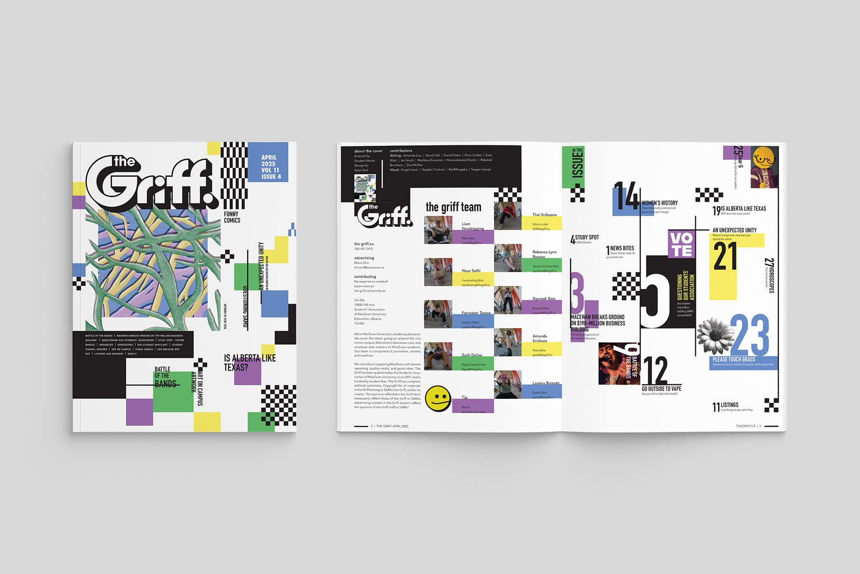
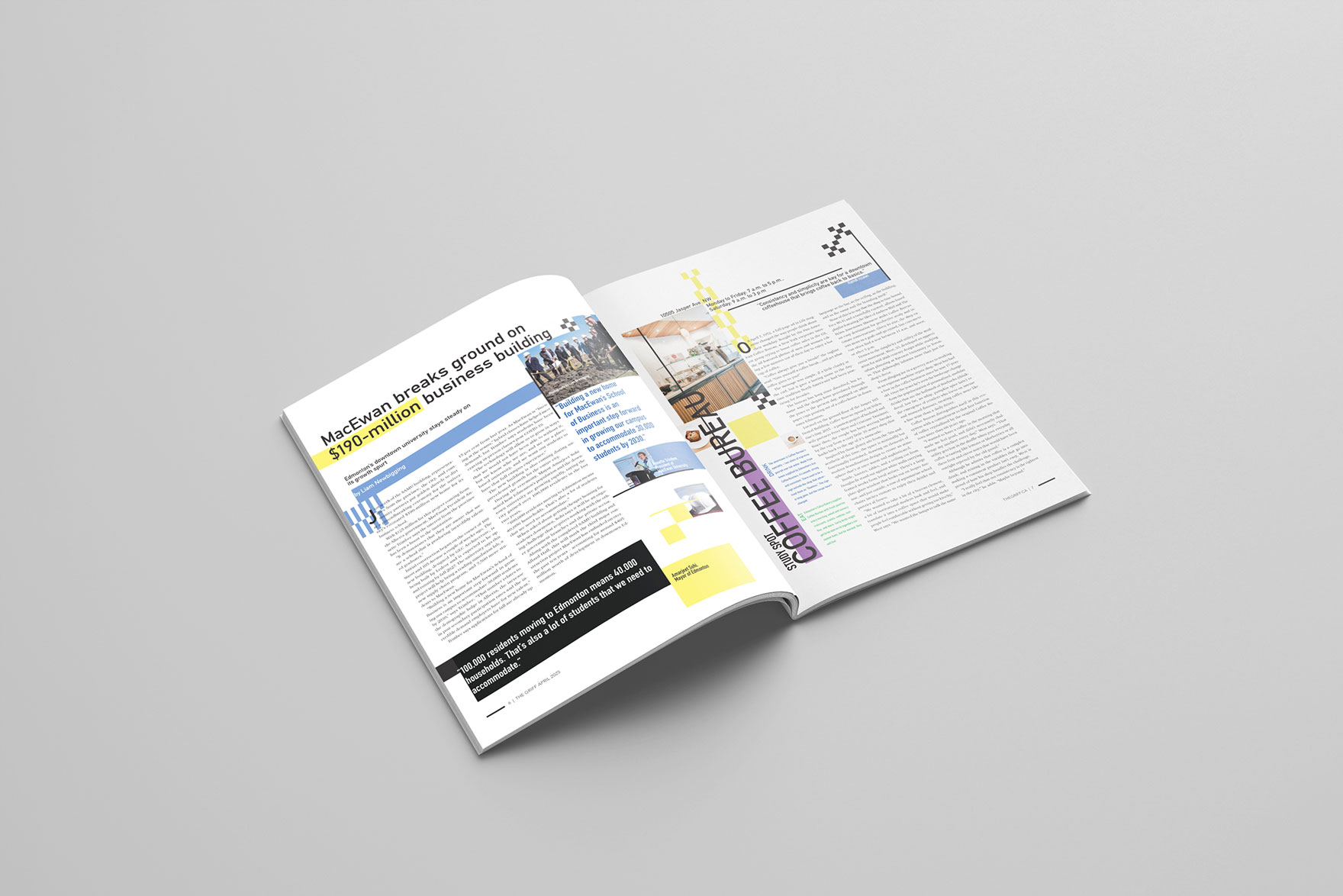
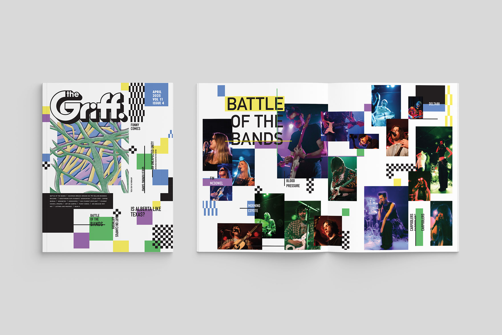
The Griff Magazine
This project features a publication design for The Griff magazine, in which I utilized a rigid grid system to intentionally create a sense of visual chaos. The design mimics the frantic, multifaceted experience of university student life by pushing the boundaries of traditional layout structure, while maintaining the high standards of communication expected in a professional publication.
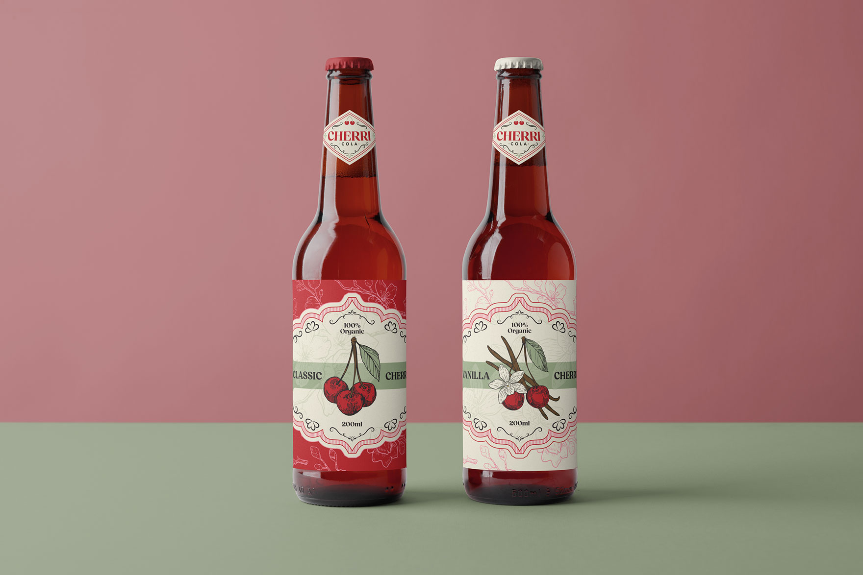
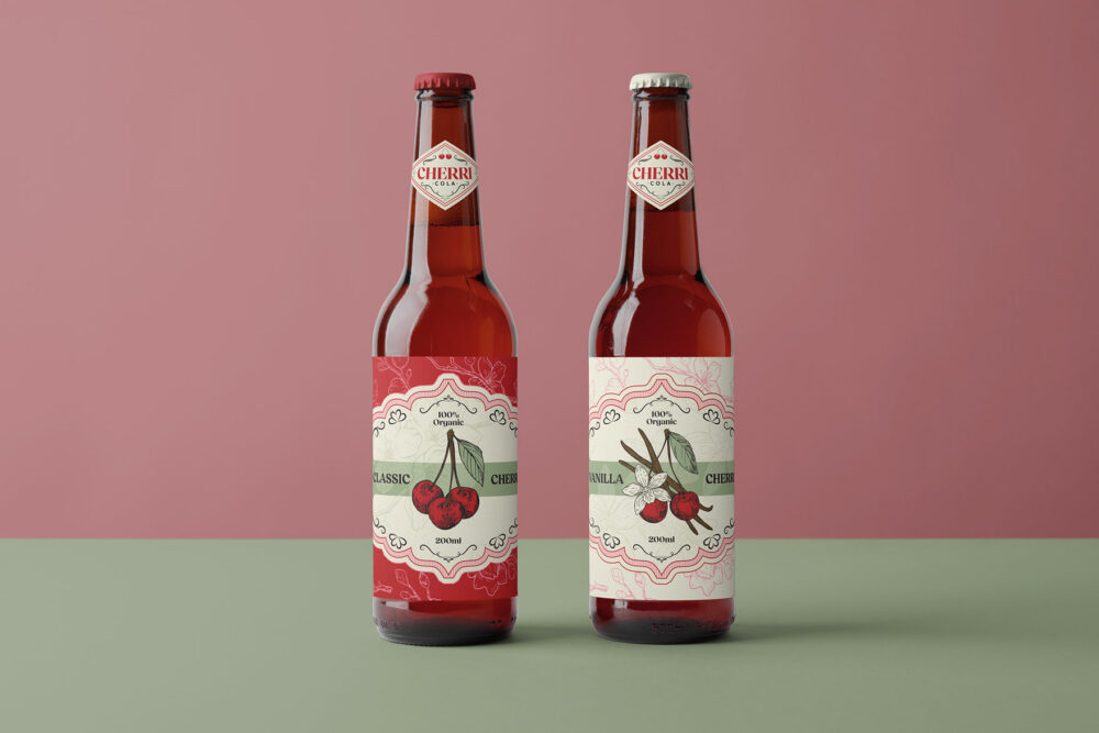
Cherri Cola Branding, Packaging and Ad Campaign
This project encompasses the full brand identity, packaging, and advertising campaign for Cherri Cola, a soda company dedicated to healthy, fruit-forward beverages. The visual direction leans into a "vintage farmer" aesthetic, using nostalgic graphic design elements to highlight the brand's commitment to using actual fruits.