
Community Partner
Couture Cones
The Couture Cones Rebrand focused on developing a refreshed brand identity that better reflected the company’s unique and playful personality. Guided by research and an iterative design process, a new combination mark and website were created to enhance both visual appeal and user experience. The logo embraced a lively, energetic aesthetic to capture the brand’s character, while the website was designed to address challenges within Couture Cones’ distinctive ordering process, creating a more intuitive and engaging experience for users.

Over the course of the first semester, a variety of research was conducted, including surveys, observation, interviews, user testing, co-design, and comparative analysis, to better understand user needs, client challenges, and expectations when interacting with the brand both online and in person.

Each method revealed distinct opportunities for both the brand and website. Insights included clarifying the correct pronunciation of the brand, understanding the step-by-step ordering process, identifying the target demographic, and informing the visual direction of both the logo and website.
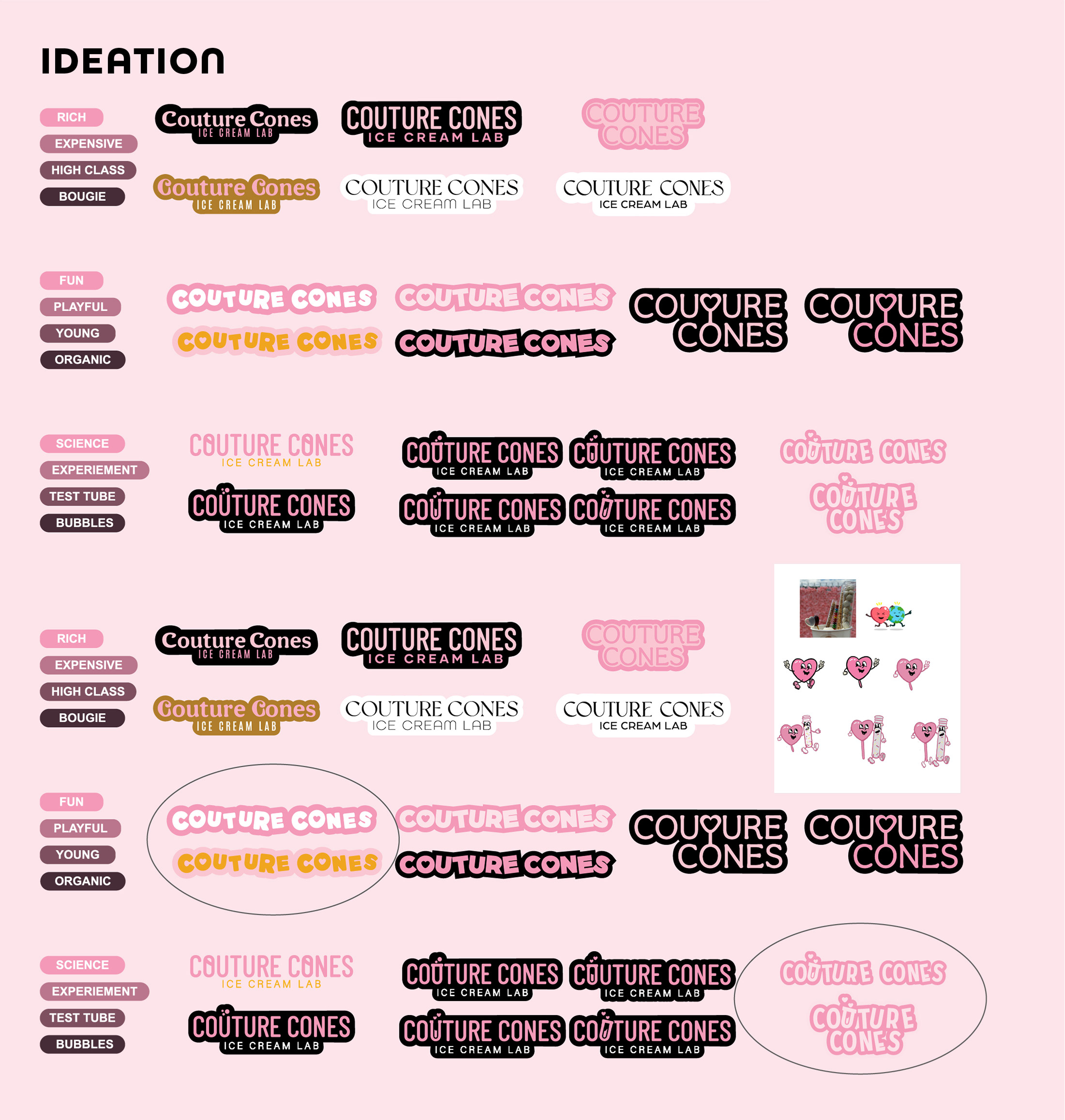
Several concepts were explored, each reflecting a different brand personality. These included a refined, luxurious direction inspired by the meaning of “couture,” a science-driven theme highlighting the process of creation, and a playful approach designed to appeal to the target demographic. All of which were eventually narrowed down to the top selections.
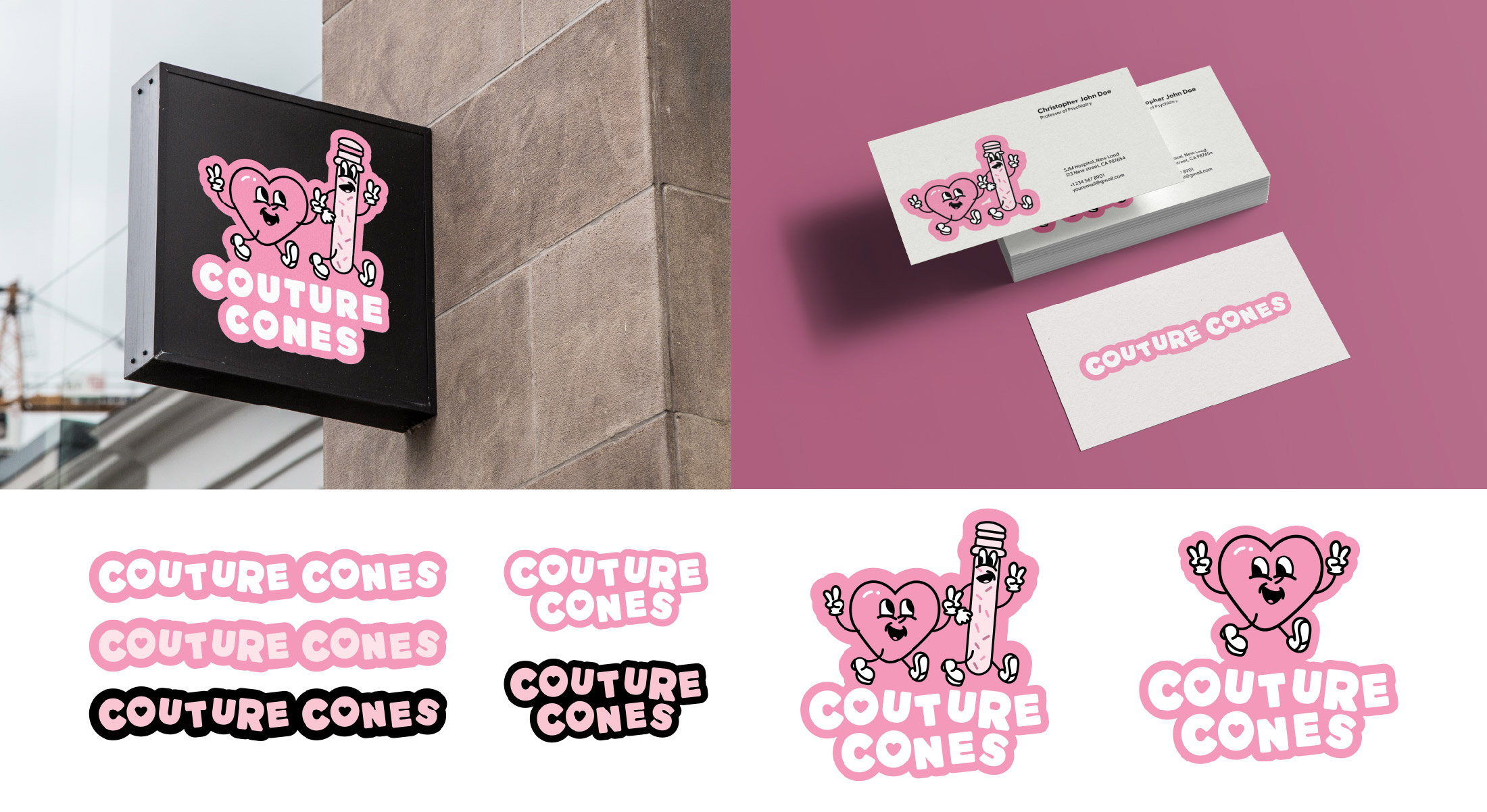
Chosen in the end was this combination mark. Featuring playful illustrated characters and a bright pink colour palette, this mark inspires to create an energetic brand that appeals to a wide range of customers while also reflecting Couture Cones’ fun and welcoming identity.
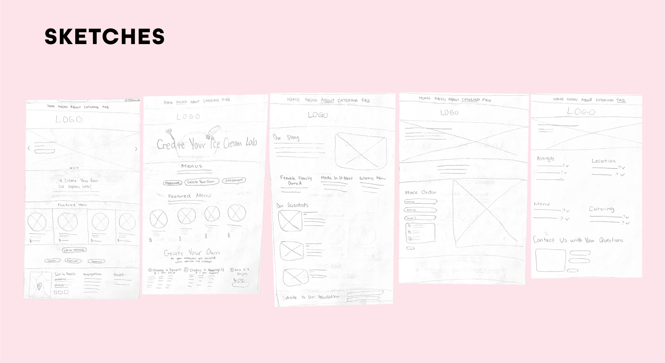
The ideation process for the website began with a series of initial sketches used to outline the structure of the rebrand. These early concepts focused on identifying the key pages that would be included, as well as establishing a general sense of layout and content hierarchy. This stage helped define the overall direction of the site before moving into more detailed design development.

The final website designs showcase a strong focus on improving the user experience through clearer organization and a more intuitive, step-by-step ordering system. The “Create” menu helped break down the ordering process into manageable steps, while an added feature within the other menus provided detailed guidance on how flavour combinations are built, using brand characters to visually communicate the process. Enhanced navigation also made it easier for both new and returning users to explore the menu and quickly access key information, resulting in a more seamless and engaging experience overall.
A comprehensive walkthrough of the redesigned interface, demonstrating how users will interact with the new site and move through the ordering process.

A set of brand guidelines was created to support the client in consistently applying the new brand identity. This resource outlined key elements such as logo usage, colour palette, typography, and visual style, ensuring the brand could be implemented clearly and cohesively across future materials.