Jasmeen Nona
She/Her
- advertising
- environmental
- publication
Jasmeen Nona
She/Her
About
Hi! I’m Jasmeen, a multidisciplinary designer passionate about using design and research to create meaningful change. My design education has shaped the way I see the world, noticing the subtle ways design influences everyday life. I find fulfillment in creating work that is not only visually appealing but also contributes to a more inclusive, accessible, and just world. Design has the power to shape perception and influence behaviour, which drives my interest in intentional, concept-driven projects. I believe being a designer is a lifelong journey of overcoming challenges, growth and self-reflection, and I am excited to keep learning after graduation.
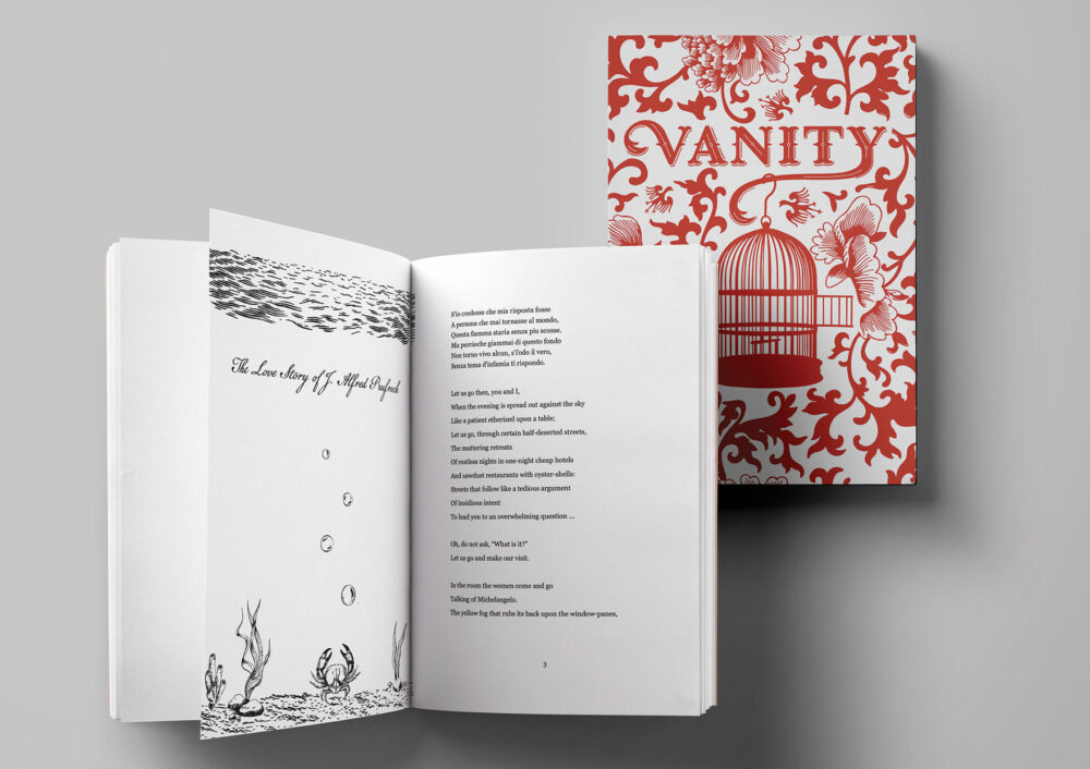


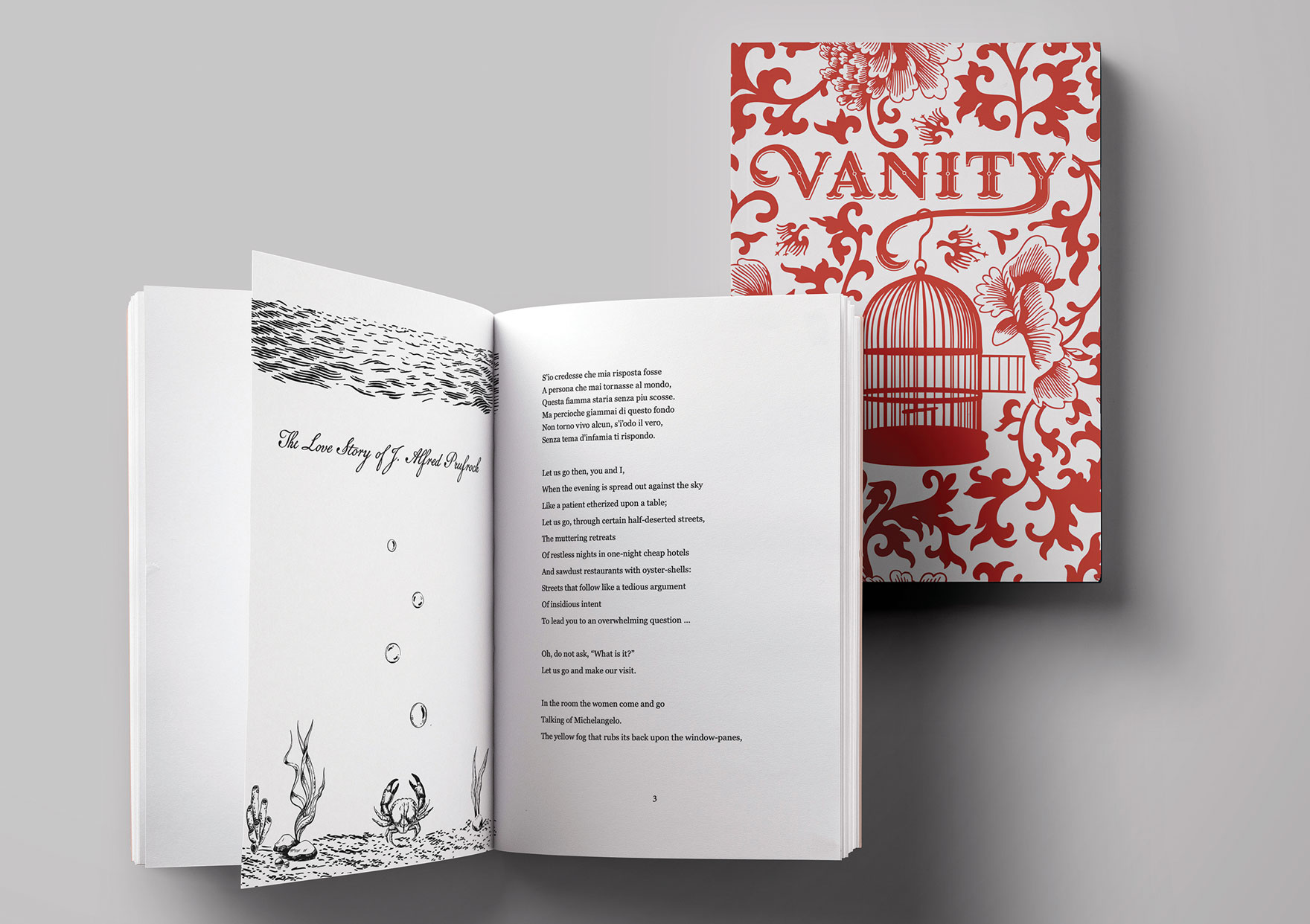
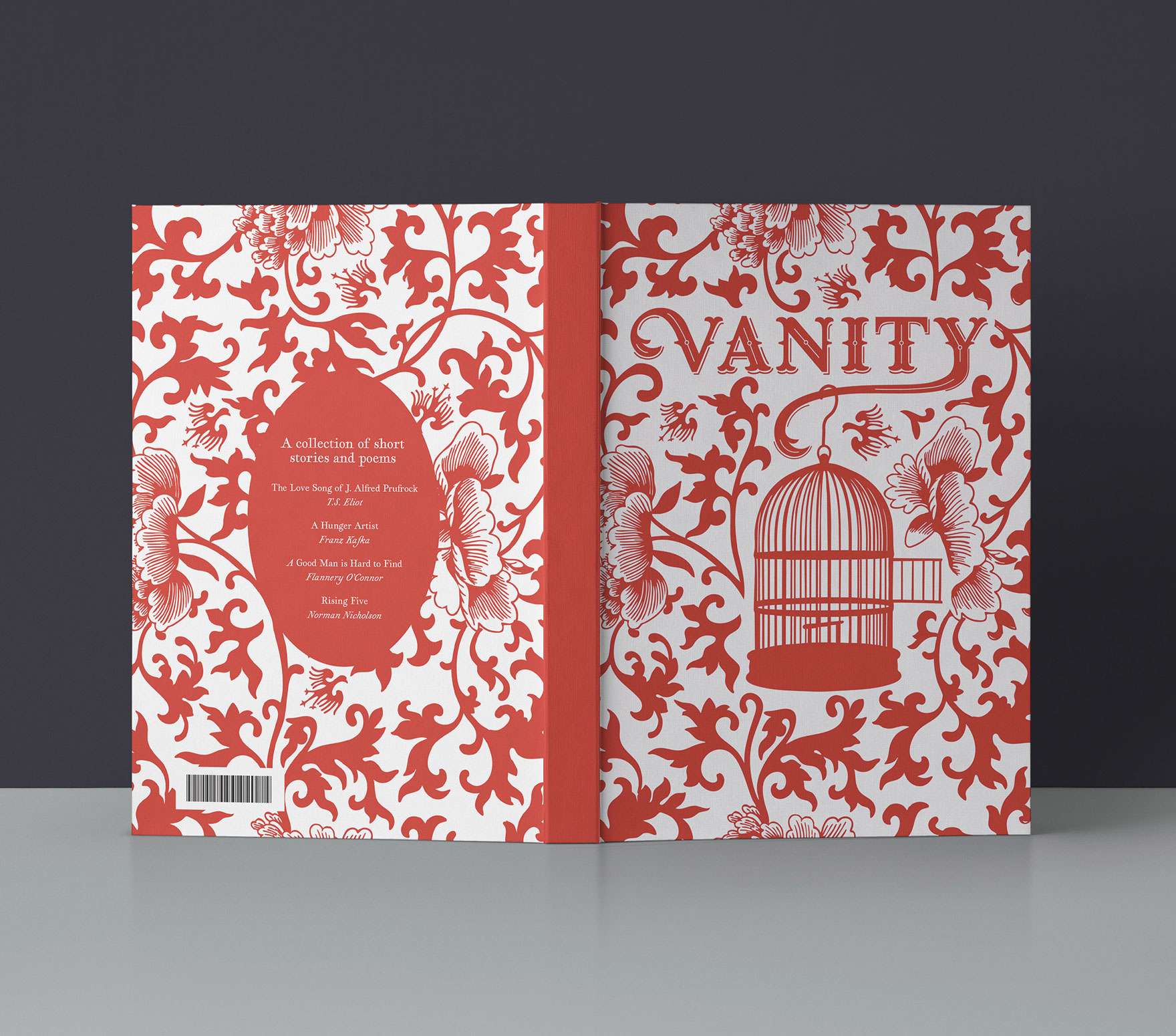
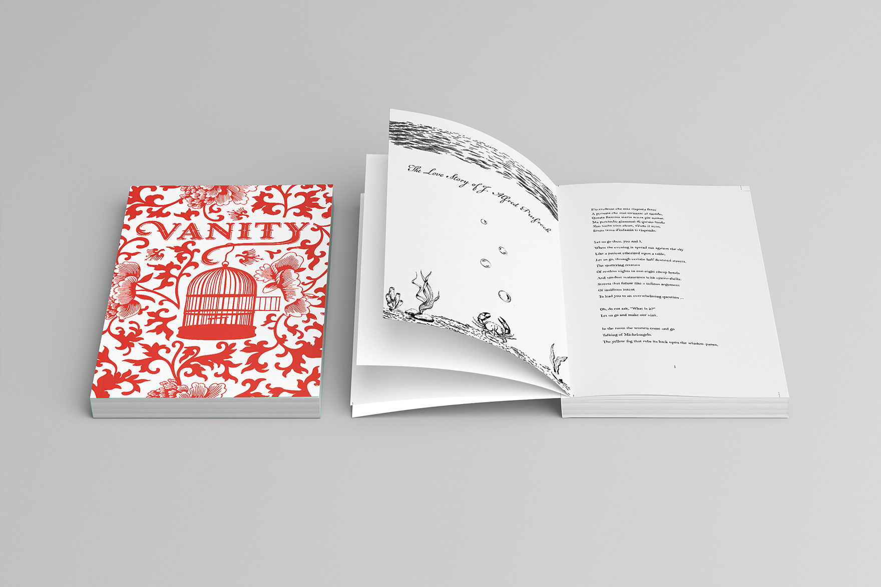
Book Design: Vanity
The book ‘Vanity’ is a collection of short stories and poems exploring the themes of ego, self-importance, and the search for validation. It reveals how these pursuits can distance us from true happiness and mindfulness. The vintage-inspired book cover design reflects this theme with an open cage surrounded by ornamentation and bird motifs, symbolizing the mind’s confinement and the possibility of liberation.

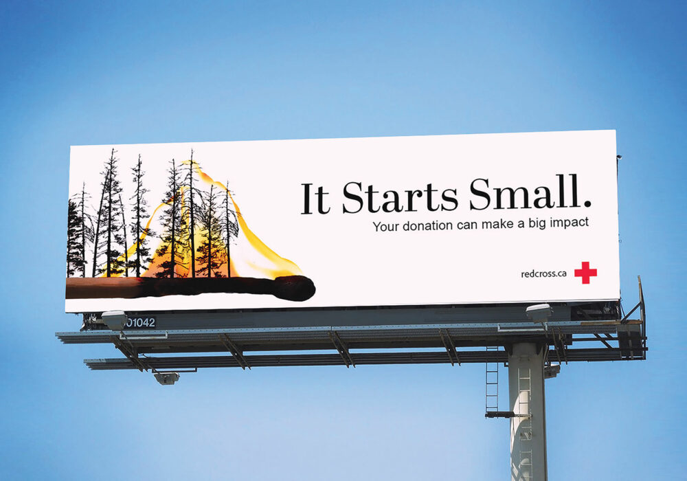
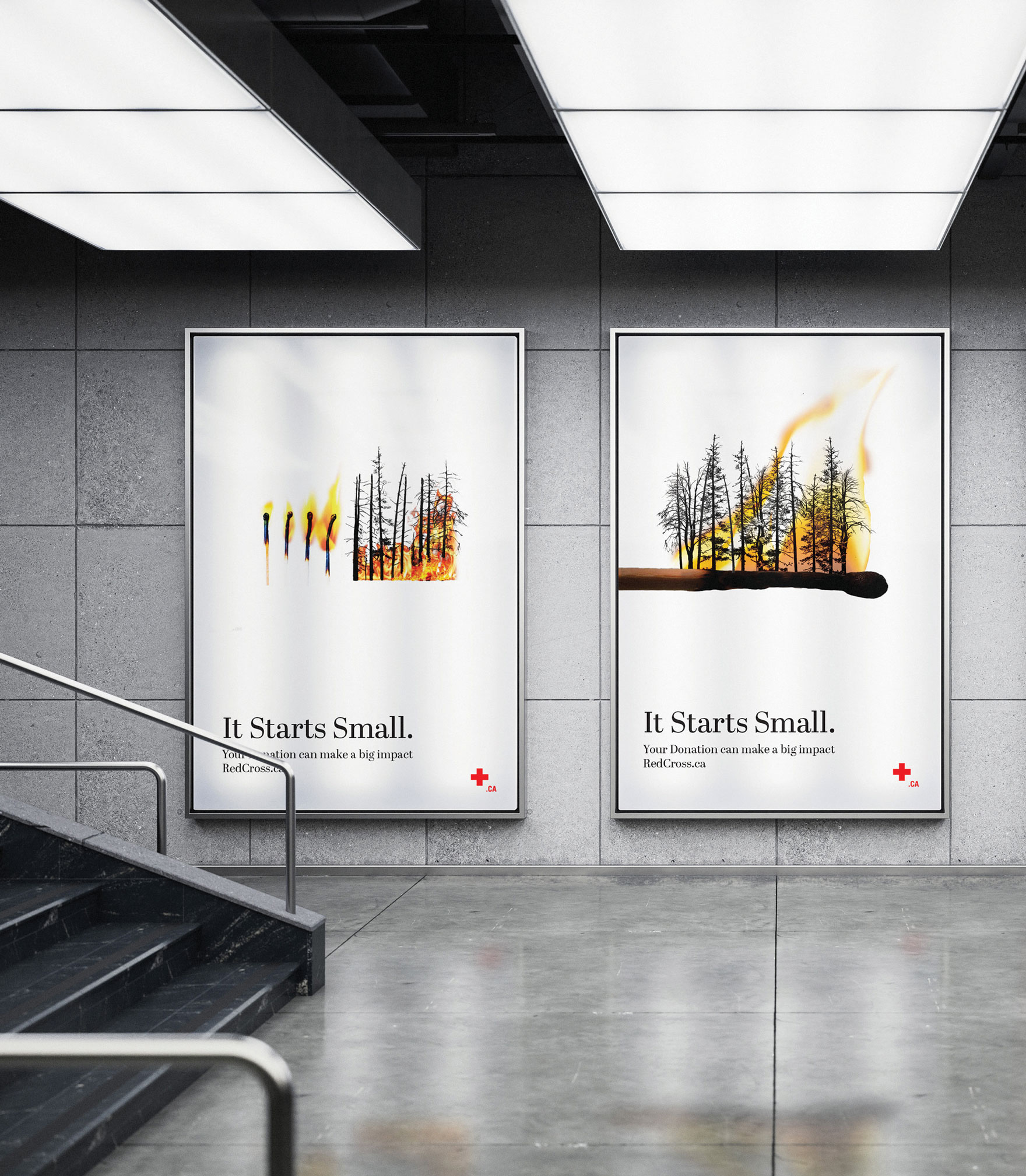
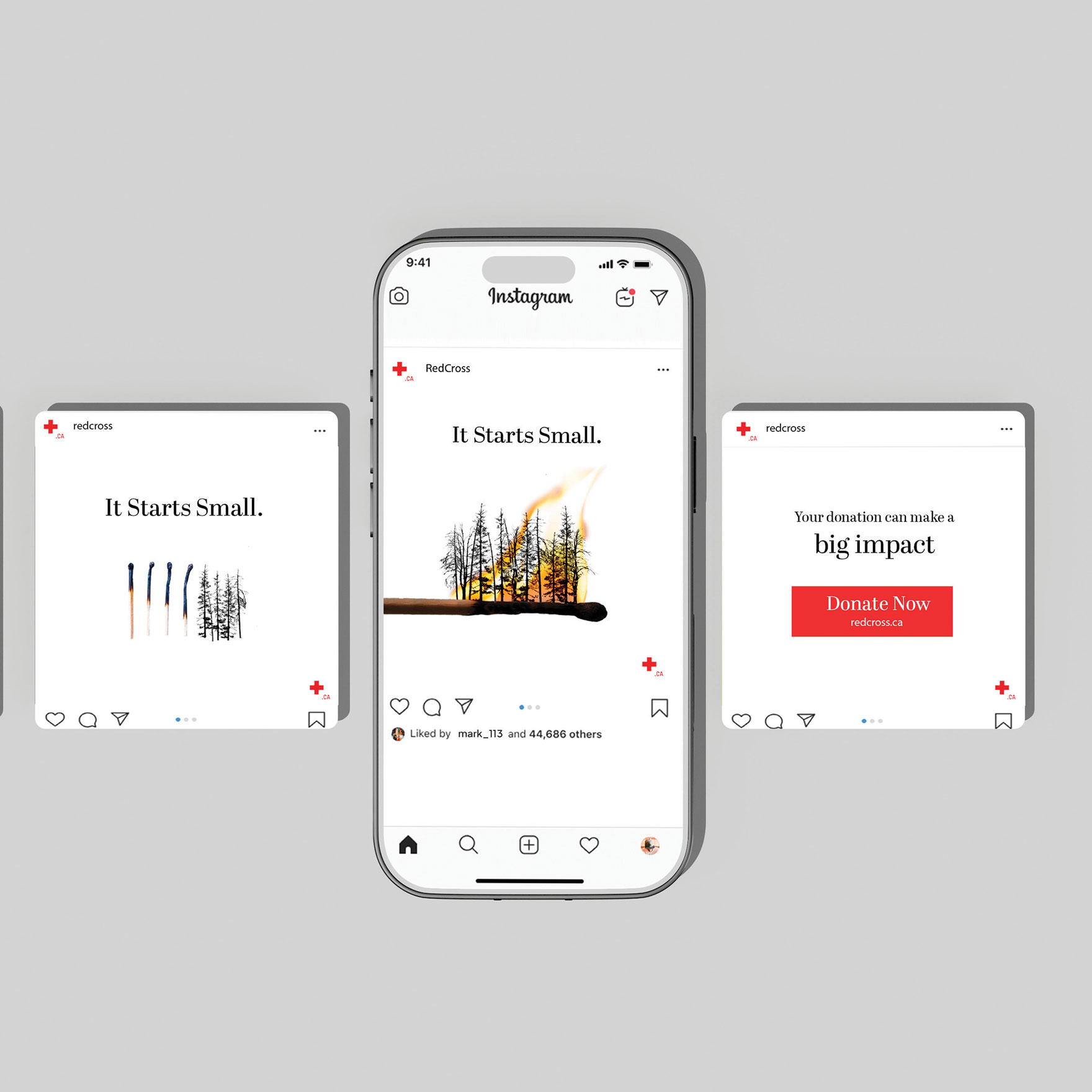
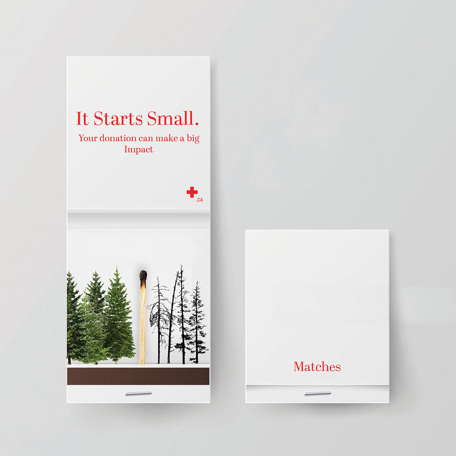
Public Service Advertising: It Starts Small
This Red Cross advertising campaign addresses wildfires by visually conveying the rapid escalation from small flames to large-scale forest destruction. The imagery is designed to evoke an emotional response from the target audience while reinforcing the idea that small actions can lead to significant change. The campaign aims to motivate viewers to support the Red Cross by donating to aid wildfire relief and recovery efforts.

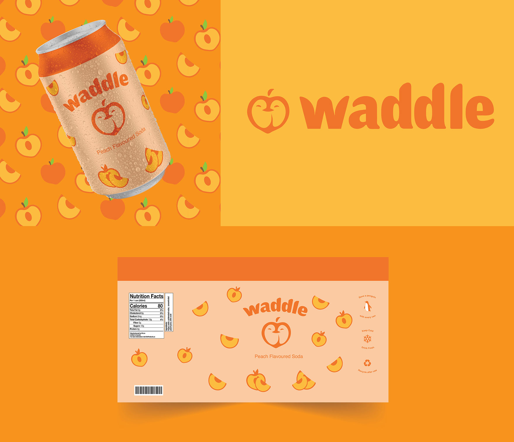
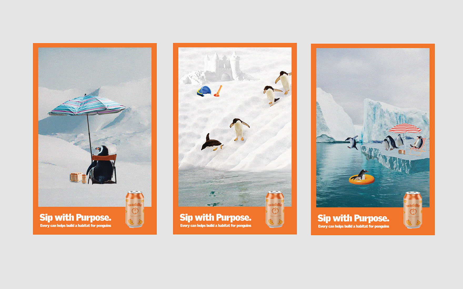
Soda Brand Identity and Ad Campaign: Waddle
Waddle is a peach-flavoured soda brand that centers around donating a part of its profits to endangered penguins. The brand identity is fun, inclusive, and playful. By incorporating penguins into its branding and advertising, Waddle raises awareness of endangered animals in a lighthearted, approachable way. This strategy allows the brand to communicate an important environmental message while appealing to a wide and diverse audience.

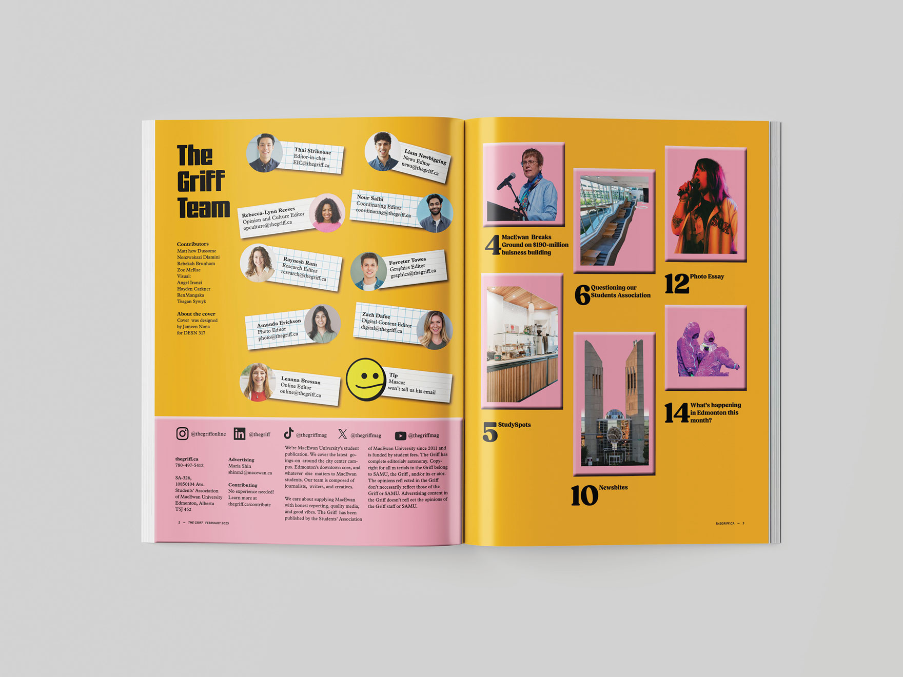
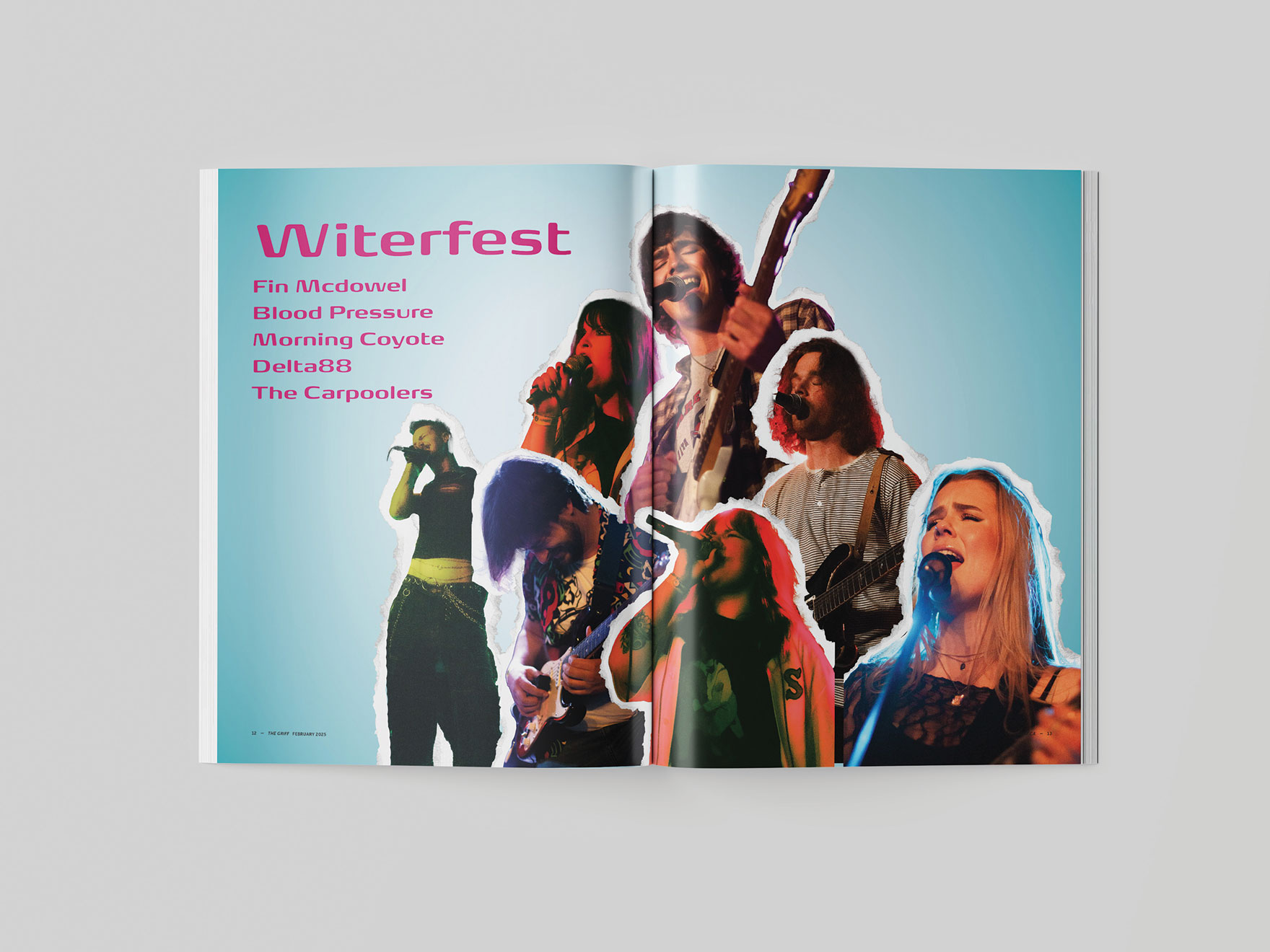
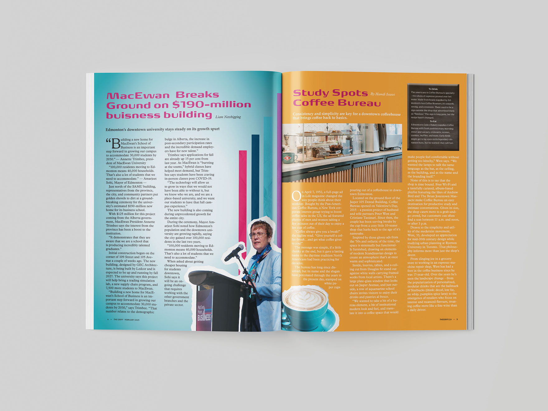
The Griff Magazine
The redesign of Griff Magazine aims to create a more engaging and visually dynamic publication for students. The design draws inspiration from early 2000s magazines to introduce a sense of energy and playfulness. Bold graphic elements, including collage-style imagery, 3D effects, and vibrant colours, create a visually engaging and enjoyable reading experience. Playful typography and consistent branding further reinforce the magazine’s identity.