 Kaye Rivera

 Kaye Rivera
she/her
Hi, I'm Kaye! Creativity has always been my driving force and has only continued further through developing my skills in MacEwan. In combining my passion for creativity and organization through UX/UI and information design, I can create a user experience that brings creativity and fun to products while maintaining structure and concise organization.
My portfolio displays a course of projects that show the quality of skills I have learned within the last few years at MacEwan while providing visual interest and personality to each project. Post-graduation, I look forward to developing my skills further through industry experience.
My portfolio displays a course of projects that show the quality of skills I have learned within the last few years at MacEwan while providing visual interest and personality to each project. Post-graduation, I look forward to developing my skills further through industry experience.
Projects
Plantiful Apothecary
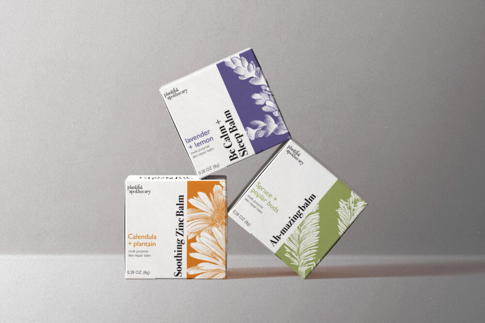
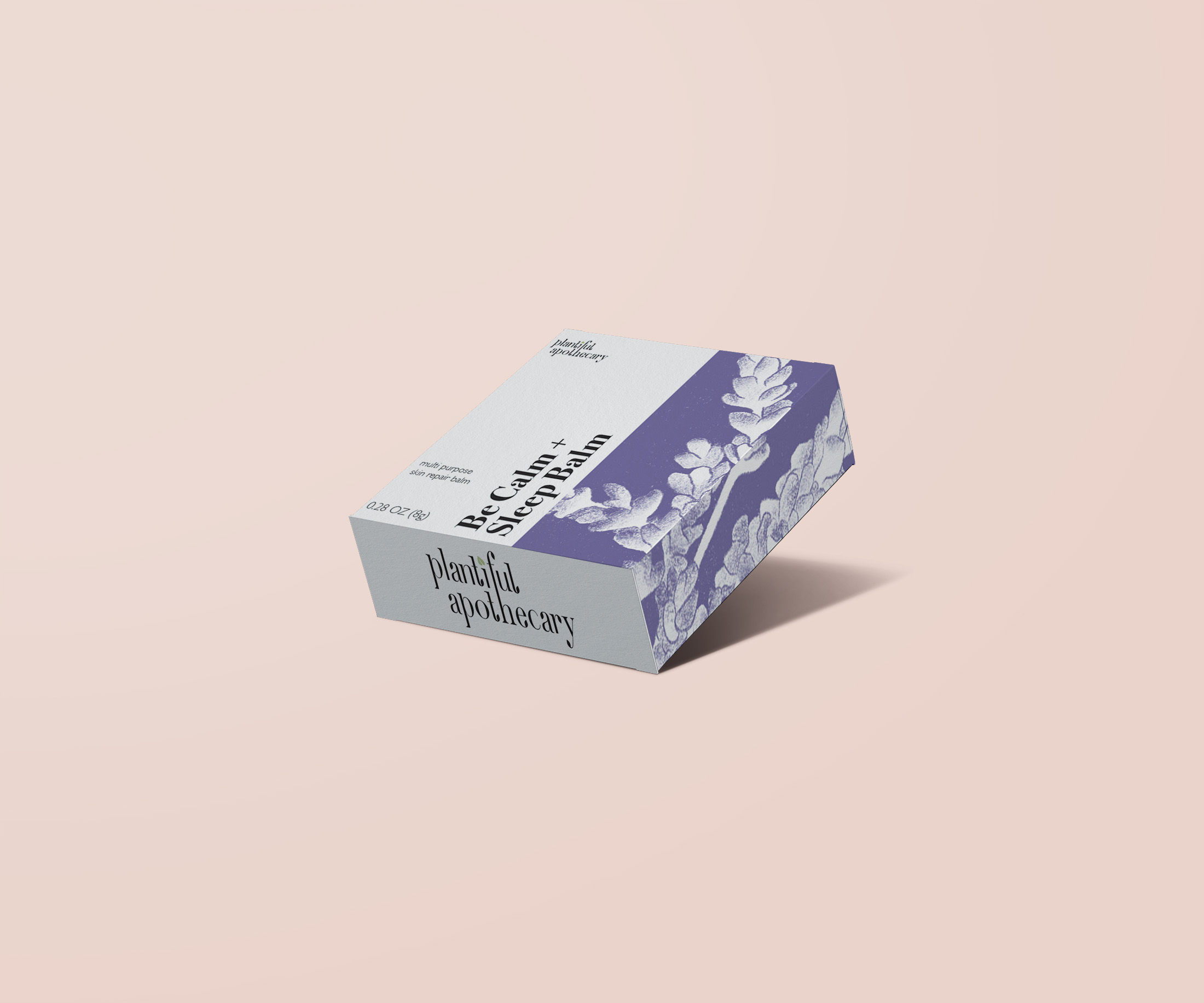
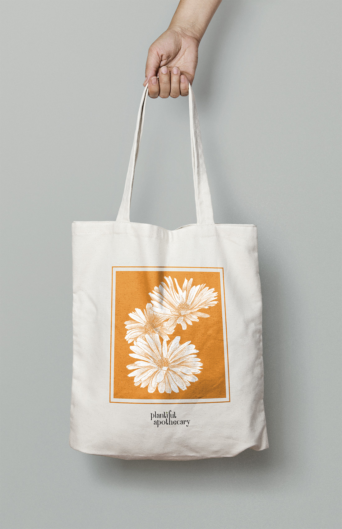
Plantiful Apothecary strives to be a simple and clean brand, using locally foraged botanicals harvested fresh and processed immediately to capture the highest ratio of antioxidants, minerals, and nutrients.
The brand redesign reflects Plantiful Apothecary's focus on using all-natural botanical ingredients for its products through the wordmark's organic feel and use of hand-drawn visual elements.
The brand redesign reflects Plantiful Apothecary's focus on using all-natural botanical ingredients for its products through the wordmark's organic feel and use of hand-drawn visual elements.
Edmonton Railway Society
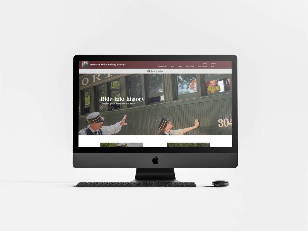
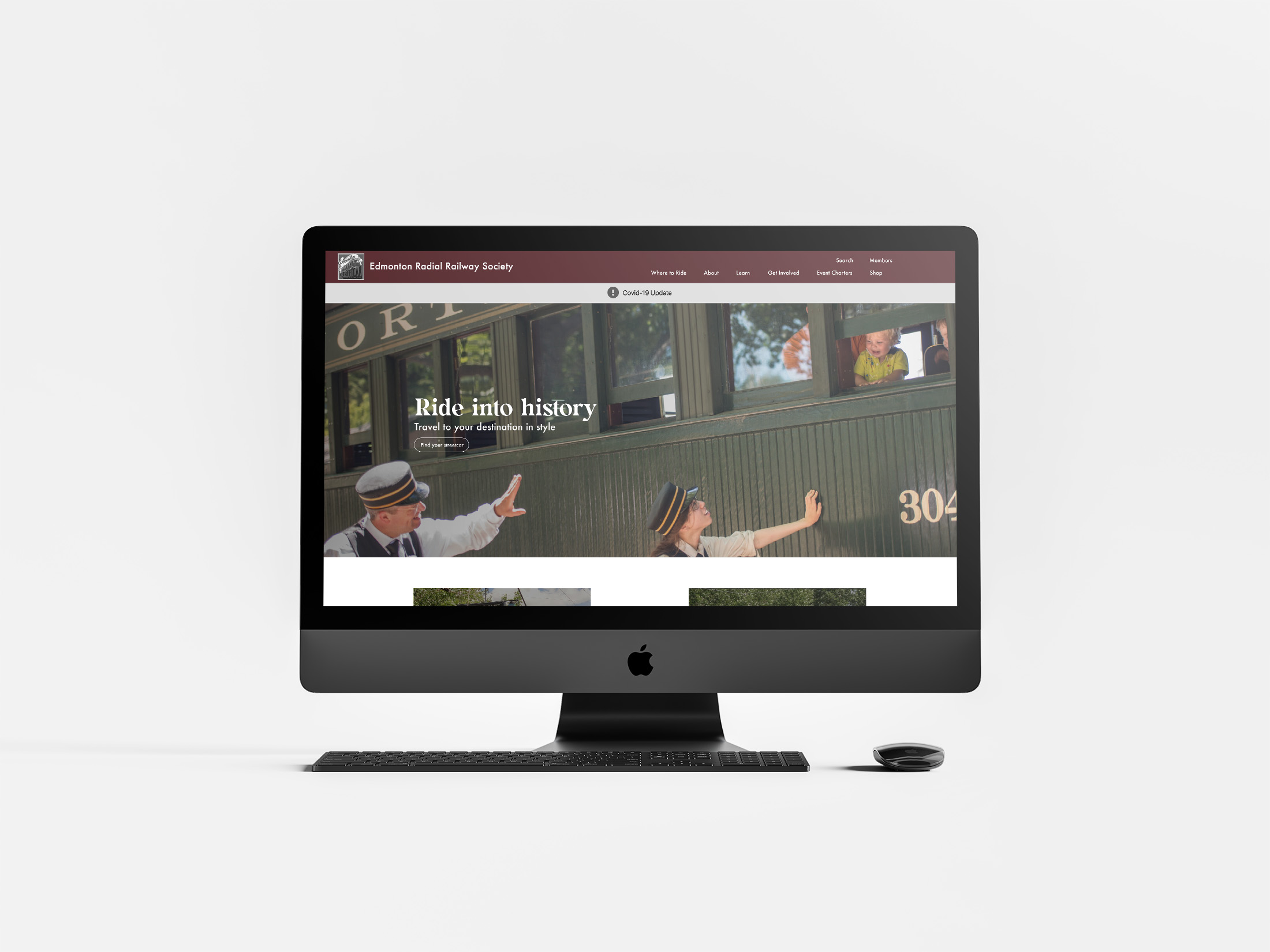
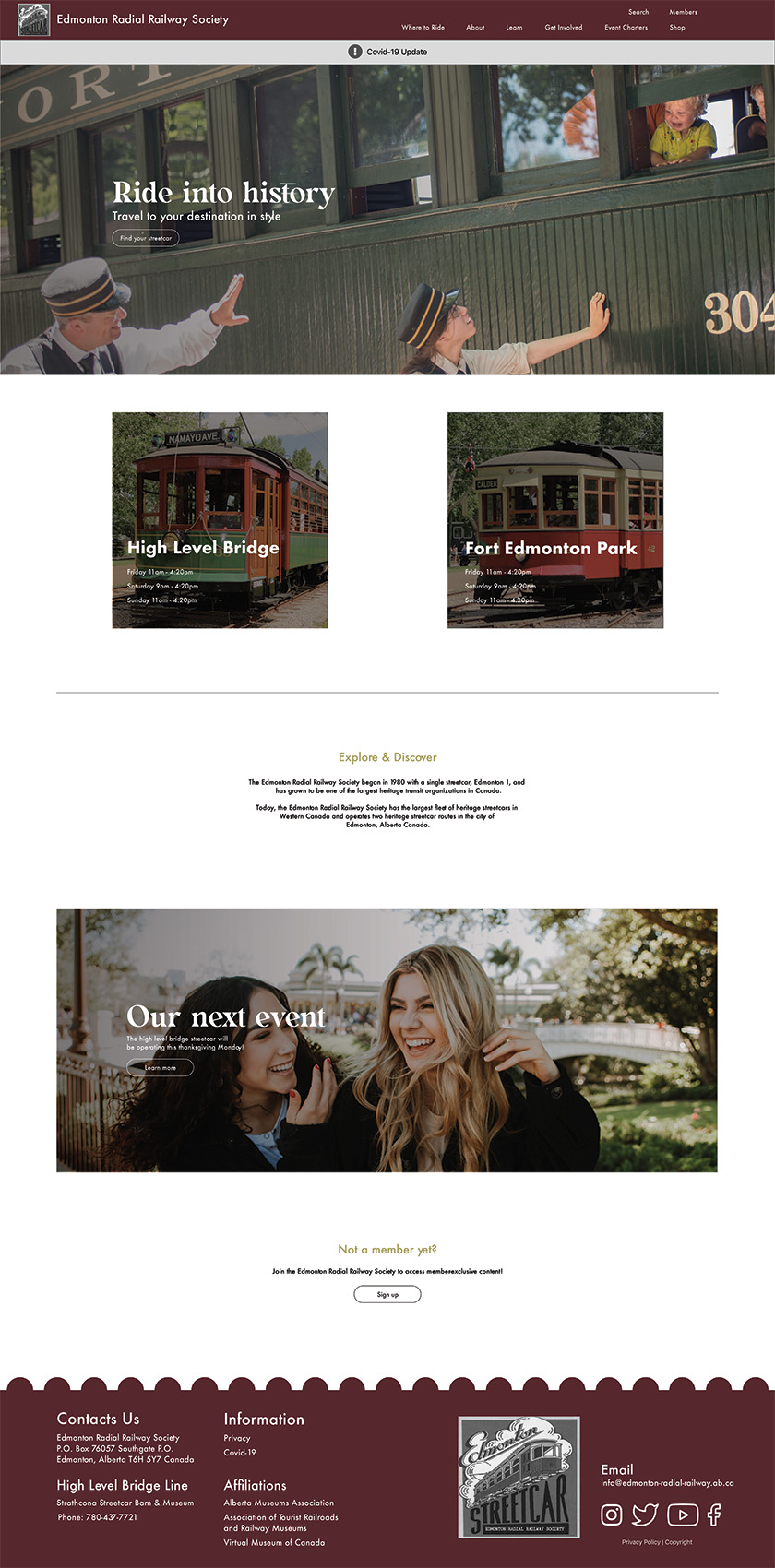
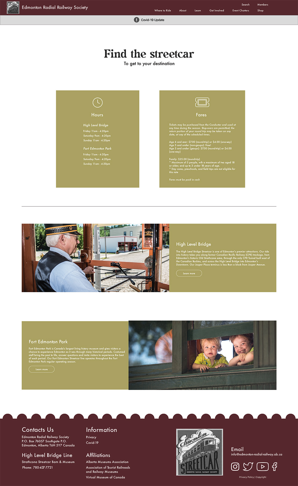
After extensive understanding of the client and user through research and user-testing, this Edmonton Railway Society website redesign acknowledges and solves problems users come across on the website.
In contrast to the original website, the redesign highlights the most sought-after information and organizes the rest of the information into different sections within the navigation bar.
In contrast to the original website, the redesign highlights the most sought-after information and organizes the rest of the information into different sections within the navigation bar.
Annual Report Design
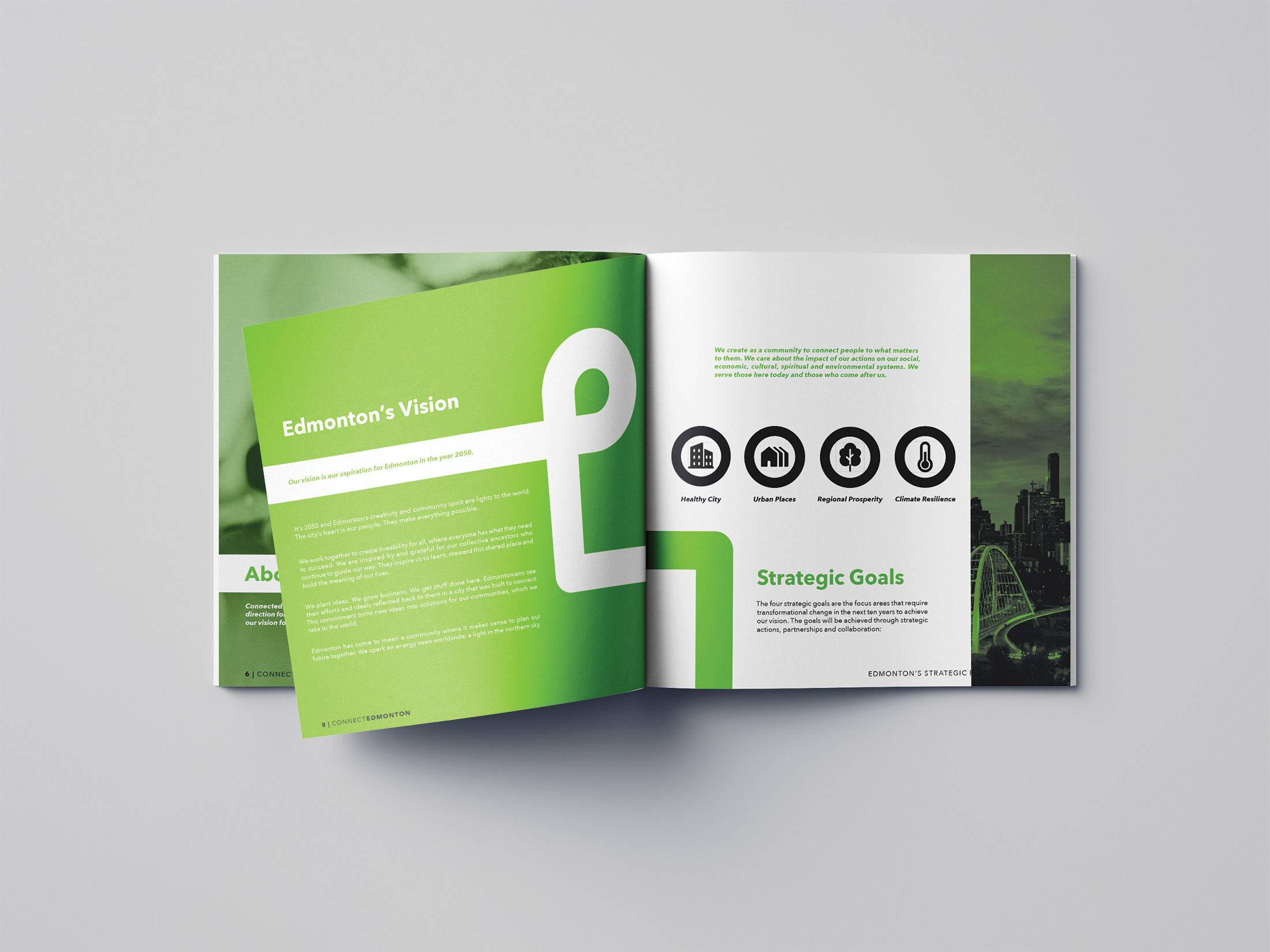
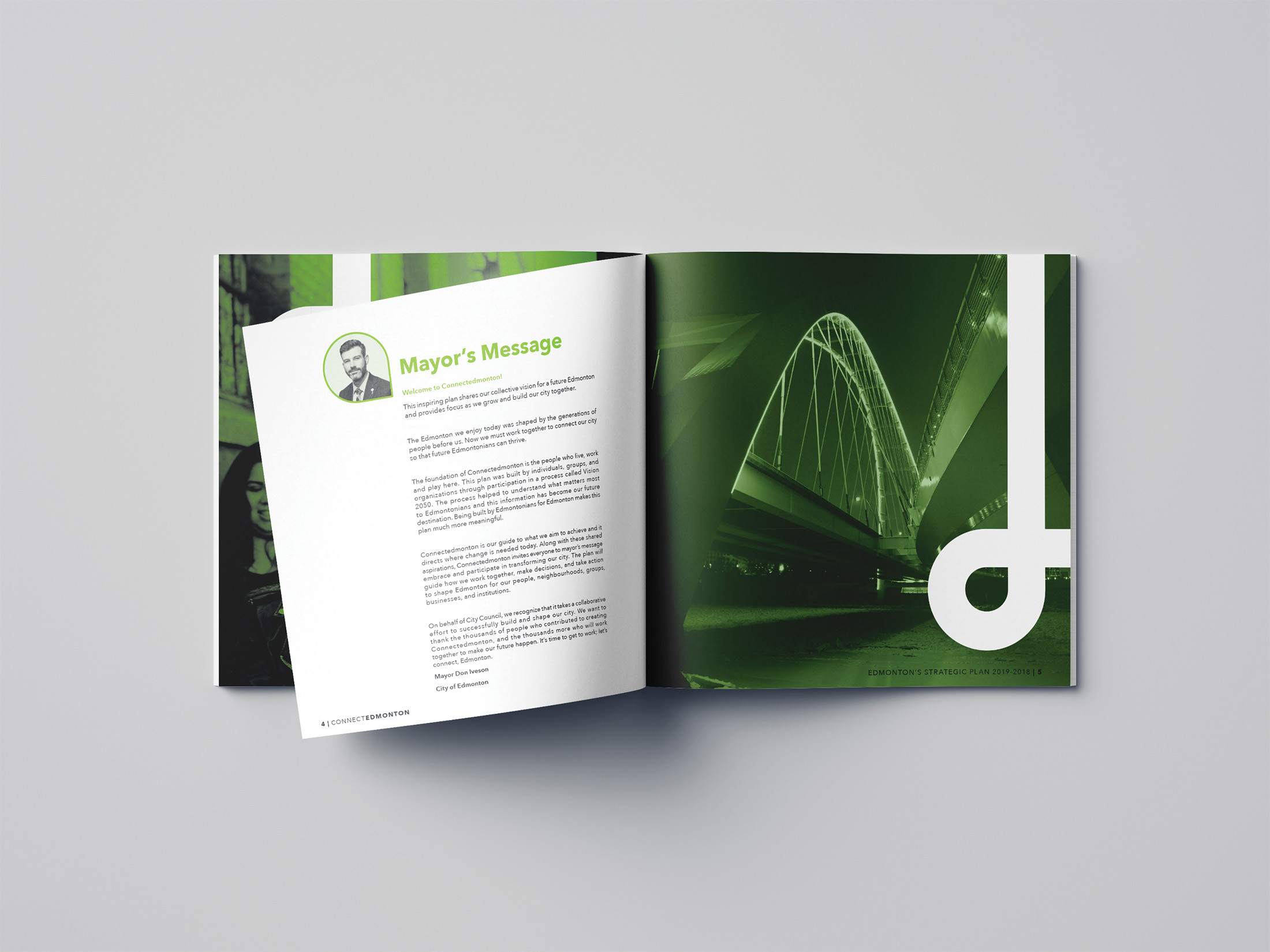
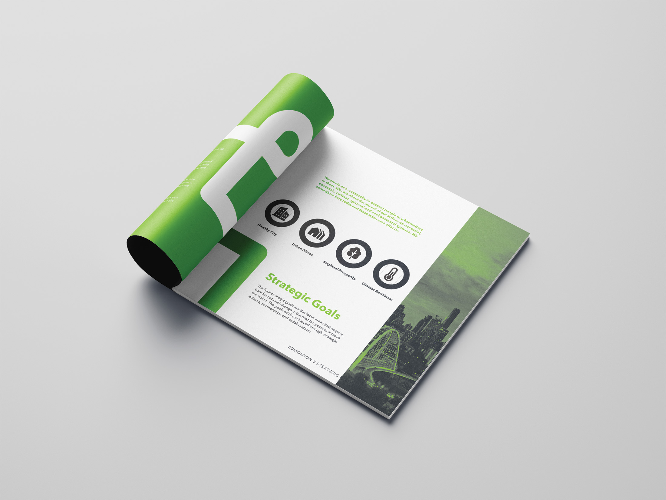
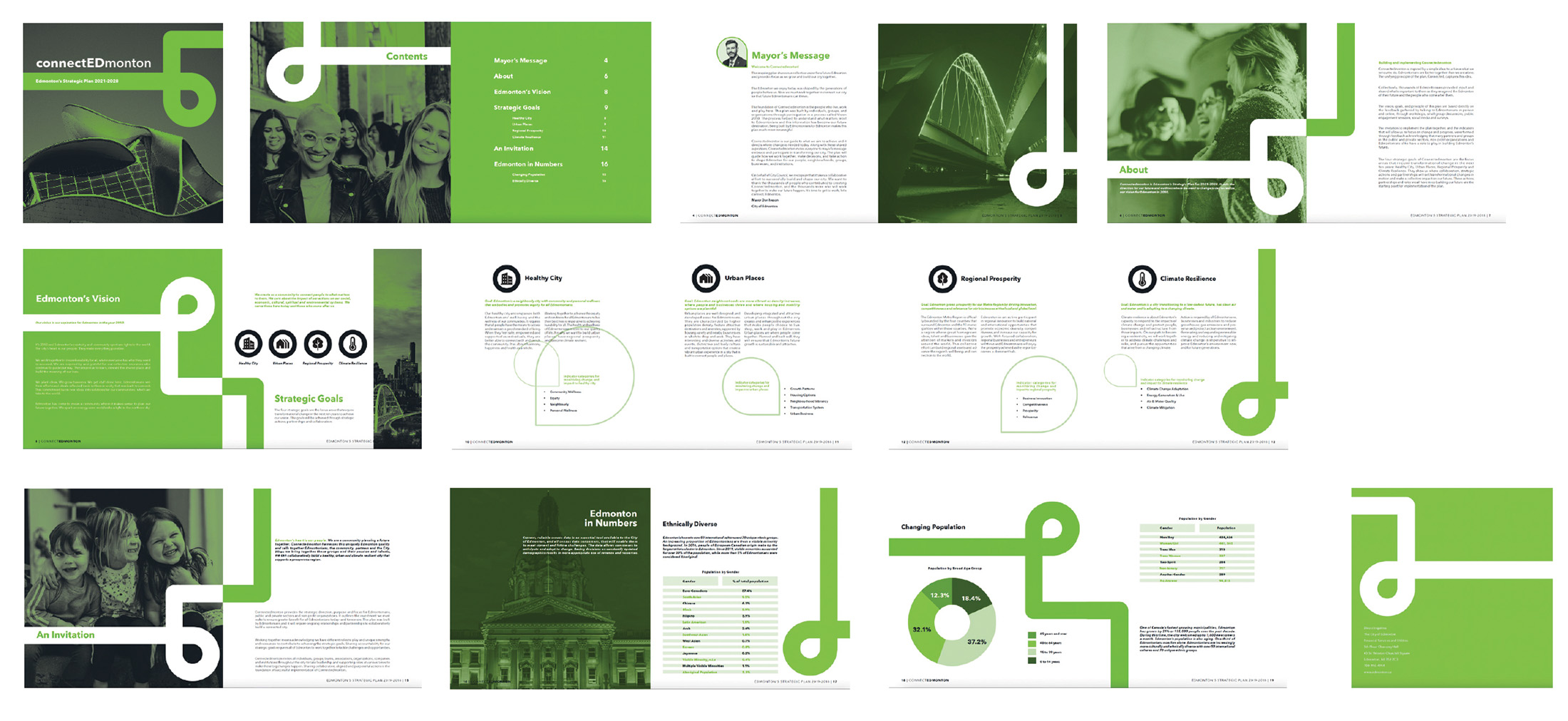
This Annual Report Design showcases a comprehensive and visually engaging presentation of the city's achievements, initiatives, and progress over the past year.
This design displays the essence of Edmonton's dynamic spirit and commitment to growth through the visual elements carried throughout the report.
This design displays the essence of Edmonton's dynamic spirit and commitment to growth through the visual elements carried throughout the report.
Up and Over Trio
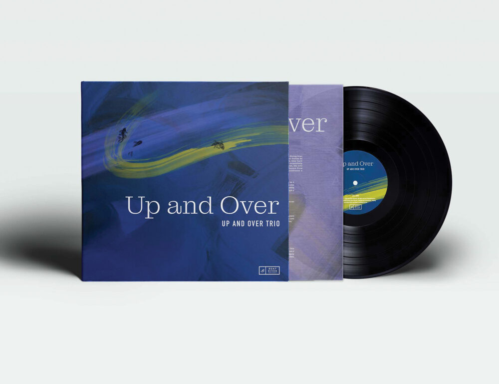
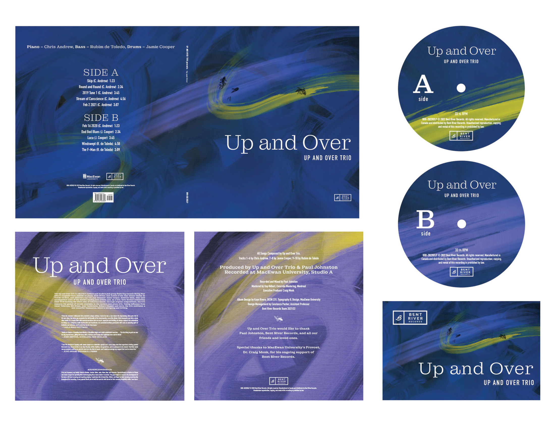
Inspired by how emotion influences the listener’s interpretation of the Up and Over Trio’s music, the viewer’s current emotion evokes the impression of the cover jacket and album package.
The overall design in the strokes of paint and pop of colour represents the Trio’s creativity and fluidity in their music.
The overall design in the strokes of paint and pop of colour represents the Trio’s creativity and fluidity in their music.
