Laura
Caney
Laura
Caney
She/Her
I am deeply passionate about turning challenges into engaging and accessible solutions. My expertise lies in branding, advertisement, and publication, with a profound love for illustration. Through my portfolio, I demonstrate a fusion of strategic branding, impactful advertisements, and visually captivating illustrations. What distinguishes me is my commitment to visual storytelling and my distinctive ability to integrate creativity with practicality. As I approach graduation, I am eager to explore opportunities that involve collaborative work with industry designers, tackling fresh challenges, and translating my skills into meaningful real-world impact.
Projects
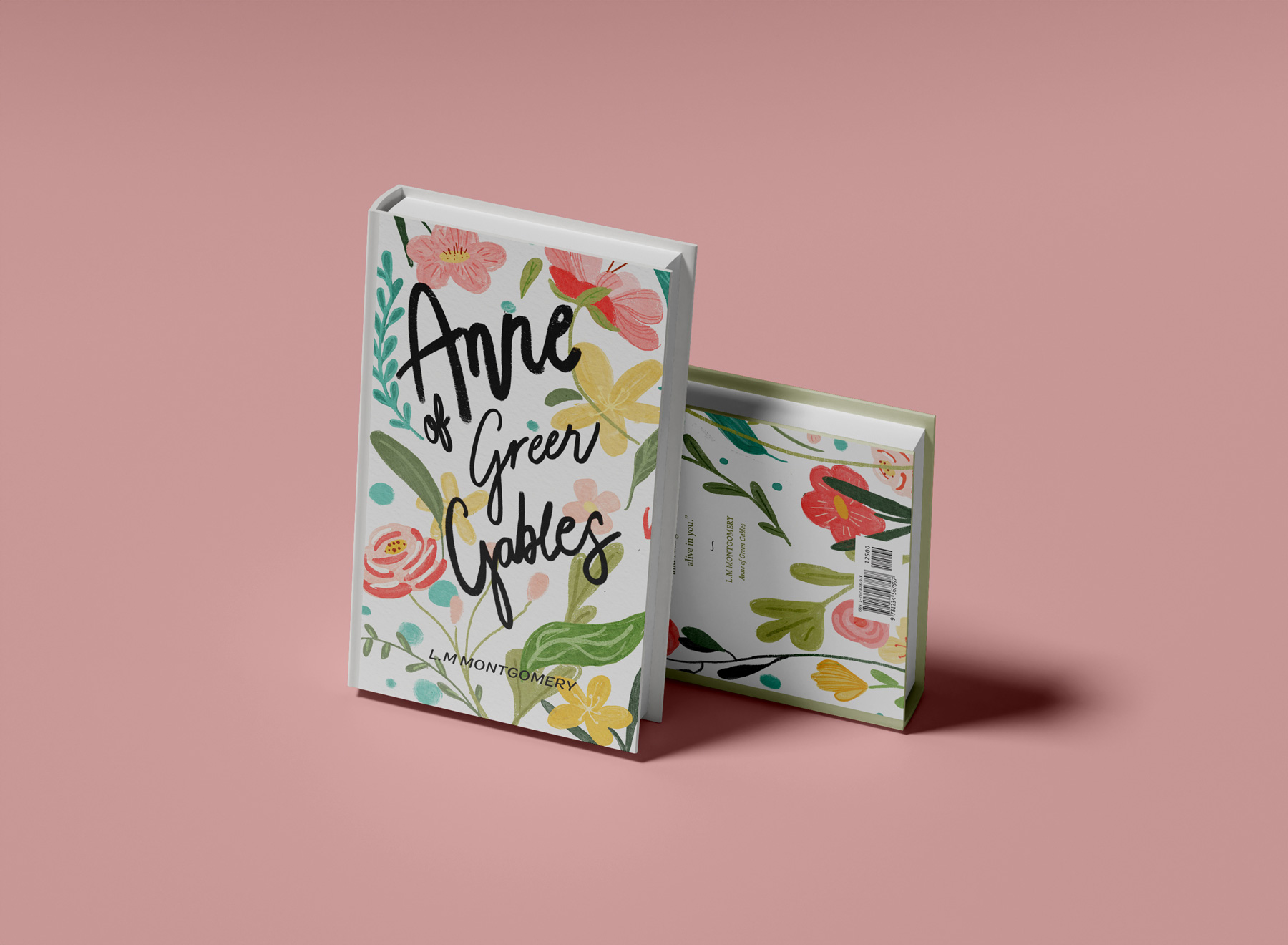
Anne of Green Gables
Anne of Green Gables, a spirited coming-of-age tale, shapes its design around Anne's vibrant imagination. Using mixed media, the cover blends gouache, pencil crayon, and oil pastels for depth and a handmade feel. Vibrant flowers and a hand-drawn black title on the cover reflect Anne's lively nature. The back cover, with serene white space around a beautiful quote, captures Anne's contemplative perspective, crafting a whimsical and wonder-filled design in this poignant narrative.

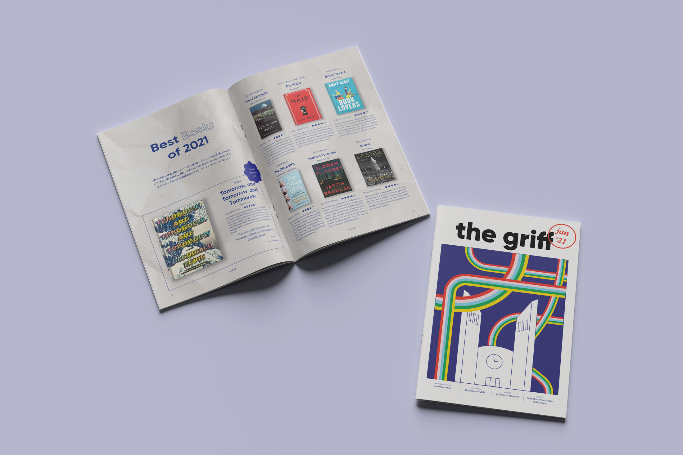
The Griff Redesign
This project draws inspiration from the vibrant energy of MacEwan students, aiming to position ‘The Griff’ as a place of rejuvenation and inspiration amid the academic stress. Inspired by indie zines, it blends handcrafted aesthetics with organized grids and minimalistic typography. The result is an authentic, easily readable magazine with a sense of clarity despite its bold colours and patterns. Adaptable to evolving student styles, it features varied textures, zine-inspired graphics, and a limited, bright colour palette that collectively energizes each page.
Tease Tea’s & Infusions - Brand and identity
The goal for this project was to create a brand that would deliver a small dose of sunshine to its audience. The main logo features a playful teacup of sunshine, playfully winking at viewers; while the mono-weight typography strikes a balance between organic structure and sharp, elongated lines, offering a modern yet carefree feel. The vibrant colours evoke happiness, aligning with the goal to bring joy to the audience through a brand that revolves around tea.

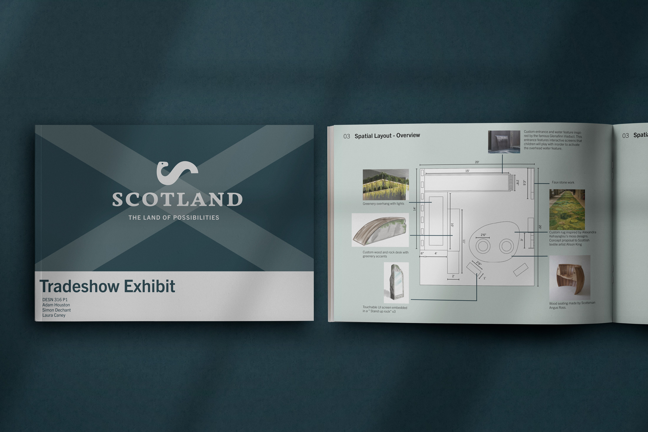
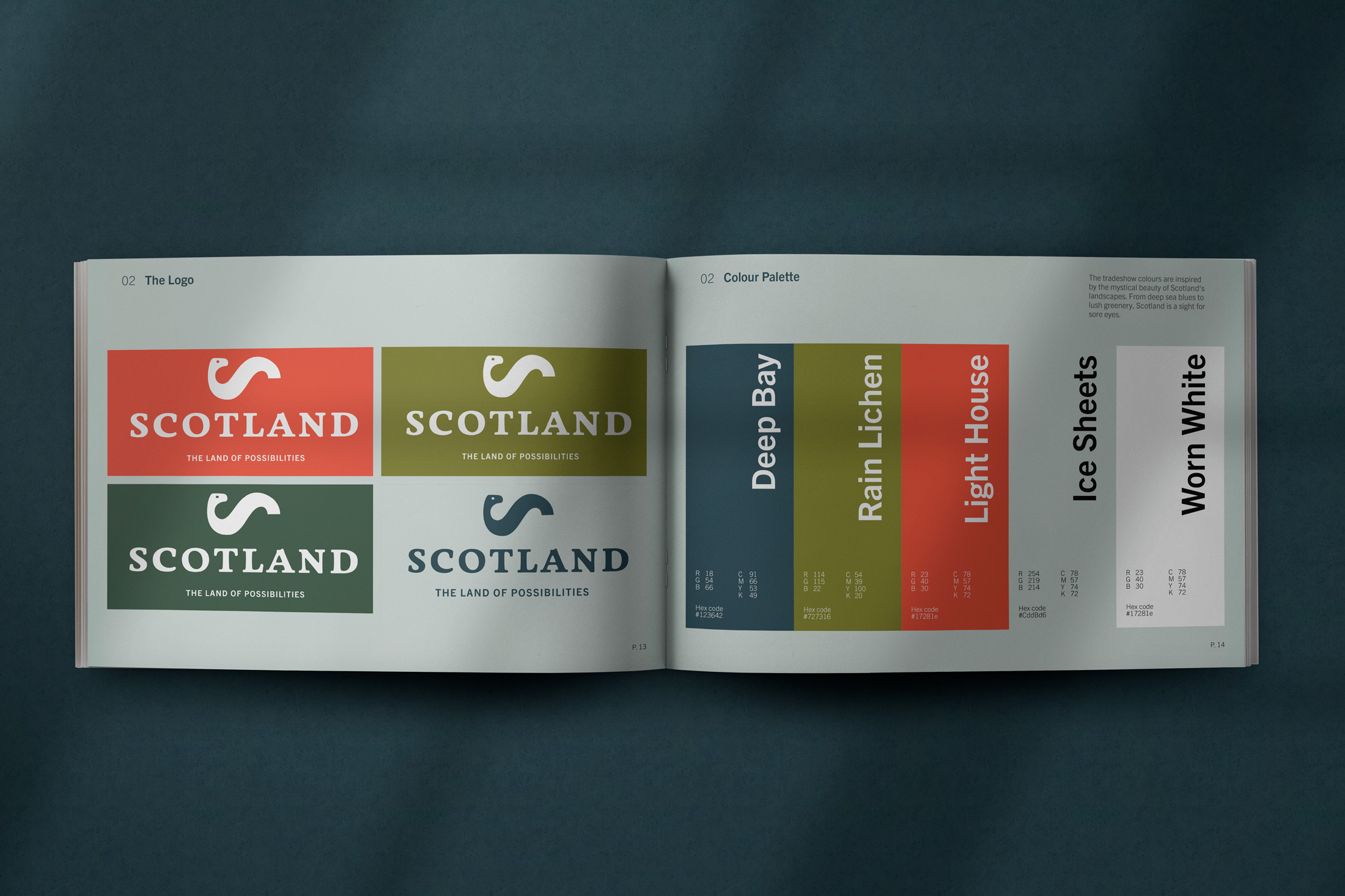
Scotland - Brand and Identity
For this group project, my task was to create a brand identity for Scotland at a tradeshow exhibit. The icon is simple and clean to conjure universal intrigue. The colour palette mirrors the Scottish landscape—lush greens, deep blues, and muted grays and a punch of red—immersing the brand in authenticity. The typography balances tradition and modernity, reflecting Scotland's rich history.
Partners: Adam Houston, Simon Dechant
Partners: Adam Houston, Simon Dechant